Kestrel White vs Shoji White: The Closest SW Off-Whites Compared
- Beril Yilmaz

- Mar 16
- 9 min read
Updated: Mar 24
Kestrel White and Shoji White are two of Sherwin Williams' most closely matched warm off-whites -- both sitting in the soft greige-white zone, both popular with designers, and both appearing on shortlists for the same kind of brief. On a paint chip they are genuinely difficult to tell apart. On a wall the differences are subtle but real -- and for someone trying to decide between them, those differences matter.
This guide covers exactly what separates Kestrel White from Shoji White in undertone, LRV, room behavior, and best application -- so you can make the right call for your specific room.

Quick Reference -- Kestrel White vs Shoji White
| Kestrel White SW 7516 | Shoji White SW 7042 |
LRV | ~73 | 74 |
Undertone | Warm beige with soft greige-green | Warm beige-greige, subtle gray-green |
Depth | Marginally softer, slightly more settled | Marginally brighter, slightly more open |
Temperature | Warm, slightly earthier | Warm, slightly fresher |
North-facing rooms | Reads warm and earthy -- works well | Can read slightly gray-greige -- works well |
South-facing rooms | Glows warmly, earthy quality | Glows warmly, creamy-greige quality |
Best trim | Pure White SW 7005, Extra White SW 7006 | Pure White SW 7005, Extra White SW 7006 |
Best for | Organic modern, earthy, warm interiors | Minimalist, transitional, versatile |
Verdict | Earthier and slightly more distinctive | Slightly more versatile and widely known |
What Is Kestrel White?

Kestrel White SW 7516 is a warm off-white from Sherwin Williams with an LRV of approximately 73 -- placing it fractionally deeper than Shoji White and firmly in the soft greige-white category. It is less widely known than Shoji White but appears consistently in designer specifications for organic modern, earthy, and transitional interiors where the brief calls for a warm white with just a little more body and earthiness than the most popular off-whites deliver.
Kestrel White's undertone is warm beige with a soft greige-green quality -- it shares Shoji White's general warm greige character but leans slightly earthier and more settled. It has less of the fresh, open quality that Shoji White carries and more of a grounded, organic warmth that suits spaces with natural materials -- warm wood, stone, linen, and rattan -- particularly well. In strong natural light it glows with a warm, earthy quality. In north-facing rooms it holds its warmth well without shifting dramatically.
What Is Shoji White?

Shoji White SW 7042 is one of Sherwin Williams' most popular and widely specified warm off-whites -- an LRV of 74 places it at the brighter end of the warm greige-white zone. It has a loyal following among designers for its versatility: it works across minimalist, transitional, and organic modern interiors without demanding a specific material palette or room orientation.
Shoji White's undertone is warm beige-greige with a subtle gray-green quality -- it is warmer than a pure white but fresher and slightly more open than Kestrel White. The gray-green undertone gives it its characteristic 'chameleon' quality: it shifts subtly with changing light conditions, reading as creamier in warm light and slightly grayer in cool light, which is exactly what makes it so adaptable. The full breakdown of Shoji White's undertone behavior, room performance, and best pairings is in the Shoji White review.
For how Shoji White compares to Natural Linen -- another SW warm off-white at nearly identical LRV but with a warmer, more earthy undertone -- the Shoji White vs Natural Linen guide covers that comparison.
Kestrel White vs Shoji White -- The Key Differences

Undertone
Both colors share a warm beige-greige foundation but Kestrel White leans earthier and Shoji White leans fresher. The practical difference is that Kestrel White reads as slightly more grounded and settled on the wall -- it has more of an organic, linen quality. Shoji White reads as slightly more open and versatile -- it has more of a clean, airy quality that suits a wider range of interior styles. The difference is subtle but visible when both colors are sampled side by side in the same room.
LRV and Light Behavior
Kestrel White at LRV ~73 and Shoji White at LRV 74 are extremely close -- in practice the difference in brightness is almost imperceptible on a wall. Both colors absorb a similar amount of light and create a similar sense of depth compared to brighter off-whites. Neither is a substitute for a true off-white or white in a room that needs maximum light reflectance. In rooms with good natural light, both perform equally well. In rooms with limited light, both carry the same risk of reading slightly heavy or greige rather than white.
Versatility
Shoji White is the more versatile of the two across different interior styles and material palettes. Its slightly fresher undertone means it adapts more gracefully to contemporary and minimalist interiors alongside organic modern and traditional spaces. Kestrel White's earthier quality makes it the stronger choice in interiors with a deliberate organic, earthy character -- spaces with warm wood, stone, terracotta, and natural textiles where Kestrel White's extra warmth and groundedness is an asset rather than a limitation.
Recognition and Availability
Shoji White is significantly better known and more widely available as a reference point -- it appears on more designer shortlists, more Pinterest boards, and more color review sites than Kestrel White. This matters practically: if you are working with a designer, a contractor, or sourcing color references, Shoji White has a much larger body of real-world photography and comparison content available. Kestrel White is a genuine designer alternative but it is a more deliberate, less well-documented choice.
Want expert guidance choosing between warm off-whites for your home? Book a color consultation here -- bydesignandviz.com/book-online |
Kestrel White vs Shoji White -- Room by Room
Living Rooms

Both work well in living rooms but Shoji White suits the wider range of living room styles. Kestrel White is at its best in living rooms with an organic modern or earthy character -- spaces with warm wood floors, natural stone, linen and rattan furniture, and warm brass fixtures. Its earthier undertone enhances those materials in a way that Shoji White's slightly fresher quality does not quite match. Shoji White suits all of those spaces equally but also works in more contemporary or minimalist living rooms where Kestrel White's earthiness can feel slightly heavy.
Bedrooms
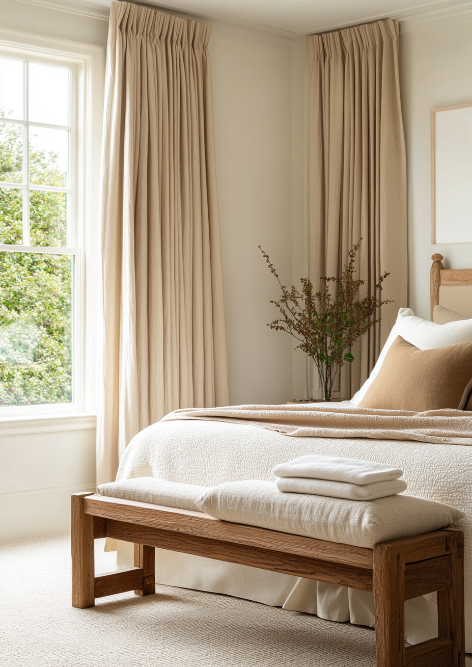
Kestrel White makes an excellent bedroom color in the right setting -- its warm, settled, earthy quality creates a genuinely cosy, enveloping bedroom atmosphere. In a bedroom with warm wood floors, linen bedding, and warm lighting it reads beautifully. Shoji White in a bedroom creates a slightly fresher, airier atmosphere -- it suits a wider range of bedroom styles and is the safer choice if the bedroom has mixed or limited natural light.
Kitchens
Shoji White is the stronger kitchen choice for most situations -- its slightly higher LRV and fresher undertone keep kitchen spaces feeling clean and bright without the slightly earthier weight that Kestrel White can bring to a large surface area like kitchen cabinets or walls. Kestrel White on kitchen walls can work beautifully in a kitchen with warm stone countertops and open wood shelving, but it needs those materials to anchor it -- without them it can read as slightly heavy.
Hallways and North-Facing Rooms

Both colors hold their warm character reasonably well in north-facing and limited-light conditions, but Shoji White has a slight edge -- its fractionally higher LRV and slightly fresher undertone mean it is less likely to read heavy or greige in poor light. Kestrel White in a dark north-facing hallway can feel noticeably heavy. Shoji White in the same space reads as a soft warm neutral. For rooms with limited natural light, Shoji White is the safer of the two.
Exteriors
Both colors work on exteriors but Shoji White has a stronger track record in exterior applications -- it appears frequently on cottage, farmhouse, and contemporary exterior shortlists and its slightly higher LRV means it reads with more presence on a large facade. Kestrel White on an exterior creates a warm, earthy, slightly more muted quality that suits certain architectural styles -- particularly organic modern and natural material exteriors -- but is more situationally specific than Shoji White.
What to Pair With Kestrel White

Trim: Pure White SW 7005 or Extra White SW 7006 -- both provide crisp definition against Kestrel White's earthy warmth without introducing a color clash.
Floors: Warm wood in medium to dark tones, warm stone, terracotta tile -- Kestrel White's earthiness relates most naturally to warm, organic floor materials.
Accents: Warm terracotta, deep olive green, warm brass, aged bronze, natural linen -- materials and colors that share Kestrel White's organic, earthy character.
Style: Organic modern, earthy transitional, natural material interiors, warm farmhouse.
What to Pair With Shoji White

Trim: Pure White SW 7005 or Extra White SW 7006 -- the same crisp trim whites that work with Kestrel White also suit Shoji White's warm greige character.
Floors: Warm wood in any tone, warm stone, natural tile -- Shoji White's versatility means it works alongside a wider range of floor materials than Kestrel White.
Accents: Warm brass, warm navy, soft sage green, warm terracotta, natural linen -- Shoji White suits a broad range of accent colors and materials.
Style: Minimalist, transitional, organic modern, contemporary, traditional -- Shoji White's adaptability makes it one of the most style-agnostic warm off-whites in the Sherwin Williams range.
For how Shoji White compares with Alabaster -- the other major SW warm white -- the Shoji White vs
Alabaster guide covers that comparison in detail. For how Shoji White compares to Benjamin Moore Swiss Coffee across brand lines, the Shoji White vs Swiss Coffee guide covers that directly.
The Verdict

Choose Kestrel White if: the interior style is organic modern or deliberately earthy, your floor and material palette is warm-toned and natural, you want a warm off-white with slightly more body and groundedness than Shoji White, and you are prepared to test it carefully given its lower profile and fewer reference points.
Choose Shoji White if: you want a warm off-white with proven versatility across a wide range of interior styles and room orientations, the room has mixed or limited natural light, or you want the reassurance of a more widely documented color with a large body of real-world photography to reference.
For most rooms and most people, Shoji White is the safer choice between the two -- its combination of versatility, documentation, and slightly fresher undertone makes it easier to work with across a wider range of conditions. Kestrel White is a genuine and beautiful alternative for designers who know exactly what they want from it -- but it rewards deliberate specification more than Shoji White does.
Frequently Asked Questions

Is Kestrel White warmer than Shoji White?
Kestrel White reads as marginally earthier and more settled than Shoji White in most conditions -- its undertone has a slightly more organic, grounded quality. Shoji White reads as marginally fresher and more open. Both are warm colors; the difference is in the character of the warmth rather than its intensity.
Can I use Kestrel White and Shoji White in the same house?
Not on adjacent or open-plan surfaces -- the undertone difference between them, while subtle, is visible enough that placing them side by side will create an unintentional clash. Used in separate rooms with clear visual boundaries they can work in the same house, but there is no strong reason to use both when either one works well on its own.
Is Kestrel White good for cabinets?
Kestrel White works on cabinets in the right kitchen -- specifically a kitchen with warm stone countertops, warm wood accents, and brass or bronze hardware where its earthy warmth is complemented by the surrounding materials. In a kitchen without those warm materials it can read slightly heavy on a large cabinet surface. Shoji White is a more reliable cabinet choice across a wider range of kitchen styles.
Does Shoji White look gray on walls?
In north-facing rooms or under cool artificial light, Shoji White's gray-green undertone can become slightly more visible -- it can read as a soft warm gray rather than an off-white. This is normal for the color and is one reason it is described as a 'chameleon' neutral. In south-facing rooms or under warm artificial light it reads as a clean, warm off-white without any gray quality.
Which is better for a minimalist interior -- Kestrel White or Shoji White?
Shoji White is the stronger choice for minimalist interiors -- its slightly fresher, more open undertone suits clean lines and spare spaces better than Kestrel White's earthier quality. Kestrel White in a minimalist interior can read as slightly heavy or warm in a way that draws attention to the wall color rather than receding as a backdrop.
Final Thought
Kestrel White and Shoji White are close enough that for most rooms, either will work -- the difference between them is one of character rather than quality. If you are drawn to Kestrel White, it is almost certainly because you want the earthier, more grounded quality it brings. If you are drawn to Shoji White, it is almost certainly because you want the cleaner, more versatile quality it offers. Both are excellent colors. Sample both in your specific room before deciding -- at this level of similarity, the actual conditions of the room are what will make the difference visible.
Need help choosing the right warm white for your home? See our design packages here -- bydesignandviz.com/#interiordesignpackages |
About the Author
Beril Yilmaz is a qualified architect and interior designer based in the UK. She runs BY Design And Viz, a design platform covering paint color reviews, interior design guidance, and residential design projects.


Comments