


Repose Gray vs Creamy: The Comparison That Actually Helps You Decide

These two rarely get shortlisted against each other, and once you see the numbers side by side it is obvious why. Repose Gray sits at an LRV of roughly 58 while Creamy sits at roughly 81 — a gap of more than twenty points. This is not a close call between two similar off-whites. It is a comparison between a mid-tone greige built to recede and a warm, high-reflectance cream built to announce itself.
I have specified both, though almost never in competition with each other. They do different jobs. Repose Gray handles walls that need to settle a room down without going cold. Creamy handles walls, trim, or cabinetry that need warmth and presence. Understanding which job your room actually needs is the whole decision.
This guide covers what each colour looks like on the wall, where the LRV gap actually matters, and how to use them together rather than choosing one over the other.
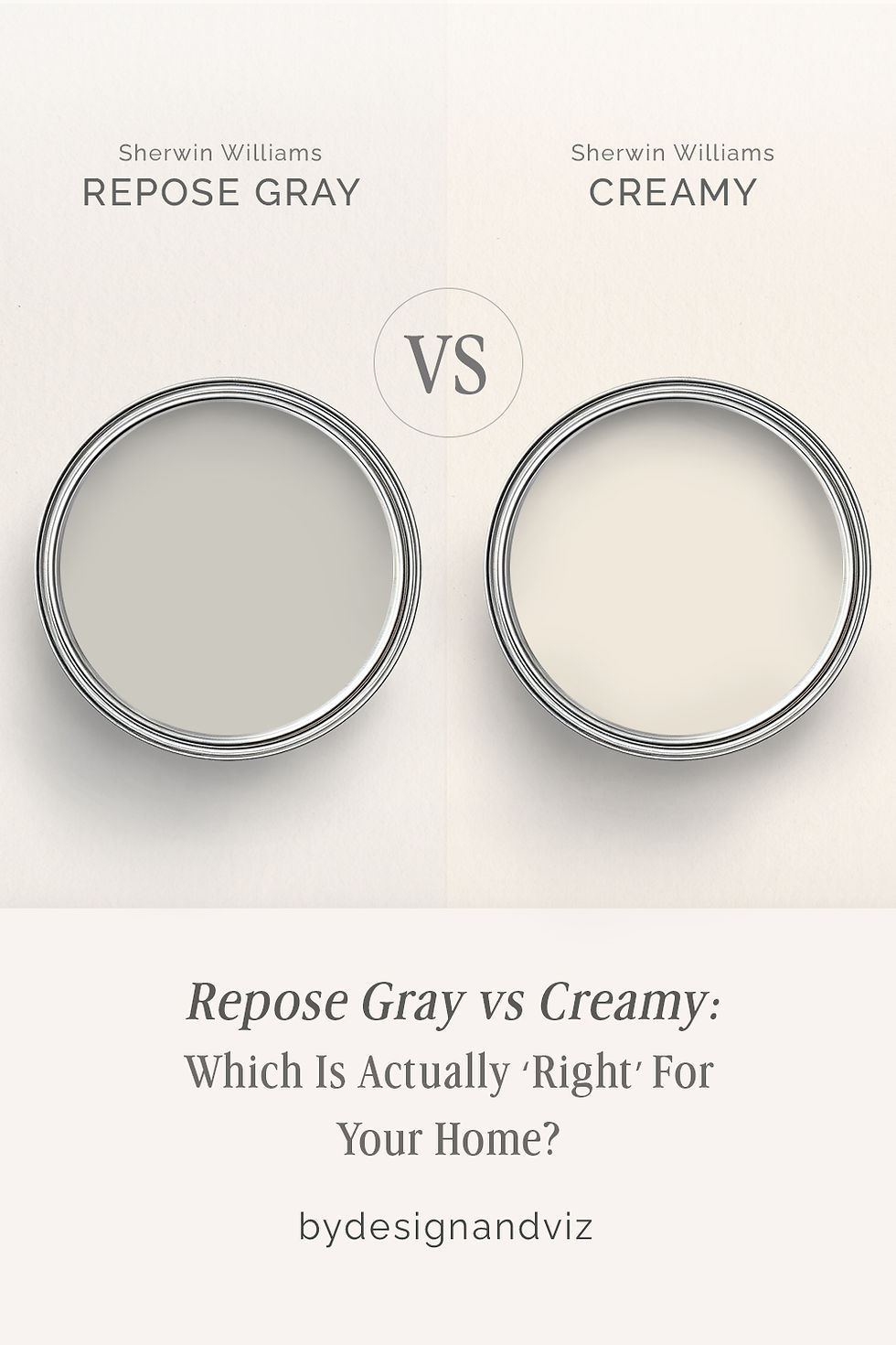
At a Glance
| Repose Gray | Creamy |
Brand | Sherwin-Williams | Sherwin-Williams |
LRV | ~58 - mid-tone, absorbs and reflects in roughly equal measure | ~81 - bright, warm, reflects light well |
Colour category | Warm greige with a cool undercurrent - the most balanced grey in the Sherwin-Williams range | Committed warm cream - reads as intentionally buttery, not accidentally warm |
Undertones | Subtle violet-grey with a whisper of warmth - shifts cooler in shade, warmer in direct sun | Strong yellow, verging on buttery in direct light - the undertone announces itself immediately |
Character | Quiet and grounding; recedes into the background rather than asserting a mood | Rich and traditional; commits hard to warmth and needs warm materials around it to perform |
North-facing | Reliable - can read slightly cool and flat without warm materials nearby | Risky - can read yellow without warm light or warm materials to balance it |
South-facing | Excellent - warms just enough to avoid looking chalky | Excellent - the yellow undertone activates and reads as intentional, glowing cream |
Open-plan | Strong - one of the most consistent performers across mixed light and material zones | Weak - reads inconsistently across zones with different light and material temperatures |
On walls | Settled, grounding mid-tone backdrop - never bright, never heavy | Full-commitment warm cream backdrop - unmistakably warm from every angle |
On cabinets | Reads as a soft warm grey; needs a decisive white or dark accent to avoid feeling flat | Best in warm, traditional kitchens with wood tones; can look yellowed against cool stone |
Use together? | Yes - Repose Gray on walls with Creamy on trim or an adjacent room reads as a deliberate warm-cool handoff, not a clash | Yes - Creamy on an adjacent warm room or on trim against Repose Gray walls creates a clear, intentional temperature shift rather than a mismatch |
Trim for each | Extra White SW 7006 or Alabaster SW 7008 for a clean, quiet lift | Alabaster SW 7008 for a clean step up in brightness, or Extra White SW 7006 for more contrast |
Style fit | Transitional, modern farmhouse, Scandinavian-influenced interiors | Traditional, farmhouse, cottage, warm classic interiors |
Architect's pick | When the room needs to calm down and the brief is 'quiet, not cold' | When the brief is specifically warm and creamy and the room's materials can support it |
Sherwin-Williams Repose Gray SW 7015 - What It Really Looks Like

Repose Gray has an LRV of approximately 58, which puts it firmly in the mid-tone range rather than the near-white category Creamy occupies. It is grey with a warm hand rather than a true neutral, and Sherwin-Williams has built a reputation around it for a reason: it reads differently depending on what light hits it. In north light it leans cooler and flatter. In direct sun it warms and softens.
This is a colour built to absorb attention, not demand it. It does not glow the way Creamy does, and it does not need to. Its job is to settle a room, provide a calm backdrop for furniture and art, and hold its own against both warm wood and cooler stone without picking a fight with either.
The critical thing to understand about Repose Gray is that its undertone is genuinely balanced, not just marketed that way. Compare it to a colour with a strong single-direction undertone and Repose Gray looks almost neutral by contrast. That balance is precisely what makes it forgiving across a wide range of adjacent materials.For the comparison against Alabaster - the guide covers how a mid-tone grey and a near-white warm neutral perform when placed in the same open-plan scheme, and which one actually reads as the anchor colour.
Sherwin-Williams Creamy SW 7012 - What It Really Looks Like
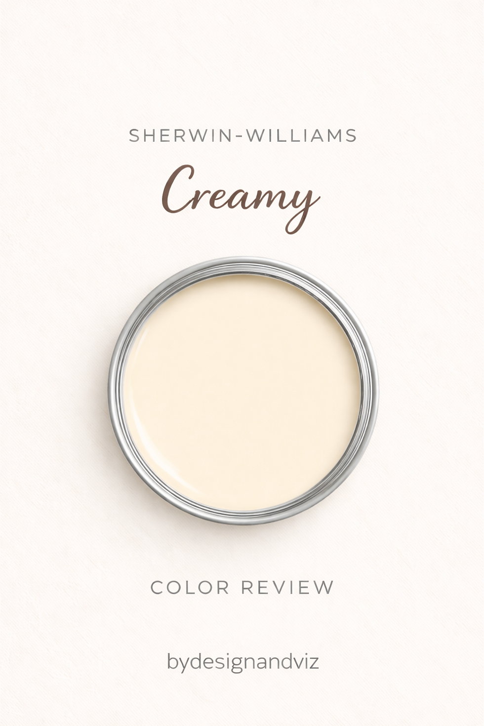
Creamy has an LRV of approximately 81, more than twenty points above Repose Gray, and a noticeably warm yellow undertone. The name is accurate - in warm natural light this colour reads as a soft, buttery cream that sits clearly in the warm white family. In strong southern light it can lean quite yellow, which is either exactly what you want or a problem depending on the brief.
It does not hedge. If the surrounding materials are warm - warm wood floors, warm trim, warm furnishings - Creamy looks beautiful and considered. If the surrounding materials are cool or neutral, it can look yellowed and out of place. It needs warmth around it to perform at its best.
Where Repose Gray is built to recede, Creamy is built to be noticed - that is the fundamental split between these two colours. It is a decision, not a default.For how Creamy compares to a warm white built on the same undertone family, the Creamy vs Alabaster guide explains why a single LRV point can hide a significant undertone gap, and which one holds up in mixed-material rooms.
The Real Difference Between Repose Gray and Creamy

The simplest way to explain it: Repose Gray is a colour built to recede. Creamy is a colour built to be noticed. With a twenty-plus point LRV gap between them, this is not a comparison of two similar neutrals fighting for the same wall. It is a comparison of two colours doing entirely different jobs.
A gap this size means the two rarely compete for the same room. Repose Gray settles a space down - it is the colour you reach for when the brief is calm, consistent, and unobtrusive. Creamy adds presence and warmth - it is the colour you reach for when the brief explicitly wants character and cosiness. Choosing between them is really a question of which job the room needs done, not which colour looks nicer on a chip.
Used together, the pairing works as a deliberate handoff rather than a matched set. Repose Gray in a hallway or open living space with Creamy carried into an adjoining den or dining room creates a considered warm-cool transition through the home, rather than a jarring one. Natural Linen vs Creamy guide covers how Creamy performs against a softer warm neutral in the same family, useful context if Creamy is one candidate among several for the warm side of your scheme.
Not sure which one works for your room? A colour consultation is included in all our design packages - book directly here. |
When to Choose Repose Gray

Choose Repose Gray when the room needs to feel settled rather than warm and inviting. These are the conditions where it is the right answer:
Open-plan spaces where consistency across zones matters more than character. Modern or transitional interiors where a warm cream would feel out of step with the material palette. Rooms with a mix of warm wood and cool stone, where a balanced undertone avoids taking sides. Home offices, hallways, and bedrooms where the goal is calm rather than cozy.
Avoid Repose Gray where the brief explicitly calls for warmth and richness - it will read as competent and quiet rather than characterful, which is the wrong outcome in a room built around cream, wood, and warm brass.
When to Choose Creamy

Choose Creamy when warmth and creaminess are specifically what the brief calls for. These are the conditions where it is the right answer:
South or west facing rooms with good natural light where the yellow undertone has something to activate it. Traditional, farmhouse, and cottage interiors where a warm, aged quality is part of the design intent. Rooms with warm wood floors, warm stone, and warm natural materials throughout, where everything else in the room pulls in the same direction.
Avoid Creamy in north-facing rooms where it is likely to look obviously yellow without warm light to balance it, and avoid it in contemporary or minimal interiors where cool-toned materials will fight the undertone.
How the Pairings Differ

For Repose Gray on walls, Extra White or Alabaster on trim gives a clean, quiet lift without introducing warmth the room does not need. Avoid a strongly warm trim colour, which will read as an unresolved undertone clash against the greige.
For Creamy on walls, Alabaster on trim is the classic step up in brightness within the same warm family. Pure white or brilliant white trim will make Creamy look yellow and unintentional rather than deliberate.
For flooring, Repose Gray is the more forgiving of the two - it sits comfortably with warm wood, cool stone, and mid-tone oak alike. Creamy needs warm floors more urgently; cool grey stone or tile alongside Creamy walls creates an undertone conflict that is difficult to resolve.
For hardware, Repose Gray works with almost anything - brushed nickel, matte black, aged brass all read cleanly against it. Creamy is more particular; it suits aged brass and warm gold but fights cooler metals, where the yellow undertone reads against the cool finish rather than with it.
Architect's Verdict - Repose Gray or Creamy?

For most homes with mixed material temperatures or open-plan layouts, Repose Gray is the lower-risk choice. Its balanced undertone and mid-range LRV mean it performs consistently across zones, light conditions, and adjacent finishes without demanding the room build itself around it.
Repose Gray is the right call when the brief is calm, grounded, and consistent - a room that needs to work quietly with furniture, art, and a mix of materials rather than assert a mood of its own.
Creamy is the right call when the brief specifically wants warmth, character, and a traditional cream backdrop - and when the room's light and materials can support the commitment it requires.
The test I always use for this pairing: paint a large sample of Repose Gray on the room's north-facing wall - its most challenging exposure - and a large sample of Creamy on the same wall. A pass for Repose Gray looks calm and faintly warm, not flat or blue-grey. A pass for Creamy looks rich and buttery, not obviously yellow. Check both again in evening lamplight before you commit. Your room will tell you which job it actually needs done.
Frequently Asked Questions
Is Repose Gray warmer than Creamy?
No - Creamy is significantly warmer. Repose Gray carries only a subtle warm undercurrent beneath a predominantly grey base, while Creamy is a committed warm yellow cream. The two are not close on the warmth spectrum despite both being popular Sherwin-Williams neutrals.
Can I use Repose Gray and Creamy in the same house?
Yes, and it works well as a deliberate transition. Repose Gray in main living spaces with Creamy carried into an adjoining warmer room - a den, a dining room, a kitchen with warm wood - reads as an intentional shift in mood rather than a mismatch, provided the two are not placed on adjoining walls without a break.
Which is better for an open-plan space?
Repose Gray is the far stronger choice for open-plan layouts. Its balanced undertone holds up consistently across zones with different light and material conditions. Creamy's strong yellow undertone can read inconsistently as it moves through varying light across an open floor plan.
Does Creamy look yellow next to Repose Gray?
Not if there is a transition between them. Placed in adjoining rooms or separated by trim, the contrast reads as intentional. Placed directly next to each other on the same wall plane without a break, the temperature gap can look unresolved rather than considered.
Which is better for a north-facing room?
Repose Gray handles north light more reliably than Creamy. Its balanced undertone stays calm and only mildly cool in low light. Creamy in a north-facing room without warm materials to support it is one of the riskier combinations in the Sherwin-Williams warm neutral range.
What is the LRV difference between Repose Gray and Creamy?
Repose Gray sits at approximately 58 and Creamy at approximately 81 - a gap of more than twenty points. This is a substantial difference in light reflectance, which is why the two rarely compete for the same wall and are better understood as colours with different jobs rather than direct rivals.
Final Thought
Repose Gray and Creamy are not really in competition. The more than twenty-point LRV gap between them means they are built for different rooms and different briefs, not for a head-to-head choice on the same wall.
If the room needs to settle down and work quietly across mixed materials, Repose Gray is the more reliable choice. If the room's light and materials can support real warmth and the brief wants character, Creamy delivers something Repose Gray was never built to do. Test both in your own light before deciding which job your room actually needs done.
Want a complete colour scheme built around Repose Gray or Creamy? Our design packages cover full palette selection, finish recommendations, and 3D visualisations - see our packages. |
About the Author
Beril Yilmaz is a qualified architect and interior designer based in the UK. She runs BY Design And Viz, a design platform covering paint colour reviews, interior design guidance, and residential design projects. Beril has specified both Repose Gray and Creamy across residential projects in the UK and internationally - Repose Gray in open-plan living spaces and hallways where a calm, consistent backdrop was the priority, Creamy in traditional kitchens and dining rooms with warm wood and stone, often carrying the two through adjoining rooms in the same home as a deliberate warm-cool transition.


Comments