


Farrow & Ball School House White No. 291 - An Architect's Honest Review

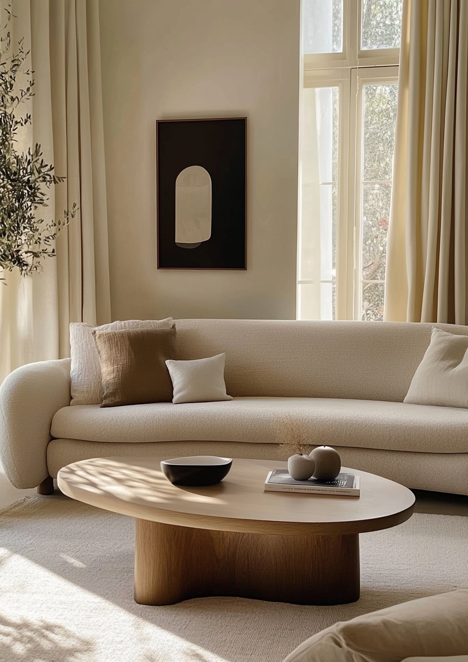
Farrow & Ball School House White No. 291 promises more brightness than it delivers, and that gap is exactly what makes it worth understanding. The name suggests a crisp, whitewashed classroom white. What it actually is is a soft, muted parchment at an LRV of roughly 73-74, closer to pale putty than to any true white, with a quiet warm yellow-beige undertone instead of a clean neutral base. Beside a bright white it looks tired; surrounded by oak, linen and plaster it looks calm and quietly expensive.
I have specified School House White in period terraces, renovated farmhouses and plaster-walled conversions, and the pattern repeats: it succeeds where the architecture supplies texture and warm daylight, and it disappoints where the client expected a white. Farrow & Ball places it in a family of shaded whites, colours built to look white when used in deep shade, and School House White is the lightest of that group. A colour designed to read as white in shade will always look beige in strong light.
The undertone is where sources are not unanimous, and I would rather say so than smooth it over. Most measured data and most reviewers read it as a warm orange-yellow beige; a minority see a faint grey or green flicker in cool light. This review covers the undertone question, the LRV, how the colour behaves by orientation, what to pair it with, and who should choose something else entirely.
School House White No. 291 - The Key Facts
Collection | Farrow & Ball core range - grouped with Shadow White, Shaded White and Drop Cloth |
LRV | ~73-74 (light zone - lifts a room without reading as a true white) |
Undertone | Warm, muted yellow-beige - soft, low-chroma, parchment-like |
Character | Traditional, period, softly contemporary, calm, understated |
Best trim | Wimborne White for a gentle lift, or School House White itself in a harder finish for tonal trim |
Best orientation | South, east or west-facing - warm daylight keeps it luminous |
Main risk | Reads flat, putty-beige and slightly dingy in north-facing rooms, under cool bulbs, or beside a brighter white |
School House White Undertones - What Is Actually Going On

The undertone of School House White is a warm, low-chroma yellow-beige. Measured colour data puts its hue in the orange-yellow range at low saturation, which is why it reads as soft and parchment-like rather than obviously cream. Farrow & Ball describes it as an off-white free of the cool undertones found in its contemporary neutrals, and that description holds in most rooms I have worked in.
Low saturation cuts both ways. Because the pigment load is light, the undertone is easy to push around: warm bulbs and timber floors pull it toward honey-beige, while cool daylight and grey surroundings drag it toward a flat, slightly greyed stone. A few independent reviewers describe a faint grey or green flicker in the shadows, and I treat that as a possibility in cool light rather than a defining trait. It is the reason this colour has to be judged on the wall and never from a swatch.
It helps to separate School House White from neighbours that carry greyer reputations. Farrow & Ball describes Strong White as a grey-based white with an urban, contemporary feel, while School House White reads consistently warm across the measured data. The full profile of that colour is in the Farrow & Ball Strong White review, and the gap between the two is far more noticeable on a north wall than on a chip.
LRV - What 73-74 Means in a Real Room
At LRV ~73-74, School House White sits in the light-but-not-white zone - bright enough to keep a room open, yet a clear step below the 80s where a wall starts to read as a true white. In a room with one average window it reflects enough light to feel soft and airy rather than heavy. It will not give the glow of a high-reflectance white, and it is not meant to.
Its depth is what people underestimate. It sits level with Slipper Satin at roughly 74-75, about a point apart, so the two behave almost identically on brightness; the difference between them is character rather than reflectance, which the Farrow & Ball Slipper Satin review explores in detail. Against Wimborne White, which sources place anywhere between the low 80s and around 90, School House White is visibly deeper.
The practical consequence is that a north-facing room or a small window leaves little reflectance in reserve. Expect the wall to feel quietly muted rather than luminous, and plan the lighting and the surrounding materials to supply the warmth the paint cannot generate by itself.
How School House White Behaves in Different Light
South-Facing Rooms
South-facing rooms show School House White at its most luminous and its most forgiving. Strong, warm light lifts the yellow in the undertone just enough to read as a soft cream-white, and the walls glow instead of flattening. I have used it in south-facing living rooms with limed oak floors and lime-plastered ceilings, and the result was the enveloping neutral the client pictured when they first read the name. The one caution is midday glare, where it can look close to plain cream, so check it at that hour too.
North-Facing Rooms
North-facing rooms are where School House White needs the most honest assessment. Cool, indirect light removes the warmth the colour depends on, and with LRV in the low 70s there is little reflectance to compensate, so the wall tends toward muted putty or flat stone-beige. It is not a dramatic failure, but it is a letdown if the brief was bright and fresh. If the room faces north I want warm 2700K lamps, timber, and textured fabrics in place, and I test it against a lighter alternative before committing.
East and West-Facing Rooms
East-facing rooms give School House White a buttery morning and a quieter afternoon. Early light brings out the yellow in the undertone, then as the sun moves round the wall settles into a calmer stone-beige. West-facing rooms mirror that pattern: the colour is subdued through the day and warms strongly in the evening, which suits living and dining rooms used after work. In both cases I judge it at the hours the room is actually used rather than averaging across the day.
Artificial Lighting
Artificial lighting decides how warm or how flat School House White feels after dark. Under 2700K bulbs the undertone deepens into a soft parchment that suits bedrooms and sitting rooms. Under 4000K and above, the warmth drains out and the wall reads as a slightly grey beige that can look tired. I specify warm-white bulbs wherever this colour is used and avoid mixing colour temperatures within one room, because the wall shows every difference.
For how School House White compares to Slipper Satin - the chalkier, slightly creamier neighbour that shares its warm direction - the Slipper Satin vs School House White guide sets the two side by side, covers trim and flooring for each, and ends with a worst-case light test to settle the choice.
Not sure if School House White works for your room? A colour consultation is included in all our design packages - book directly here. |
Trim Colours and What to Pair With School House White

Trim - A Step Lighter, or Tonal
Trim for School House White should be either a clear step lighter or the same colour in a harder finish. Wimborne White is the lighter option: a warm, cream-leaning white that is brighter than the wall without cutting a hard edge. A tonal scheme, with School House White on woodwork in a more durable sheen, is the more period-appropriate route and avoids the dingy-wall effect that stark white trim can cause. I avoid cool blue-whites on trim, since they push the wall toward yellow by contrast.
Floor Materials
Warm timber, limestone and terracotta are the natural floor partners. Oak in natural or smoked finishes sits in the same warm family, and the muted wall lets the grain lead. Honed limestone and flagstone give a matching softness, while terracotta or encaustic tile adds a deliberate warm contrast. Cool grey porcelain and very pale bleached boards are harder pairings because the wall starts to look more yellow beside them.
Metal Finishes
Aged brass, unlacquered bronze and burnished nickel suit School House White best. The patina on these finishes echoes the parchment quality of the wall and keeps a room reading as warm and layered. Polished chrome can work in a bathroom but pulls the wall further toward yellow. Black iron hardware gives clean definition against the soft backdrop, particularly on doors and window frames.
Accent Colours
Deep, slightly muted colours let School House White do its job as a quiet backdrop. Ink navy, bottle green and warm charcoal all give strong contrast without fighting the undertone. For a tonal approach, Cornforth White is noticeably deeper at roughly LRV 60 and works on joinery or a feature wall, as the Farrow & Ball Cornforth White review explains. Pale pastel pinks and bright cool blues are best avoided, since they pick up the beige and look washed out.
School House White Room by Room

Bathrooms
Bathrooms are the most demanding application for School House White. Reflected light off tile and cold surfaces drains the warmth, leaving a flat stone-beige, especially in a room with no window. If I use it, I specify 2700K lighting, aged brass or bronze taps, honed limestone or warm-toned tile, and a finish rated for damp conditions. Where the brief is bright and clean, a lighter white is the better answer.
Bedrooms
School House White gives bedrooms a soft, enveloping calm. The muted warmth works with linen, wool and natural timber, and the LRV is light enough to avoid a cave-like effect in smaller rooms. In an east or south-facing bedroom it reads as soft cream by morning and warm parchment by evening. I reconsider it in a dark north-facing bedroom unless the client wants a deliberately cocooning mood.
Living Rooms
Living rooms in period and traditional houses are where School House White earns its place. On plaster walls with cornicing and panelling it flatters the architecture without announcing itself. I pair it with natural linen, a deeper accent on joinery, and warm lamps. In a stark contemporary box with glossy surfaces it can look slightly muddy.
Kitchens
School House White works on kitchen walls and cabinetry when the room has warm daylight and timber. On Shaker or panelled cabinetry beside a mid-tone worktop it creates a soft, painterly look that avoids the clinical feel of a bright white. Cabinetry exaggerates the undertone, so judge it against your worktop and splashback. In a north-facing kitchen or one with cool LED strip lighting, expect it to go grey.
Home Offices and Studies
Home offices and studies suit School House White when the aim is a calm, low-contrast workspace. The muted warmth stays quiet behind a screen and softens the shift from daylight to lamplight. I like it with dark joinery or a navy bookcase for definition, plus a warm desk lamp. For task-heavy work, supplement the wall with good task lighting rather than relying on its reflectance.
Who School House White Is Right For - And Who It Is Not

School House White is right for you if:
The house is period, traditional, or softly contemporary - School House White was made for plaster, panelling and timber. It supports the architecture instead of competing with it, and it gives mouldings a gentle definition without needing a contrasting trim.
The room has good daylight from the south, east, or west - warm light keeps the yellow in the undertone alive and stops the wall flattening. In these rooms the colour moves through the day in a way that feels natural rather than inconsistent.
You want an off-white that sits clearly away from stark white - at LRV ~73-74 it is deliberately muted. If the brief is a soft wall that does not glare, it delivers that with real character.
You are comfortable with a visibly warm, slightly muted wall - the colour reads as beige-leaning parchment rather than a white. Clients who accept that from the start tend to love it, while those who expected white tend to feel it has gone dull.
School House White is not right for you if:
The room is north-facing, small, or short on natural light - with LRV in the low 70s there is little reflectance to offset cool light. The wall slides toward putty or flat stone, and the room feels heavier than the paint chip promised.
The brief is bright, crisp, and fresh - School House White is a soft wall, not a luminous one. A lighter white such as Wimborne White is the correct answer for a clean, airy brief.
The palette leans cool or glossy - cool grey stone, polished chrome and high-gloss surfaces make the warm undertone look yellow and slightly dirty by contrast. The colour needs warm, matt, tactile materials around it.
You will not test it against your actual trim, flooring and bulbs - this is a low-chroma colour that shifts noticeably with its surroundings. Judging it from a chip is the most common route to disappointment.
How School House White Compares to Similar Colours
vs Wimborne White No. 239 - Wimborne White is the brighter, creamier option, with sources placing its LRV between the low 80s and around 90 against School House White's ~73-74. That gap is large enough to be seen at a glance, so Wimborne White suits bright, airy briefs and works well as trim beside School House White walls. If the room is north-facing or the brief is crisp, Wimborne White is the safer choice.
vs Slipper Satin No. 2004 - Slipper Satin sits within about a point of School House White on LRV, at roughly 74-75, and shares its warm direction, so the two are close relatives rather than alternatives with a clear winner. Farrow & Ball describes Slipper Satin as chalky and greyed, and measured saturation is slightly higher than School House White's, so it can read a touch creamier. Choose between them with side-by-side samples in the actual room, because the difference is subtle and light-dependent.
vs Strong White No. 2001 - Strong White is only a couple of points lighter, at roughly 75-76, but Farrow & Ball positions it as a grey-based white with a contemporary, urban feel. School House White is the warmer, more traditional of the pair, and the difference shows most in cool north light. Where the brief is contemporary and restrained, lean toward Strong White; for period rooms, School House White sits more naturally.
vs Shaded White No. 201 - Shaded White is roughly ten points deeper at LRV 63-64 and shares the same warm direction, making it a stronger, more enveloping neutral. It is a good choice for large, bright rooms that can carry the depth, while School House White is the lighter pick for rooms that need more reflectance. Used together, Shaded White on joinery with School House White on walls produces a soft tonal scheme.
vs Cornforth White No. 228 - Cornforth White sits around LRV 60, well below School House White, and Farrow & Ball describes it as neither too warm nor too cool, so it reads greyer and cooler. It is a mid-tone neutral rather than a soft off-white, and it works as a grounding partner in a tonal scheme but not as a substitute. If you want the lightness of School House White with a greyer cast, you will not find it here.
Frequently Asked Questions
Is School House White warm or cool?
School House White is warm. Its muted yellow-beige undertone sits on the warm side in most measured data, and Farrow & Ball positions it as an off-white without cool undertones. Some reviewers notice a faint grey or green flicker in cooler light, so it never reads as a bright cream. Sample it in your room before treating it as a safe warm neutral.
Does School House White look beige or yellow on the wall?
In most rooms it reads as a soft parchment-beige, not obviously yellow. The low saturation keeps the warmth restrained, and at LRV ~73-74 the colour sits clearly below a true white. It can look more yellow beside cool stone, polished chrome or a brighter white trim. Warm timber, matt finishes and warm bulbs keep it looking soft rather than sallow.
What is the best trim colour for School House White?
Wimborne White for a gentle lift, or School House White itself in a harder finish for a tonal scheme. Wimborne White is brighter and warm, so it defines the woodwork without a stark edge. Avoid cool blue-whites, which make the wall look yellower by contrast. If you choose the tonal route, use a more durable sheen on woodwork so it stays visually distinct from the walls.
Can School House White work in a north-facing room?
It can, but only with warmth added around it. North light removes the warmth the colour depends on, and with LRV in the low 70s the wall tends toward putty or flat stone-beige. Warm 2700K bulbs, timber, and textured fabrics help considerably. If the room is also small or dark, a lighter white is the better specification.
What rooms is School House White best for?
Living rooms, bedrooms and studies in period or traditional houses are its strongest applications. The soft warmth flatters plaster, panelling and natural materials, and it creates a calm backdrop without glare. Kitchens work with warm daylight and timber, while bathrooms and dark north-facing rooms are the least reliable. It is not the right choice where the brief is bright, crisp or contemporary.
The Verdict
Farrow & Ball School House White is a quiet, warm, deliberately muted off-white that rewards the right room. It is not a bright white and does not pretend to be one. Its strength is softness: it lets plaster, timber and linen carry a room without competing.
In the right conditions - warm daylight, warm bulbs, natural materials - it creates one of the most restful wall colours in the Farrow & Ball range. In the wrong ones it reads as dull putty. The difference is almost always orientation and the materials around it.
Test it in this order: paint two large boards and fix them to two different walls, one facing the window and one away from it. Place each beside your actual trim sample, floor material and worktop. View them at 9am, midday, 5pm and after dark under your real bulbs. Hold a sheet of plain white paper next to them at each stage; if the boards still look soft and warm beside it and hold their quality at the dimmest check, School House White is right for the room.
Want a complete colour scheme built around School House White? Our design packages cover full palette selection, finish recommendations, and 3D visualisations - see our packages. |
About the Author
Beril Yilmaz is a qualified architect and interior designer based in the UK. She runs BY Design And Viz, a design platform covering paint colour reviews, interior design guidance, and residential design projects. Beril has specified School House White across residential projects in the UK and internationally - most often in south and west-facing living rooms and bedrooms in period homes, paired with natural oak floors and aged brass fittings.


Comments