


Sherwin-Williams Creamy SW 7012 - An Architect's Honest Review

Sherwin-Williams Creamy SW 7012 sits at LRV 81, which places it right on the border between white and off-white - and that border is exactly where the confusion starts. On a paint chip it reads as a soft, forgiving cream. On a wall in strong, warm sun the soft yellow undertone takes over the room, and what looked like a gentle off-white turns distinctly buttery. The tension runs both ways: the same yellow that causes trouble in a south-facing kitchen is the quality that stops a shaded room from turning grey and flat.
I have specified Creamy where a scheme needed warmth built into the walls rather than added later with textiles, and I have taken it out of schemes where a sample board went yellow by midday. It is a committed colour, not a safety net. If the brief is a quiet, almost invisible backdrop, there are cleaner warm whites in the same range, and I compare the closest ones below.
This review covers Creamy's undertone, what its LRV means in a real room, how it behaves by orientation and under artificial light, which trim, floors, metals and accent colours suit it, and an honest assessment of who should and should not paint a room with it.
Creamy SW 7012 - The Key Facts
Collection | Sherwin-Williams White & Pastel colour family (interior and exterior use) |
LRV | ~81 (light, warm zone - bright without the glare of a high-reflectance white) |
Undertone | Soft warm yellow - buttery, calmed by a neutral base |
Character | Traditional, farmhouse, warm transitional, cocooning |
Best trim | Extra White SW 7006 for a crisp edge or Alabaster SW 7008 for a tonal one |
Best orientation | East or north-facing rooms with moderate, even light - strong south sun needs care |
Main risk | Yellow undertone turns buttery in strong south or west sun and stacks with warm bulbs, honey timber and cream fabrics |
Creamy Undertones - What Is Actually Going On
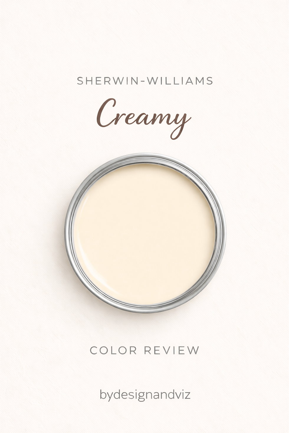
The undertone of Creamy is a soft, warm yellow - muted enough that it reads as cream rather than as a painted colour, but present enough that it defines the whole character of the wall. Reviewers who have lived with it describe the same thing: a yellow base calmed by a neutral component, warm in every light. Next to Alabaster, Swiss Coffee or White Dove it reads, in my experience, as the more openly cream of the group, because less grey or green is left in the mix to temper the yellow.
The neutral component is the detail that matters most in practice. It is why Creamy looks like a soft cream on the wall rather than a pale yellow paint, and it is why the colour has real range: in moderate light it settles into something quiet and warm, and it only starts to announce itself when the light is strong, warm, or both. Sherwin-Williams rates it for both interior and exterior use, but the variation you see on a wall comes from the room rather than the paint.
Where the undertone creates risk is accumulation. Yellow paint, honey-toned timber, cream upholstery and warm bulbs all push in the same direction, and a room with several of them can slide from cream to yellow without any single element looking wrong. The reverse problem appears against cool grey stone or tile, where the yellow has nothing neutral to merge with and the wall tends to look warmer than it is. If the yellow is more than the brief calls for, the Creamy vs Alabaster guide explains how the nearest warm white handles the same family of undertone with less intensity.
LRV - What 81 Means in a Real Room
At LRV 81, Creamy sits at the bright end of the off-white range - Sherwin-Williams publishes 81.191, and the independent reviews I cross-checked all round to the same figure. That is light enough to keep a room open without the glare of a high-reflectance white. Extra White SW 7006 sits at 86, and that five-point gap is visible where the two meet at a wall-and-trim junction.
In practical terms, 81 means Creamy will not make a small room feel heavy, but it will not make a dim room bright either. LRV measures how much light the surface returns, not how much light the room has, so a shaded room painted in Creamy will still read softer and dimmer than the same room in Extra White. What you gain in exchange is warmth that a brighter white cannot deliver, and in a low-light room that warmth often matters more than the last few points of brightness.
Among its warm-white neighbours the gaps are small. Alabaster (82), Swiss Coffee (82) and White Dove (83) sit within two points, which the eye will not register, so the decision between them is made on undertone rather than brightness. Greek Villa (84) and Cloud White (85) are where the extra brightness starts to show, and the Creamy vs Greek Villa guide covers what that three-point step does to the feel of a room.
How Creamy Behaves in Different Light

South-Facing Rooms
South-facing rooms are where Creamy needs the most careful judgement - strong, warm sun amplifies the yellow undertone, and a wall that looked like soft cream at nine in the morning can read distinctly buttery by midday. I would not specify it across a large, sun-flooded south-facing wall without a full-day test. Where the brief demands it, I balance the yellow with crisp Extra White trim and at least one cool counterweight such as deep navy joinery or grey stone. Shaded south-facing rooms, under a deep porch or behind mature trees, behave much more like east-facing rooms and are far safer.
North-Facing Rooms
North-facing rooms are the most debated condition for Creamy - and the honest answer is that it depends on what else is in the room. Cool, indirect daylight tones the yellow down, so the wall tends to read as a warm cream rather than a yellow one, and it avoids the grey cast that cooler whites pick up in the same light. The condition is that the warmth does not stack: 2700K bulbs, honey timber and cream textiles added on top can still tip the room toward yellow, whereas 3000K bulbs and a more neutral material palette keep it balanced. Creamy will not brighten a dark north room, so judge it on warmth rather than light.
East and West-Facing Rooms
East-facing rooms are the most forgiving orientation for Creamy - the warm morning light brings out the cream at the time of day most people actually see the room, and the cooler afternoon light settles the yellow back down. West-facing rooms behave closer to south-facing ones at the end of the day: the late, low sun turns the wall golden, which is lovely in a dining room used in the evening and less welcome in a home office where you want a neutral working light. In both cases a large sample observed at the hour the room is used most will tell you more than any chip.
Artificial Lighting
Artificial lighting changes Creamy more than most whites, because the colour is already warm. Bulbs at 2700K deepen the cream and make a room feel enveloping at night, while 3000K keeps it cleaner and is the safer choice where there is already warm timber. Cool bulbs at 4000K or above strip the warmth out, and the wall can look muted and slightly dull rather than bright. I specify one colour temperature throughout a room, because mixing 2700K lamps with 4000K downlights makes the same wall look like two different colours.
Not sure if Creamy works for your room? A colour consultation is included in all our design packages - book directly here. |
Trim Colours and What to Pair With Creamy

Trim - Crisp or Tonal
Extra White SW 7006 is the trim I reach for first with Creamy - at LRV 86 and with a crisper, more neutral character, it gives the wall a clean edge and lets the cream read as deliberate. Alabaster SW 7008 (LRV 82) is the tonal alternative: it sits almost level with Creamy in brightness, so the boundary is soft rather than crisp, which suits traditional joinery and period rooms. Avoid putting a second cream of similar depth on the trim in a south-facing room, where the two yellows compete and the wall loses definition.
Floor Materials
Walnut, brown oak and other mid-to-dark timber floors are the most reliable partners for Creamy - the depth of the wood grounds the cream and the shared warmth feels intentional. Orange-toned honey oak or pine doubles up on yellow and is the combination most likely to push the room toward buttery. Cool grey stone, tile or grey-washed timber tends to create an undertone conflict that is difficult to resolve, so if the floor is cool the wall usually needs a different colour rather than more styling.
Metal Finishes
Aged brass, bronze and black iron are the natural metal companions for Creamy - their depth and warmth sit comfortably with the cream rather than competing with it. Unlacquered brass in particular develops a patina that deepens the traditional character of the room. Polished nickel and chrome can work as a deliberate cool counterpoint in a sunny room, but they sit less easily against this undertone and need to be repeated across the room to look intentional.
Accent Colours
Deep navy such as Naval SW 6244 gives Creamy its strongest counterbalance - at LRV 4 it supplies the weight a light wall cannot, and its cool blue direction keeps the yellow in check without fighting it. Use it on joinery, a bookcase or a feature wall in a room that gets too much sun. Muted sage and olive greens suit the traditional end of the palette, while pinks and peaches placed near Creamy tend to push the whole scheme toward sweetness, so I keep them to small, textile-scale amounts.
Creamy Room by Room
Living Rooms
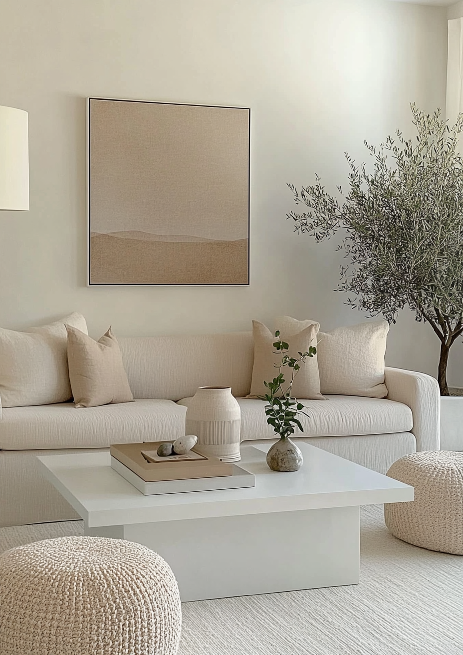
Living rooms are where Creamy is at its most convincing - it gives traditional, farmhouse and warm transitional interiors a lived-in quality that a barely-tinted white cannot. It works best with timber, linen and aged metals, and with a fireplace or stone surround in a warm tone. In a living room used mostly in the evening, lamplight deepens the cream further, so choose lamp bulbs with that in mind.
Bedrooms
Bedrooms are the application where Creamy's warmth is least likely to cause trouble - the light is soft, the finishes are mostly textile, and the room is used in the low light where cream looks its best. Painting the ceiling in the same colour creates a cocooning effect, although it makes a low ceiling feel closer. In a north or east-facing bedroom it is a strong choice; in a bedroom with a large south-facing window I would sample first.
Kitchens
Creamy on kitchen walls is a safe and attractive choice alongside crisp white cabinetry - the contrast keeps the cream from feeling heavy. On the cabinets themselves it is a far more demanding choice, because the yellow shows against countertops, tile and appliances in a way a wall rarely does. For cabinets that must work with mixed or cool finishes, a more adaptable warm white is usually the better call, and the Creamy vs Swiss Coffee guide sets out how the two behave on joinery.
Bathrooms
Bathrooms are where Creamy is least forgiving - the materials are often cool-toned, and white tile, polished chrome and grey-veined marble all tend to make the yellow look more obvious. It works well with warm limestone, travertine, zellige tile and brass fittings, where the warmth is shared across the room. If the room has cool fittings that cannot change, choose a different wall colour rather than trying to compensate.
Home Offices and Studies
Home offices and studies suit Creamy when the room is used mostly in the evening or in low light - it is a comfortable colour to sit in, and it makes a book-lined or timber-heavy room feel settled. In a day-use office with bright south-facing light the yellow can become distracting, and I would move to a quieter warm white. Pairing it with deep navy shelving or joinery gives the room structure and keeps the cream from dominating.
Who Creamy Is Right For - And Who It Is Not
Creamy is right for you if:
The room is east or north-facing, or lit by soft, even light for most of the day - this is the condition Creamy handles best. The yellow undertone is toned down by cooler daylight, so the wall reads as warm cream instead of yellow, and it holds its warmth in rooms where a brighter white drifts toward grey.
The interior style is traditional, farmhouse, or warm transitional - Creamy has the committed cream character these briefs need, and it relates naturally to timber, linen, aged metals and patterned textiles. It gives the room a settled, lived-in quality that a barely-tinted white cannot produce.
You want the walls themselves to carry the warmth - with Creamy the warmth is built into the architecture rather than added later through fabrics and lamps. That makes a large difference in rooms with little furniture or in new builds that feel cold on the first day.
You are comfortable with a colour that visibly changes across the day - Creamy is cream in the morning, golden in the late afternoon, and deeper under lamps at night. If that range reads as richness rather than inconsistency, the colour will reward you.
Creamy is not right for you if:
The room is south-facing with strong direct sun for most of the day - the sun amplifies the yellow undertone and the wall can read buttery across a large surface. Without shade or deliberate cool counterweights, the colour will feel more yellow than the sample suggested.
The brief is a near-white backdrop rather than a cream - Creamy always shows its warmth, and it will never recede the way a quieter warm white does. If the real brief is 'warm but barely there', the Creamy vs White Dove guide shows which warm white delivers that more reliably.
The room is full of cool-toned or grey finishes - grey stone, white tile with grey veining and polished chrome tend to make the yellow look more obvious by contrast. The undertone conflict is hard to resolve with styling alone and usually needs a different wall colour.
You need one colour to run across a long open-plan space with several orientations - Creamy can look noticeably different at the north-facing end of the room than at the south-facing end. A quieter warm white holds more consistently across the whole run.
How Creamy Compares to Similar Colours
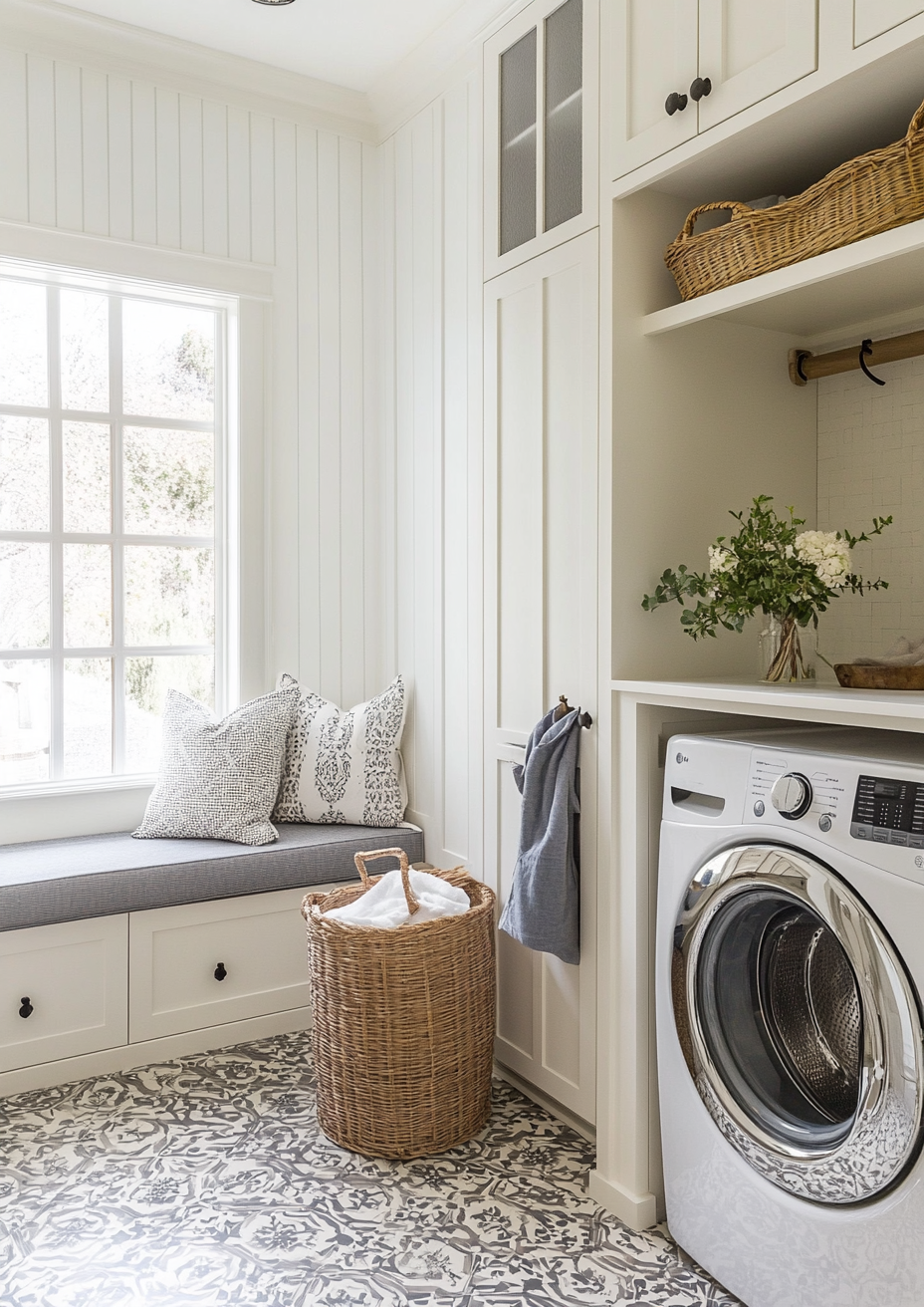
vs Alabaster SW 7008 - Alabaster is one point higher at LRV 82 against Creamy's 81, a gap that nobody will see on a wall. The difference is undertone: Alabaster reads as a restrained creamy yellow-beige, while Creamy carries the more open, buttery yellow. Choose Alabaster when one warm white has to work on walls, trim and cabinets across mixed finishes; choose Creamy when the walls themselves are meant to feel cream.
vs Greek Villa SW 7551 - Greek Villa sits at LRV 84, three points brighter than Creamy, and reviewers consistently describe its yellow as subtler, which makes it the cleaner and more adaptable of the two. Creamy has more depth and a more committed cream character, so it reads as a colour where Greek Villa reads as a warm white. Greek Villa suits brighter and south-facing rooms and cabinetry; Creamy suits softer-lit rooms where the extra warmth is the point.
vs Swiss Coffee OC-45 (Benjamin Moore) - Swiss Coffee is a close Benjamin Moore neighbour at LRV 81.91, effectively level with Creamy. Both are warm and yellow-based, but Swiss Coffee can pick up a trace of green in some light, which makes its warmth feel more layered, while Creamy's yellow is more direct. Swiss Coffee tends to be the steadier choice for cabinets and changing light; Creamy delivers more obvious warmth on walls in softer light.
vs White Dove OC-17 (Benjamin Moore) - White Dove is two points brighter at LRV 83.16 and softer in how it expresses warmth - it reads closer to a warm white, where Creamy reads as a cream. Its warmth is more restrained and carries a touch of grey, so it sits more quietly beside cool finishes that would make Creamy look yellow. White Dove suits a near-white brief and Creamy suits a cream one, and the Creamy vs White Dove guide covers the pairing in full.
vs Cloud White OC-130 (Benjamin Moore) - Cloud White is the brightest of the group at LRV 85.05, four points above Creamy, and its warm, creamy undertone is subtle rather than pronounced. It reads as a clean warm white while Creamy reads as a defined cream, so Cloud White gives more brightness and less character. Choose it for bright, open rooms and joinery; choose Creamy when warmth outranks brightness, and see the Creamy vs Cloud White guide for the full comparison.
Frequently Asked Questions
Is Creamy warm or cool?
Creamy is warm. It has a soft yellow undertone with no cool base, which places it firmly on the warm side of white and makes it one of the creamier options in the Sherwin-Williams range. That warmth is the reason to choose it and the reason to avoid it: if you want a neutral backdrop that disappears, a quieter white is a better match. If you want a wall that looks and feels cream, it is one of the most direct ways to get it.
Does Creamy look yellow on the wall?
It can, depending on the light. In moderate or cool daylight it reads as a soft cream, but in strong warm light - south or west-facing sun, or 2700K lamps at night - the yellow becomes more visible and can read as buttery. The effect is stronger across a large wall than on a small sample, which is why a chip tends to understate it. Test a large board in the brightest part of the room before committing.
What is the best trim colour for Creamy?
Extra White SW 7006 for a crisp edge, Alabaster SW 7008 for a tonal one. Extra White's LRV of 86 and more neutral character give the cream clear definition against the trim. Alabaster, at 82, is almost level with Creamy, so the boundary is soft and suits period rooms and traditional joinery. Avoid a second, similarly deep cream on the trim in a sunny room, where the two yellows compete.
Is Creamy good for north-facing rooms?
Often yes, but it depends on the rest of the room. Cool north light mutes the yellow, so Creamy tends to read as warm cream rather than yellow, and it avoids the grey cast that cooler whites pick up. The risk is stacking warmth: honey timber, cream fabrics and 2700K bulbs can add enough yellow to tip it over. Because Creamy will not make a dark room brighter, expect warmth rather than light.
What rooms is Creamy best for?
Living rooms, bedrooms and dining rooms in moderate light are Creamy's strongest applications. These are rooms used in softer or evening light, where cream feels welcoming and the yellow is not amplified. Kitchen walls work well alongside crisp white cabinetry. It is least reliable in bathrooms with cool fittings, bright south-facing rooms, and any scheme that is predominantly cool or grey.
The Verdict
Sherwin-Williams Creamy is a colour with a clear job: to make a room feel warm, soft and lived-in from the walls up. It does that job better than most warm whites, and the price is that it is specific about where it can live - moderate light, warm materials, and a brief that wants cream rather than a near-white backdrop.
If Creamy is close but not quite right, the most useful next samples are Alabaster for a quieter warmth and Greek Villa for a brighter one. Test it in this order. First, paint two boards of at least 60 x 60 cm (24 x 24 in) in two coats and fix one to the brightest wall and one to the darkest. Second, check both at 8am, at midday and at dusk with your lamps on, because the yellow shows at a different strength in each. Third, hold the boards against your intended trim and floor and judge the junction, not the wall. Fourth, leave them up for three days including at least one overcast day. If the wall reads buttery at midday, move to Alabaster or Greek Villa; if it looks flat in the evening, change the bulbs before you change the colour.
Want a complete colour scheme built around Creamy? Our design packages cover full palette selection, finish recommendations, and 3D visualisations - see our packages. |
About the Author
Beril Yilmaz is a qualified architect and interior designer based in the UK. She runs BY Design And Viz, a design platform covering paint colour reviews, interior design guidance, and residential design projects. Beril has specified Creamy across residential projects in the UK and internationally - most often in east and north-facing bedrooms and traditional living rooms, paired with warm timber floors and aged brass hardware.


Comments