


Sherwin-Williams Dover White Coordinating Colors: The Complete Architect's Guide

Sherwin-Williams Dover White SW 6385 reads as a luminous, creamy off-white in almost any light. An LRV of roughly 83 carries a warm yellow undertone that is stronger than most people expect from a white. It is the lighter, more restrained neighbour of Creamy on the same Sherwin-Williams strip, and it still commits to its warmth.
I have specified Dover White where a room needed a bright, warm backdrop, and here is the honest truth: the challenge is not choosing Dover White — it is choosing what goes with it. The wrong trim makes the wall look yellow beside it. The wrong materials make the warmth feel flat. The right ones make it look luminous. Here are the Dover White coordinating colors named in my own comparisons and in independent reviews, and exactly why each one works.

Understanding Dover White Before You Coordinate
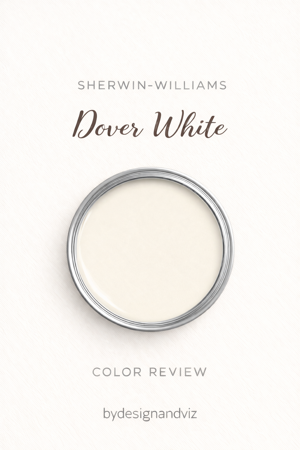
Dover White's LRV of roughly 83 puts it among the brightest warm whites in the range. It sits level with Alabaster (82) and just one to two points below Pure White and Greek Villa (both 84). That near-parity is why the trim decision is about undertone, not brightness.
The undertone is a warm, creamy yellow, more pronounced than Alabaster's. The warmth is genuine and immediate. It keeps a room open and bright by day and cosy in the evening. It is a wall colour first and a trim colour second.
That tells you what to coordinate it with. A clean, crisp white gives it separation. Clearly warm neighbours, such as a greige, a warm gray, or a warm beige, settle it. Earthy, muted, and rich accents suit it. Cool, stark whites make it look unintentionally yellow.
For a full breakdown of how Dover White compares to another warm Sherwin-Williams near-white, the Greek Villa vs Dover White guide covers the undertone differences in detail — useful reading before you commit to a whole-house scheme.
Quick Reference Table
The six colors below are covered in full in the pairings section that follows. Each is named for Dover White in my own comparisons or in independent reviews. Two additional colors are included here for completeness.
Color | Code | Why it works with Dover White |
Pure White | SW 7005 | The correct trim — cooler and cleaner without going cold, with real separation |
Alabaster | SW 7008 | The warmer trim alternative — sample first, since two warm whites can read unresolved |
Accessible Beige | SW 7036 | Warm greige wall that grounds Dover White — and Dover White works as its trim |
Sanctuary | SW 9583 | A deeper beige wall where Dover White is the natural trim direction |
Urbane Bronze | SW 7048 | Deep bronze for front doors and accents — dramatic and warm |
Clary Sage | SW 6178 | Muted earthy green for bedrooms and bathrooms |
Creamy | SW 7012 | Same-strip family trim for a fully committed warm scheme |
Naval | SW 6244 | A hint of navy as a cool, rich accent against the warm wall |
Dover White as a Wall Color — Best Pairings
Pure White SW 7005 with Dover White Walls

Pure White is the correct trim choice for Dover White walls. It is cooler and cleaner than Dover White without going cold, and it gives real separation at the trim line. The combination of Dover White walls and Pure White trim is one of the most consistently successful warm-palette specifications in the Sherwin-Williams range.
Use it on trim and doors, and on the ceiling in a bedroom. You can also run Dover White as the trim in a satin sheen with a flat Pure White ceiling. Pure White needs almost no sampling — in most Dover White rooms, it just works.
For the full comparison of Dover White against Pure White — the wall colour and the most reliable trim white in the range — the Dover White vs Pure White guide explains the two-point gap and why Pure White is the trim I reach for first.
Alabaster SW 7008 with Dover White Walls

Alabaster is the warmer trim option, and it needs testing. It carries the same warm family direction as Dover White, so it can give a softer, more tonal result than Pure White. It can also create an undertone conflict, because two warm whites at similar brightness with slightly different undertones read as unresolved rather than deliberate.
Keep the trim clearly crisper than the wall if you try it. Sample the two side by side before you commit. If you want certainty, use Pure White.
Accessible Beige SW 7036 with Dover White

Accessible Beige and Dover White are a comfortable, harmonious pair. Dover White keeps the space light while Accessible Beige brings a grounding warmth. They share enough of the same yellow-warm family that Dover White can also work as trim alongside Accessible Beige walls, which is the more daring, more rewarding direction.
This suits living rooms, kitchens, and open spaces. Use Alabaster or Pure White on trim unless the brief calls for a fully committed warm traditional scheme.
For the full comparison of Dover White against Accessible Beige — a warm white set against a warm colour — the Dover White vs Accessible Beige guide covers the trim question in detail, which is the most practically useful part.
Sanctuary SW 9583 with Dover White Trim

Dover White on trim against Sanctuary walls is the natural direction. It gives a clean step up in brightness, and it is a classic, well-tested pairing. The reverse is not recommended: Sanctuary is too deep and too warm to read cleanly as trim against a white wall.
This suits farmhouse and traditional kitchens and rooms with a grounded beige wall. Keep hardware warm. Cool metals and bright white trim can make Sanctuary look muddy.
For the full comparison of Dover White against Sanctuary — a bright warm white set against a deeper, grounded beige — the Sanctuary vs Dover White guide explains which one belongs on the wall and which on the trim.
Urbane Bronze SW 7048 with Dover White

Urbane Bronze is the deep, warm contrast. A bronze-brown front door, shutters, or island against Dover White walls or siding gives a classic, timeless look. The warmth carries through, so the contrast feels cohesive instead of cold.
Use it on a single surface. Black shutters are the other classic choice. Brass hardware carries either one through.
Clary Sage SW 6178 with Dover White
Clary Sage is a muted, earthy green. It combines soft warmth with a refreshing, natural tone, and Dover White keeps the pairing light. Reviews point to earthy, muted, and rich tones as the colours Dover White plays best with.
Use it in a bedroom, bathroom, or any room that wants a relaxed, nature-inspired feel. Natural wood and linen sit comfortably between the two.
Dover White for Trim, Ceilings, and What to Avoid

Dover White is a wall colour that can also work as trim. On trim, it works best alongside clearly warm walls — greige, warm gray, warm beige — where its pronounced warmth belongs. Its warmth can fight cooler wall colours. Where the wall is not clearly warm, hand the trim to Pure White.
Avoid Shoji White on trim against Dover White walls. The deeper greige reads as a mismatched, muddier white rather than a deliberate contrast. Avoid Dover White on trim against Shoji White walls for the reverse reason: it reads warmer and more yellow than intended, fighting the calm that makes Shoji White work.
Extra White is split. One reviewer calls it her go-to, while another warns that Dover White has enough yellow in it that Extra White reads disconnected and cold beside it. Sample before you commit, and default to Pure White.
For woodwork, use a satin or semi-gloss finish. For floors, hardware, and accents, warm wood, brass, and butcher block all agree with it.
For the full comparison of Dover White against Shoji White — a bright, creamy off-white set against a muted, ambiguous greige — the Dover White vs Shoji White guide explains why the two should not trade places on the trim.
Dover White vs Alabaster — Which for Trim?
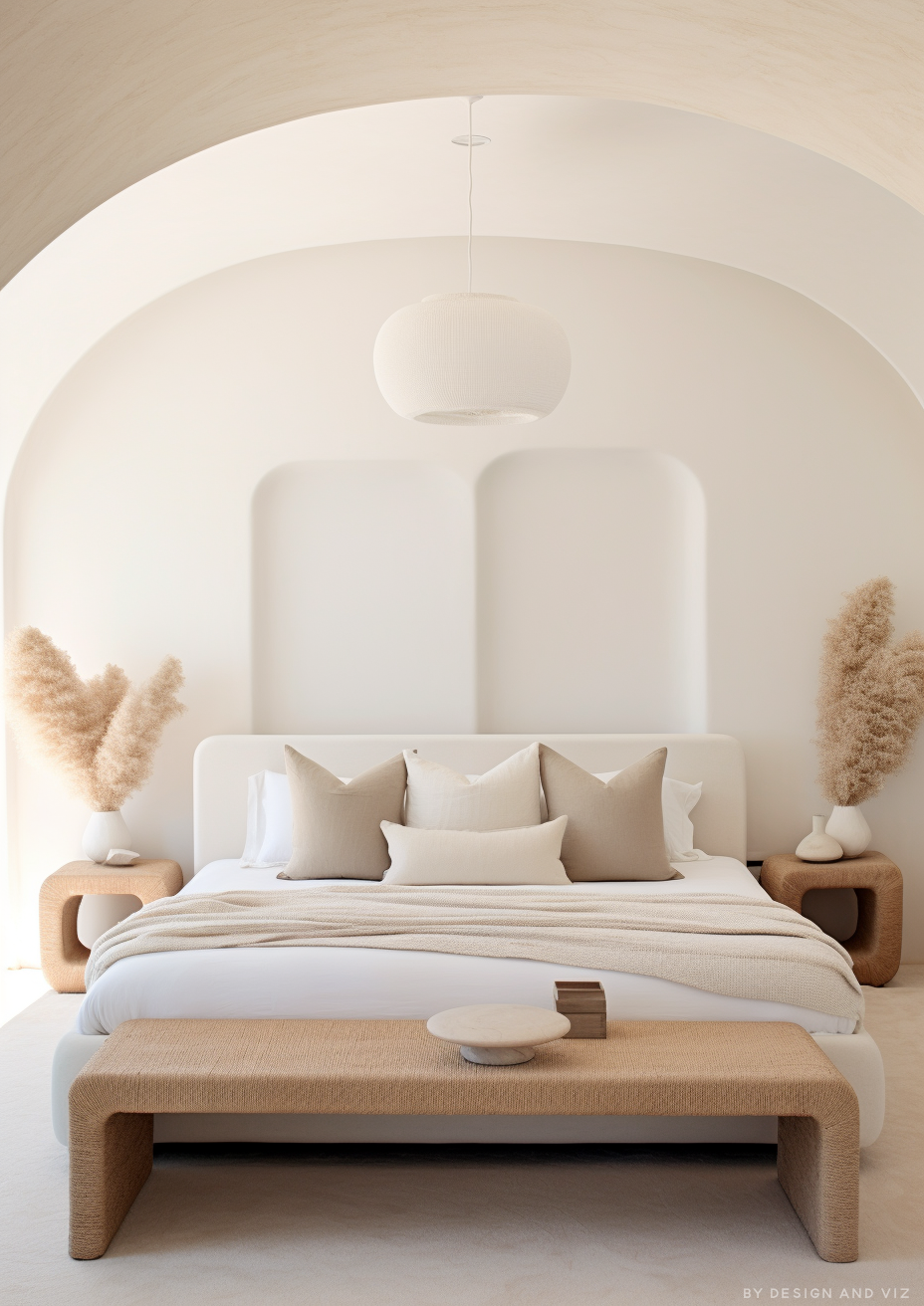
This is the most common trim question. Dover White and Alabaster sit at nearly identical brightness. The difference is undertone. Dover White is warmer and more committed to yellow. Alabaster is more restrained and bridges warm and neutral.
The decision comes down to the wall colour. Alabaster on trim is the more versatile choice, because its restrained warmth works alongside both warm and cool walls. Dover White on trim works best alongside clearly warm walls, where its more pronounced warmth belongs.
When in doubt, Alabaster is the more flexible trim, and Pure White is the safest of all. Dover White is the right choice only when the room is warm enough to carry its yellow.
Want a complete color scheme built around Dover White? A Color Direction consultation gets you a full custom palette built around your space - book yours here. |
For the full comparison of Dover White against Alabaster — two warm Sherwin-Williams whites at near-identical brightness — the Dover White vs Alabaster guide covers the undertone gap and both trim scenarios.
Dover White Coordinating Colors by Room

Living Room
Dover White walls with Pure White trim, warm wood floors, and taupe or charcoal accents keeps a living room open and bright by day and cosy in the evening. A hint of navy gives a rich, cool counterpoint. For a fully committed warm scheme, take Creamy into an adjoining room.
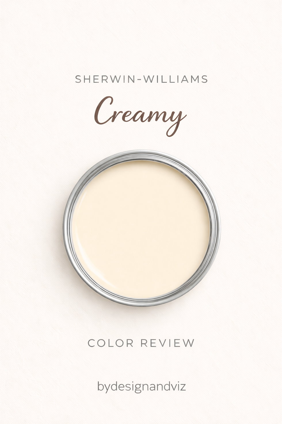
Dover White and Creamy sit on the same strip, one step apart. The Dover White vs Creamy guide explains why the lighter, more restrained one is the more broadly usable.
Bedroom
For the calmest bedroom, pair Dover White walls with a Pure White ceiling and trim, linen bedding, and a Clary Sage accent. The pale, warm wall stays restful, and the green adds a natural note.
Kitchen
On cabinetry, Dover White gives a creamy, farmhouse feel. I have seen it work beautifully with brass hardware, butcher block countertops, and dark islands, and it pairs with dark countertops such as black granite or quartz for a dramatic contrast.
For the comparison useful for kitchen cabinet decisions, the Swiss Coffee vs Dover White guide covers how Dover White's creamy brightness compares to a softer, more saturated near-white.
Bathroom
Dover White keeps a bathroom light and warm. Pair it with a Pure White ceiling, brass fixtures, and a warm wood vanity, and a Clary Sage accent if the room wants colour.
Exterior
Dover White is stunning on exteriors, as siding or as a main colour, and it reads bright and welcoming. Pair it with black shutters, a deep bronze front door such as Urbane Bronze, or a warm gray trim for a classic, timeless look.
Test at full scale in outdoor light — the yellow reads stronger outdoors than the chip suggests.
Frequently Asked Questions
What colors go with Sherwin-Williams Dover White?
Pure White for trim, Alabaster as a warmer option, Accessible Beige and Sanctuary as warm walls, Urbane Bronze for contrast, and Clary Sage for a muted green. Avoid Shoji White on trim, and sample Extra White before you use it.
What is the best trim color for Dover White?
Pure White SW 7005. It is cooler and cleaner than Dover White without going cold, and it gives real separation. Alabaster is the warmer option and needs testing.
What is the difference between Dover White and Alabaster?
They sit at nearly identical brightness. Dover White is warmer and more committed to yellow; Alabaster is more restrained and bridges warm and neutral. Alabaster is the more versatile trim.
Can Dover White be used on walls and trim together?
It can, for a seamless monochromatic look, with matte or eggshell on the walls and satin on the trim. Because Dover White has a strong yellow undertone, a Pure White ceiling keeps the room from feeling heavy.
Final Thought
Dover White's defining trait as a coordinating color is luminous warmth. Every winning combination in this guide gives that warmth a clean white edge, a clearly warm wall, or an earthy or deep accent that makes it look deliberate, rather than a cool white that makes it look yellow.
For one more angle on where Dover White sits in the warm-white field, the Dover White vs White Dove guide covers a comparison against Benjamin Moore's softer, more restrained warm white.
Want a complete color scheme built around Dover White? Our design packages cover full palette selection, finish recommendations, and 3D visualisations - see our packages. |
About the Author
Beril Yilmaz is a qualified architect and interior designer based in the UK. She runs BY Design And Viz, a design platform covering paint colour reviews, interior design guidance, and residential design projects. Beril has specified Sherwin-Williams Dover White across residential projects in the UK and internationally — in farmhouse and traditional kitchens, bright living rooms, and bedrooms where a luminous warm wall was the brief, most often paired with Pure White on the trim and ceiling.


Comments