


Sherwin-Williams Sea Salt SW 6204 - An Architect's Honest Review

Sherwin-Williams Sea Salt SW 6204 is described as green, grey, and blue by people who are all looking at the same paint, and each of them is right for the wall they were standing at. That is the core tension: Sea Salt is a chameleon, and the room decides which colour you get. I have specified it in bathrooms and bedrooms where it read as a quiet mineral sage, and the lesson from those projects is that the chip tells you the formula while the light tells you the result.
At LRV ~63 Sea Salt is light without being pale, and its cool grey-green undertone carries a faint blue-green flash that surfaces whenever the light turns cool. It is muted enough to work as a neutral, which is why it turns up in so many whole-house palettes, but it is not a beige-led neutral. If your shortlist puts it beside Repose Gray or Accessible Beige, you are choosing between two temperatures, not two depths of the same colour.
This review covers Sea Salt's undertone, its LRV, how it behaves by orientation and bulb temperature, which trims, floors, and metals suit it, the rooms where it earns its place - bedrooms, bathrooms, and laundry rooms included - and an honest account of who should and should not choose it.
Sea Salt SW 6204 - The Key Facts
Collection | Sherwin-Williams Top 50 Colors - Green colour family |
LRV | ~63 (light range - keeps a room open without reading as a white) |
Undertone | Cool grey-green with a blue-green flash - shifts with the light |
Character | Coastal, spa-like, softly organic, transitional |
Best trim | Extra White SW 7006 or Pure White SW 7005; Alabaster SW 7008 for a softer edge |
Best orientation | Balanced or south-facing light for sage-grey; north-facing light pushes it blue |
Main risk | Turns pale blue in north-facing, shaded or 4000K-lit rooms, and can look washed out beside cream or yellow-toned finishes |
Sea Salt Undertones - Green, Grey, and a Blue Flash

The undertone of Sea Salt is a cool grey-green - and the grey does as much work as the green. Independent reviewers describe it anywhere between green-grey and blue-green, which is less a disagreement than a record of different rooms: the formula contains all three directions and the light chooses which one leads. Across the sources I checked, the weight sits on green, with blue as the secondary flash.
The grey is what keeps Sea Salt in neutral territory. Without it, a colour at this lightness with this much green would read as mint or seafoam. The muting lets it sit beside white trim and natural materials without announcing itself, while the blue flash supplies the coastal association that made the colour famous. That is a different mechanism from a warm greige, which is why Sea Salt should not be judged against beiges at all.
Where the undertone creates risk is the gap between the chip and a cool, shaded room. Most clients who wanted a soft sage and received a pale blue had painted a north-facing or poorly lit space, or lit it with 4000K bulbs. For the warm, creamy white at the opposite end of the temperature spectrum - the colour Sea Salt is most often paired with - the Sherwin-Williams Alabaster coordinating colors guide shows what sits comfortably beside it.
LRV - What 63 Means in a Real Room
At LRV ~63, Sea Salt sits in the light range without tipping into near-white. Published figures cluster at 63, with a small spread either side, so ~63 is a safe working number. That is enough reflectance to keep a bedroom or bathroom feeling open, yet clearly deeper than any true white, so the wall reads as a colour rather than a tinted backdrop.
Against its neighbours, Sea Salt is about five points lighter than Repose Gray (LRV 58) and Accessible Beige (LRV 58), and roughly three points lighter than Benjamin Moore Palladian Blue (LRV ~60). Alabaster (LRV 82) sits nearly twenty points above it, which is why Alabaster trim reads as a clear step lighter rather than a matching tone. For how Repose Gray behaves in its own right, the Sherwin-Williams Repose Gray review covers it in full.
The LRV matters most in dim rooms. A colour at 63 still darkens and cools in a space with little daylight, and the cooled version of Sea Salt is exactly the one that reads blue. A windowless bathroom or a shaded utility room deserves a large sample before any commitment.
How Sea Salt Behaves in Different Light

South-Facing Rooms
South-facing rooms are where Sea Salt leans green and where it most resembles the soft sage people picture from photographs. Warm sunlight pushes the green side forward while the grey calms it, so the wall reads as a muted mineral green-grey rather than a distinct colour. I find it works best here in bedrooms and bathrooms, where strong light needs softening rather than warming. Because the sun supplies the warmth, trim can stay crisp white instead of creamy.
North-Facing Rooms
North-facing rooms are where Sea Salt tips blue, and it is the condition to plan around. Cool, indirect light amplifies the blue-green flash, and reviewers regularly describe the colour reading as pale blue on overcast days. Some clients want exactly that, and in a north-east bedroom used mostly in daylight it can be atmospheric, but anyone expecting sage will be disappointed. To hold it nearer its green-grey centre in a north-facing room, I use 2700K bulbs and bring in warm timber and natural textiles.
East and West-Facing Rooms
East-facing rooms give Sea Salt two personalities - warm morning light draws out the green, then flatter afternoon light lets the blue and grey step forward. West-facing rooms run the sequence in reverse, cooler early and warmer, greener light by late afternoon, although some owners of west-facing rooms report seeing more blue than green, so the result is less predictable there. Mixed-light rooms are where Sea Salt is at its most interesting, because it never settles on one note. If the room is used at one time of day, judge the sample at that time.
Artificial Lighting
Bulb temperature shifts Sea Salt as much as orientation does. At 2700K it tips toward a soft sage; at 4000K and above it reads cooler and bluer, and in a room that already lacks warm daylight the two effects compound. I specify 2700K, and 3000K at the most, for rooms painted Sea Salt. Dimmable warm fittings in a bedroom or bathroom let the colour move gently through the evening instead of flattening under a single hard light.
Not sure if Sea Salt works for your room? A colour consultation is included in all our design packages - book directly here. |
Trim Colours and What to Pair With Sea Salt
Trim - Crisp Whites, or Alabaster for a Softer Edge
The best trim for Sea Salt is a clean white, and the two I specify most are SW Extra White (LRV 86) and SW Pure White (LRV 84). Extra White draws the sharpest boundary, while Pure White is slightly softer and warmer, which helps in rooms with less daylight. SW Alabaster (LRV 82) is the third option and the one this colour's trim questions keep returning to: it softens the edge and nudges the wall toward its cosier, greener side. I would not go creamier than Alabaster, because yellow in the trim makes the wall look cooler and bluer by contrast.
Floor Materials
Warm natural timber is the most reliable floor beside Sea Salt - mid-tone oak, walnut, or limed ash. The warmth in the wood counterbalances the cool wall, so the room does not collapse into a single family of cool tints. Pale grey tile or cool stone beneath Sea Salt pushes everything toward the blue end, a cool-on-cool result I would only use in a south-facing room. In bathrooms, honed white-veined marble works well because the veining adds movement without competing with the wall.
Metal Finishes
Warm metals - brushed brass, aged bronze, and unlacquered brass - are my first choice beside Sea Salt, since they supply the warmth the wall lacks. Chrome and brushed nickel are workable but lean clinical, which in a north-facing bathroom exaggerates the blue. Matte black gives a graphic contrast on taps, frames, and door furniture, and it suits a coastal or farmhouse brief where the room needs some definition.
Accent Colours and Coordinating Palette
Sea Salt coordinates well in three directions, and a palette needs only one from each. For depth, deep navy such as SW Naval SW 6244 deepens the coastal association, and SW Iron Ore gives a near-black alternative for doors and joinery. For a tonal step, Comfort Gray SW 6205 is a deeper green-grey from the same part of the deck. For a warm neutral in adjoining spaces, Repose Gray is the usual choice, and the Repose Gray coordinating colors guide covers that neighbouring palette in detail. A workable whole-room scheme is Sea Salt walls, Extra White trim, Repose Gray in the hall, and navy on the front door.
Sea Salt Room by Room

Bathrooms
Bathrooms are where Sea Salt is most at home, and the spa association is earned by how the colour behaves in a small, bright, reflective room. Daylight lifts it, tile and mirrors bounce it around, and the grey stops the green from becoming sweet. My standard specification is Sea Salt walls, Extra White ceiling and trim, white-veined stone or timber-effect floor, brass or nickel fixtures, and 2700K warm lighting. A windowless bathroom is the exception, where the lack of daylight tends to push it cooler and bluer.
Bedrooms
Sea Salt in a bedroom gives a calm, restful envelope that works in coastal, transitional, and Scandinavian-leaning schemes. Its softness suits rooms used at the edges of the day, when low sun and warm bedside lamps pull it toward sage. With linen bedding, warm timber, and 2700K lamps it is soothing without being cold. In a north-facing bedroom, plan for the blue shift and add warmth through textiles and lighting.
Living Rooms
Living rooms need Sea Salt to be balanced with warm furnishings or the room can drift toward cool and slightly impersonal. It works best with natural fibres, timber furniture, and a sofa in oatmeal or warm white rather than grey. In a south or west-facing room with those elements, the wall reads as a soft backdrop that lets the furniture lead. Repose Gray in an adjoining hall makes the transition between spaces feel considered.
Kitchens
Sea Salt on kitchen walls pairs naturally with white cabinetry, where the muted green-grey softens a crisp white scheme without competing with it. Butcher block, brass hardware, and warm timber open shelving keep the room from reading cold. On cabinetry the colour is a more demanding choice, because the contrast against countertops and hardware amplifies undertone shifts, so I would test it against the actual worktop before committing.
Laundry Rooms
Sea Salt suits laundry rooms because they are small, practical, and usually need to feel clean. The LRV keeps a compact room open, and the cool undertone reads as fresh next to white appliances and white shelving. The risk is the same as in a windowless bathroom: with only artificial light the colour can slide toward blue, so specify warm-spectrum bulbs and a warmer white for the shelving or worktop to keep it balanced.
Exteriors
Sea Salt appears often in exterior colour guides, but treat it with more caution outdoors. Sources disagree on whether it is rated for exterior use, with some listing it for interiors only, so confirm the exterior-suitable formulation with your Sherwin-Williams supplier before ordering. Outdoors, light colours read lighter and cooler in strong sun, and the blue flash is more likely to surface in overcast conditions. On shutters, doors, and trim details alongside white cladding it is a gentler move than on a full facade.
Who Sea Salt Is Right For - And Who It Is Not
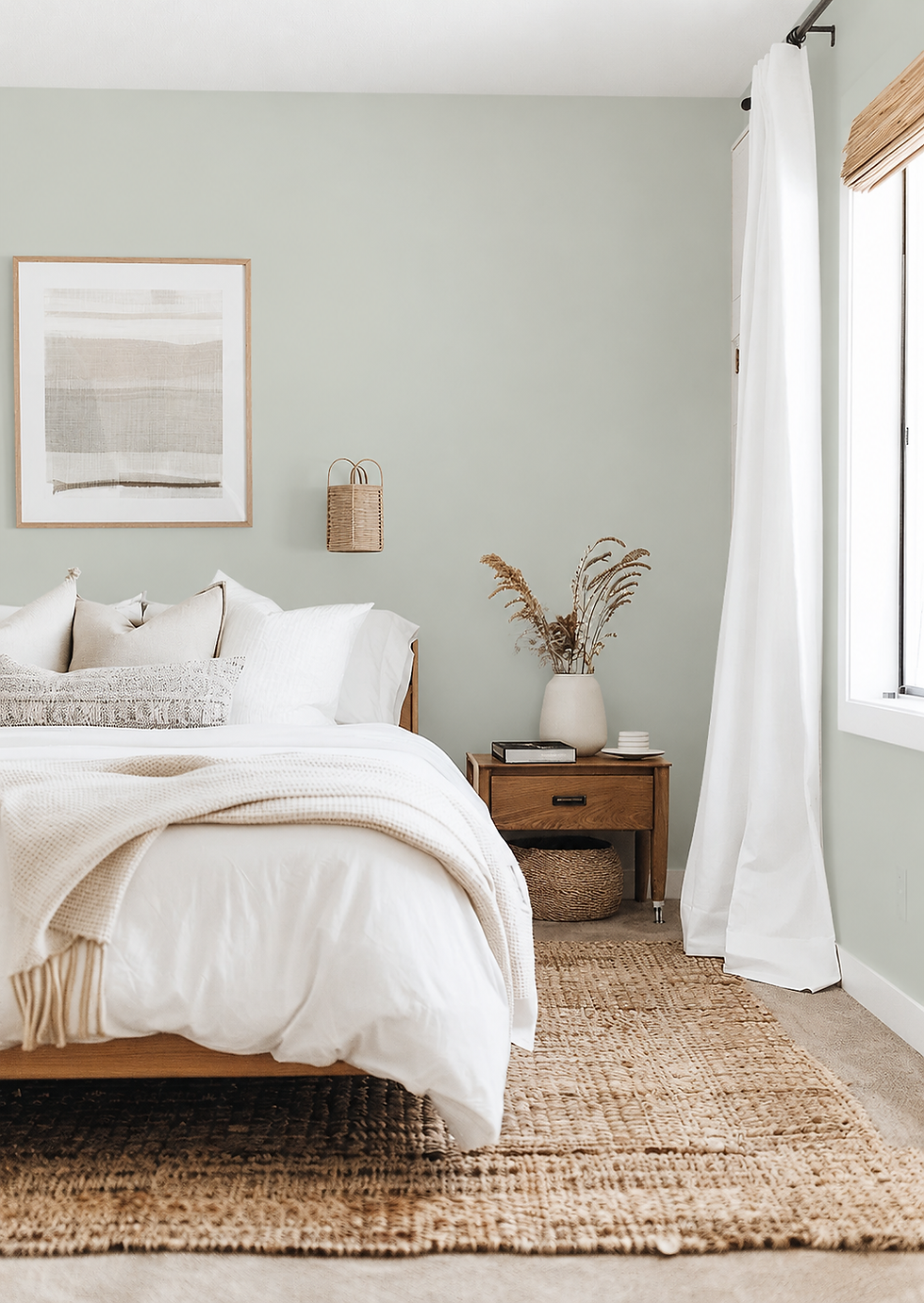
Sea Salt is right for you if:
The brief is calm, coastal, or spa-like - Sea Salt carries that character without needing a saturated colour. It reads as soft and restorative in bathrooms and bedrooms in a way that a warm greige does not, and it suits transitional and Scandinavian-leaning interiors equally.
The room gets balanced or warm daylight, or you control the bulbs - these are the conditions in which Sea Salt resolves to a sage-grey rather than blue. Warm 2700K lighting and a south or west aspect do most of the work for you.
You want a neutral with more character than a greige - Sea Salt behaves like a neutral beside white trim and timber, but it has genuine colour identity. For a client who finds beige flat and grey cold, it sits in a useful middle ground.
You are comfortable with a colour that changes through the day - its shifts are part of its appeal. If you enjoy a wall that moves between green-grey and soft blue, Sea Salt is rewarding to live with.
Sea Salt is not right for you if:
The room is north-facing, dim, and cool-lit, and you want a sage - that combination reliably delivers a pale blue instead. Without warm bulbs and warm materials to counter it, the colour can look washed out.
The brief is warm, traditional, or beige-led - Sea Salt is cool and does not create cosiness on its own. If the words 'warm', 'cosy', or 'inviting' drive the brief, a warm greige such as Accessible Beige or Repose Gray is the better answer.
The surrounding finishes are cream or yellow-toned - creamy tile, yellow-biased stone, or buttery cabinetry make the wall look cooler and thinner by contrast. The undertones fight rather than sit together.
You need a single fixed colour you can specify from a chip - Sea Salt is the clearest example of a colour that has to be judged in the actual room. If you cannot sample it in situ across a full day, a more stable neutral will serve you better.
How Sea Salt Compares to Similar Colours

vs Repose Gray SW 7015 - Repose Gray is about five LRV points deeper (58 against Sea Salt's ~63) and sits on the opposite temperature: a warm grey with a trace of beige, where Sea Salt is a cool grey-green. They are more often paired than chosen between, with Repose Gray in halls and living spaces and Sea Salt in bedrooms and bathrooms. The Sherwin-Williams Repose Gray review sets out how it behaves when used alone.
vs Alabaster SW 7008 - Alabaster is a creamy warm white at LRV 82, nearly twenty points lighter than Sea Salt, with a yellow-beige undertone against Sea Salt's cool grey-green. The two rarely compete: Alabaster is the trim, ceiling, or whole-room white, and Sea Salt is the wall colour that it softens. For how Alabaster sits beside a warm grey, the other half of this shortlist, the Repose Gray vs Alabaster guide is the closest match.
vs Accessible Beige SW 7036 - Accessible Beige sits at LRV 58, about five points deeper than Sea Salt, and is clearly warm - a beige over a grey base with only a faint green in it. The two share a muted green-grey thread, which is why they appear in the same palettes, but Accessible Beige warms a room while Sea Salt cools it. Choose Sea Salt for fresh and coastal, and Accessible Beige for cosy and grounded, as laid out in the Sherwin-Williams Accessible Beige review.
vs Palladian Blue BM HC-144 - Palladian Blue is the Benjamin Moore colour most often set against Sea Salt, with an LRV of roughly 60 against Sea Salt's ~63 and a softer, bluer blue-green character. Sea Salt is the greener, greyer of the two and shifts to blue only in cool light, whereas Palladian Blue starts closer to the blue end. For a client who wants the coastal feeling with less risk of a green wall, Palladian Blue is worth sampling alongside it.
Frequently Asked Questions
Is Sea Salt green, grey, or blue?
Sea Salt is a cool grey-green that can flash blue. Under warm light and in south-facing rooms it reads as a soft sage; under cool north light or 4000K bulbs it reads as pale blue. In balanced daylight it sits somewhere between, as a muted mineral grey-green. Which one you get depends on the room, so large samples are essential.
What trim colour works with Sea Salt?
A clean white is the safest trim for Sea Salt. SW Extra White gives the crispest edge, SW Pure White is a touch softer and warmer, and SW Alabaster gives a gentler, slightly cosier boundary. Avoid anything creamier than Alabaster, since the yellow in the trim makes the wall look cooler and bluer. Match the trim to the light in the room: crisper in bright south-facing rooms, softer where daylight is limited.
What colours coordinate with Sea Salt?
Sea Salt coordinates best with whites, deep blues, and warm neutrals. Extra White, Pure White, and Alabaster work for trim; navy such as Naval SW 6244 and near-black Iron Ore work for doors and joinery; Comfort Gray gives a tonal step deeper. For an adjoining space, Repose Gray is the standard warm neutral. A simple palette needs just one colour from each group.
Does Sea Salt work in a north-facing room?
It can, but it will lean blue. Cool indirect light emphasises the blue-green flash, and some people find the result serene while others find it washed out. To keep it closer to green-grey, use 2700K bulbs, warm timber, and warm textiles. If the room is also dim, sample at large scale before you decide.
Can Sea Salt be used outside?
Possibly, but verify before you order. Sources disagree on whether Sea Salt is rated for exteriors, and some list it for interior use only. Outdoors, light colours read lighter and cooler, and the blue flash is more likely in overcast light. Ask your Sherwin-Williams supplier about the exterior-suitable formulation and sample on the actual cladding.
Is Sea Salt a good laundry room or bedroom colour?
Yes - both are strong applications. In a bedroom its softness is restful, especially with warm lamps and natural linen. In a laundry room it keeps a small space feeling clean and fresh next to white appliances. In either, the main caution is artificial light: use warm-spectrum bulbs so the colour does not drift toward blue.
The Verdict
Sherwin-Williams Sea Salt is a versatile and genuinely beautiful colour, provided you accept that the room, not the chip, decides what you get. It is not a fixed neutral. It is a muted green-grey with a blue flash, at its best in balanced or warm light with warm bulbs and natural materials, and at its most disappointing in a cool, dim room where it turns pale blue. For clients choosing between this and the warm greiges, the Sherwin-Williams Accessible Beige review is the useful comparison.
Test it in this order. First, paint or stick two large samples on two different walls, one beside the window and one facing away from it, each with a white border. Second, view them at three points in a single day - morning, midday, and dusk. Third, check them after dark under the bulbs you will actually use, then briefly under a cooler bulb to see the worst case. Fourth, hold the proposed trim, floor sample, and a fabric against the wall. Fifth, make the decision only if it still looks right on both walls at all three times of day.
Want a complete colour scheme built around Sea Salt? Our design packages cover full palette selection, finish recommendations, and 3D visualisations - see our packages. |
About the Author
Beril Yilmaz is a qualified architect and interior designer based in the UK. She runs BY Design And Viz, a design platform covering paint colour reviews, interior design guidance, and residential design projects. Beril has specified Sea Salt across residential projects in the UK and internationally - most often in south and west-facing bathrooms and bedrooms, paired with warm timber floors and brushed brass fixtures.


Comments