Simply White vs Creamy: The Comparison That Actually Helps You Decide
- Beril Yilmaz

- Jun 2
- 9 min read
Updated: Jul 3
Simply White and Creamy are both Benjamin Moore warm whites and both appear on shortlists for homeowners who want warmth without committing to a full greige or neutral. Both are clearly warm. Both carry yellow in their undertone. On a paint chip they can look like two versions of the same direction. On a wall in a real room they create entirely different atmospheres - and the 8.5-point LRV gap between them, while smaller than many VS comparisons, represents a meaningful difference in warmth, character, and how committed each colour is to its cream direction.
Simply White reads as a warm white. At LRV 89.5 it is bright, clean, and warm - the yellow undertone is restrained enough that the colour reads as a living, warm white rather than cream or ivory. Creamy reads as a cream. At LRV 81 it is a proper warm off-white that commits fully to its buttery yellow direction - it announces its warmth clearly and unambiguously, and in the right room that quality is genuinely one of the most beautiful warm white results available.
This guide covers exactly how Simply White and Creamy differ in undertone, LRV, light behaviour, and room application - with a clear verdict on which one to choose and when.

At a Glance
| Simply White OC-117 | Creamy SW 7012 |
Brand | Benjamin Moore | Sherwin Williams |
LRV | 89.5 - bright warm white, reads as white with warmth | 81 - warm off-white, reads as cream with body |
Colour category | Warm white - reads as white with clean restrained warmth | Warm off-white / cream - reads as a committed cream colour |
Undertones | Clean barely-there yellow - restrained, fresh, never obviously cream | Direct warm yellow with buttery quality - committed, obvious, proud |
Character | Bright, warm, clean white backdrop with living quality | Soft, buttery, enveloping cream with genuine warmth and depth |
North-facing | Good - warm yellow holds and prevents cool reading | Risky - yellow undertone becomes more prominent without warm light |
South-facing | Beautiful - warm and luminous without reading cream | Exceptional - buttery warmth glows, most beautiful result |
Open-plan | Excellent - consistent across orientations | Best in zones with consistent warm light |
On walls | Warm white backdrop - reads as white, not cream | Committed cream backdrop - reads as cream, not simply white |
On cabinets | Excellent warm white - suits traditional and transitional kitchens | Beautiful cream cabinet colour - suits farmhouse and traditional kitchens |
On trim | Outstanding - BM's most popular trim white | Less typical on trim - too creamy for most wall colour combinations |
Use together? | No - similar undertone families with different depths create an unresolved match | Simply White and Creamy should not appear on adjacent surfaces |
Trim for Creamy | Alabaster SW 7008 is the most natural warm pairing | Pure White SW 7005 for a crisper result |
Style fit | Traditional, transitional, contemporary, organic modern - broadly versatile | Traditional, farmhouse, warm organic modern - suits committed warm briefs |
Architect's pick | When bright warm white that reads as white is the brief | When committed buttery cream warmth is specifically the brief |
BM Simply White OC-117 - What It Really Looks Like

Simply White has an LRV of 89.5 and a clean, barely-there yellow undertone. It reads as a warm white on a wall - the yellow quality is present but so restrained that it reads more as freshness and clarity than warmth. This is what makes Simply White so broadly specified: it delivers warmth without the depth commitment of a proper off-white, and it delivers brightness without the crispness of a cool white like Chantilly Lace. It occupies the sweet spot between those two directions.
In my practice Simply White is my most-used BM trim and ceiling white. On trim it provides crisp, warm definition against almost any wall colour. On walls it creates a bright, warm, open backdrop that reads as clearly white while giving the room genuine warmth and life. The key distinction from Creamy: Simply White's warmth is restrained. You feel it rather than see it. For how Simply White compares to the other BM white it is most often shortlisted against, the Simply White vs White Dove guide covers that distinction in full.
SW Creamy SW 7012 - What It Really Looks Like
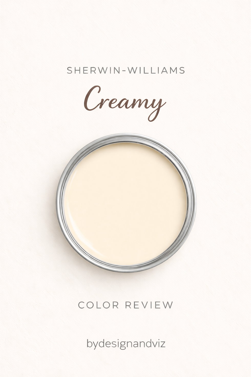
Creamy has an LRV of 81 and a direct warm yellow undertone with a committed buttery quality. It reads as a proper warm off-white on a wall - not quite as deep as Shoji White, not as restrained as Alabaster, but clearly a committed colour decision. Creamy announces its warmth. The yellow undertone commits fully to its direction - in warm natural light it reads as soft, buttery, and unmistakably cream. There is no grey anchor moderating it, no complex undertone restraining it.
In south-facing rooms with warm materials and warm light, Creamy is one of the most beautiful warm white results available. The buttery warmth glows and the room feels enveloping and instinctively inviting. The risk is the reverse: in north-facing rooms or rooms with cool artificial lighting, the yellow undertone has nothing to activate it and can read as flat or slightly yellowed without feeling warm. For how Creamy compares to the SW warm white it is most often confused with, the Chantilly Lace vs Creamy guide covers where Creamy's committed character is an advantage and where it creates problems.
The Real Difference Between Simply White and Creamy

Simply White is a warm white that reads as white. Creamy is a warm off-white that reads as cream. That single distinction is the most important thing to understand about this comparison.
Both have yellow warmth - but the quality and commitment of that yellow is entirely different. Simply White's yellow is so restrained it functions as a character note rather than a colour statement. Creamy's yellow is direct, obvious, and fully committed to being cream. On a wall at sample scale this difference is immediately visible. Simply White rooms feel warm, bright, and open. Creamy rooms feel warm, enveloping, and specifically cream.
For how Creamy compares to Westhighland White - the higher-LRV, gray-counterbalanced SW warm white that reads as the quieter, more adaptable alternative to Creamy's richer undertone - the Westhighland White vs Creamy guide covers the chroma difference and which one suits a whole-home scheme.
The 8.5-point LRV gap amplifies the undertone difference. Simply White at LRV 89.5 reflects significantly more light and reads as noticeably brighter on a wall than Creamy at LRV 81. In a south-facing room both look beautiful - Simply White luminous and clean, Creamy buttery and glowing. In a north-facing room Simply White holds its warm-white quality reliably; Creamy's yellow undertone becomes more prominent without the warm light to give it context, and the result can read as yellowed rather than warm. This light sensitivity is the most important practical consideration when choosing between them.
Not sure which one works for your room? A colour consultation is included in all our design packages - book directly here. |
When to Choose Simply White

Choose Simply White when the brief is warm white - bright, clean, and instinctively inviting - and when the colour needs to read as clearly white rather than cream. Trim and ceilings throughout any warm-palette home - this is where Simply White performs most consistently. Walls in rooms with any orientation, including north-facing. Open-plan spaces where consistent warmth across varied light conditions is needed. Any room where the warmth needs to be felt rather than seen.
Simply White is also the right answer when Creamy would feel too committed or too obviously cream for the brief. If the client wants warmth but not creaminess - warm white that reads as white, not as a colour decision - Simply White is the answer every time.
When to Choose Creamy

Choose Creamy when obviously warm, buttery, enveloping cream is specifically the brief. South and west-facing rooms with good natural light where the yellow undertone activates beautifully. Traditional, farmhouse, and warm organic modern interiors where a cream quality is part of the design intent. Rooms with warm wood floors, warm stone, and brass hardware where everything is pulling in the same warm direction.
Avoid Creamy in north-facing rooms without warm 2700K artificial lighting - the yellow undertone becomes flat and slightly yellowed without warmth in the light to activate it. Avoid it on trim alongside most wall colours - the committed cream quality on trim creates tension with almost any wall colour except the most committed warm neutrals. Avoid it adjacent to Simply White - the similar undertone families with different depths read as an unresolved mismatch rather than a deliberate scheme.
How the Pairings Differ

For Creamy on walls, Alabaster SW 7008 on trim is the most natural within-system pairing - the slight step up in brightness creates gentle definition while keeping both colours in the same warm family. Pure White SW 7005 gives a crisper result. Simply White OC-117 BM on trim alongside Creamy walls should be avoided - the similar warm yellow undertones at different depths read as two whites that do not quite match rather than a considered pairing.
For Simply White on walls or trim, Creamy should not appear on adjacent surfaces for the same reason - the undertone similarity with depth difference reads as mismatched. On walls, Simply White suits trim in Chantilly Lace OC-65 for a crisper boundary or Chantilly Lace itself. On trim, Simply White pairs naturally with almost any wall colour including warm greiges, deep neutrals, and saturated accent colours.
For flooring, both colours work with warm wood tones. Creamy is most naturally at home with honey wood, warm oak, and traditional hardwood - the shared buttery yellow warmth creates an instinctively cohesive relationship. Simply White handles a broader range of floor finishes including cooler stone and contemporary tile, where the restrained warmth prevents undertone conflict.
For hardware, both suit aged brass, warm bronze, and matte gold. Creamy's committed warmth is strongest alongside the warmest metals - cool hardware can make the cream quality read as slightly off. Simply White handles a wider range of hardware finishes including brushed nickel and matte black without the warmth creating tension.
Architect's Verdict - Simply White or Creamy?

Both are excellent colours for the right brief - but they are not interchangeable and the choice between them comes down to one question: do you want the walls to read as white or as cream?
If the brief is warm white that reads as white - clean, bright, and broadly reliable across any room and any orientation - Simply White is the answer. It is the most versatile warm white in the BM range and one of the most specified whites in residential design for good reason.
If the brief is committed, buttery, enveloping cream - a colour that announces its warmth and glows in the right conditions - Creamy is the answer, with Alabaster SW on trim and warm south-facing light as the ideal conditions. The test: if you look at a sample of Creamy and think "that's beautiful" - choose Creamy. If you think "that's too much" - Simply White is your answer.
Frequently Asked Questions

Is Simply White lighter than Creamy?
Yes - by 8.5 LRV points. Simply White has an LRV of 89.5 and Creamy has an LRV of 81. Simply White reads as a bright warm white. Creamy reads as a committed warm off-white with genuine body and cream character. The gap is clearly visible on a wall side by side.
Can I use Simply White on trim with Creamy on walls?
No - this combination should be avoided. Simply White and Creamy share a similar warm yellow undertone direction but at different depths - on adjacent surfaces this reads as two whites that do not quite match rather than a considered pairing. Use Alabaster SW 7008 on trim alongside Creamy walls instead.
Which is better for north-facing rooms?
Simply White handles north-facing rooms more reliably. The restrained yellow undertone holds its warm-white quality in cool indirect light without becoming prominently yellow. Creamy's committed yellow undertone has less warmth in the light to activate it in north-facing conditions and can read as flat or slightly yellowed rather than warm. If the brief calls for warmth in a challenging north-facing room, Simply White is the safer choice.
Do Simply White and Creamy go together?
No - they should not be used on adjacent surfaces. The undertone similarity with the depth difference reads as a mismatch. Choose one for walls and use a different white family entirely for trim - Alabaster SW or Pure White SW for Creamy walls, Chantilly Lace OC-65 or simply repeat Simply White for Simply White walls.
What is the LRV of Simply White vs Creamy?
Simply White OC-117 has an LRV of 89.5 and Creamy SW 7012 has an LRV of 81. The 8.5-point gap is clearly visible on a wall and represents a meaningful difference in brightness and depth - Simply White reads as bright warm white, Creamy reads as a committed warm cream.
Final Thought
Simply White and Creamy are both outstanding colours for the right brief. The choice comes down to how much cream commitment the brief calls for.
If the brief is warm white that reads as white - Simply White, on walls or trim, in any room. If the brief is committed buttery cream - Creamy on walls in a south-facing room with warm materials and Alabaster SW on trim. Buy sample pots of both, paint large patches in your room under morning light and evening artificial lighting. The answer will be clear within 24 hours.
Want a complete colour scheme built around Simply White or Creamy? Our design packages cover full palette selection, finish recommendations, and 3D visualisations - see our packages. |
About the Author
Beril Yilmaz is a qualified architect and interior designer based in the UK. She runs BY Design And Viz, a design platform covering paint colour reviews, interior design guidance, and residential design projects. Beril has specified both Benjamin Moore Simply White and Sherwin Williams Creamy across residential projects in the UK and internationally - regularly reaching for Simply White on trim and ceilings, and Creamy for south-facing rooms where a committed warm cream is specifically the brief.


Comments