


Westhighland White vs Creamy: The Comparison That Actually Helps You Decide

Westhighland White and Creamy are both Sherwin-Williams warm whites, and both get pulled into the same shortlist by anyone comparing SW's warm off-white range - but they are not solving the same problem. I have specified both across residential projects, and the distinction that actually matters is not which one is "whiter." It is that Westhighland White is built to recede and Creamy is built to be felt. Put them side by side on a wall and the five-point LRV gap is visible immediately, but the character difference is the part that determines which one belongs in your room.
Westhighland White SW 7566 sits at LRV 86, with a warm yellow-beige undertone held in check by a faint gray counterbalance - the quality that keeps it reading as a soft neutral rather than a cream. Creamy SW 7012 sits at LRV 81, with a noticeably higher-chroma yellow undertone that gives it real color weight on the wall. Both are warm. Only one of them is quiet about it.
This guide covers exactly how Westhighland White and Creamy differ in undertone, LRV, light behaviour, and room application - including which one to trust in a space with mixed light zones and which one rewards a room that can handle genuine warmth.

At a Glance
| Westhighland White SW 7566 | Creamy SW 7012 |
Brand | Sherwin-Williams | Sherwin-Williams |
LRV | 86 - a high-reflectance warm white, close to the top of the off-white range | 81 - five points lower and noticeably more saturated in its warmth |
Colour category | Balanced warm white - reads as a soft, adaptable neutral rather than a committed cream | Committed warm cream - reads as a genuine off-white with real color presence, not a near-white |
Undertones | Warm yellow-beige base with a faint gray counterbalance that keeps it from tipping into cream | Rich, buttery yellow with higher chroma - warmer and more golden than a typical off-white |
Character | Soft, versatile, quietly warm - the white that supports a room instead of defining it | Warm, cozy, unapologetically cream - the color that gives a room its temperature, not just its light |
North-facing | Very good - the gray counterbalance holds it steady and prevents a yellow cast | Good - the yellow undertone counters cool light without needing help, though it reads less neutral |
South-facing | Excellent - brightens without turning golden the way higher-chroma whites can | Strong but requires care - warm afternoon light can push it toward visibly golden |
Open-plan | Excellent - the most consistent of the two across mixed light zones and adjoining rooms | Good - most cohesive in consistently warm-lit spaces; shifts more than Westhighland across zones |
On walls | Soft warm-white backdrop that stays neutral enough to carry furniture, art, and accent color | Warm cream backdrop with genuine color weight - the wall reads as a decision, not a default |
On cabinets | A dependable everyday white for cabinetry that needs to read clean, not cream | Harder to pair broadly - the higher chroma makes it a considered choice rather than a safe one |
Use together? | Yes - Westhighland White on trim against Creamy walls gives clean, quiet definition | Creamy on trim against Westhighland White walls reads muddy - the reverse pairing is the one that works |
Trim for each | Pure White SW 7005 for a crisp lift; Westhighland White itself for a seamless, monochromatic result | Pure White SW 7005 for the cleanest contrast; Westhighland White for a softer, tonal trim line |
Style fit | Transitional, coastal, modern farmhouse, everyday contemporary | Traditional, farmhouse, cottage, warm transitional |
Architect's pick | When the brief needs a warm white that recedes and lets everything else in the room lead | When the brief needs a wall color with genuine warmth and presence, not just brightness |
SW Westhighland White SW 7566 - What It Really Looks Like

Westhighland White has an LRV of 86 - one of the brighter warm whites in the Sherwin-Williams range. The undertone is warm yellow-beige, but it is held in check by a faint gray counterbalance that keeps the colour from tipping into cream. That counterbalance is exactly what makes it so dependable across a whole home: it holds its neutrality in cool north light and doesn't turn golden in warm south light either.
Westhighland White does not announce itself. On walls it creates a soft, warm-white backdrop where the room's furniture, art, and accent colour are left to do the talking. On cabinets it is a dependable everyday white - clean enough to read as white in most kitchens, warm enough to avoid feeling clinical.For the wider field of Sherwin-Williams warm whites this one sits alongside - including how it compares to the brand's other most-used near-neutrals - the SW White Paint Colors Guide maps the full range in one place.
For how Westhighland White compares to Alabaster - the Sherwin-Williams warm white it is most often shortlisted against despite having a four-point higher LRV - Westhighland White vs Alabaster guide explains why the LRV gap predicts brightness rather than warmth, and which colour holds up better in a north-facing room.
SW Creamy SW 7012 - What It Really Looks Like
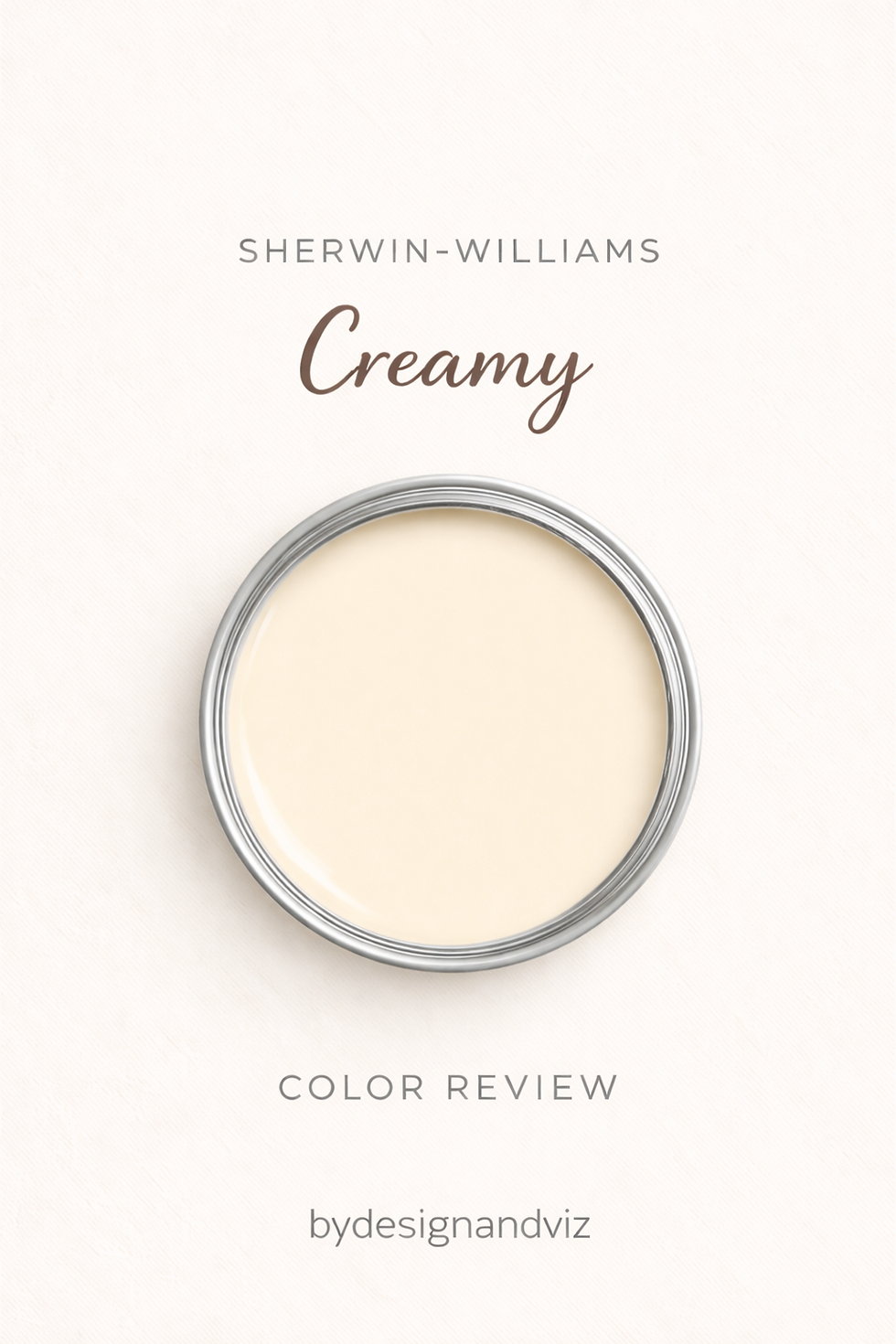
Creamy has an LRV of 81 - five points below Westhighland White, and the gap in feel is bigger than the number suggests. The undertone is a rich, buttery yellow with noticeably higher chroma than most SW warm whites, which means the colour carries genuine weight on the wall rather than sitting quietly in the background.
Creamy is a wall colour, not a near-white. It reads as a considered warm cream in most light, and in strong south or west-facing afternoon sun the golden quality intensifies noticeably. On cabinets and trim it is a harder colour to place - the higher chroma limits how broadly it pairs, which is why it is far more often specified for walls than for millwork.For how Creamy sits against the SW warm white it is most frequently shortlisted alongside, the Creamy vs Alabaster guide covers that comparison directly.
The Real Difference Between Westhighland White and Creamy

Westhighland White is a balanced warm white. Creamy is a committed warm cream. That is the entire distinction, and nearly every practical decision about where to use each of them follows from it.
The five-point LRV gap between them - 86 for Westhighland White against 81 for Creamy - is enough to be visible on adjoining walls, but the gap in chroma is what actually separates them in real rooms. Westhighland White's gray counterbalance holds its warmth at a low simmer. Creamy has no such counterbalance, and its higher chroma means the yellow undertone is doing real work on the wall rather than sitting quietly in the background.
Westhighland White reads as a wall colour for people who are not sure they want a wall colour. It behaves like a soft neutral in most light, which is precisely why it turns up in whole-home schemes where consistency across rooms matters more than character in any single one. For the fuller picture of how SW's warm whites sit against each other across the full range - not just this one pairing - the SW White Paint Colors Guide is the reference point worth checking before committing to either.
Not sure which one works for your room? A colour consultation is included in all our design packages - book directly here. |
When to Choose Westhighland White

Choose Westhighland White when the brief is a warm white that adapts rather than commits. Open-plan homes and whole-house schemes where the same colour needs to hold its character across rooms with different light exposures. Cabinets in kitchens where a dependable, unfussy white is the goal. Any brief where the wall colour is meant to support the room rather than define it.
Westhighland White is also the right trim choice alongside Creamy walls - its restrained undertone provides clean, quiet definition against Creamy's richer warmth without competing with it.
When to Choose Creamy

Choose Creamy when the brief calls for genuine warmth, not just brightness. Traditional, farmhouse, and cottage interiors where the walls are meant to contribute real colour character. Rooms with warm wood floors and brass or bronze hardware where the golden undertone has material to play off. South or west-facing rooms with moderate, not maximum, direct light.
Creamy is the right answer when Westhighland White feels too quiet for the brief - when the room needs to feel genuinely warm and cozy rather than simply bright. Use Pure White on trim for the cleanest, most reliable contrast.
How the Pairings Differ

For Westhighland White on walls, Pure White SW 7005 on trim gives a clean, slightly brighter contrast that keeps architectural lines defined. Westhighland White itself on trim and ceiling creates a soft, seamless result that suits open-plan spaces where you want minimal visual break between surfaces.
For Creamy on walls, Pure White SW 7005 is the more reliable trim choice - its lower chroma keeps it from competing with Creamy's warmth. Westhighland White on trim against Creamy walls is workable but softer, and the two warm whites can start to blur into each other rather than reading as a considered contrast.
For flooring, Westhighland White is genuinely flexible - warm wood, pale stone, and contemporary tile all sit comfortably against it because the undertone is restrained. Creamy is strongest with warm wood floors and natural materials that can absorb and echo its yellow warmth; cool stone or grey-toned tile alongside Creamy can make the undertone read more insistent than intended.
For hardware, Westhighland White handles brushed nickel, matte black, and warm brass equally well - the neutral base does not fight any of them. Creamy is strongest with warm metals - brushed brass, bronze, and warm nickel - where the metal tone and the wall's warmth reinforce each other rather than creating tension.
Architect's Verdict - Westhighland White or Creamy?
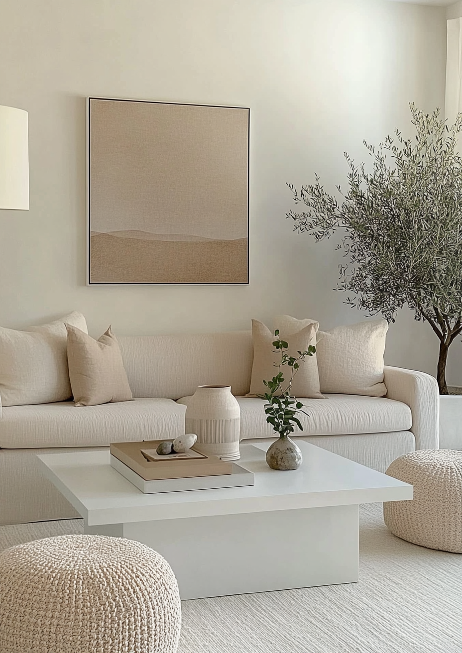
These two Sherwin-Williams whites are not competing for the same wall - they are answering two different briefs entirely.
If the brief is a warm white that stays out of the way - a background for furniture, art, and mixed-light zones across an open-plan home - Westhighland White is the answer. It is the safer, more adaptable choice precisely because it does less.
If the brief is a wall colour with genuine warmth and presence - a room that is meant to feel cozy and considered rather than simply bright - Creamy is the answer, provided the room's light and materials can support it.
Before committing to Creamy specifically, test a large sample on the wall that gets the most direct afternoon sun in your home - south or west-facing if you have the choice - and look at it again in the last hour of daylight. A pass means it still reads as a warm cream rather than tipping visibly gold. If it goes golden in that light, Westhighland White is the safer wall colour and Creamy is better saved for a room with gentler exposure.
Frequently Asked Questions
Is Westhighland White lighter than Creamy?
Yes - by 5 LRV points. Westhighland White has an LRV of 86 and Creamy has an LRV of 81. The gap is visible side by side, but the bigger difference is chroma - Creamy's undertone is more saturated, which is why it reads as a genuine cream rather than a near-neutral white.
Which one is more versatile for a whole-home scheme?
Westhighland White. Its gray counterbalance keeps it reading consistently across rooms with different light exposures, which is exactly what a whole-home warm white needs to do. Creamy shifts more noticeably between warm-lit and cool-lit rooms, so it works best used deliberately rather than throughout.
Can I use Creamy and Westhighland White together in the same scheme?
Yes, but only in one direction. Westhighland White on trim against Creamy walls gives clean, quiet definition. Reversing it - Creamy on trim against Westhighland White walls - tends to read muddy, since Creamy's higher chroma does not sit well as a supporting trim colour.
Which is better for north-facing rooms?
Westhighland White handles north-facing rooms more predictably. The gray counterbalance actively works against the cool cast of north light. Creamy's yellow undertone still counters cool light reasonably well, but it reads noticeably warmer in that room than it will elsewhere in the house.
What is the LRV of Westhighland White vs Creamy?
Westhighland White SW 7566 has an LRV of 86 and Creamy SW 7012 has an LRV of 81. The five-point gap places Westhighland White at the brighter, more neutral end of SW's warm white range, while Creamy sits further into genuine off-white territory with more visible colour presence.
Final Thought
Westhighland White and Creamy are both excellent Sherwin-Williams warm whites, but they are built for different jobs. One is designed to support a room without asking for attention. The other is designed to give a room its warmth.
A soft, adaptable warm white for open-plan homes and mixed-light spaces - Westhighland White. A genuine warm cream with real character for rooms that can carry it - Creamy, with Pure White on trim. Sample both at large scale in your own light. The five-point LRV gap is visible, but it is the chroma difference that will actually decide which one belongs on your walls.
Want a complete colour scheme built around Westhighland White or Creamy? Our design packages cover full palette selection, finish recommendations, and 3D visualisations - see our packages. |
About the Author
Beril Yilmaz is a qualified architect and interior designer based in the UK. She runs BY Design And Viz, a design platform covering paint colour reviews, interior design guidance, and residential design projects. Beril has specified both Sherwin-Williams Westhighland White and Creamy across residential projects in the UK and internationally - Westhighland White in open-plan homes where consistency across mixed light zones was the priority, and Creamy in traditional and cottage-style interiors where the brief called for genuine, felt warmth on the walls.


Comments