


Slipper Satin vs Pointing: The Comparison That Actually Helps You Decide

Slipper Satin and Pointing look like neighbours on the Farrow & Ball card. They are not. Slipper Satin is a soft, stone-leaning off-white with body. Pointing is a bright, creamy white with a warm glow. One settles a room. The other lifts it. Roughly 13 points of LRV separate them, and that gap shows on a full wall before the undertone does.
I have specified both across UK residential projects, and the choice is never about taste alone. It comes down to daylight, floor material, and what sits against the wall. Here is exactly how I tell them apart, and how I decide which one a room needs.
This guide covers the real brightness and undertone differences, where each colour works and fails, the trim and flooring pairings, and a worst-case light test that settles it in your own room.

At a Glance
| Slipper Satin | Pointing |
Brand | Farrow & Ball | Farrow & Ball |
LRV | ~75 — mid-light; the wall keeps visible body and never reads as white | ~88 — bright; reflects far more light and reads close to white in daylight |
Colour category | Stone-leaning off-white — a grounded neutral that sits one step in from the whites | Creamy warm white — bright and clean, with warmth built into the brightness |
Undertones | Soft warm stone with a faint grey-beige cast; no cool blue, no obvious yellow | Warm cream with a rosy-yellow, red-based glow; can tip faintly peach in low light |
Character | Quiet and settled. Gives the wall weight and lets oak, linen and stone lead — suits rooms that should feel held rather than bright | Luminous and warm. Brightens and softens in the same coat — suits rooms that need lift without the chill of a stark white |
North-facing | Holds steady, but can flatten to a dull stone where daylight is thin | A strong choice — lifts the walls and keeps the warmth, though low evening light can push it toward peach |
South-facing | Warms into a pale oatmeal — soft and composed, never glaring | Reads as a bright, soft cream close to white; stays clean in strong sun |
Open-plan | Strong — the stone-leaning balance reads consistently across zones and materials | Mixed — glows in bright zones, turns creamier and warmer in shaded ones |
On walls | A grounded backdrop that frames furniture and art; suits panelled halls, period living rooms and calm bedrooms | A bright, warm envelope that opens up small rooms; suits bedrooms and dining rooms in period homes |
On cabinets | The more comfortable match for stone, slate and mixed-metal kitchens | Brightens dim kitchens; best against warm oak and brass, less comfortable beside cool stone |
Use together? | Yes — as the wall colour, with Pointing on the trim for a clear step up | Yes — as trim on Slipper Satin walls; avoid reversing the pair |
Trim for each | Pointing for a clean step up, or All White No. 2005 for sharper definition | Wimborne White No. 239 for a gentle tonal step, or All White No. 2005 for crisp contrast |
Style fit | Traditional, period, country, organic modern | Traditional, cottage, period, warm classic |
Architect's pick | When the room has decent daylight and natural materials, and the brief is calm, grounded and settled | When the room is short on light and the brief is warm, bright and soft without going stark |
Farrow & Ball Slipper Satin No. 2004 - What It Really Looks Like

Slipper Satin has an LRV of approximately 75, which puts it firmly in the mid-light off-white category. That is noticeably lower than most whites it gets compared with, and the number matters. The wall has body. It reads as a soft, stone-leaning cream with a faint grey-beige cast and no cool blue behind it, so it never goes stark under strong light. In south light the warmth rises into a pale oatmeal. In shade it settles into a quiet stone.
It does not behave like a white. Slipper Satin sits one step in from the whites, which is exactly why it works as a wall colour and as a trim colour against deeper shades. Paint all four walls and the room feels held, not bright. Pair it with oak, linen and aged brass and it looks inherited rather than decorated. Put it beside a crisp white and it reads as dusty. That is the design, not a flaw.
Its closest relative is Skimming Stone. Both sit in the stone-leaning neutral zone, and the gap between them is smaller than the gap between Slipper Satin and Pointing. If you are weighing Slipper Satin against a neighbouring stone neutral instead, the Slipper Satin vs Skimming Stone guide shows how that pair separates, so you can rule it in or out before you sample.
Farrow & Ball Pointing No. 2003 - What It Really Looks Like
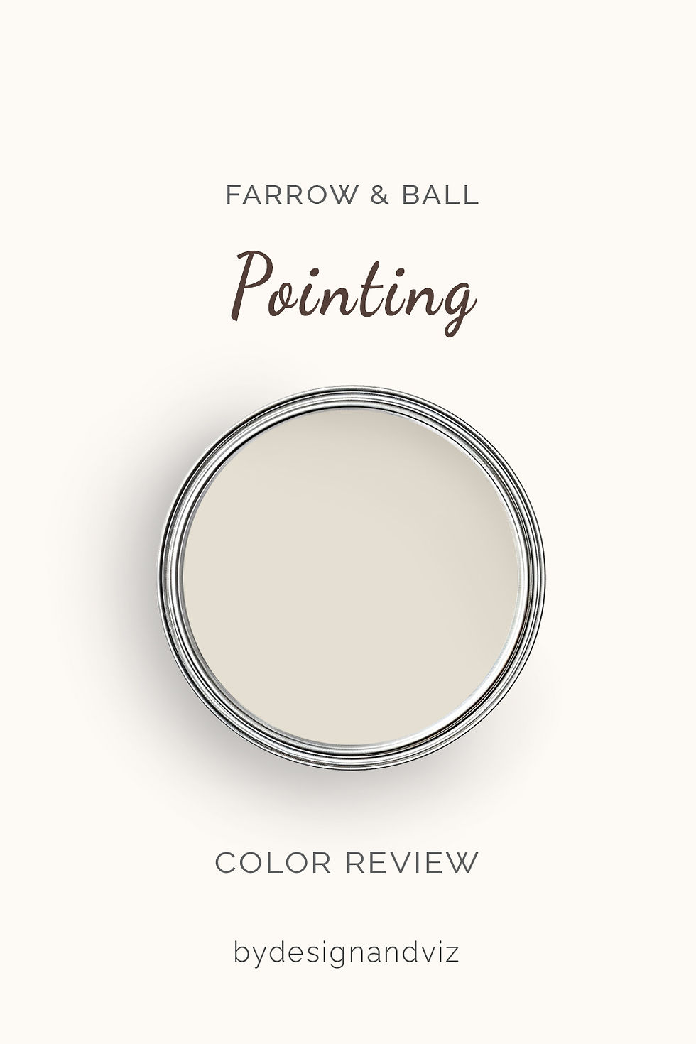
Pointing has an LRV of approximately 88, which puts it firmly in the bright off-white category. That is the highest reflectance of the pair by a wide margin. It is a creamy warm white with a soft rosy-yellow warmth, closer to the glow of lime plaster than to the grey of stone. The warmth is clear and clean. There is nothing muddy in it.
Pointing brightens a room without cooling it. That is its real job. In a north-facing room it lifts the walls and keeps the warmth a stark white would strip out. In south light it reads as a soft cream, close to white. In low evening light the red base can tip faintly toward peach. Test it before you trust it.
Wimborne White is the sibling to know. It sits brighter and cleaner than Pointing, with the warmth turned down. If Pointing feels too creamy once it is on the wall, the Farrow & Ball Wimborne White review shows what the cleaner step up looks like and where it stops working.
The Real Difference Between Slipper Satin and Pointing

The simplest way to explain it: Slipper Satin is a stone-leaning off-white with body. Pointing is a bright, creamy white with a glow. One settles a room. The other lifts it.
Here the LRV does real work. Roughly 75 against roughly 88 is a 13-point gap, and it is visible on a full wall before the undertone registers. Most comparisons between close whites hinge on undertone alone. This one hinges on brightness first and warmth second. Slipper Satin absorbs more light and looks deeper and more stone-like for it. Pointing returns more light and looks cleaner and creamier. Hold the two cards together and the difference is plain.
The gap makes trim decisions easy. Pointing on trim with Slipper Satin on walls gives a clear, deliberate step up in brightness while both colours stay in the same warm family. The reverse does not work. Slipper Satin trim beside Pointing walls reads darker and duller than the wall it frames. If Pointing is on the walls and you want sharper definition on the joinery, the Farrow & Ball All White review covers how that crisper white behaves on skirtings, doors and window frames.
Not sure which one is right for your room? A Color Direction consultation gets you a full custom palette built around your space - book yours here. |
When to Choose Slipper Satin

Choose Slipper Satin when you want a soft, grounded backdrop rather than a bright one. It earns its place in living rooms, hallways and bedrooms where oak, linen and stone do the visual work and the wall should hold steady behind them. It suits rooms with stone floors or a limestone fireplace. It suits period homes where a crisp white would feel borrowed from a showroom. In open-plan spaces with mixed material temperatures, it stays composed.
Skip Slipper Satin when the brief is bright and airy. At an LRV of roughly 75 it will not lift a dim room. In a small north-facing space with little daylight it can flatten into a dull stone. If light is the problem, choose the brighter colour.
When to Choose Pointing

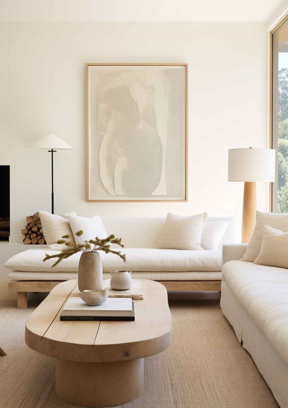
Choose Pointing when you want warmth and brightness in the same coat. It is the right answer for north-facing rooms, small rooms and bedrooms in period properties where daylight is limited. It suits dining rooms with warm oak, aged brass and terracotta. It lifts a dim kitchen without turning it clinical. The warmth here is a decision, not an accident.
Skip Pointing when the room is full of cool stone or grey. Cool grey tile, stainless appliances and slate fight the red base. The wall looks pink against them, and it does not recover. Avoid brilliant white trim too, which makes Pointing look yellow by comparison.
How the Pairings Differ

For Slipper Satin on walls, Pointing is the natural trim choice. It gives clean definition without a harsh contrast. All White No. 2005 is the sharper alternative when the room needs real crispness. Slipper Satin on walls and trim together makes a soft, tonal envelope that suits panelled halls and bedrooms.
For Pointing on walls, Wimborne White on trim is the gentlest step up. All White gives more contrast. Avoid brilliant white, which turns Pointing yellow by comparison. Slipper Satin on the trim is the wrong direction here, because it is darker than the wall.
For flooring, Slipper Satin is the more forgiving of the two. It handles limestone, pale grey-washed oak and honed stone without conflict. Pointing wants warmth underneath it. Warm oak, terracotta and honey-toned stone make it glow. Cool grey tile makes it look pink.
For hardware, both colours suit aged and unlacquered brass. Slipper Satin also takes antique nickel and bronze comfortably. Pointing is happiest with warm metals. Polished chrome and cool nickel pull the red out of its base.
Architect's Verdict - Slipper Satin or Pointing?

These two answer different briefs, so the choice follows the room rather than your taste. Pointing is the safer pick for dark rooms. Slipper Satin is the safer pick where cool materials are present.
Slipper Satin is the right choice when you want a grounded, stone-leaning backdrop in a room with decent daylight and natural materials. In a traditional living room with oak floors and linen, it looks settled and considered. It does not try to brighten the room. That is its strength.
Pointing is the right choice when the room needs both warmth and light. In a north-facing bedroom or a dim period dining room, it does what Slipper Satin cannot: it lifts the walls and keeps them warm. It asks more of the surrounding materials, and it rewards you where it fits.
The test: wait for a grey, overcast morning, which is the worst case for both. Paint a 60cm square of each on two walls, one facing the window and one away from it. Check them at 9am, at midday, and again under evening lamplight. Pointing passes if it still reads as a warm cream with no pink or peach cast. Slipper Satin passes if it still reads as a soft stone with some life in it, not flat grey or dull beige. If Pointing turns pink, choose Slipper Satin. If Slipper Satin goes flat, choose Pointing.
Frequently Asked Questions
Is Pointing brighter than Slipper Satin?
Yes — Pointing is noticeably brighter. Its LRV is roughly 88 against roughly 75 for Slipper Satin, a gap of about 13 points. That difference is visible on a full wall, particularly in lower light. Slipper Satin has more body. Pointing has more lift.
Which is better for a north-facing room?
Pointing, in most cases. Its higher reflectance and clean warmth lift a room that lacks direct sun. Slipper Satin can flatten into a dull stone in north light. Test either one under warm bulbs before committing.
Can I use Slipper Satin and Pointing together?
Yes, with Slipper Satin on the walls and Pointing on the trim. The brightness step gives clean definition while keeping both in the same warm family. The reverse arrangement does not work, because Slipper Satin trim looks darker than the wall around it.
Does Pointing look pink?
It can, in the wrong room. Pointing has a red-based warmth. In cool light, or beside grey tile and stainless steel, that base can show as a faint pink or peach. With warm wood, brass and good natural light it reads as soft cream. Always test at scale.
Which is better for kitchen cabinets?
It depends on the kitchen. Slipper Satin is the more comfortable match for stone, slate and mixed-metal kitchens. Pointing suits dim kitchens with warm oak and brass, where it brings lift and warmth together. Neither is at its best beside cool grey surfaces.
What is the LRV of Slipper Satin vs Pointing?
Slipper Satin is approximately 75 and Pointing approximately 88. Published figures vary slightly between sources, so treat both as approximate. The gap, not the exact number, is what you will see in the room.
Final Thought
Slipper Satin and Pointing are not interchangeable. One is a grounded, stone-leaning off-white. The other is a bright, creamy white with a warm glow. The choice depends on how much light the room has and what its materials are doing.
If your room has good daylight and natural stone and oak, Slipper Satin will look settled and considered. If your room is short on light and warm in its materials, Pointing will do the work Slipper Satin cannot. Buy sample pots of both, paint large patches side by side on two walls, and check them at morning, midday and evening. The answer will be clear within a day.
Want a complete colour scheme built around Slipper Satin or Pointing? Our design packages cover full palette selection, finish recommendations, and 3D visualisations - see our packages. |
About the Author
Beril Yilmaz is a qualified architect and interior designer based in the UK. She runs BY Design And Viz, a design platform covering paint colour reviews, interior design guidance, and residential design projects. Beril has specified both Slipper Satin and Pointing across residential projects in the UK and internationally — Slipper Satin in period living rooms and hallways with oak floors and natural stone, Pointing in north-facing bedrooms and dining rooms where daylight is limited, often in the same scheme with Pointing on the trim.


Comments