


Snowbound vs Pure White: The Comparison That Actually Helps You Decide

Snowbound is the quiet white. Pure White is the clean one. One recedes, the other defines, and on a paint card they look like the same color with a one-point LRV gap between them. On a wall, the gap is not about brightness at all. It is about how much warmth each one lets into the room.
I have used both across residential projects, and the mistake I see most often is treating them as interchangeable. Snowbound leans soft and neutral, with a faint cool-grey edge. Pure White carries a gentle warm undertone that keeps it reading as a clean, bright white. Put the wrong one in the wrong light and it shows within a day.
This guide covers the undertone difference, how each behaves in north and south light, which one suits walls, cabinets and trim, and a simple light test to settle it in your own room.

At a Glance
| Snowbound | Pure White |
Brand | Sherwin-Williams | Sherwin-Williams |
LRV | 83 - bright and soft; reflects plenty of light without the glare of a stark white | 84 - clean and bright; the higher reflectance shows as a crisper, cleaner white |
Colour category | Soft neutral white - muted and restrained; sits between a true white and a pale greige | Clean warm-leaning white - reads white first, warm second; the benchmark soft white in the range |
Undertones | Faint cool-grey with a neutral base - the grey is subtle, but it surfaces in low or north light | Gentle warm beige-yellow - low in intensity, enough to prevent any chill without reading cream |
Character | Calm and recessive; softens a room without adding warmth, and works as a backdrop rather than a statement | Bright and defined; gives edges, joinery and cabinetry a clean finish while staying friendly rather than clinical |
North-facing | Risky - the grey undertone can tip it flat and dull when the light turns cool and offers no warmth to balance it | Reliable - the warm undertone counters cool light and keeps the color from going grey or lifeless |
South-facing | Excellent - strong light keeps it soft and clean, and it avoids the cream drift that warmer whites show here | Strong, but warmth builds - the beige-yellow rises in intense sun and can lean toward a soft cream by late afternoon |
Open-plan | Good where flooring and stone lean cool or neutral - it stays consistent across zones that share that temperature | Excellent - the gentle warmth reads consistently across zones, even where timber, stone and metal mix |
On walls | A muted, low-contrast backdrop that makes art, timber and textiles do the talking | A bright, clean backdrop with enough warmth to feel finished; walls feel lifted rather than muted |
On cabinets | Best with cool or neutral stone, grey-toned flooring and chrome or nickel hardware - looks flat against warm oak | The more flexible choice - works with warm oak, brass, white marble and mixed finishes without clashing |
Use together? | Yes - Snowbound walls with Pure White trim gives gentle definition; the reverse needs testing as grey walls can read dull | Yes - Pure White trim on Snowbound walls is a clean, well-tested pairing; Pure White walls with Snowbound trim can look grey by comparison |
Trim for each | Pure White SW 7005 for soft definition, or Extra White SW 7006 for a crisper edge | Extra White SW 7006 for a sharper contrast, or Pure White itself for a seamless wall-and-trim finish |
Style fit | Scandinavian, contemporary, coastal, minimalist - interiors with cool or neutral materials | Transitional, traditional, modern farmhouse, classic contemporary - the broadest range of the two |
Architect's pick | When the materials are cool or neutral, the light is strong, and the brief is calm and soft rather than bright and crisp | When the light is mixed or cool, the materials are varied, and the brief needs a clean white that still feels welcoming |
Sherwin-Williams Snowbound SW 7004 - What It Really Looks Like

Snowbound has an LRV of 83, which puts it firmly in the soft white category. It is bright enough to lift a room, but it never glares. The undertone is neutral with a faint cool-grey lean, and that restraint is the whole point. It does not add warmth to a room. It simply gets out of the way.
Where Snowbound earns its place is in strong, clean light. In a south or west-facing room it reads as a soft, even white with no yellow and no pink. In bright daylight it can look almost pure. In the evening under warm lamps it settles into a gentle, muted off-white. There is nothing ambiguous about it.
The weakness is north-facing and low light. The faint grey undertone that feels calm in good light can turn flat and slightly dull when the room is cool and shaded. Beside warm timber it can look washed out. Snowbound needs neutral or cool surroundings to look intentional, not tired.
Sherwin-Williams Pure White SW 7005 - What It Really Looks Like
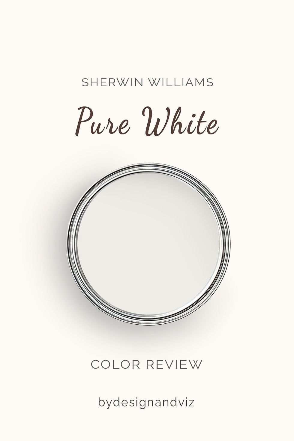
Pure White has an LRV of 84, which puts it firmly in the clean, bright white category. Its undertone is a gentle warm beige-yellow, held well back. It reads as white first. The warmth is felt rather than seen. That balance is why it has become the default soft white for so many schemes.
In practice, Pure White is the more forgiving of the two in difficult light. In a north-facing room the warm undertone lifts it away from grey and gives the walls a clean, finished look. In strong sun the warmth rises slightly toward a soft cream, which most rooms absorb easily. If your shortlist also includes a creamier, more traditional white, the Dover White vs Pure White guide shows exactly where Pure White stops and a true cream begins.
Its other strength is cabinetry and joinery. Pure White gives doors, panelling and skirting a crisp, defined edge without the sterile feel of a stark white. Against warm oak or brass it looks intentional. Against cool grey stone it holds its own, which Snowbound cannot always do in reverse.
The Real Difference Between Snowbound and Pure White
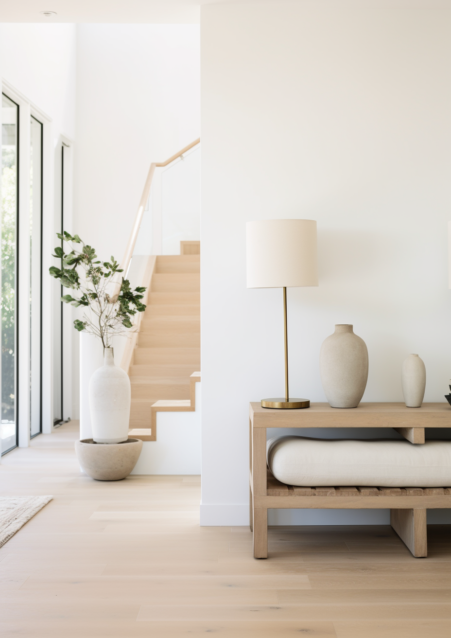
The simplest way to explain it: Snowbound is a soft white that stays neutral. Pure White is a clean white that stays warm. Side by side in good light, Snowbound looks slightly greyer and more muted. Pure White looks brighter and a touch warmer. The difference is small in a swatch and obvious on a full wall.
The LRV gap is one point, 83 against 84, and it tells you almost nothing. Both reflect nearly identical amounts of light. What separates them is undertone, not brightness. Choose by the temperature of your room, not by the number on the card.
Trim is where the choice shows most clearly. Pure White trim on Snowbound walls is a clean, reliable pairing. The slight step up in brightness and warmth gives joinery definition without harshness. The reverse is riskier, because Snowbound trim beside Pure White walls can look faintly grey and tired. For a deeper look at how Pure White holds its ground against another well-known soft white, the Pure White vs White Dove guide compares both colors across walls, trim and cabinetry so you can see how far its warmth actually travels.
Not sure which one is right for your room? A Color Direction consultation gets you a full custom palette built around your space - book yours here. |
When to Choose Snowbound
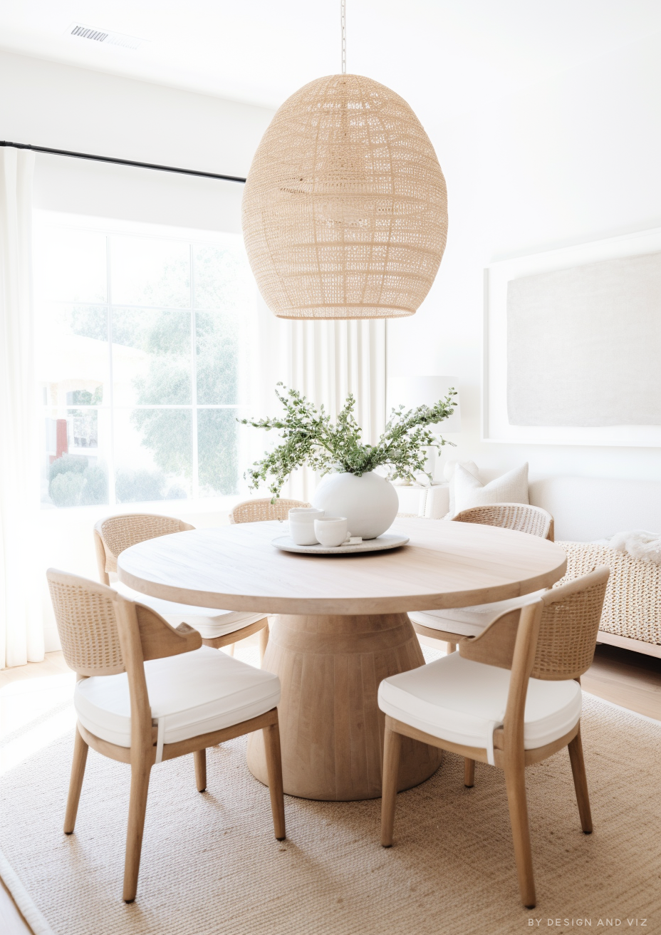
Choose Snowbound when the room is bright, the materials are cool or neutral, and the brief is calm rather than crisp. That means south or west-facing rooms with plenty of daylight, where the grey undertone stays soft and never turns heavy.
It suits interiors built around cool stone, grey-washed flooring, chrome or nickel fixtures and linen-toned fabrics. Scandinavian, coastal and contemporary schemes are its natural home. In a kitchen with white quartz and stainless appliances it sits comfortably where a warmer white would look out of place.
Avoid Snowbound in north-facing rooms and beside warm oak or terracotta. It will look flat in the first and cold in the second.
When to Choose Pure White

Choose Pure White when the light is mixed or cool, the materials vary, and you need a clean white that still feels warm. North-facing rooms, open-plan spaces and any room where warm and cool finishes sit side by side are its strongest territory.
It is the better choice for kitchen cabinets, built-ins and trim. The slightly higher LRV gives joinery crisp definition, and the gentle warmth works with brass, nickel and oak alike. If you want one white across the whole house, this is the safer pick.
Avoid Pure White where you want a muted, grey-leaning softness. Beside Snowbound in the same light, Pure White looks brighter and slightly warmer, which can feel too crisp for a minimalist or coastal scheme.
How the Pairings Differ

For Snowbound on walls, Pure White is the most natural trim choice. It adds soft definition and a hint of warmth that stops the walls looking cold. Extra White is the alternative for a sharper contrast. Avoid warm cream trim, which will make Snowbound look grey by comparison.
For Pure White on walls, Extra White on trim gives a crisp finish, while Pure White on both walls and trim creates a seamless, calm scheme. That tone-on-tone approach works well in bedrooms and hallways, where continuity matters more than contrast.
For flooring, Snowbound pairs best with grey-washed oak, pale stone and neutral tile. Pure White is far more flexible, handling warm oak, limestone and mixed-tone floors without an undertone clash. Snowbound against honey-toned timber is the combination I steer clients away from.
For hardware, Snowbound suits chrome, brushed nickel and matte black. Pure White works with all of those and adds aged brass and brushed gold to the list. If your scheme mixes metals, Pure White is the less awkward host.
Architect's Verdict - Snowbound or Pure White?

The honest answer is that neither is better. They solve different problems.
Snowbound is the specialist. It does one thing very well: it delivers a calm, neutral, soft white in bright rooms with cool or neutral materials. In a south-facing coastal living room with pale stone and linen, it is more beautiful than Pure White. The calm is genuine.
Pure White is the more reliable all-rounder. Its gentle warmth keeps it clean in cool light, forgiving across mixed materials and flexible on walls, trim and cabinets. For most homes, and for any room where you are unsure about the light, Pure White is the safer choice and the better result.
The test I always use targets the worst case: your darkest, north-facing wall on an overcast morning. Paint a large patch of each, at least 30 by 30 inches, side by side on that wall, with your trim color beside them. Check at 9am in flat grey light, again at noon, and once more at dusk under lamplight. A pass for Snowbound is a soft, clean white with no grey cast against the trim. A pass for Pure White is a bright white with no beige or cream drift. If Snowbound looks dull at 9am, Pure White is your answer.
Frequently Asked Questions

Is Snowbound warmer or cooler than Pure White?
Snowbound is cooler and more neutral. It has a faint cool-grey lean, while Pure White carries a gentle warm beige-yellow undertone. The difference is subtle but visible side by side, particularly in north-facing light where Snowbound can look greyer.
Can I use Snowbound and Pure White in the same house?
Yes, and the pairing works well when Pure White is on the trim. Snowbound walls with Pure White trim gives gentle definition. Keep them in separate zones if the rooms get very different light, and always test the transition at doorways and ceilings.
Which is better for kitchen cabinets?
Pure White is the more flexible choice for kitchen cabinets. It handles warm oak, brass, white marble and stainless without an undertone clash. Snowbound works beautifully with cool stone and chrome, but can look flat beside warm timber. Always test in your actual kitchen light.
Which is better for a north-facing room?
Pure White handles north light better. Its warm undertone counters cool light and keeps the walls from going grey. Snowbound can turn flat and dull in the same room. If you love Snowbound, test it with warm artificial lighting first.
Does Snowbound look grey on the walls?
In low or cool light, it can lean slightly grey. In bright south or west light it reads as a soft, clean white. The grey is a faint undertone, not a visible tint, but it surfaces when the room has little natural light.
What is the LRV of Snowbound vs Pure White?
Snowbound has an LRV of 83 and Pure White has an LRV of 84. The one-point gap is negligible in practice. Both reflect nearly the same amount of light, so the real difference is undertone, not brightness.
Final Thought
Snowbound and Pure White are both excellent soft whites, and the choice is not about which is better. It is about which one your room can support. Light and materials decide it.
If your room is bright and your materials are cool or neutral, Snowbound will give you a calm, muted backdrop that few whites match. If your light is mixed or cool, or your finishes vary, Pure White is the more forgiving and ultimately more reliable choice. Buy sample pots of both, paint large patches side by side in your room, and check them at 9am, noon and dusk across a full day. The answer will be clear within 24 hours.
Want a complete colour scheme built around Snowbound or Pure White? Our design packages cover full palette selection, finish recommendations, and 3D visualisations - see our packages. |
About the Author
Beril Yilmaz is a qualified architect and interior designer based in the UK. She runs BY Design And Viz, a design platform covering paint colour reviews, interior design guidance, and residential design projects. Beril has specified both Sherwin-Williams Snowbound and Pure White across residential projects in the UK and internationally — Snowbound in bright, neutral-toned living spaces with cool stone and pale flooring, Pure White on kitchen cabinetry, joinery and north-facing rooms where a clean, warm white is needed, often in the same scheme with Pure White on the trim.


Comments