Dover White vs Pure White: The Comparison That Actually Helps You Decide
- Beril Yilmaz

- 5 hours ago
- 10 min read
Dover White and Pure White are both Sherwin Williams whites and both appear on shortlists when the brief involves warm, inviting whites for residential projects. The 2-point LRV gap between them is small. On a paint card they look like similar light whites. On a wall in a real room they serve entirely different purposes - and that difference is not just about brightness. It is about undertone direction, versatility, and the role each colour is designed to play in a scheme.
Dover White SW 6385 is a wall colour. At LRV 82 it has a direct warm yellow-cream undertone that commits to warmth clearly and deliberately - it is a colour you choose because you want the walls to read as warm, creamy, and specifically traditional. Pure White SW 7005 is primarily a trim colour. At LRV 84 it sits so close to neutral that its near-imperceptible warmth makes it the most universally versatile white in the SW range - it works alongside virtually every wall colour without creating undertone conflict. Dover White wants to be seen. Pure White wants to make everything else look better.
This guide covers exactly how Dover White and Pure White differ in undertone, character, role, and application - with a clear verdict on which one belongs on your walls, which one belongs on your trim, and whether there is a scenario where the choice between them is genuinely difficult.

At a Glance
| Dover White SW 6385 | Pure White SW 7005 |
Brand | Sherwin Williams | Sherwin Williams |
LRV | 82 - bright warm white, reads as committed cream-quality white | 84 - bright near-neutral white, reads as clean versatile white |
Colour category | Warm white - committed yellow-cream, wall colour | Near-neutral white - almost no undertone, the universal trim white |
Undertones | Direct warm yellow-cream - committed, clearly warm, traditional | Faintest warm quality, essentially neutral - versatile, universal |
Character | Warm, creamy, traditional - announces its warmth clearly | Clean, crisp, near-neutral - provides definition without taking a colour position |
Primary role | Wall colour in traditional and warm schemes | Trim colour alongside almost any SW wall colour |
North-facing | Risky - yellow-cream needs warm light to avoid reading flat | Excellent - near-neutral holds perfectly in any light condition |
South-facing | Beautiful - yellow-cream glows warmly | Clean and bright - does not change character with light direction |
Open-plan | Good in warm-lit zones; yellow risk in north-facing zones | Excellent - utterly consistent across any orientation |
On walls | Warm cream backdrop - traditional and committed | Possible but reads as near-white rather than warm white |
On trim | Reads as wall colour on trim - too warm for most trim applications | Outstanding - the most reliable SW trim white across any wall colour |
On cabinets | Beautiful warm cream cabinet colour | Clean, versatile cabinet white - contemporary and transitional |
Use together? | Yes - Pure White on trim is the most reliable choice alongside Dover White walls | Dover White on walls with Pure White on trim is the standard and correct combination |
Style fit | Traditional, transitional, farmhouse, warm coastal | Every style - contemporary, traditional, transitional, farmhouse, coastal |
Architect's pick | When warm creamy wall colour is the brief | When the most reliable, universally compatible trim white is the brief |
SW Dover White SW 6385 - What It Really Looks Like
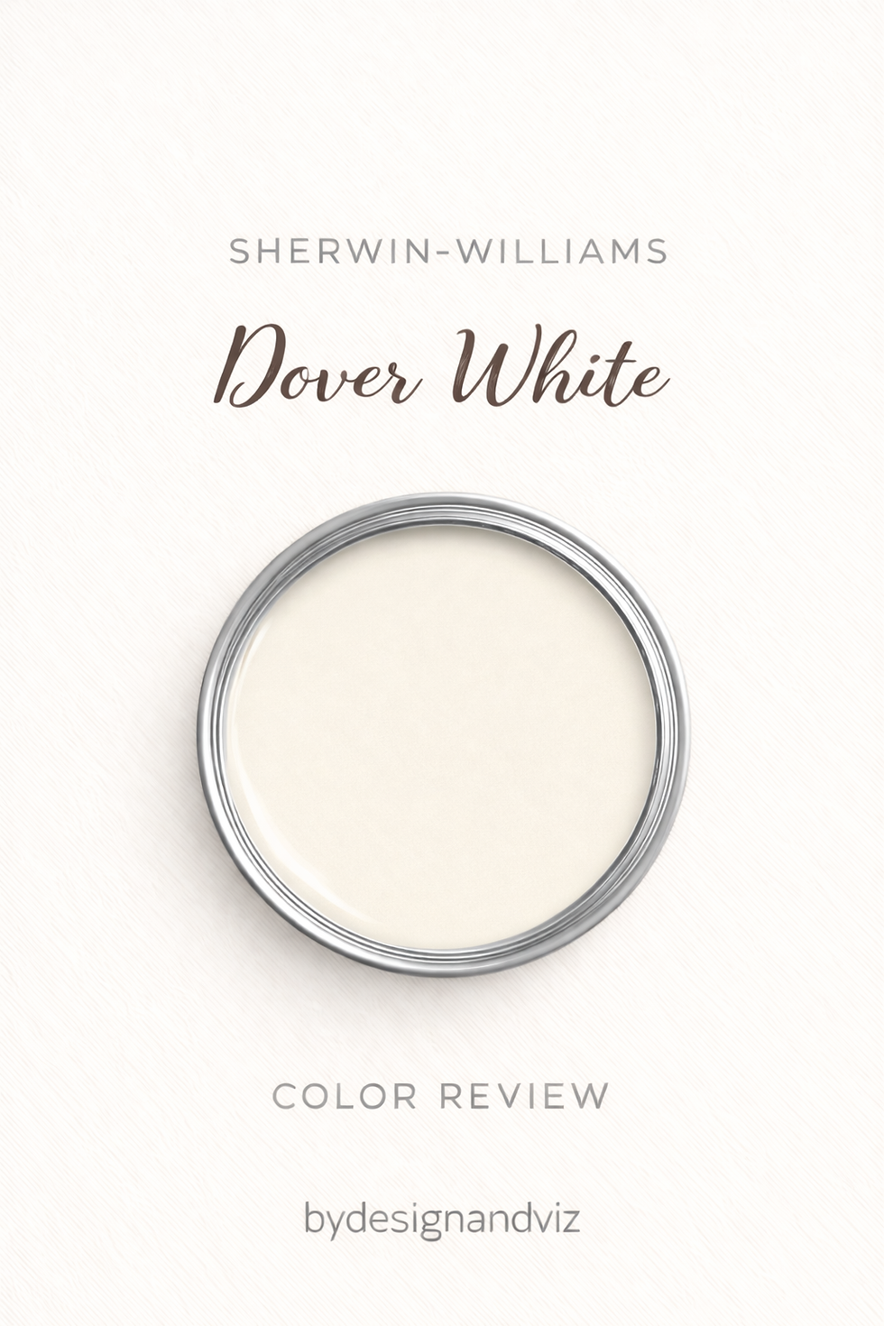
Dover White has an LRV of 82 and a direct warm yellow-cream undertone that commits to warmth clearly and deliberately. In south-facing rooms with warm natural light it is genuinely beautiful - the yellow-cream activates and rooms feel rich, creamy, and specifically traditional. On kitchen cabinets it creates a warm cream result that suits farmhouse and transitional kitchens particularly well. The warmth is front and centre and it makes no apology for it.
In my practice Dover White works best when every design decision in the room is aligned with its warmth direction - warm wood floors, warm stone, brass hardware, south or west-facing light. I have specified it on a traditional kitchen renovation where the client's brief was "the warmest cream possible" and in that context, with unlacquered brass hardware, warm Cotswold stone countertops, and south-facing windows, it was one of the most beautiful results I have delivered. In that same client's utility room which faced north with no warm artificial lighting - a different story. Dover White demands the right conditions. Pure White does not. For the full comparison of Dover White against the SW off-white it is most often directly shortlisted against, the Dover White vs Alabaster guide covers every condition in detail.
SW Pure White SW 7005 - What It Really Looks Like

Pure White has an LRV of 84 and an undertone that sits so close to neutral it is almost imperceptible. There is the faintest warm quality - just enough to prevent it reading cold or clinical - but it is so restrained that most people register Pure White simply as a clean, bright white rather than a warm white. That near-neutrality is its defining quality and its greatest practical strength.
Pure White is the trim colour I specify most consistently in SW-system residential projects. It works alongside warm wall colours like Agreeable Gray, Accessible Beige, and Dover White without introducing a warmth conflict. It works alongside cool or complex wall colours like Repose Gray without activating undertone problems. It works on trim, ceilings, joinery, and cabinets with equal reliability. In fifteen years of residential specification I have never had an undertone complaint about Pure White on trim. It is not a colour that announces itself. It is a colour that makes every other decision in the room look better. For how Pure White compares to Alabaster - the other most commonly used SW trim white - the Alabaster vs Pure White guide covers when Alabaster is the warmer alternative worth considering.
The Real Difference Between Dover White and Pure White

Dover White is a wall colour. Pure White is a trim colour. That single distinction resolves the comparison for most people. They are not alternatives for the same brief - they serve different roles in a scheme and in fact work best when used together.
Dover White commits to warmth and reads as a deliberate cream-quality colour decision on a wall. Pure White commits to neutrality and reads as clean, crisp definition on trim without taking a colour position. The 2-point LRV gap is almost invisible in practice. The undertone difference - warm yellow-cream versus near-neutral - determines everything about how each colour performs and what role it should play.
The standard, correct, and most reliable combination for Dover White schemes is Dover White on walls with Pure White on trim. This is one of the most consistently used wall-and-trim relationships in SW residential specification. The near-neutral crispness of Pure White provides clean architectural definition against Dover White's cream warmth. The contrast reads as considered and classic. It is the trim relationship I specify on virtually every Dover White project - traditional kitchens, farmhouse living rooms, warm-palette transitional schemes. The warm-cream walls are defined by the near-neutral trim, and both colours look better for the relationship than they would alongside any other pairing.
Not sure which one works for your room? A colour consultation is included in all our design packages - book directly here. |
When to Choose Dover White

Choose Dover White when the brief is warm, creamy wall colour with traditional character. South and west-facing rooms with good natural light. Traditional, farmhouse, and warm transitional interiors where cream warmth is specifically part of the design intent. Rooms where the material palette is entirely warm - warm wood, warm stone, brass hardware - and the brief calls for walls that commit to that warmth direction. Kitchen cabinets where a warm cream result is specifically wanted.
Do not use Dover White on trim alongside any wall colour - the yellow-cream undertone reads as a wall colour on trim rather than a crisp trim white, and creates an unresolved near-match with almost any wall colour it is placed next to. Pure White is the correct trim choice for Dover White walls.
When to Choose Pure White

Choose Pure White when the brief is the most versatile, universally reliable trim white in the SW range. Trim, skirting, architrave, window frames, and doors alongside almost any SW wall colour. Ceilings in any room. Contemporary kitchen cabinets where a clean, near-neutral result is the goal. Any room where the wall colour is warm and the trim needs to provide clean definition without introducing warmth of its own.
Pure White on walls is possible but delivers a near-white rather than a warm white result. If warmth on the walls is the brief, Dover White, Alabaster, or another warm SW white is the correct choice. Pure White on walls is best suited to contemporary and minimal schemes where near-neutral white walls are specifically the goal and the brief does not require warmth from the walls themselves.
How the Pairings Differ

Dover White on walls with Pure White on trim is the standard and most reliable relationship. The near-neutral crispness of Pure White provides clean definition against Dover White's cream warmth without undertone conflict. Extra White SW 7006 on trim gives a slightly brighter, crisper result for schemes that call for more definition. Alabaster SW 7008 on trim gives a warmer, more tonal result where the trim reads as part of the same warm family as the walls - suitable for the most committed warm traditional schemes but risks reading flat in rooms with limited light.
Pure White on walls with Dover White on trim is a combination to avoid. Dover White reads as a wall colour on trim - the yellow-cream undertone makes the trim feel heavy and off-white rather than crisp and defining. Any scheme using Pure White on walls needs a trim that is either the same colour (Pure White throughout) or slightly brighter (Extra White SW 7006). Never use a warmer or creamier white on trim than on walls.
For flooring, Dover White on walls is most natural above warm wood floors where the shared warmth direction creates cohesion. Pure White on walls handles the full range of floor finishes because the near-neutral undertone creates no tension with any floor material. This is part of what makes the Dover White walls and Pure White trim combination so effective - the warm wall colour defines the character of the room while the near-neutral trim bridges the relationship between the walls and any floor material.
For hardware, Dover White walls suit warm metals - aged brass, warm bronze, and matte gold complement the yellow-cream direction. Pure White trim handles any hardware finish equally well - the near-neutral quality creates no conflict with brushed nickel, chrome, matte black, or aged brass. This versatility is one of the reasons Pure White on trim works so reliably across the full range of SW wall colour schemes.
Architect's Verdict - Dover White or Pure White?

This comparison resolves more quickly than almost any other white VS post because the two colours are designed for different roles.
If the brief is warm, creamy, traditional wall colour with committed yellow-cream warmth - Dover White on walls with Pure White on trim. That is the correct and standard specification for Dover White schemes and it works consistently well in south-facing rooms with warm materials.
If the brief is the most reliable, universally compatible trim white in the SW range - Pure White on trim. Alongside Dover White walls, alongside Agreeable Gray walls, alongside Repose Gray walls, alongside Accessible Beige walls - Pure White is the trim white I reach for first in any SW scheme where I am uncertain which direction the palette will settle. It resolves almost every trim decision by refusing to take a colour position of its own.
The only scenario where this comparison is genuinely difficult is if someone is trying to choose one colour for both walls and trim throughout a whole house. In that case the answer is still clear: Dover White cannot serve as both because its yellow-cream reads as wall colour on trim. Pure White can serve as both in a contemporary near-neutral whole-house scheme - but if warmth is needed on the walls, Dover White is the wall colour and Pure White is the trim white. They work together. They do not compete.
Frequently Asked Questions

Is Pure White lighter than Dover White?
Yes - by 2 LRV points. Pure White has an LRV of 84 and Dover White has an LRV of 82. The gap is small and almost invisible in practice. The meaningful difference is undertone character: Dover White has a committed warm yellow-cream undertone that reads as a wall colour. Pure White has an almost imperceptible near-neutral undertone that reads as a universal trim white.
Can I use Pure White on trim with Dover White on walls?
Yes - this is the standard, correct, and most reliable trim choice for Dover White walls. The near-neutral crispness of Pure White provides clean architectural definition against Dover White's cream warmth without undertone conflict. It is the combination I specify on virtually every Dover White project.
Can I use Dover White on trim with Pure White on walls?
No. Dover White reads as a wall colour on trim - the yellow-cream undertone makes it feel heavy and off-white rather than crisp and defining. Any scheme using Pure White on walls needs trim in Pure White itself, Extra White SW 7006, or another near-neutral or cool-leaning white.
Which is better for north-facing rooms?
Pure White handles north-facing rooms significantly more reliably than Dover White. The near-neutral undertone reads consistently clean in any light condition without the yellow-cream risk that Dover White's more committed undertone carries in cool indirect light. For north-facing rooms within the SW warm white range, Pure White on walls is the more reliable specification. Dover White in north-facing conditions needs warm 2700K artificial lighting to hold its warmth.
What is the LRV of Dover White vs Pure White?
Dover White SW 6385 has an LRV of 82 and Pure White SW 7005 has an LRV of 84. The 2-point gap is almost invisible in practice. The meaningful difference is entirely in undertone character and role: Dover White is a committed warm cream wall colour, Pure White is the near-neutral universal trim white.
Final Thought
Dover White and Pure White are not competing for the same brief. They are designed for different roles in a scheme and perform best when used together - Dover White on walls to deliver committed cream warmth, Pure White on trim to provide clean, near-neutral definition.
Warm creamy traditional wall colour in a south-facing room with warm materials - Dover White on walls, Pure White on trim. Most reliable universal trim white for any SW wall colour - Pure White, every time. The combination of Dover White walls and Pure White trim is one of the most consistently successful SW warm-palette specifications. Sample Dover White at large scale in your specific room. Pure White on trim needs no sampling - it works.
Want a complete colour scheme built around Dover White or Pure White? Our design packages cover full palette selection, finish recommendations, and 3D visualisations - see our packages. |
About the Author
Beril Yilmaz is a qualified architect and interior designer based in the UK. She runs BY Design And Viz, a design platform covering paint colour reviews, interior design guidance, and residential design projects. Beril has specified both Sherwin Williams Dover White and Pure White across residential projects in the UK and internationally - Dover White on walls in traditional and farmhouse schemes where committed cream warmth is the brief, Pure White on trim throughout those same schemes and in virtually every other SW residential project where a reliable, universally compatible trim white is needed.


Comments