


Strong White vs Ammonite: The Comparison That Actually Helps You Decide

Strong White is a white that leans grey. Ammonite is a grey that leans white. Same Farrow & Ball chalkiness, same contemporary-neutral family, and a gap of roughly nine LRV points between them. That gap decides everything. One reads as a wall left white. The other reads as a wall painted a colour.
I have used both across residential projects, and I often specify them together. Strong White keeps a room sharp and bright. Ammonite gives it body. Choose the wrong one and the room feels either clinical or heavier than the brief. The paint card hides this completely.
This guide covers the undertone split, how each colour behaves by light direction, the trim and flooring pairings that make or break them, and a worst-case light test to settle it.

At a Glance
| Strong White | Ammonite |
Brand | Farrow & Ball | Farrow & Ball |
LRV | Approx. 75 - reads as white; roughly nine points brighter than Ammonite | Approx. 66 - reads as colour; visibly deeper, a light stone rather than a white |
Colour category | Grey-based white - a cool-leaning architectural white | Grey-green stone neutral - a pale grey that carries real colour |
Undertones | Light grey with a trace of lilac; keeps the white crisp rather than creamy | Faint green-yellow beneath a clean grey; steady across the day and rarely turns pink or beige |
Character | Crisp and gallery-like; gives a room edges and clarity without any cream | Soft and grounded; gives a room a tonal, stone-washed depth that white cannot |
North-facing | Risky - the grey base has nothing to push against and can read cold and dull without warm materials | More forgiving than Strong White - the extra depth settles the room, though it needs warm timber to avoid flat grey |
South-facing | Excellent - strong light opens it into a clean, bright white with a hint of warmth | Good - strong light shows its green-yellow and keeps it fresh; the depth cuts glare |
Open-plan | Unifies zones with a continuous, even brightness; can look clinical beside warm timber | Works as a unifying tonal colour; can read differently between bright and dim zones |
On walls | A bright, edited backdrop that makes walls, ceilings and trim feel continuous | A soft, tonal backdrop that makes walls feel painted rather than left white |
On cabinets | Crisp, modern kitchens with stone, steel and matte black; can look stark beside warm oak | Calmer, warmer kitchens; ties to oak, brass and natural stone and hides marks better than white |
Use together? | Yes - Strong White on ceilings, trim and doors with Ammonite walls is the easiest tonal scheme in the range | Yes - Ammonite on walls with Strong White on woodwork; or Strong White walls with Ammonite on doors in a modern scheme |
Trim for each | All White for a crisper edge; Strong White itself works as trim against deeper walls | Strong White for a soft tonal step, or Wevet for a cleaner contrast (Farrow & Ball's own suggested pairing) |
Style fit | Contemporary, minimal, gallery-style, modern period | Contemporary, Scandinavian-leaning, Japandi, relaxed period |
Architect's pick | When the brief is a disciplined white wall and the room has enough warm material to offset the grey base | When you want a white-adjacent room with more body: tonal, calm and willing to commit a little to colour |
Farrow & Ball Strong White No. 2001 - What It Really Looks Like
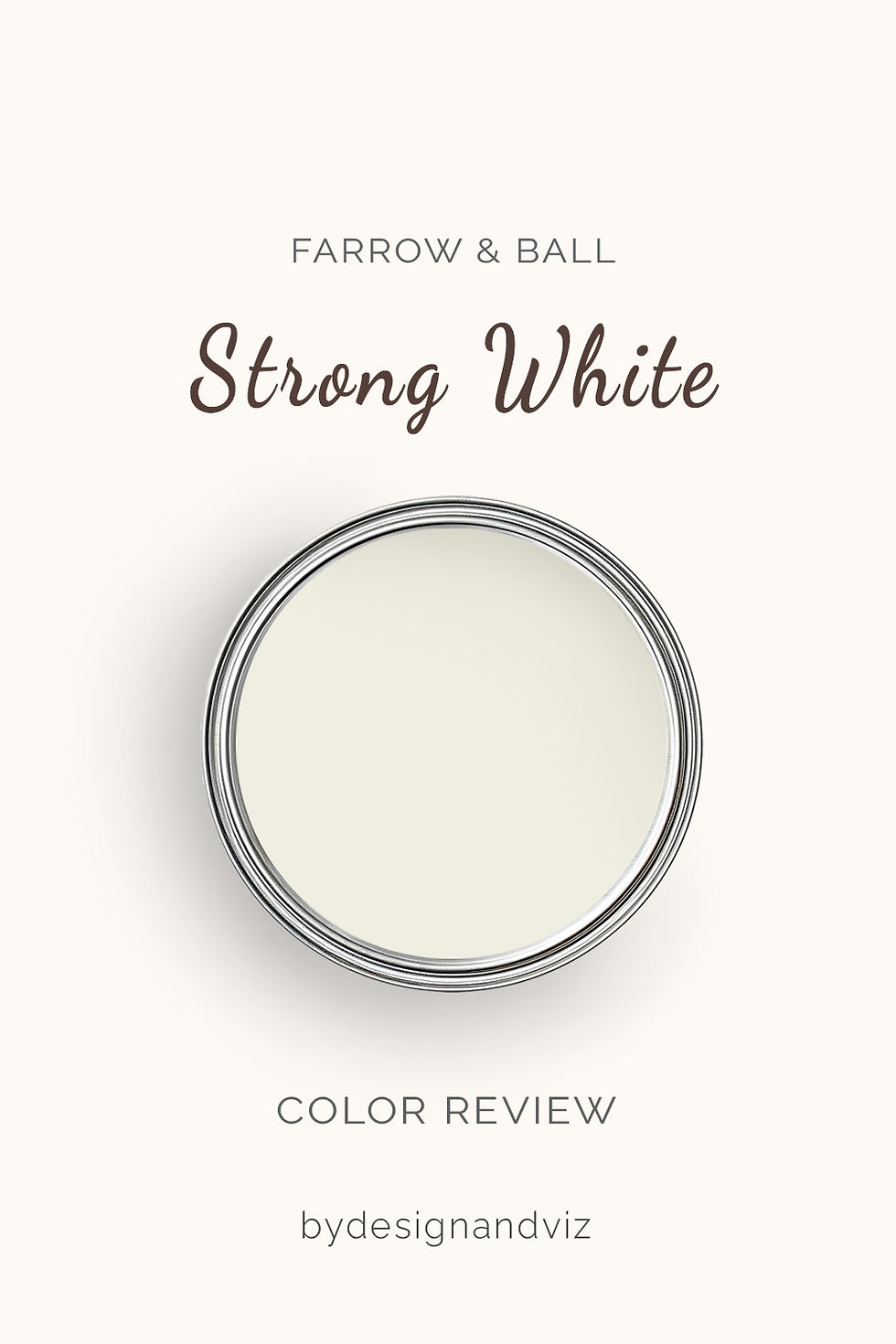
Strong White has an LRV of approximately 75, which puts it firmly in the light-white category. The undertone is what separates it from a standard white. A light grey sits underneath, with a faint lilac edge. In bright daylight it reads crisp and clean. In low light it softens to a pale warm grey. It is a white with a spine. It does not flatter. It clarifies.
Farrow & Ball positions it as a cool white, and that is accurate against a cream but not against a true brilliant white. Strong White sits between white and pale grey. Put it beside a stark white and the grey appears at once. Put it beside oak and linen and it looks restrained and quietly modern. It needs light to stay white.
If you are weighing it as a primary wall colour rather than trim, the Farrow & Ball Strong White review shows how the grey base behaves in low light, which is where a white like this goes wrong.
Farrow & Ball Ammonite No. 274 - What It Really Looks Like

Ammonite has an LRV of approximately 66, which puts it in the light-stone category rather than the white one. The undertone is a faint green-yellow under a clean grey. Farrow & Ball positions it as neither too warm nor too cool, and that is accurate. It reads as stone, not beige. In daylight it is clear and calm. There is no pink in it anywhere.
Where Strong White sharpens a room, Ammonite settles it. The depth means the wall absorbs light rather than bouncing it back, so rooms feel quieter and more enclosed. That suits bedrooms, halls and relaxed living rooms. It is a risk in rooms that already lack light. It needs warm accents to stay soft.
To see how Ammonite shifts between morning, midday and lamplight before you commit, my Farrow & Ball Ammonite review lays out the light-by-light behaviour and the whites that sit best beside it.
The Real Difference Between Strong White and Ammonite

The simplest way to explain it: Strong White is a white that leans grey. Ammonite is a grey that leans white. One disappears into the room. The other shapes it.
Unlike many close pairs, the LRV gap here is real. Roughly nine points separates a wall that reads as white from one that reads as colour. Depth does the sorting. Strong White reflects more light and keeps a room bright. Ammonite absorbs more and gives it body. Hold each against a sheet of white paper and the difference is immediate. Strong White looks pale grey. Ammonite looks like stone. Choose Strong White when brightness is the brief. Choose Ammonite when calm is the brief.
Together they form the easiest tonal scheme in the range. Ammonite on walls with Strong White on ceilings, trim and doors gives a soft step rather than a hard line. Reverse it and you get a pale grey frame around a white wall, which can look deliberate in a modern scheme and accidental in a period one. Ammonite's own suggested white is Wevet, so before you buy trim paint the Strong White vs Wevet guide shows how Strong White compares with that warmer option and which one suits your walls.
Not sure which one is right for your room? A Color Direction consultation gets you a full custom palette built around your space - book yours here. |
When to Choose Strong White
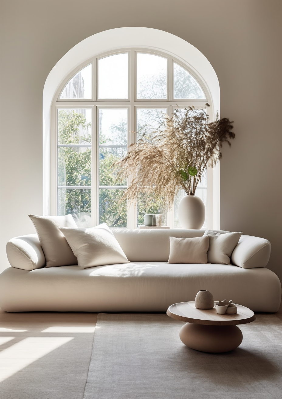
Choose Strong White when the room needs a crisp, disciplined white and has the light and warm materials to keep the grey base looking intentional. These are the conditions where it is the right answer.
South and west-facing rooms with strong natural light. Contemporary and minimal schemes where clean edges matter. Rooms with oak, linen and aged brass that bring the warmth the paint will not. Ceilings, trim and joinery that need to sit gently against a deeper wall colour. It rewards good light and warm materials.
Avoid it in dark, north-facing rooms with no warm materials. Avoid it where the brief is cosy or traditional. The grey will feel cold.
When to Choose Ammonite

Choose Ammonite when you want a white-adjacent room with real body, and a calm tonal wall matters more than crisp brightness. These are the conditions where it outperforms Strong White.
Rooms with changeable or moderate light, where a pure white would go dull. Bedrooms, halls and living rooms with a relaxed brief. Kitchens with oak, brass and natural stone. Schemes where Strong White on the woodwork gives a soft, layered finish. It holds its character when the light does not.
Avoid it in very dark rooms with little warm material. Avoid it where the brief is bright and gallery-crisp. The room will feel heavier than intended.
How the Pairings Differ
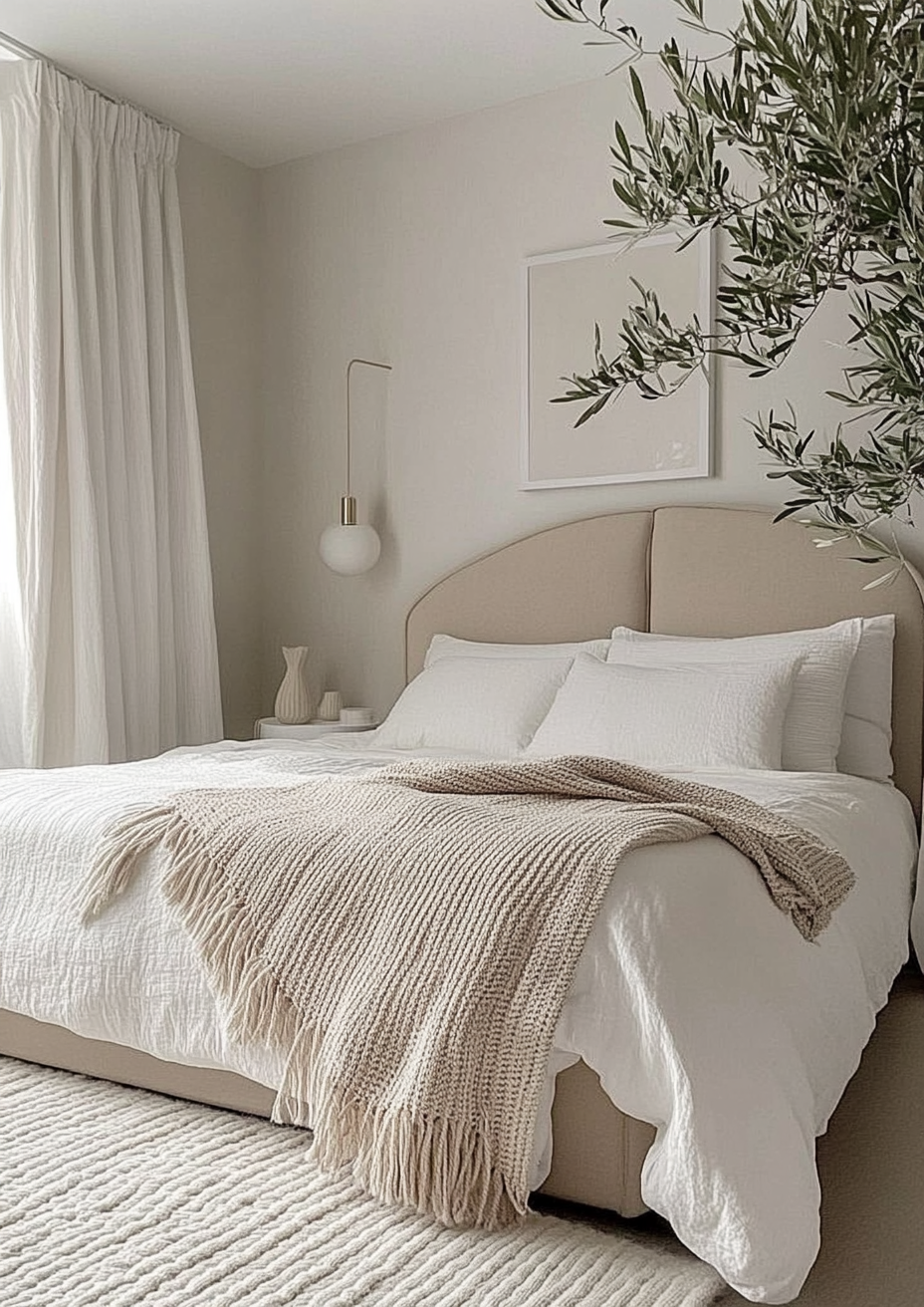
For Strong White on walls, All White on trim gives the crispest definition. It sharpens the edge without turning the walls grey. Strong White on both walls and trim creates a seamless, gallery-like finish. Avoid cream or warm white trim, which makes Strong White look cold and dingy.
For Ammonite on walls, Strong White on trim is the natural choice. The step is soft and tonal, and both colours share the same grey base. Wevet is the alternative for a cleaner contrast. Avoid warm cream trim, which makes the grey in Ammonite look cold.
For flooring, Strong White needs warmth underfoot. Oak, walnut and warm limestone offset the grey base. Cool grey tile makes the whole room feel clinical. Ammonite is more forgiving. It handles pale oak, grey-toned stone and polished concrete, though very cool floors in north light can push it flat.
For hardware, Strong White suits matte black, brushed nickel and aged brass. Polished chrome sharpens it further and suits a gallery brief. Ammonite suits aged brass, antique bronze and matte black. Brass warms it nicely. Chrome makes it look slightly cold.
Architect's Verdict - Strong White or Ammonite?

These two are neighbours rather than rivals. The real question is how much colour you want on the wall.
For bright rooms, modern schemes and anywhere a disciplined white is the brief, Strong White is the sharper answer. It keeps a room clean and gives edges real clarity. It also exposes weak light, so it rewards a good room.
For rooms with moderate or changeable light and a calm, tonal brief, Ammonite is the more forgiving colour. Its depth masks shifts in daylight and gives walls presence without committing to a heavy colour. It is the safer choice when you are unsure of your light.
Buy sample pots of both. Paint two large A2 patches on the wall facing away from the window, and hold a sheet of white card against each. Check them at 8 am on an overcast morning, then under a warm 2700K lamp at 8 pm. Strong White passes if it still reads as white rather than dull grey beside your ceiling or skirting. Ammonite passes if it stays soft stone without sliding into flat grey. Whichever passes both checks is your colour.
Frequently Asked Questions

Is Strong White lighter than Ammonite?
Yes - Strong White is noticeably lighter. The gap is roughly nine LRV points. Strong White reads as a white. Ammonite reads as a light stone with real colour. Published figures vary between sources, so treat both numbers as approximate.
Which is better for a north-facing room?
Ammonite is more forgiving in north light. Its depth settles the room, while Strong White can read cold and dull when the grey base has no light to push against. Test both on the north wall at midday on an overcast day before deciding.
Can I use Strong White and Ammonite together?
Yes, and it is the easiest tonal scheme in the range. Ammonite on walls with Strong White on ceilings, trim and doors gives a soft, layered finish. The two share a grey base, so the step looks deliberate rather than accidental.
Which is better for kitchen cabinets?
Strong White suits crisp, modern kitchens. Ammonite suits calmer, warmer ones. Strong White pairs with stone, steel and matte black. Ammonite ties in with oak, brass and natural stone. Always test on a cabinet door, not just a wall.
Does Strong White look grey on the walls?
In low light, yes. It sits between white and pale grey, so the grey base shows most in north-facing rooms and under cool artificial light. In strong daylight it reads as a clean, crisp white. Compare it with true white card to see exactly where it sits.
What is the LRV of Strong White vs Ammonite?
Strong White is approximately 75 and Ammonite approximately 66. Figures vary between sources, so treat both as approximate. The gap is large enough to see on a wall. That is why this pair separates more clearly than most.
Final Thought
Strong White and Ammonite are both excellent contemporary neutrals. The choice is not about quality. It is about whether the room needs brightness or body.
If your light is strong and your materials are warm, choose Strong White. If your light is moderate or changeable and the brief is calm, choose Ammonite. Sample both, paint large patches, and check them across a full day. The answer shows up by evening.
Want a complete colour scheme built around Strong White or Ammonite? Our design packages cover full palette selection, finish recommendations, and 3D visualisations - see our packages. |
About the Author
Beril Yilmaz is a qualified architect and interior designer based in the UK. She runs BY Design And Viz, a design platform covering paint colour reviews, interior design guidance, and residential design projects. Beril has specified both Strong White and Ammonite across residential projects in the UK and internationally — Strong White on ceilings, joinery and in bright contemporary living spaces, Ammonite on walls in calmer bedrooms and hallways, often in the same scheme with Strong White on the woodwork.



Comments