Your Guide to Wabi Sabi Interior Design: Honest Advice Designers Wish You Knew
- Beril Yilmaz

- Jan 9
- 8 min read
Wabi sabi interior design is one of those styles people misunderstand instantly. They think it means “unfinished,” “rustic,” or “I don’t have time to decorate.” In reality, it’s highly intentional. The difference is that the intention is about restraint, materials, and honesty — not matching sets and perfect symmetry.
This is also why wabi sabi interior design can be a relief if you’re stuck in a loop of buying, styling, editing, and still feeling like something is slightly off. When a room relies on a thousand small extras to look complete, it’s usually missing a stronger foundation.
So let’s do this properly. Ahead, we’re breaking down wabi sabi interior design into clear, usable decisions you can apply room by room — what to prioritise, what to skip, and how to make it look considered rather than accidental.
At A Glance
-Wabi sabi interior design explained in plain English
-What makes a room look intentional instead of unfinished
-Which materials create the right finish and patina over time
-How to choose colours that don’t fight the architecture
-Furniture rules that stop a room feeling staged
-Styling boundaries that keep surfaces edited
1. Wabi Sabi Interior Design: What It Actually Means in Real Homes

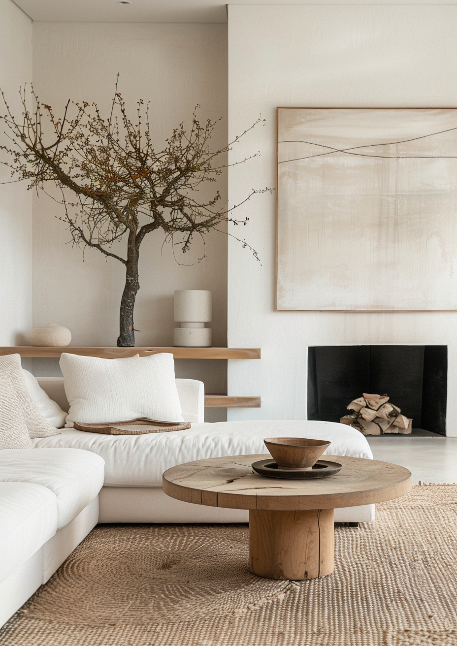
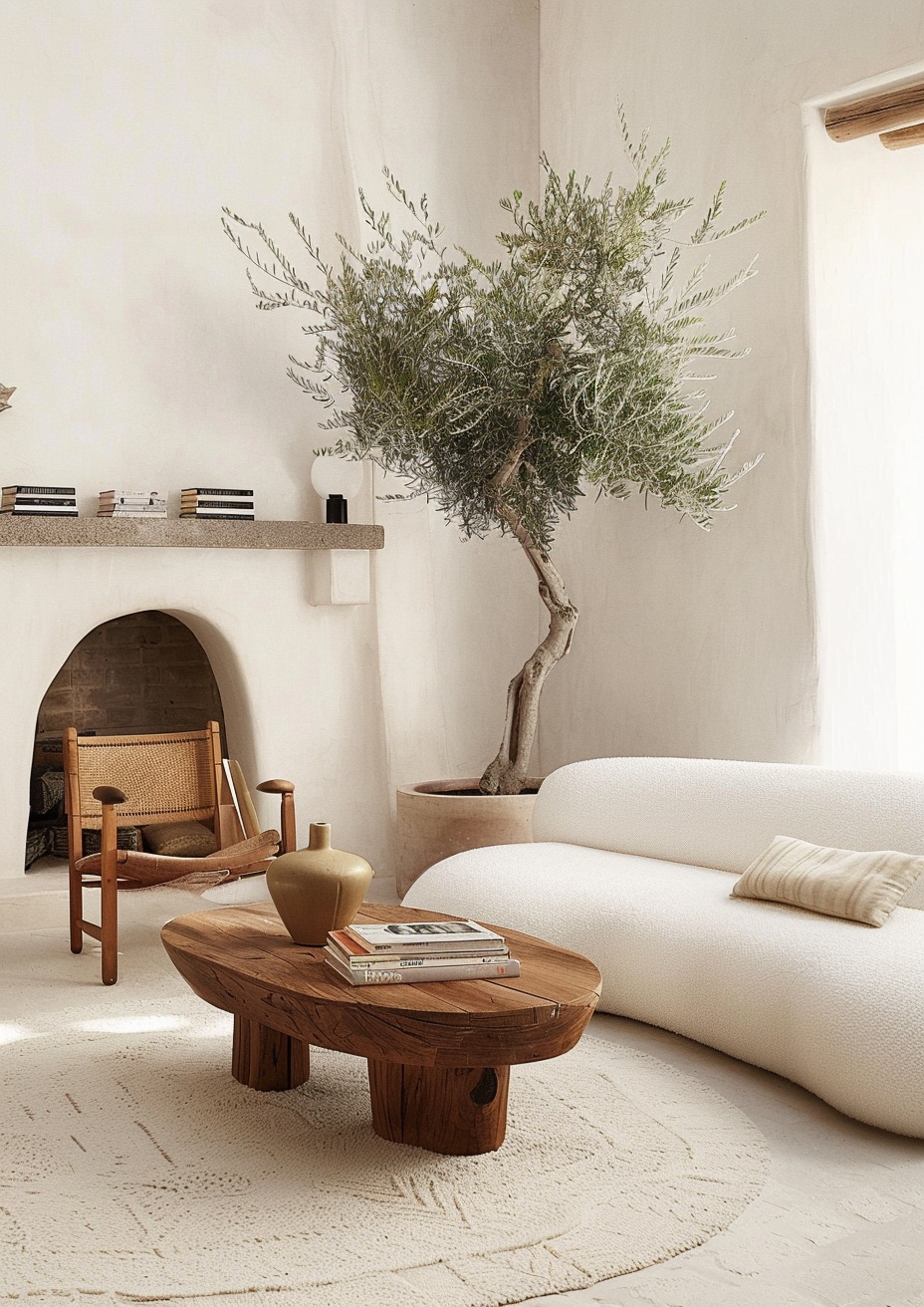
Wabi sabi interior design is rooted in the idea that beauty can come from age, irregularity, and simplicity. In practice, it means choosing fewer items, letting materials speak, and allowing a home to look like it’s lived in — without trying to hide every mark or texture change.
The goal isn’t to make a room look empty. It’s to remove the pressure to make everything new, shiny, and identical. A timber table with visible grain, a stone surface with variation, or a ceramic vase with slight asymmetry can carry more visual weight than a shelf full of small decor.
When people say wabi sabi interior design feels “different,” they usually mean it feels less performative. It doesn’t rely on constant styling to hold together.
Designer Tip: If you can remove ten small items and the room looks better, you’re already moving toward wabi sabi interior design.
YOU MAY LIKE

2. Wabi Sabi Interior Design: The Three Principles That Keep You on Track
If you only remember one thing, let it be this: wabi sabi interior design is not a shopping list. It’s a filter for decision-making.
Use these principles to check every purchase and styling choice.
-Imperfection: choose items with variation, visible grain, hand-finished edges, or natural colour shifts
-Impermanence: favour materials that develop patina rather than looking damaged when they age
-Simplicity: remove extras so the key pieces can carry the room
This is where people go wrong: they buy “wabi sabi objects” but keep the same clutter level, the same shiny finishes, and the same overly coordinated palette. The result looks themed rather than lived.
Designer Tip: If everything in a room looks brand new at the same time, wabi sabi interior design won’t read — even if the colours are right.
3. Wabi Sabi Interior Design: Start With Surfaces Before Decor

Wabi sabi interior design works best when the backdrop is doing real work. Think walls, floors, and large built-in elements. If those surfaces look flat and synthetic, the room will rely on accessories to create depth — and that’s where overdecorating starts.
Instead, aim for surfaces with visible texture and honest finish. Limewash, clay paint, microcement, timber with grain, stone with natural movement, or matte plaster-style walls all create the kind of visual interest that doesn’t require extra styling.
If a full surface change isn’t realistic, focus on one “anchor surface” that sets the tone: a textured wall finish behind a bed, timber slatted panelling used sparingly, or a matte paint finish with depth rather than crisp brightness.
Designer Tip: In wabi sabi interior design, the room should still feel finished when every shelf is empty.
Let’s Map Out Your Space Together
If you're planning a makeover and want a designer’s eye on how stick on tiles could work in your home, we’d love to help you visualise the transformation. Book a free 30-minute consultation and let’s sketch out a layout that feels tailored to your space.
4. Wabi Sabi Interior Design: Choose Materials That Improve With Use

Materials are the shortcut to making wabi sabi interior design look authentic. The easiest way to miss the mark is picking finishes that only look good when untouched.
Prioritise materials that age well: timber that deepens in tone, leather that develops character, stone with natural variation, linen that relaxes over time, and metals that patinate rather than peel. Even within budget ranges, you can choose finishes that look less factory-perfect: brushed, honed, matte, tumbled, washed.
This isn’t about “rough” finishes. It’s about finishes that don’t punish you for living in your home.
Designer Tip: If you’re choosing between glossy and matte for a wabi sabi interior design scheme, matte usually supports the look more convincingly.
5. Wabi Sabi Interior Design: Colour Choices That Don’t Look Flat or Trendy

Colour in wabi sabi interior design is usually restrained, but it’s not boring. The trick is choosing shades with undertone complexity — colours that shift slightly through the day rather than sitting as one solid block.
Here are designer-trusted paint colours that tend to work well for wabi sabi interior design backdrops in UK homes:
-Farrow & Ball Skimming Stone for a neutral that doesn’t look stark
-Farrow & Ball Cornforth White for a deeper grey without looking cold
-Little Greene Slaked Lime for a chalky off-white effect
-Dulux Heritage Mallow White for a muted neutral with depth
-Crown Period Collection Canvas Cotton for a grounded light tone
-Farrow & Ball Pigeon for a green-grey that reads architectural
Keep ceilings and trim consistent where possible. Strong contrast often pulls a room toward a sharper, more graphic look than wabi sabi interior design typically aims for.
Designer Tip: When in doubt, pick one main wall colour and repeat it across spaces; wabi sabi interior design often looks stronger when the home feels connected.
6. Wabi Sabi Interior Design: Lighting That Makes the Room Look Intentional

Lighting is where many wabi sabi interior design rooms fall apart, because the wrong light makes textures look harsh and materials look cheap.
Aim for layered lighting: ceiling fixture for general light, table lamps for eye-level glow, and a floor lamp where you need task support. Choose shades in linen, paper, or matte glass rather than shiny metal domes that throw glare.
Also, pay attention to bulb temperature. In most living spaces, 2700K tends to flatter natural materials and avoid that clinical look. Dimmers matter here, because wabi sabi interior design relies on subtlety — you want control over how the room reads at different times of day.
Designer Tip: If you can only upgrade one thing, swap the bulbs first; it’s the fastest way to see your materials properly.
Your Renovation, Simplified
If you’re diving into a big home update, our Ultimate Renovation Planner can make the entire process far easier. From material planning to budgeting, it’s designed to keep your project organised while
helping you visualise every detail. Explore the planner and plan your makeover with clarity.
7. Wabi Sabi Interior Design: Furniture Rules That Stop a Room Feeling Staged

Wabi sabi interior design furniture tends to look grounded, not sculptural-for-the-sake-of-it. That doesn’t mean everything has to be low and minimal — it means the shapes should feel honest, the scale should make sense, and the layout should support how you actually use the room.
Mixing old and new helps. A vintage sideboard paired with a clean-lined sofa often reads more believable than buying everything from one collection at once. Look for pieces with visible joinery, natural grain, and proportions that don’t overpower the room.
Avoid over-matching. If your coffee table, side tables, and shelving are all the same timber tone and finish, the space can start looking like a showroom.
Designer Tip: In wabi sabi interior design, one strong, well-chosen piece will do more work than five “filler” pieces.
8. Wabi Sabi Interior Design: Textiles That Add Depth Without Looking Styled

Textiles are where you can add depth without adding clutter. Linen curtains, wool rugs, cotton throws, and cushions in varied weaves create enough variation that you don’t need loud patterns to compensate.
Keep your palette tight and your textures varied. For example: a flat-weave rug, a boucle cushion, and a linen curtain can all be within the same colour family but still create contrast through texture alone.
One thing to avoid is the “newness problem.” If every textile looks crisp and unused at the same time, the room can feel staged. Choose fabrics that relax over time and don’t require constant perfect arrangement.
Designer Tip: If your cushion lineup looks too coordinated, remove one and replace it with a different texture in the same colour family.
9. Wabi Sabi Interior Design: Styling Rules for Shelves, Tables, and Surfaces
Styling is where wabi sabi interior design becomes either elegant or chaotic. The goal is not empty surfaces — it’s edited surfaces.
Use these boundaries as a guide:
-Leave at least one third of a surface completely clear
-Choose fewer objects, but make them larger and more tactile
-Group items with different heights, but similar material tone
-Use one organic element, like a branch in a ceramic vessel, rather than multiple small decor pieces
-Avoid lines of identical items (matching candles, matching frames, matching vases)
If you love books, keep them — but treat them as structure, not scatter. Stacks can anchor a surface and give one sculptural object a place to sit.
Designer Tip: If you’re not sure what to remove, take everything off, put back only three items, then stop.
10. Wabi Sabi Interior Design: How to Make It Work in Small Spaces

Wabi sabi interior design can be a gift in smaller homes because it reduces visual noise. The mistake is interpreting “simple” as “tiny furniture.” In small rooms, undersized furniture often looks apologetic and makes the space feel less functional.
Instead, choose fewer pieces at the right scale. One properly sized sofa beats two small chairs and a cramped side table arrangement. One substantial rug can define the room more effectively than several small ones.
Storage matters, too. A closed storage piece in timber or matte finish can keep the room looking edited without removing the things you genuinely use.
Designer Tip: If a small room feels busy, don’t add more storage baskets; reduce the number of items you’re trying to display.
Conclusion
Wabi sabi interior design isn’t about making your home look unfinished. It’s about making it feel honest. The rooms that land best are the ones built on strong surfaces, considered materials, and a layout that doesn’t need constant styling to look complete.
If you take one thing from this guide, let it be this: the goal is not perfection, and it’s not emptiness either. It’s intention, restraint, and materials that hold up to daily life.
Once those foundations are right, everything else becomes easier. You buy less, you style less, and your home starts looking like it belongs to you — not like it’s trying to win a trend cycle.
FAQ: Wabi Sabi Interior Design
What is wabi sabi interior design in simple terms?
Wabi sabi interior design is a style approach focused on simplicity, natural materials, and intentional imperfection, creating rooms that feel considered rather than overly staged.
How do I start wabi sabi interior design without renovating?
Start by editing surfaces, reducing small decor, and choosing one or two tactile materials (like linen, timber, or matte ceramics) that you repeat throughout the room.
What colours work best for wabi sabi interior design?
Muted neutrals and complex undertones tend to work best, especially matte finishes that highlight texture rather than high contrast schemes.
How do I keep wabi sabi interior design from looking unfinished?
Focus on strong foundational pieces, consistent materials, and clear boundaries for styling so the room reads intentional even when surfaces are mostly clear.
Start Your Dream Home Transformation
Our online design packages were created to make the entire process smoother, clearer, and far more enjoyable — no stress, no second-guessing. Whether you’re refreshing one room or reimagining your whole home, we guide you every step of the way with layouts, visuals, and a fully personalised design plan.
See our interior and exterior design packages to get started.
Author Bio
Beril Yilmaz is the founder of BY Design And Viz, an online interior and exterior design studio specialising in clear layouts, thoughtful architectural details, and design decisions that support how people actually live. With a background in architecture and a practical design approach, her work focuses on creating homes that feel considered, functional, and intentionally designed.


Comments