Greenblack Sherwin Williams: The Near-Black Designers Use When Black Feels Too Harsh
- Beril Yilmaz

- Jan 9
- 8 min read
A “black” paint sounds simple until you try it in a real home. Suddenly it reads blue, or chalky, or it turns every shadow into a hard edge. And the worst part is you often don’t notice what’s wrong until the room is finished and you’re standing there thinking, why does this feel so severe?
Greenblack Sherwin Williams is the paint colour we reach for when someone wants the impact of black, but not the harshness. Sherwin-Williams describes it as a black with a green undertone, which is exactly why it behaves differently on walls, cabinetry, and exteriors.
In this guide, we’re breaking down how Greenblack Sherwin Williams actually reads, where it performs best, what makes it shift, and the practical rules that stop it from looking accidental.
At A Glance
-Greenblack Sherwin Williams undertone and why it matters
-What the LRV means for real rooms
-Where Greenblack Sherwin Williams works best
-How to choose the right sheen for walls vs cabinets
-Colour pairings that make Greenblack Sherwin Williams look intentional
-Common mistakes that make it read flat or overly heavy
1. Greenblack Sherwin Williams: What It Really Is and Why It Is Not Just Black
Greenblack Sherwin Williams is SW 6994, and it sits in that near-black category where the colour isn’t “pure black” on the wall. It has a green undertone that becomes more visible depending on daylight direction, artificial lighting temperature, and what you pair it with. Sherwin-Williams calls it a cool black with a green undertone, and that “cool” detail matters because it affects trim whites, metals, and wood tones.
If you want a black that behaves like a graphic outline, Greenblack Sherwin Williams is usually not that. It’s a black that reads slightly softened at the edges, which is exactly why it can feel easier to live with than sharper blacks.
Designer Tip: If you’re choosing between “true black” and Greenblack Sherwin Williams, decide what you want the shadows to do. Greenblack tends to feel less stark because the undertone shifts the edge.
YOU MAY LIKE

2. Greenblack Sherwin Williams: The LRV That Explains Everything

LRV is the Light Reflectance Value, and Greenblack Sherwin Williams sits extremely low. Multiple sources place it around 4, which means it reflects very little light and will visually pull surfaces forward.
This is why it can look rich in a bright room and heavy in a dim one. It’s also why the same paint can look like a near-black wall in daylight and a flat block at night if your lighting plan is weak.
Designer Tip: Treat Greenblack Sherwin Williams like a material choice, not just a colour choice. With an LRV around 4, it needs lighting and contrast to look considered.
3. Greenblack Sherwin Williams: The Undertone Test That Stops Regret

The fastest way to understand Greenblack Sherwin Williams is to test it next to two things: a bright white and a warm white. Against a bright, cool white, the green undertone is easier to spot. Against a warmer white, it can read closer to charcoal.
Also, keep in mind that colour data supports what your eyes see. Greenblack is commonly represented around hex 373A3A and RGB values near 55, 58, 58, which signals it’s not a “dead black” but a balanced dark neutral with a slight green-cyan lean.
Designer Tip: Do a simple side-by-side test: Greenblack Sherwin Williams, your trim white, and one other black you were considering. You’ll immediately see whether Greenblack is the calmer option.
Let’s Map Out Your Space Together
If you're planning a makeover and want a designer’s eye on how stick on tiles could work in your home, we’d love to help you visualise the transformation. Book a free 30-minute consultation and let’s sketch out a layout that feels tailored to your space.
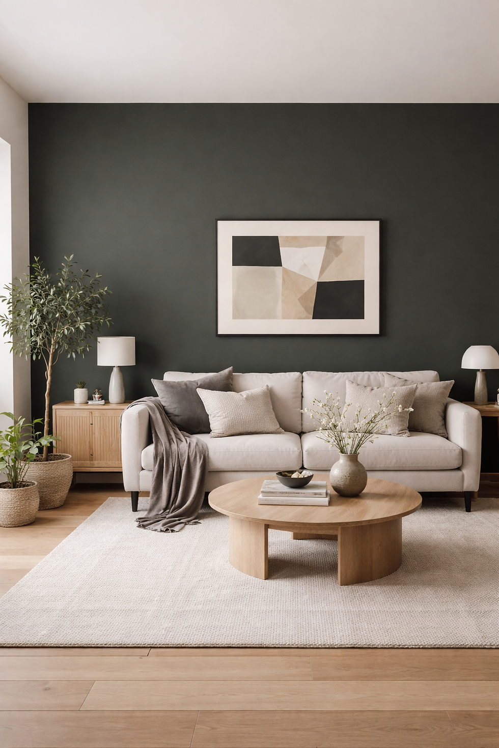
4. Greenblack Sherwin Williams: Where It Works Best in Real Homes

Greenblack Sherwin Williams has a specific strength: it makes architectural lines look sharper without needing decorative clutter. It’s also one of the most reliable near-blacks for built-ins and cabinetry because it gives depth without looking like a flat printed black.
Use it where you want structure, contrast, and a defined zone.
-Entry doors and interior doors where you want a statement without high-gloss drama
-Built-in cabinetry and shelving that needs a darker anchor
-Accent walls behind a bed, sofa, or media unit when the room needs direction
-Exterior cladding or siding when you want a dark house look with a softer edge than pure black
-Mudrooms and utility spaces where scuffs and fingerprints need a forgiving dark tone
Designer Tip: Pick one “hero surface” first. If you try to paint everything Greenblack Sherwin Williams in one go, you risk losing the contrast that makes it look intentional.
5. Greenblack Sherwin Williams: Cabinets Versus Walls Are Two Different Projects
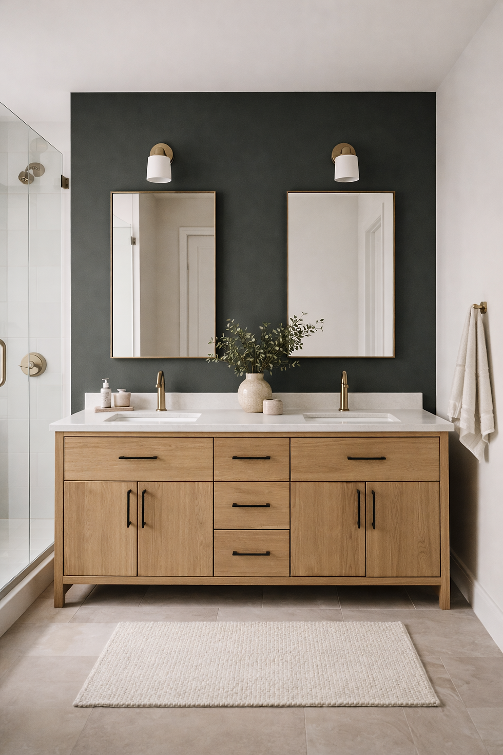
On cabinetry, Greenblack Sherwin Williams reads more uniform because the surface is broken up by doors, rails, and shadows. On a large wall, it reads more like a field of colour, so you notice undertone, roller texture, and lighting gaps more quickly.
Cabinets also bring hardware into the equation. Brass, blackened steel, and brushed nickel all behave differently against a green-leaning near-black.
If you’re aiming for kitchen cabinets, Greenblack is often chosen specifically because it can read as black in some lighting and show its undertone in others, which creates dimension without adding another colour.
Designer Tip: If Greenblack Sherwin Williams is going on cabinets, choose your hardware first. Hardware is what makes dark cabinetry look finished rather than heavy.
6. Greenblack Sherwin Williams: The Lighting Rule That Makes or Breaks It

With a low LRV colour, your lighting plan is not optional. In north-facing rooms, Greenblack Sherwin Williams can read deeper and more muted. In south-facing rooms, it can show more of the undertone and look slightly lighter during the day.
At night, warm bulbs can pull it towards a charcoal feel. Cooler bulbs can make the undertone more noticeable. Sherwin-Williams specifically notes pairing it with other cool neutrals, which is a hint about how they expect it to behave in balanced palettes.
Designer Tip: Before you paint, change the bulb temperature in the room and test again. It’s the cheapest way to avoid a “this looked different yesterday” problem.
7. Greenblack Sherwin Williams: Pairings That Make It Look High-End

Greenblack Sherwin Williams looks best when you give it clean contrast and one or two supporting tones that keep the palette disciplined. Sherwin-Williams suggests Quietude as a coordinating direction, which makes sense because it stays on the cooler, muted side.
Here are pairings that consistently make it look deliberate rather than random.
-Alabaster SW 7008 or Pure White SW 7005 for trim and ceilings when you want crisp contrast
-Repose Gray SW 7015 if you need a mid-tone that sits quietly in the background
-Quietude SW 6212 for a softer supporting wall colour that stays connected to the undertone
-White oak, ash, or walnut finishes to bring in natural contrast without fighting the undertone
Several paint guides also call out Alabaster, Pure White, and Repose Gray as strong partners, which aligns with how designers build dark-neutral palettes in real homes.
Designer Tip: Choose one white, one wood tone, and one metal finish alongside Greenblack Sherwin Williams, then repeat them. Repetition is what makes the scheme look designed.
Your Renovation, Simplified
If you’re diving into a big home update, our Ultimate Renovation Planner can make the entire process far easier. From material planning to budgeting, it’s designed to keep your project organised while
helping you visualise every detail. Explore the planner and plan your makeover with clarity.
8. Greenblack Sherwin Williams: Doors and Trim Without the Heavy Look

Painting doors in Greenblack Sherwin Williams is one of the most reliable ways to update a home without touching the layout. It frames sightlines, makes white walls look cleaner, and gives corridors more structure.
For trim, be selective. Full Greenblack trim can look sharp in the right architecture, but it can also compress a space if ceilings are low or daylight is limited. A more common approach is Greenblack doors with lighter trim and walls.
Designer Tip: If you want to try Greenblack Sherwin Williams on trim, start with one room and do the door first. If the door works, you’ll know the trim will.
9. Greenblack Sherwin Williams: Exterior Use Without the Painted-Over Look

Dark exteriors are everywhere, but the problem is many of them look like a single flat block from the street. Greenblack Sherwin Williams performs best outside when you break it up with material contrast.
Think light stone, lighter roof tones, timber details, or sharper white window surrounds depending on the style of the house. Because it’s not a pure black, it can read slightly softer on large exterior planes, especially in daylight.
Designer Tip: On exteriors, plan at least two contrasting elements: windows and one other detail such as soffits, a front door, or a timber feature. That’s what stops a dark paint from looking one-note.
10. Greenblack Sherwin Williams: Sheen Choices That Keep It Looking Intentional

Sheen is where many near-black projects go wrong. High sheen shows every surface issue and can look reflective in the wrong way. Flat finishes can look chalky if the prep isn’t right.
Use this as a practical starting point.
-Walls: matte or flat if the walls are smooth and you want minimal reflection
-Trim and doors: satin for a wipeable surface with controlled reflection
-Cabinets: satin or a cabinet-specific finish designed for durability and cleaning
-Ceiling: usually keep ceilings lighter unless you are intentionally colour-drenching the space
If you’re using peel-and-stick samples or shipped samples, note that sample finishes can differ from your final paint finish, so always judge colour and sheen separately.
Designer Tip: Decide sheen based on the job the surface has to do. Near-black plus high traffic needs a finish that can handle cleaning without leaving marks.
Conclusion
Greenblack Sherwin Williams is one of the smartest options when you want black impact without the hard edge that true black can bring. The green undertone and the very low LRV explain why it can look rich in daylight and more solid at night, and why pairing and lighting matter as much as the paint itself.
If you treat it like a design element rather than a last-minute colour choice, it rewards you. Use it where you want structure, choose supporting whites with intention, plan your sheen, and make sure lighting is doing its job. That’s the difference between a near-black that looks accidental and Greenblack Sherwin Williams used like a designer would.
FAQ: Greenblack Sherwin Williams
What undertone does Greenblack Sherwin Williams have?
Greenblack Sherwin Williams is described by Sherwin-Williams as a black with a green undertone, which becomes more noticeable depending on lighting and surrounding whites.
What is the LRV of Greenblack Sherwin Williams?
Greenblack Sherwin Williams is commonly listed with an LRV around 4, which means it reflects very little light and reads very dark on large surfaces.
Is Greenblack Sherwin Williams better for cabinets or walls?
It works for both, but it often feels easier on cabinetry because doors and panels create natural breaks and shadows that add dimension.
What colours pair best with Greenblack Sherwin Williams?
Crisp whites like Alabaster and Pure White, balanced greys like Repose Gray, and cooler supporting tones like Quietude are commonly recommended pairings.
Start Your Dream Home Transformation
Our online design packages were created to make the entire process smoother, clearer, and far more enjoyable — no stress, no second-guessing. Whether you’re refreshing one room or reimagining your whole home, we guide you every step of the way with layouts, visuals, and a fully personalised design plan.
See our interior and exterior design packages to get started.
Author Bio
Beril Yilmaz is the founder of BY Design And Viz, an online interior and exterior design studio specialising in clear layouts, thoughtful architectural details, and design decisions that support how people actually live. With a background in architecture and a practical design approach, her work focuses on creating homes that feel considered, functional, and intentionally designed.


Comments