Westhighland White vs Alabaster: The Comparison That Actually Helps You Decide
- Beril Yilmaz

- 4 hours ago
- 9 min read
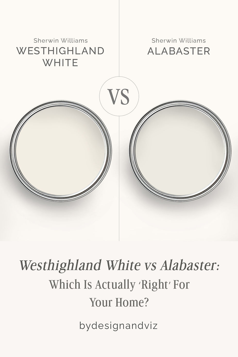
Westhighland White and Alabaster are both Sherwin-Williams warm whites, and both sit near the top of the brand's most-specified list - but they are not interchangeable, and the four-point LRV gap between them undersells how differently they read on a wall. Alabaster commits fully to soft, chalky warmth. Westhighland White holds a cleaner, more restrained version of the same warm family. The choice between them comes down to how much cream you actually want your walls to carry.
Alabaster SW 7008 has an LRV of 82 and a warm undertone built on soft beige with the faintest touch of green-gray depth - it is the color that made Sherwin-Williams' name in modern farmhouse interiors, and it reads as a true soft white rather than a stark one. Westhighland White SW 7566 has an LRV of 86 and a warm undertone rooted in yellow-beige - brighter, cleaner, and less chalky than Alabaster, with a quality that stays closer to white even as it holds its warmth.
This guide covers exactly how Westhighland White and Alabaster differ in undertone, LRV, light behaviour, and room application - including which one to choose when the brief calls for warmth without cream, and which one to choose when soft, enveloping warmth is the entire point.
At a Glance
| Westhighland White SW 7566 | Alabaster SW 7008 |
Brand | Sherwin-Williams | Sherwin-Williams |
LRV | 86 - bright warm white, sits near the top of the SW warm-white range | 82 - soft warm white with real body, sits just below Westhighland White |
Colour category | Clean warm white - reads as white first, warm second | Committed soft white - reads as warm and chalky rather than clean |
Undertones | Warm yellow-beige with low chroma - present but restrained, never chalky | Warm beige with a faint green-gray depth - soft, enveloping, unmistakably cream |
Character | Bright, fresh, gently warm - holds its brightness without turning stark | Soft, chalky, atmospheric - carries visible warmth in every light condition |
North-facing | Good - the yellow-beige base keeps north light from reading flat, without adding visible cream | Excellent - the beige base fills flat north light with genuine warmth |
South-facing | Very good - stays bright and clean rather than glowing gold | Good - can lean noticeably cream in strong sun; test before committing |
Open-plan | Excellent - consistent read across zones because the undertone is low-chroma | Good - most consistent in warm-toned light; can shift more than Westhighland White across mixed zones |
On walls | Bright, fresh warm-white backdrop with minimal visible cream cast | Soft, enveloping warm-white backdrop with a visible cream presence |
On cabinets | A crisp, contemporary warm-white cabinet color that reads lighter than Alabaster | The most widely specified soft warm-white cabinet color in the SW range |
Use together? | Yes - Westhighland White on trim against Alabaster walls is a clean, workable SW pairing | Alabaster on trim against Westhighland White walls reads flat and under-defined - avoid |
Trim for each | Extra White or Pure White for a crisper boundary; Westhighland White itself for a seamless warm-white scheme | Alabaster itself for a seamless soft scheme; Pure White only where a deliberate step up in brightness is wanted |
Style fit | Contemporary, coastal, transitional, modern farmhouse without heavy cream | Modern farmhouse, transitional, traditional, warm coastal |
Architect's pick | When the brief is warm-white brightness with almost no visible cream | When the brief is soft, enveloping warmth with real atmospheric depth |
SW Westhighland White SW 7566 - What It Really Looks Like

Westhighland White has an LRV of 86 - noticeably brighter than Alabaster, and one of the higher-LRV warm whites in the Sherwin-Williams line. The undertone is warm yellow-beige, but the chroma is low enough that the warmth reads as a quiet presence rather than a dominant cast. On a swatch it can look nearly identical to a handful of SW whites; on a wall, the difference from a true cream is immediately clear.
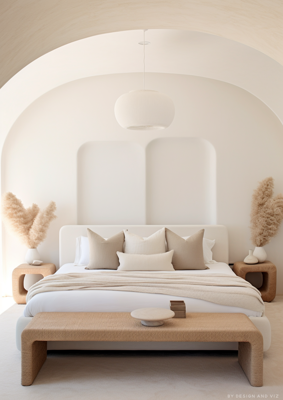
This is a white that stays white. It holds enough warmth to avoid feeling clinical, but not enough to tip into the soft, chalky territory that defines Alabaster. On walls it creates a bright, fresh backdrop where the undertone supports the room rather than defining it. On cabinets it reads as a clean, contemporary warm white - lighter and less enveloping than Alabaster's cabinet presence.For the broader Sherwin-Williams white range Westhighland White sits within, the SW White Paint Colors Guide covers where it fits alongside the brand's other leading whites.
SW Alabaster SW 7008 - What It Really Looks Like

Alabaster has an LRV of 82 and a warm beige undertone with a faint green-gray depth underneath it - the combination that gives Alabaster its distinctive soft, chalky quality rather than a simple cream cast. It is one of the most specified whites in American residential design for exactly this reason: it reads as warm and considered rather than flat or stark.
Alabaster does not stay quiet the way Westhighland White does. On walls it fills the room with soft, atmospheric warmth - the kind that photographs beautifully in modern farmhouse and transitional interiors. On cabinets it is the benchmark soft warm white against which most other SW whites are measured.For how Alabaster performs against another SW warm white with a similar chalky character, the Creamy vs Alabaster guide covers that closer same-family comparison in full.
The Real Difference Between Westhighland White and Alabaster

Westhighland White is a clean warm white. Alabaster is a soft, chalky warm white. They sit four LRV points apart, but the character gap is wider than that number suggests - Westhighland White reads as white with warmth attached, while Alabaster reads as warmth that happens to be white.
Westhighland White rooms feel bright and fresh, with the undertone supporting the space rather than defining it. Alabaster rooms feel soft and enveloping, with the beige base visibly present on every wall. The difference shows up most clearly side by side - a Westhighland White wall next to an Alabaster wall reads noticeably cooler and cleaner, even though both are warm whites by any technical definition.
The trim relationship runs in one direction only. Westhighland White on trim against Alabaster walls works cleanly - the brighter, lower-chroma white provides gentle definition without fighting the wall color's warmth. Alabaster on trim against Westhighland White walls reads flat, because the trim carries more visible cream than the walls it is meant to frame. For the closest direct SW-to-SW test of Alabaster's brightness ceiling, the Alabaster vs Pure White guide covers what happens when Alabaster is pushed against a true bright white instead.
Not sure which one works for your room? A colour consultation is included in all our design packages - book directly here. |
When to Choose Westhighland White

Choose Westhighland White when the brief is bright warmth without visible cream. Contemporary and coastal interiors where a soft undertone is welcome but a chalky or heavily cream-based white is not. Cabinets where a lighter, cleaner warm white is preferred over Alabaster's deeper presence. Open-plan spaces where consistency across orientations matters more than atmospheric depth.
Westhighland White is also the right call when Alabaster has read too soft or too cream in a sample test. If Alabaster felt like it was pulling the room toward beige rather than simply warming it, Westhighland White delivers the same warm-white family with a cleaner, brighter result.
When to Choose Alabaster

Choose Alabaster when the brief is soft, enveloping warmth with genuine depth. Modern farmhouse and transitional interiors where a chalky, atmospheric white is the goal rather than a clean backdrop. North-facing rooms that need real warmth rather than a subtle lift. Cabinets and trim where the softest, most classic SW warm white is the correct choice.
Alabaster is also correct when Westhighland White has read too clean or too bright for the room. If Westhighland White felt closer to a neutral white than a warm one, Alabaster delivers the depth and atmosphere the brief was actually asking for.
How the Pairings Differ

For Westhighland White on walls, Pure White or Extra White on trim keeps the scheme crisp and contemporary. Westhighland White itself on trim and ceiling creates a quiet, seamless warm-white result well suited to coastal and transitional interiors.
For Alabaster on walls, Alabaster itself on trim is the classic modern farmhouse approach - a mono-material soft white scheme. Pure White on trim introduces a deliberate step up in brightness for those wanting more contrast than the tonal approach gives.
For flooring, Westhighland White is the more flexible of the two - it holds its clean character against pale oak, warm mid-tone wood, and light stone alike. Alabaster is strongest against warm-toned wood and traditional stone, where its chalky depth has material warmth to lean into; very pale or cool-toned floors can make the beige undertone read heavier than intended.
For hardware, Westhighland White works across brushed nickel, matte black, and warm brass without pulling the undertone in any particular direction. Alabaster is strongest with warm metals - aged brass and warm bronze reinforce the soft, traditional character the color is built around; cool chrome can make the beige base feel slightly more pronounced than expected.
Architect's Verdict - Westhighland White or Alabaster?

These two Sherwin-Williams warm whites are not fighting for the same brief, and the four-point LRV gap between them matters less than the character difference it signals.
If the brief is bright, clean warmth with almost no visible cream - contemporary interiors, lighter cabinets, open-plan consistency - Westhighland White is the answer. It is the SW warm white for anyone who wants softness without commitment to a chalky finish.
If the brief is soft, enveloping, atmospheric warmth - modern farmhouse, transitional, north-facing rooms that need real depth - Alabaster is the answer. It remains the benchmark soft white in the SW range for exactly that reason.
Sample both on a north-facing wall at dusk, where warmth is hardest to read accurately: if Alabaster still looks soft and chalky rather than gray, and Westhighland White still looks bright and clean rather than flat, both are performing as they should - and the one that still feels right in that low, flat light is the one to commit to.
Frequently Asked Questions
Is Westhighland White lighter than Alabaster?
Yes - by 4 LRV points. Westhighland White has an LRV of 86 and Alabaster has an LRV of 82. Westhighland White reads as a bright, clean warm white. Alabaster reads as a soft, chalky warm white with more visible body. The gap is small on paper but noticeable on a wall, because Alabaster's undertone carries more presence than the LRV difference alone suggests.
Does Westhighland White work on trim with Alabaster on walls?
Yes - this is a clean, workable Sherwin-Williams pairing. The lower-chroma brightness of Westhighland White provides gentle definition against Alabaster's soft warmth without creating contrast that feels harsh. It is a quieter pairing than a true white-on-cream trim relationship, which suits interiors where subtlety is the goal.
Can I use Alabaster on trim with Westhighland White on walls?
It is not the strongest choice. Alabaster's visible cream depth reads as under-defined against Westhighland White's cleaner brightness, and the trim can end up looking like a slightly duller version of the wall color rather than a considered contrast. Pure White or Extra White give Westhighland White walls a cleaner, more deliberate trim boundary.
Which is better for north-facing rooms?
Alabaster handles north-facing rooms with more genuine warmth. The beige undertone fills flat, cool light with real atmospheric depth. Westhighland White holds up well in the same conditions but reads more neutral - a good result if the brief wants a lift without heavy warmth, less ideal if the room genuinely needs cream-level warmth to feel inviting.
What is the LRV of Westhighland White vs Alabaster?
Westhighland White SW 7566 has an LRV of 86 and Alabaster SW 7008 has an LRV of 82. Both sit in the bright end of the Sherwin-Williams warm-white range, but Alabaster's stronger undertone chroma makes it read noticeably softer and more atmospheric than the four-point LRV gap implies on its own.
Final Thought
Westhighland White and Alabaster are both excellent Sherwin-Williams warm whites, and the right choice depends entirely on how much visible warmth the room should carry. Westhighland White gives you brightness first, warmth second. Alabaster gives you warmth first, and lets the brightness follow.
Bright, clean warm-white brightness with minimal cream cast - Westhighland White. Soft, enveloping, atmospheric warmth with real depth - Alabaster. Sample both at large scale in your specific room. The four-point LRV gap is small on paper, but the character difference is unmistakable once they're on the wall.
Want a complete colour scheme built around Westhighland White or Alabaster? Our design packages cover full palette selection, finish recommendations, and 3D visualisations - see our packages. |
About the Author
Beril Yilmaz is a qualified architect and interior designer based in the UK. She runs BY Design And Viz, a design platform covering paint colour reviews, interior design guidance, and residential design projects. Beril has specified both Sherwin-Williams Westhighland White and Alabaster across residential projects in the UK and internationally - Westhighland White in contemporary and coastal schemes where a clean, low-chroma warmth was the brief, and Alabaster in modern farmhouse and transitional interiors where soft, enveloping warmth was the goal.


Comments