


Sherwin-Williams Westhighland White Coordinating Colors: The Complete Architect's Guide

Sherwin-Williams Westhighland White SW 7566 is one of the brightest warm whites in the range. An LRV of 86 carries a yellow-beige base held in check by a faint gray counterbalance, which keeps it reading as a soft neutral rather than a cream. There is nothing showy about it, and that is the point.
I reach for Westhighland White when a room needs brightness with a little warmth and no drama, and here is the honest truth: the challenge is not choosing Westhighland White — it is choosing what goes with it. It is a forgiving colour, but the wrong trim makes it look flat, and cool metals fight its warmth. The right pairings keep it crisp and considered. Here are the Westhighland White coordinating colors named in my own comparisons and in independent reviews, and exactly why each one works.

Understanding Westhighland White Before You Coordinate

Westhighland White's LRV of 86 puts it among the brightest whites Sherwin-Williams makes. It sits four points above Alabaster (82), two above Greek Villa (84) and Pure White (84), and twelve above Shoji White (74). That makes it a bright warm white rather than a deeper warm off-white.
The undertone is a warm yellow-beige with a faint gray counterbalance. It reads soft and warm rather than golden. It was built to be forgiving, and it holds its own line regardless of what is around it, which is rarer in a warm white than the chip suggests.
That tells you what to coordinate it with. Clean whites give it definition. Warm woods, brass, and muted earthy colours settle it. Cool metals and cool-toned materials fight its visible warmth.
For how Westhighland White compares to a deeper SW warm off-white, including the twelve-point LRV gap that puts the two in different depth categories, the West Highland White vs Shoji White guide explains which room needs which — useful reading before you commit to a whole-house scheme.
Quick Reference Table
The six colors below are covered in full in the pairings section that follows. Each is named for Westhighland White in my own comparisons or in independent reviews. Two additional colors are included here for completeness.
Color | Code | Why it works with Westhighland White |
Pure White | SW 7005 | The dedicated trim partner — a cleaner, cooler step beside the warm wall |
Alabaster | SW 7008 | Westhighland White on trim against Alabaster walls is a clean, workable pairing |
Greek Villa | SW 7551 | Greek Villa walls with Westhighland White trim is the classic move |
Creamy | SW 7012 | Westhighland White is the right trim beside Creamy walls |
Accessible Beige | SW 7036 | A tonal warm companion for adjoining rooms and islands |
Urbane Bronze | SW 7048 | Deep brown contrast that plays up the white's warmth |
Extra White | SW 7006 | The crisp, contemporary trim option when more contrast is wanted |
Pewter Green | SW 6208 | A muted dark green for shutters, doors, and cabinetry |
Westhighland White as a Wall Color — Best Pairings
Pure White SW 7005 with Westhighland White Walls

Pure White is the dedicated trim partner for Westhighland White. At LRV 84 it is two points darker than the wall, but it is cleaner and cooler, and that is what gives the trim its line. Each of these whites performs better beside its own partner, and this is Westhighland White's.
Use it on trim, doors, and ceilings. This suits bedrooms, living rooms, and kitchens where the walls should stay bright and the trim should stay clean. Keep hardware warm so the pairing reads as deliberate.
Alabaster SW 7008 with Westhighland White

Westhighland White on trim against Alabaster walls is a clean, workable pairing. At LRV 86 it is four points brighter than the wall, which gives a clear boundary without harshness, and it stays in the same warm family.
Alabaster on trim against Westhighland White walls is the reverse, and it needs testing. Alabaster is four points darker and carries more yellow, so it can read soft and under-defined. Sample both ways in your own light.
For the full comparison of Westhighland White against Alabaster — a bright, clean warm white set against a softer, more atmospheric one — the Westhighland White vs Alabaster guide covers cabinets, metals, and trim in detail.
Greek Villa SW 7551 with Westhighland White Trim

For Greek Villa on walls, Westhighland White on trim is the classic move. It keeps the same warm family while giving clean definition on the joinery. Alabaster is the alternative where a touch more warmth is wanted on the trim.
This suits transitional, coastal, and organic modern rooms. Greek Villa carries more character; Westhighland White is the quieter, more universally applicable of the two.
For the full comparison of Westhighland White against Greek Villa — two of the brightest SW warm whites with very different temperaments — the Westhighland White vs Greek Villa guide explains which suits inconsistent light and which rewards generous light.
Creamy SW 7012 with Westhighland White Trim
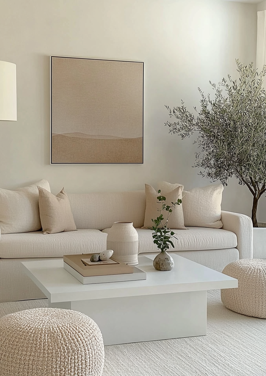
Westhighland White is the right trim alongside Creamy walls. Its restrained undertone provides clean, quiet definition against Creamy's richer warmth without competing with it. Creamy sits at LRV 81, so the five-point step is visible without turning stark.
This suits traditional kitchens and rooms with warm wood and warm stone. If Creamy goes golden in your strongest light, Westhighland White is the safer wall colour and Creamy is better saved for a room with gentler exposure.
For the full comparison of Westhighland White against Creamy — a restrained bright white set against a high-chroma cream — the Westhighland White vs Creamy guide covers the LRV gap and the undertone difference in full.
Accessible Beige SW 7036 with Westhighland White

Accessible Beige is a tonal companion in the same warm family. It carries real weight against the bright white, so it works on an island, a built-in, or an adjoining room. Westhighland White keeps the space light and Accessible Beige grounds it.
Keep wood tones and metals warm. This suits open-plan living areas where one white throughout would feel flat.
Urbane Bronze SW 7048 with Westhighland White

Urbane Bronze is the deep, warm contrast. Brown tones such as bronze, copper, and wood play up the white's yellow undertone, so the contrast feels cohesive rather than cold. It works on doors, shutters, an island, or window frames.
Use it on a single surface. Brass or bronze hardware carries the pairing through.
Westhighland White for Trim, Ceilings, and Finishes

Pure White and Extra White are the two trims to choose between. Pure White is the softer step and the default. Extra White gives crisp contrast for a more contemporary look. Both are cleaner than the wall, which is what gives the trim its line.
Westhighland White is less comfortable with cool metals. Its visible undertone fights a cool finish in a way a more restrained white does not. Warm brass, aged brass, and bronze suit it best. It handles a wider range of floor finishes than Shoji White, so warm wood, pale oak, and warm stone all work.
For accents, muted greens and blues sit quietly beside it: sage, soft navy, and dusty blue. For woodwork, use a satin or semi-gloss finish.
Westhighland White vs White Dove — Which Warm White?

This is the cross-brand comparison that comes up most, and on paper the two look identical. Westhighland White is LRV 86 and White Dove is 85.4, a gap of less than one point. The difference is undertone. Westhighland White has a yellow-beige base that gives it genuine cream presence. White Dove has a warm-gray base that keeps it neutral rather than creamy.
The decision comes down to how much cream the room wants. If the brief wants a soft, creamy, forgiving white, Westhighland White delivers. If the brief wants a warm white that stays quieter and more neutral, White Dove is the one that earns the word neutral.
Each performs better beside its own trim partner: Pure White for Westhighland White, Chantilly Lace for White Dove.
Want a complete color scheme built around Westhighland White? A Color Direction consultation gets you a full custom palette built around your space - book yours here. |
For the full comparison of Westhighland White against White Dove — two warm whites within a single LRV point of each other, built on opposite undertones — the Westhighland White vs White Dove guide covers why the number barely matters and which one suits your room.
Westhighland White Coordinating Colors by Room

Living Room
Westhighland White walls with Pure White trim, warm wood floors, and brass accents reads bright, clean, and calm. Choose it when the room's lighting is inconsistent or you need one colour to work across several zones. For depth, add an Accessible Beige island or a Urbane Bronze door.
Bedroom
For a calm bedroom, pair Westhighland White with Pure White trim, layered fabrics in muted shades, and warm wood furniture. Sage or dusty blue accents give it a quiet, restful note without breaking the brightness.
Kitchen
On cabinetry, Westhighland White is a crisp, contemporary warm-white cabinet colour that reads lighter than Alabaster. It suits modern and transitional kitchens. Pair it with warm brass hardware, warm wood, and stone, and avoid cool chrome, which fights its undertone.
Bathroom
Westhighland White keeps a bathroom bright without the cold edge of a stark white. Pair it with a Pure White ceiling and trim, warm stone, and brass or bronze fixtures.
Exterior
Westhighland White brightens a home exterior without being blinding. It suits coastal homes, farmhouses, and ranches, in modern or traditional styles. Pair it with charcoal gray shutters, natural cedar, black windows, or a muted terracotta front door. Pewter Green and Urbane Bronze also work on doors and shutters.
Direct sun washes colour out significantly, so sample it on the actual elevation. At LRV 86 it reads as a brilliant, classic white outdoors while keeping enough warmth to avoid looking icy.
Frequently Asked Questions

What colors go with Sherwin-Williams Westhighland White?
Pure White and Extra White for trim, Alabaster, Greek Villa, and Creamy as warm-white companions, Accessible Beige as a tonal neighbour, and Urbane Bronze and Pewter Green for contrast. Avoid cool metals.
What is the best trim color for Westhighland White?
Pure White SW 7005. It is the dedicated partner, cleaner and cooler than the wall. Extra White is the crisper option. Alabaster on trim under Westhighland White walls can read under-defined, so test it.
What is the LRV of Westhighland White?
86, according to Sherwin-Williams' own data. That is four points above Alabaster, two above Greek Villa and Pure White, and twelve above Shoji White.
Can Westhighland White be used on walls and trim together?
It can. A monochromatic Westhighland White room with matte walls and satin trim reads bright and seamless. For more definition, step to Pure White on the trim.
Final Thought
Westhighland White's defining trait as a coordinating color is that it is forgiving. Every winning combination in this guide gives its warm, bright base a clean edge, a warm material, or a deep earthy contrast, rather than a cool metal that fights it.
Want help building a complete scheme around Westhighland White SW 7566? See our design packages here - bydesignandviz.com/#interiordesignpackages.
Want a complete color scheme built around Westhighland White? Our design packages cover full palette selection, finish recommendations, and 3D visualisations - see our packages. |
About the Author
Beril Yilmaz is a qualified architect and interior designer based in the UK. She runs BY Design And Viz, a design platform covering paint colour reviews, interior design guidance, and residential design projects. Beril has specified Sherwin-Williams Westhighland White across residential projects in the UK and internationally — in rooms with inconsistent light and open-plan homes where one forgiving white had to work across several zones, most often paired with Pure White on the trim.


Comments