


White Heron vs Alabaster: The Comparison That Actually Helps You Decide

White Heron and Alabaster sit less than five LRV points apart, yet they pull in opposite directions. White Heron is a crisp white with a faint cool cast. Alabaster is a soft white that leans warm. One reads clean and gallery-bright. The other reads gentle and lived-in. The brightness is close, and the temperature is not.
I have specified both across residential projects, and the choice is never cosmetic. Put White Heron in a room that needs warmth and it turns clinical. Put Alabaster in a room that needs sharpness and it reads soft where the design wants crisp. The right answer depends on your light, your floors, and what sits next to the wall.
This guide covers the undertone difference, how each color behaves in north and south light, which one wins on cabinets and trim, and the exact test I run before signing off any white.

At a Glance
| White Heron | Alabaster |
Brand | Benjamin Moore | Sherwin-Williams |
LRV | 86.69 (about 87) - clearly brighter than Alabaster; the extra reflectance makes walls read crisp and open | 82 - bright but softened; the warm undertone takes the glare out of the brightness |
Colour category | Crisp bright white - clean and near-neutral, with only a faint cool cast | Restrained warm neutral white - warm enough to avoid cold, quiet enough to avoid cream |
Undertones | Faint cool cast that can drift grey-green in shade; no visible yellow | Soft yellow held well back - warms the wall without announcing itself as cream |
Character | Sharp, clean and contemporary; it clarifies a room rather than softening it, and it shows up every floor tone and fixture beside it | Gentle, enveloping and quietly warm; it softens hard light and blends with wood, brass and stone instead of contrasting with them |
North-facing | Risky - cool north light pushes it toward grey-green and it can read flat or clinical | Reliable - its warmth offsets the cool light, so the wall stays soft instead of turning grey |
South-facing | Excellent - warm light neutralizes the cool cast and leaves a clean, luminous white | Warm and glowing - strong sun amplifies the yellow, which suits cozy rooms and can overheat very bright ones |
Open-plan | Good in evenly lit plans; drifts cooler in shaded zones and against warm flooring | Strong - the warm base ties zones together whatever the light does through the day |
On walls | Gallery-clean backdrop that makes art, black frames and colorful furniture stand out | Soft, easy backdrop that flatters timber, textiles and skin tones and never demands styling |
On cabinets | Sharpest with stainless, cool stone and black hardware on flat-front doors; can feel stark beside warm wood | The easier choice in most kitchens - handles warm stone, brass and wood, and tolerates stainless |
Use together? | Yes, with care - White Heron on trim and ceilings gives Alabaster walls crisp definition, but the trim will read slightly cool | Alabaster on trim against White Heron walls is the pairing to avoid - it can look dull beside the cleaner white |
Trim for each | Chantilly Lace OC-65 for a crisper step up, or White Heron in satin on joinery for a tonal look | Extra White SW 7006 or Pure White SW 7005 for crisp definition |
Style fit | Modern, contemporary, Scandinavian, coastal, minimalist | Traditional, transitional, organic modern, farmhouse |
Architect's pick | When the brief is clean, bright and contemporary and the room has strong light | When the room needs warmth and softness, or the light is weak or mixed |
Benjamin Moore White Heron OC-57 - What It Really Looks Like

White Heron has an LRV of 86.69, which puts it firmly in the bright-white category. Benjamin Moore describes it as a classic bright white with the slightest cool cast, and the description is accurate. The cast is faint. In shade it can drift toward grey-green. In warm light it settles into a clean, near-neutral white.
White Heron does not warm a room. It clarifies it. Where Alabaster softens hard light, White Heron sharpens it, and the higher reflectance makes walls feel more open. There is no yellow in it to forgive a poor floor or a muddy shadow.
It needs the right surroundings to look intentional. Cool stone, black metal, crisp trim and good daylight all work in its favor. Warm orange-toned timber and yellow lamplight work against it. For a fuller breakdown of how it behaves on each wall direction, read the Benjamin Moore White Heron guide before you order samples.
Sherwin-Williams Alabaster SW 7008 - What It Really Looks Like

Alabaster has an LRV of 82, which puts it in the bright-but-softened category. Sherwin-Williams places it among its warm whites, and the yellow undertone is the point. It is soft rather than creamy. The warmth is enough to stop the wall reading cold, and no more.
Alabaster holds its warmth when the light turns against it. In north-facing rooms and under overcast skies, where a cool white goes flat, it stays gentle and faintly golden. In strong sun it glows. It shifts less than most whites this pale.
It bridges warm and cool materials. Oak, brass, limestone and even brushed nickel sit comfortably beside it. To see what happens when the warmth is stripped out of a Sherwin-Williams white entirely, the Alabaster vs Pure White guide is the closest in-house preview of the crisp-versus-soft decision you are making here.
The Real Difference Between White Heron and Alabaster

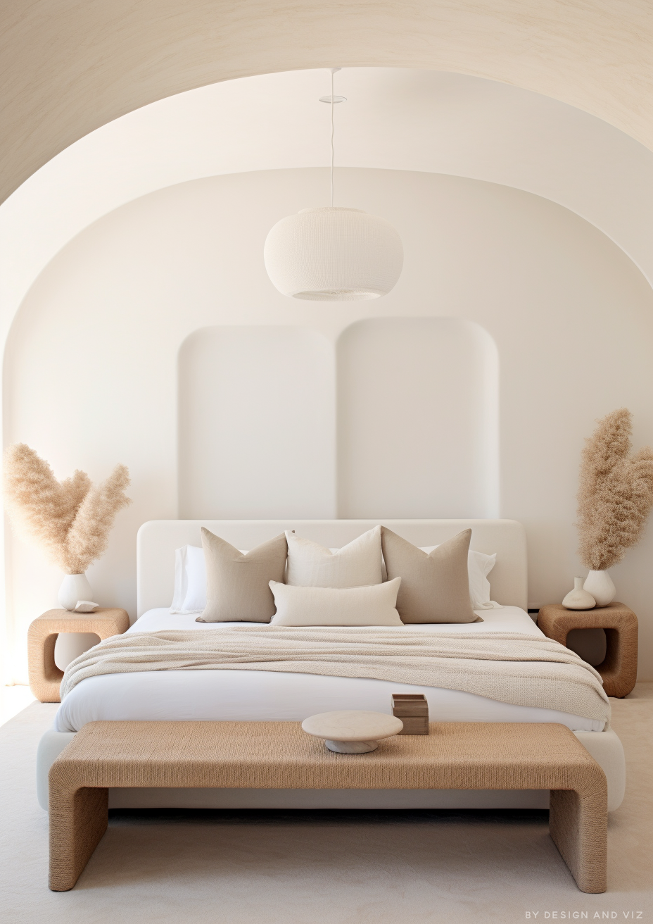
The simplest way to explain it: White Heron is a white that sharpens. Alabaster is a white that softens. Side by side, White Heron looks clean and cool. Alabaster looks gentle and slightly creamy. The temperature gap is obvious the moment the two patches touch.
The LRV gap is smaller than the visual gap. White Heron sits at about 87 and Alabaster at 82, so White Heron reflects slightly more light. That is not the headline. Two paints five points apart can look identical or opposite depending on undertone, and these two look opposite. Brightness tells you how much light bounces. Undertone tells you what color it carries.
White Heron with a crisper white on trim, or Alabaster with Extra White, are the two combinations that work without much testing. Mixing the two is possible but fussier. White Heron on trim against Alabaster walls gives crisp joinery, while Alabaster trim against White Heron walls can look dull. Test any mix before you commit. If you are also weighing White Heron against a warmer bright white, the White Heron vs Simply White guide shows exactly where the line falls between crisp and softly warm within the Benjamin Moore range.
Not sure which one is right for your room? A Color Direction consultation gets you a full custom palette built around your space - book yours here. |
When to Choose White Heron

Choose White Heron when the brief is crisp, clean and contemporary, and the room has the light to support it. These are the conditions where it is the right answer:
South or west-facing rooms with good natural light, where warm light neutralizes the cool cast. Modern and minimalist interiors with neutral or cool floors. Kitchens with stainless appliances, cool stone and black hardware. Gallery-style spaces where art and furniture should carry the color. Ceilings too, where its reflectance keeps the room bright.
Avoid White Heron in north-facing rooms, where cool light can push it toward grey-green. Avoid it beside warm orange-toned timber, where it looks flat. And avoid it in cottage or period interiors where the brief is cozy. It will look clinical there.
When to Choose Alabaster

Choose Alabaster when you want warmth and softness without committing to cream. These are the conditions where it outperforms White Heron:
North-facing and low-light rooms that need warmth to hold. Open-plan spaces with mixed light and mixed materials. Rooms with warm wood floors, limestone or brass. Bedrooms and living rooms where the goal is calm. Exteriors too, where its restrained warmth reads well across changing light.
Alabaster is also the safer choice if you are unsure. It forgives light and material mistakes that White Heron exposes. It is not the sharper white. It is the easier one to live with.
How the Pairings Differ

For White Heron on walls, the most natural trim is Chantilly Lace or White Heron itself in a higher sheen. Chantilly Lace gives a crisper step up. Matching the color in satin keeps the scheme tonal and modern. Avoid cream or ivory trims, which make White Heron look grey by comparison.
For Alabaster on walls, Extra White or Pure White on trim gives clean definition. Alabaster on both walls and trim is the softer route and suits bedrooms and living rooms. Avoid very cool, blue-leaning whites, which make Alabaster look yellow beside them.
For flooring, White Heron wants neutral or cool surfaces. Grey oak, pale stone, polished concrete and black tile all work. Warm orange-toned timber pulls against it and can make the wall look faintly green. Alabaster is the better partner for warm wood, limestone and terracotta, where its warmth echoes the floor instead of fighting it.
For hardware, White Heron suits matte black, brushed nickel and chrome, where the crisp wall sharpens the metal. Aged brass works but reads as contrast rather than harmony. Alabaster suits aged brass, brushed gold and bronze, and handles matte black well in transitional schemes.
Architect's Verdict - White Heron or Alabaster?

Both are excellent whites. They answer different questions.
White Heron is the right choice when the brief is crisp, clean and contemporary. In a south or west-facing room with neutral or cool materials, it looks sharper and more precise than Alabaster. It does not hedge. It suits kitchens with stainless and stone, minimalist living spaces, and any room where art and furniture should carry the color.
Alabaster is the right choice for most rooms that need warmth, softness or forgiveness. North-facing rooms, open-plan spaces, warm timber floors and mixed lighting all favor it. It is the safer bet. If you are unsure, choose Alabaster.
The test I use: buy sample pots of both and paint two-foot-square patches side by side on the wall that gets the least direct light, with a sheet of white printer paper taped beside them as a reference. Check at 9am on an overcast morning, then again at 7pm with lamps on. White Heron passes if it still reads as a clean white instead of grey or green. Alabaster passes if it reads as softly warm instead of yellow beside the paper. Cross off whichever one fails.
Frequently Asked Questions
Is White Heron warmer or cooler than Alabaster?
White Heron is cooler. Benjamin Moore describes it as a bright white with the slightest cool cast, while Alabaster carries a soft yellow undertone. Side by side, White Heron reads crisp and clean and Alabaster reads gentle and warm.
Which is brighter, White Heron or Alabaster?
White Heron is brighter, but only slightly. White Heron has an LRV of about 87 and Alabaster has an LRV of 82. The gap is real but small. Undertone changes how a room feels far more than reflectance does.
Which is better for kitchen cabinets?
Alabaster is the easier cabinet color. White Heron is the sharper one. Alabaster works with warm stone, wood, brass and stainless. White Heron looks best with stainless, cool stone and black hardware, and can feel stark beside warm wood. Test it on a door, not a paint card.
Which is better for a north-facing room?
Alabaster handles north light better. Cool north light amplifies White Heron's faint cool cast and can push it toward grey-green, while Alabaster's warmth counteracts the light. If you want a crisp white in a north-facing room anyway, test it with warm lamps on before committing.
Can I use White Heron and Alabaster in the same house?
Yes, but test them before putting them on adjacent surfaces. Different rooms are fine. White Heron on trim and ceilings with Alabaster walls gives crisp joinery. The reverse, Alabaster trim against White Heron walls, can look dull.
What is the LRV of White Heron vs Alabaster?
White Heron has an LRV of about 87 and Alabaster has an LRV of 82. Both are bright, and neither is dark enough to feel heavy. The real difference is the undertone, not the reflectance.
Final Thought
White Heron and Alabaster are both excellent whites, and they are not interchangeable. The choice is not about which is better. It is about whether your room needs sharpness or softness.
If your light is strong and your materials are neutral or cool, White Heron gives the cleanest, brightest result. If the light is weak, the floors are warm, or you are unsure, Alabaster is the more forgiving choice. Buy sample pots of both, paint large patches on two different walls, and look at them across a full day. The answer will be clear within 24 hours.
Want a complete colour scheme built around White Heron or Alabaster? Our design packages cover full palette selection, finish recommendations, and 3D visualisations - see our packages. |
About the Author
Beril Yilmaz is a qualified architect and interior designer based in the UK. She runs BY Design And Viz, a design platform covering paint colour reviews, interior design guidance, and residential design projects. Beril has specified both White Heron and Alabaster across residential projects in the UK and internationally — White Heron in contemporary kitchens with stainless appliances, cool stone and black hardware, Alabaster in open-plan and warm-toned spaces where light and material temperature shift through the day, often in the same scheme with White Heron on ceilings and trim.


Comments