Benjamin Moore Wrought Iron Color Palette - An Architect's Complete Guide
- Beril Yilmaz

- Apr 11
- 12 min read
Updated: Apr 13
Benjamin Moore Wrought Iron 2124-10 is one of the most specified dark neutrals in residential design - and also one of the most frequently misused. As an architect who has specified Wrought Iron on cabinets, front doors, trim, and full walls across multiple residential projects, I have seen it look extraordinary and I have seen it look flat and disconnected. The difference is almost always the palette around it.
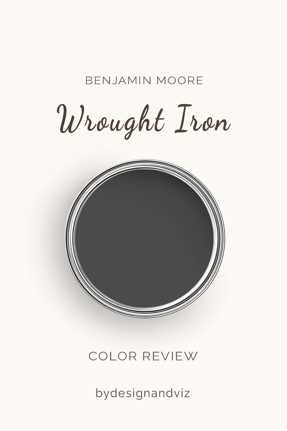
Wrought Iron at LRV 6 is a near-black with a cool blue-black undertone. That undertone is the defining characteristic that shapes every palette decision. It does not behave like a neutral black - it has a directional character that responds to what you place alongside it, and the wrong combination will expose that blue quality in ways that feel unintended. The right combination makes it look like the most considered, architectural choice in the room.
This guide covers every palette decision for Wrought Iron - trim whites, wall colours, accent colours, metals, floors, and materials - with the specific combinations I use in real residential projects and the ones I have learned to avoid.
Understanding Wrought Iron's Undertone First
Before any palette decision, you need to understand what Wrought Iron actually does in light. In strong natural light - particularly south-facing - it reveals a deep, rich blue-black quality that reads as genuinely sophisticated. Under warm artificial lighting it holds its depth and reads as a dark, considered neutral. Under cool artificial lighting or in north-facing conditions without warm materials around it, the blue quality can surface more noticeably and the colour reads as cooler than expected.
The practical implication for palette building is this: if your room or application has predominantly cool light conditions, every other palette decision needs to introduce warmth to counterbalance the cool blue quality. Warm wood, warm metals, warm white trim, warm textiles. Without these anchors, Wrought Iron in a cool room can feel stark rather than sophisticated. I learned this early on - my first Wrought Iron kitchen cabinet specification in a north-facing room looked flat until I swapped the brushed nickel hardware to unlacquered brass. That single change transformed the whole reading of the colour.
The Best Trim Colours for Wrought Iron

Trim colour is the single most consequential palette decision alongside Wrought Iron. The contrast between the near-black walls or cabinets and the trim white defines the character of the entire scheme. Get it wrong and the Wrought Iron looks either too cold or insufficiently dramatic.
Chantilly Lace OC-65 - My First Choice for Contemporary Schemes
Chantilly Lace is the trim colour I specify most often alongside Wrought Iron in contemporary and transitional residential projects. Its near-neutral LRV 92 crispness creates the cleanest, most graphic contrast available in the BM range - the boundary between Wrought Iron and Chantilly Lace is sharp and precise, which is exactly what a near-black colour needs to read as intentional rather than heavy. The near-neutral undertone of Chantilly Lace does not fight Wrought Iron's blue quality - it simply provides a clean white boundary and lets the dark colour perform. Every coordinating decision for Chantilly Lace is covered in the Chantilly Lace coordinating colors guide.
White Dove OC-17 - For Warmer, More Traditional Schemes
When the overall scheme has a warmer, more traditional brief - warm wood floors, brass hardware, linen textiles - White Dove OC-17 is often the better trim choice alongside Wrought Iron. The soft creamy warmth of White Dove introduces just enough warmth into the contrast to prevent the scheme from reading as too cool or too graphic. It suits traditional and organic modern briefs where a slightly softer transition between the dark colour and the trim is more appropriate than Chantilly Lace's sharp precision. The full palette logic for White Dove is in the White Dove coordinating colors guide.
What to Avoid on Trim
Avoid warm cream trims like Antique White or Linen White alongside Wrought Iron. I have seen this combination in projects I have been called in to assess and the result is consistent: the cream warmth of the trim fights the cool blue quality of Wrought Iron and both colours read as slightly off. The trim looks yellowed and the dark colour looks colder. Stay in the crisp white family for trim - Chantilly Lace, White Dove, or Simply White OC-117.
Wall Colours That Work With Wrought Iron

Wrought Iron is most commonly used on cabinets, trim, front doors, or feature walls - with lighter wall colours surrounding it. These are the wall colour families that create the most successful results.
Warm Off-Whites - The Most Widely Used Combination
Warm off-white walls with Wrought Iron cabinets or trim is the combination I specify most frequently in residential kitchens and living spaces. The contrast between the near-black and the warm white creates a scheme that reads as considered, high-contrast, and timeless. Alabaster SW 7008 alongside Wrought Iron cabinets is one of the most reliable combinations I have used repeatedly - the warm cream quality of Alabaster counterbalances Wrought Iron's cool blue and the result is rich without feeling cold. White Dove OC-17 on walls with Wrought Iron trim or a feature wall works on the same principle.
Warm Greiges - Grounded and Sophisticated
Warm greige walls with Wrought Iron accents - on cabinets, island, or a single feature wall - create one of the most grounded and sophisticated residential palettes available. Pale Oak OC-20 with Wrought Iron island cabinets and Chantilly Lace perimeter cabinets is a combination I have used in transitional kitchens to great effect. The warmth of the greige walls counterbalances the cool blue of Wrought Iron completely and the three-colour palette reads as considered and architectural without being stark. Edgecomb Gray HC-173 on walls with Wrought Iron trim is another consistent performer.
Deep Navy and Blue - High Drama, High Risk
Deep navy walls with Wrought Iron trim or joinery is a high-drama combination that can look extraordinary in the right room - a library, study, or dining room where the brief is richly atmospheric. Hale Navy HC-154 on walls with Wrought Iron bookshelving and Chantilly Lace ceiling creates a genuinely impressive, enveloping result. For how Hale Navy behaves across different room types and conditions, the Benjamin Moore Hale Navy guide covers every application.
The risk with this combination is that both colours carry cool undertones - Hale Navy's grey-green and Wrought Iron's blue-black - and in a room without strong warm anchors (warm wood, brass, warm textiles) the scheme can read as cold. This is not a combination I would use in a north-facing room without significant warm material investment.
Sage and Muted Greens - Warm and Organic
Muted sage green walls with Wrought Iron trim or cabinets is one of the most popular combinations I am currently specifying. The warm earthy quality of sage green counterbalances Wrought Iron's cool blue completely - the two colours sit in entirely different undertone families and the contrast creates a palette that reads as warm, organic, and deeply considered. October Mist 1495 or Sage Green SW 0055 on walls with Wrought Iron trim and Chantilly Lace ceiling works consistently across different room types. The organic warmth of the green does the work that the near-black needs to perform beautifully.
Want help building a Wrought Iron palette for your home? Book a colour consultation here - bydesignandviz.com/book-online |
Metal Finishes That Work With Wrought Iron

Metal finish choice is where I see the most errors in Wrought Iron palettes. Because Wrought Iron has a cool blue undertone, the metal finish either counterbalances that quality or amplifies it - and choosing the wrong one is an expensive mistake on hardware and fixtures.
Unlacquered Brass and Aged Brass - My First Recommendation
Unlacquered brass hardware alongside Wrought Iron cabinets or joinery is the combination I recommend first in almost every residential project. The warm gold quality of unlacquered brass counterbalances Wrought Iron's cool blue undertone completely - the result is a warm-cool contrast that reads as genuinely luxurious. I specify unlacquered rather than polished brass because the slight warmth and patina of unlacquered creates a richer relationship with the dark colour. Polished brass is too bright and reflective at this depth of colour - it creates a contrast that can feel jarring.
Matte Black - Clean, Graphic, Contemporary
Matte black hardware alongside Wrought Iron is a tonal combination rather than a contrast - the two darks sit in the same family and the result reads as moody and deliberately monochromatic. This works well in contemporary and minimalist kitchens where the brief is graphic and restrained. The risk is that without warm elements elsewhere in the scheme - warm wood, warm textiles, warm lighting - a Wrought Iron and matte black palette can feel heavy and cold.
What to Avoid
Polished chrome and brushed nickel alongside Wrought Iron are the combinations I steer clients away from most consistently. The cool silver quality of chrome amplifies Wrought Iron's blue undertone rather than counterbalancing it - the scheme reads as cold and the dark colour loses its warmth and sophistication. If the brief specifically requires a cool metal finish, brushed nickel is preferable to polished chrome, and the overall palette needs significant warm elements - warm wood floors, warm wall colour, warm textiles - to prevent the cool-on-cool combination reading as flat.
Floors and Materials
Wood Floors
Warm wood floors are the most reliable and most widely used flooring choice alongside Wrought Iron. White oak, pale oak, warm walnut, and medium warm wood all work well - the warmth of the floor counterbalances the cool blue quality and the combination reads as grounded and considered. In my experience, the ideal warm wood floor alongside Wrought Iron cabinets is a medium-warm oak - light enough to reflect light into the room and prevent the scheme from feeling heavy, warm enough to anchor the blue undertone of the dark colour.
Very cool or very pale bleached wood floors alongside Wrought Iron cabinets require careful handling - the cool floor and the cool dark colour can both feel flat without sufficient warm elements between them. If the brief demands pale bleached wood, invest in warm brass hardware and warm textiles to provide the counterbalance that the floor cannot.
Stone and Tile
Warm stone countertops - calacatta with warm veining, quartzite with beige tones, warm limestone - are among the most beautiful material pairings for Wrought Iron cabinets. The warmth and natural variation of the stone creates a richness alongside the dark colour that polished cool stone cannot replicate. I have used Wrought Iron lower cabinets with a book-matched calacatta waterfall countertop and the combination was one of the most impressive kitchen palettes I have produced.
Cool white marble and very pale cool quartz alongside Wrought Iron require more careful palette building - the cool-on-cool combination needs warm metal hardware, warm wood open shelving, and warm wall colour to prevent the scheme reading as stark.
Wrought Iron Colour Palette Room by Room

Kitchen
The kitchen is where Wrought Iron performs most consistently in residential projects - and where the palette decisions are most consequential given the fixed cost of cabinetry. My most reliable kitchen palette with Wrought Iron is: Wrought Iron lower cabinets, White Dove upper cabinets, Chantilly Lace ceiling, unlacquered brass hardware, warm stone or calacatta countertop, warm wood open shelving, Pale Oak or Alabaster walls. This combination works because every warm element - brass, stone, wood shelving, wall colour - is counterbalancing the cool blue of the dark lower cabinets. I would not deviate from warm hardware in this combination.
Front Door
Wrought Iron is one of the most specified front door colours in contemporary residential design and for good reason - the clean blue-black reads as crisp and architectural at door scale and creates an immediate statement. The palette around a Wrought Iron front door follows the same logic: warm facade colour (Alabaster, Greek Villa, or a warm greige), warm brass door furniture, and natural material context (warm stone, warm timber, warm brick) all maximise the impact. A Wrought Iron door on a cool grey render facade with chrome furniture is a combination I would actively advise against - the cool-on-cool palette loses the sophistication that makes Wrought Iron front doors so compelling.
Feature Wall
A Wrought Iron feature wall works best in rooms where the surrounding palette is warm and the brief is bold contrast - behind a bed in a bedroom with warm oak floors and warm linen bedding, behind shelving in a study with brass picture lights and warm wood, or as a fireplace breast in a living room with warm greige walls. The key principle I apply is that the Wrought Iron feature wall should never be more than 25% of the total wall area in a room unless the brief is deliberately enveloping and dramatic.
Exterior Trim and Shutters
Wrought Iron on exterior trim, shutters, and window frames alongside a warm off-white or warm greige facade is one of the most enduringly popular exterior palettes in residential design - and one I have specified on multiple exterior projects with consistently strong results. The key is ensuring the facade colour is genuinely warm - Alabaster, Greek Villa, or a warm beige - so the contrast reads as warm-dark rather than cool-dark. On warm brick facades, Wrought Iron trim picks up the dark quality of the brick mortar and creates a cohesive, considered exterior palette.
Combinations to Avoid
Cool grey walls with Wrought Iron - the two cool undertones amplify each other and the scheme reads as flat and cold. If a grey wall is unavoidable, it must be a warm greige like Repose Gray SW 7015 or Agreeable Gray SW 7029 with strong warm elements throughout.
All-dark palette with no light relief - Wrought Iron is a near-black and needs genuine light contrast to perform. Wrought Iron walls, Wrought Iron trim, and dark floors in a room without natural light is a combination that reads as oppressive rather than atmospheric. Always ensure at least one major light element - ceiling, upper cabinets, wall colour - provides contrast.
Warm yellow or very orange wood floors - the warm orange of honey oak floors creates an undertone conflict with Wrought Iron's cool blue. The contrast reads as unintentional rather than considered. Medium warm oak, walnut, or white oak are all safer floor choices alongside Wrought Iron.
Polished chrome and stainless as the only metal - as covered above, the cool silver amplifies the blue undertone. Even in a largely cool palette, a single warm brass or bronze element near the Wrought Iron prevents the colour reading as flat.
Wrought Iron vs Similar Dark Colours

vs Iron Mountain 2134-30 - Iron Mountain is the warm-undertoned alternative to Wrought Iron, with a grey-green quality that suits traditional and organic modern rooms with warm materials. If the palette brief is warm rather than cool and architectural, Iron Mountain is often the more appropriate choice. The full comparison is in the Wrought Iron vs Iron Mountain guide.
For the full standalone review of Iron Mountain - undertones, LRV, light behaviour by orientation, best rooms, what to pair it with, and a clear verdict on who it is and is not right for - the Benjamin Moore Iron Mountain review covers everything you need to know before committing.
vs Kendall Charcoal HC-166 - Kendall Charcoal at LRV 14 is significantly lighter than Wrought Iron and has a warm grey undertone with subtle green. For rooms where Wrought Iron feels too dark or too cool, Kendall Charcoal provides dark neutral presence with more warmth and more forgiveness. The Benjamin Moore Kendall Charcoal guide covers every application.
vs Black Iron 2120-20 - Black Iron is darker and more neutral than Wrought Iron - closer to a true near-black without the blue quality. For applications where the brief is closer to black and the blue direction of Wrought Iron is a concern, Black Iron is the correct step.
Frequently Asked Questions
What is the best trim colour for Wrought Iron?
Chantilly Lace OC-65 for contemporary schemes where maximum contrast and crispness are the brief, White Dove OC-17 for warmer traditional schemes where a slightly softer transition is more appropriate. Both are reliable. The deciding factor is the warmth of the overall palette - if the scheme is warm throughout, White Dove. If the scheme is more contemporary and cool-neutral, Chantilly Lace.
Does Wrought Iron go with warm or cool colours?
Wrought Iron works best when the surrounding palette is warm - warm whites, warm metals, warm wood, warm stone. Its cool blue undertone needs warm counterbalancing elements to read as sophisticated rather than cold. The most common Wrought Iron palette mistake I see is pairing it with too many cool elements - cool grey walls, cool metal hardware, cool pale floors - which amplifies the blue quality and leaves the colour reading flat.
What metal hardware goes with Wrought Iron?
Unlacquered or aged brass is my first recommendation - the warm gold quality counterbalances the cool blue undertone most effectively and the combination reads as genuinely luxurious. Matte black is a tonal option that works in more contemporary or monochromatic schemes. Avoid polished chrome and brushed nickel as the primary metal - they amplify the cool undertone rather than counterbalancing it.
Can Wrought Iron work in a north-facing room?
Yes, but the palette needs more work. In a north-facing room Wrought Iron's cool blue quality is more pronounced without warm natural light to suppress it. To make it work in north-facing conditions I always specify: warm-spectrum artificial lighting (2700K minimum, 2400K if possible), warm brass hardware, warm wall colour, and warm wood floors. Without all four of those elements, Wrought Iron in a north-facing room risks reading as cold and flat. With them, it can look exceptional.
The Verdict
Wrought Iron is one of the most rewarding dark neutrals in the BM range when the palette around it is built correctly - and one of the most disappointing when it is not. The blue undertone is the defining characteristic that every palette decision needs to account for. Warm elements counterbalance it and make the colour look sophisticated. Cool elements amplify it and make the colour look flat.
The combinations that consistently produce the best results in my practice are: Chantilly Lace or White Dove trim, unlacquered brass hardware, warm stone or calacatta countertops in kitchen applications, warm wood floors, warm off-white or warm greige wall colours, and warm-spectrum artificial lighting throughout. Build the palette around those principles and Wrought Iron will perform at its best every time.
Need help building a Wrought Iron palette for your specific room? See our design packages here - bydesignandviz.com/#interiordesignpackages |
About the Author
Beril Yilmaz is a qualified architect and interior designer based in the UK. She runs BY Design And Viz, a design platform covering paint colour reviews, interior design guidance, and residential design projects.


Comments