Wrought Iron vs Iron Mountain - The Benjamin Moore Dark Neutral Comparison That Settles It
- Beril Yilmaz

- Apr 10
- 12 min read
Updated: Apr 13
Wrought Iron 2124-10 and Iron Mountain 2134-30 are two of Benjamin Moore's most frequently compared dark neutrals - both deep, sophisticated, and enduringly popular for the kind of dramatic, considered interior that has dominated design thinking for the past decade. Both are charcoal-adjacent. Both suit cabinets, feature walls, front doors, and moody rooms. On a paint chip in the store they can look similar enough to cause real confusion. On a wall in a real room they create distinctly different atmospheres. Wrought Iron is a true dark charcoal with a cool blue-black undertone that reads as crisp, graphic, and architectural. Iron Mountain is a warm dark grey-green charcoal with an earthy, organic quality that reads as rich, grounded, and deeply sophisticated. Choosing the wrong one is a costly mistake at this depth of colour.
This guide covers exactly how Wrought Iron and Iron Mountain differ in LRV, undertone, character, light behaviour, and room application - with a clear verdict on which one suits which situation.

Side by Side
| Wrought Iron 2124-10 | Iron Mountain 2134-30 |
LRV | ~6 | ~9 |
Undertone | Cool blue-black - crisp, graphic, architectural | Warm grey-green - earthy, organic, rich |
Character | Dramatic, clean, contemporary, precise | Moody, layered, sophisticated, traditional |
Natural light | Reveals deep blue-black quality - striking | Reveals warm green-grey quality - rich and complex |
Artificial light | Holds blue-black quality - consistent | Can warm up beautifully under warm-spectrum bulbs |
Best for | Contemporary, minimalist, exterior trim, front doors, cabinets | Traditional, organic modern, cosy interiors, full rooms |
Trim pairing | White Dove OC-17 or Chantilly Lace OC-65 | White Dove OC-17 or Alabaster SW 7008 |
Risk | Can read cold or flat under very cool artificial light | Green undertone can become more prominent in strong natural light |
Wrought Iron 2124-10 - What It Actually Is
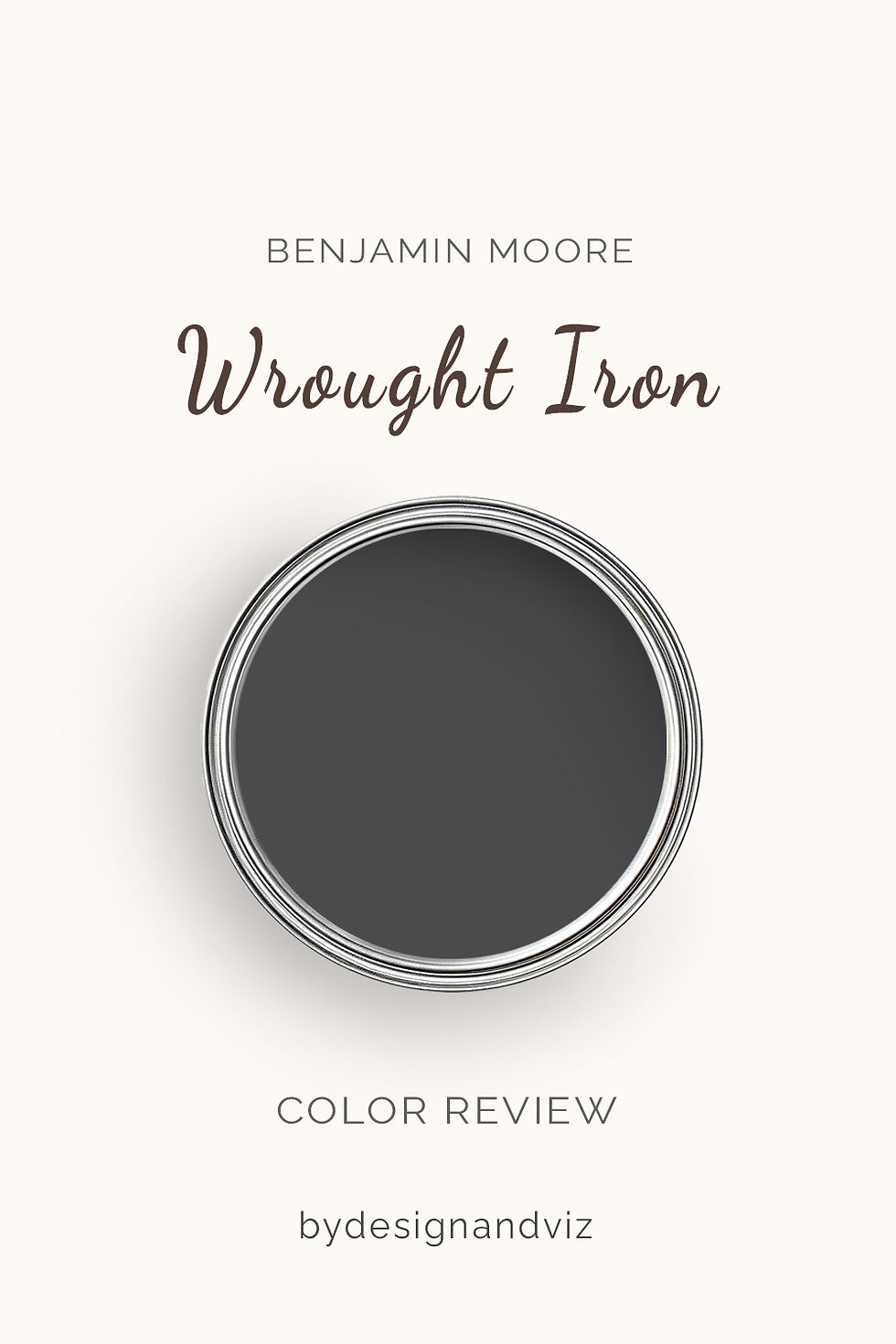
Wrought Iron 2124-10 is Benjamin Moore's most widely specified true dark charcoal and one of the most popular dark neutrals in contemporary residential design. At LRV ~6 it sits at the very dark end of the colour spectrum - a true near-black that creates immediate drama and sophistication on any surface it touches.
Wrought Iron's undertone is cool blue-black - it reads as a clean, crisp, precise dark that sits somewhere between a pure charcoal and a very dark navy. The blue quality is subtle but real: in strong natural light Wrought Iron reveals a depth that reads as graphically sophisticated rather than simply dark. It does not have the warmth or complexity of Iron Mountain - it reads as a clear, architectural dark that makes an unambiguous statement. This clarity is both its greatest strength and its defining character: Wrought Iron never surprises you, it simply delivers drama with precision.
For a complete guide to building the Benjamin Moore Wrought Iron colour palette - trim colours, metal finishes, wall colour pairings, and the combinations to avoid - the Wrought Iron color palette guide covers every decision."
Iron Mountain 2134-30 - What It Actually Is

Iron Mountain 2134-30 is one of Benjamin Moore's most distinctive and most characterful dark neutrals. At LRV ~9 it is fractionally lighter than Wrought Iron - still very dark, still deeply dramatic, but with a marginally softer presence on a wall that allows its undertone to breathe more noticeably.
Iron Mountain's undertone is warm grey-green - an earthy, organic quality that gives it a layered complexity that Wrought Iron's cleaner base does not deliver. In warm natural light the grey-green quality reads as rich, sophisticated, and alive - the colour feels genuinely three-dimensional on a wall rather than simply dark. In rooms with warm materials, warm wood, and warm artificial lighting, Iron Mountain is one of the most beautiful dark neutrals available. The risk is in rooms with strong cool natural light where the green component can become more visible and the colour reads as more obviously grey-green than intended. Always test Iron Mountain at large scale in the actual room before committing.
For the full standalone review of Iron Mountain - undertones, LRV, light behaviour by orientation, best rooms, what to pair it with, and a clear verdict on who it is and is not right for - the Benjamin Moore Iron Mountain review covers everything you need to know before committing.
The LRV Difference - Small But Meaningful at This Depth

Wrought Iron at LRV ~6 and Iron Mountain at LRV ~9 have only a 3-point gap - but at this depth of colour that gap is proportionally much more significant than the same gap would be in the mid-tone range. Both are very dark. Both will absorb a lot of light. Both require careful consideration of room size, natural light, and artificial lighting before committing.
Iron Mountain's marginally higher LRV means it retains slightly more visible colour character in low-light conditions - in a room with limited natural light, Iron Mountain's warmth keeps a faint sense of richness alive where Wrought Iron can read as closer to flat black. In a room with good natural light the difference is less consequential - both reveal their full character beautifully. In very dark rooms or rooms with predominantly artificial light, Iron Mountain is the slightly more forgiving of the two.
How Each Colour Behaves in Different Light
Natural Light

Natural light is where both colours are revealed at their most impressive - and where the undertone difference is most clearly visible. In strong warm south-facing natural light, Wrought Iron reveals a deep, rich blue-black quality that reads as genuinely sophisticated and considered. The colour looks like it was chosen with precision and it delivers on that impression.
Iron Mountain in strong natural light reveals its warm grey-green quality - the colour becomes alive and three-dimensional in a way that a simpler dark neutral cannot replicate. In south-facing rooms with warm materials, Iron Mountain in full natural light is one of the most beautiful dark neutral effects available from any brand. The richness of the green-grey in warm light is genuinely extraordinary.
In north-facing rooms both colours require more care. Wrought Iron in north-facing conditions holds its blue-black character consistently - the cool undertone suits the cool light and the colour reads as clean and precise. Iron Mountain in north-facing conditions can read as slightly heavier and more green-dominant than in warm light - the green undertone without warm light to balance it can become more pronounced. Both are still usable in north-facing rooms but Wrought Iron is the more predictable north-facing choice of the two.
Artificial Light

Artificial lighting specification is one of the most important decisions for any very dark colour - and particularly for these two. Under warm-spectrum bulbs (2700K-3000K), Wrought Iron holds its cool blue-black quality with a warm light washing over it - the result reads as dramatic and atmospheric. Iron Mountain under the same conditions becomes deeply rich and beautiful - the warm light activates the green-grey warmth and the colour reads as genuinely luxurious.
Under cool daylight bulbs (4000K+), Wrought Iron can read as slightly cold or flat - the blue-black undertone amplified by cool light loses its depth and reads as a dark grey rather than a characterful charcoal. Iron Mountain under cool daylight bulbs can show its green component more clearly - the colour reads as darker and greener than the chip suggested. Warm-spectrum lighting is strongly recommended for both colours and is arguably non-negotiable for either at full-room scale.
Considering a dark colour for your home? Book a colour consultation here - bydesignandviz.com/book-online |
Where Each Colour Works Best
Cabinets and Joinery
Both colours are exceptional cabinet choices and represent two different dark cabinet personalities. Wrought Iron on cabinets reads as clean, graphic, and precisely contemporary - it suits kitchens with cool stone countertops, polished or brushed nickel hardware, and a clean minimalist or transitional brief. The blue-black quality at cabinet scale looks professional and deliberate.
Iron Mountain on cabinets reads as rich, warm, and deeply characterful - it suits kitchens with warm stone countertops, aged brass or unlacquered brass hardware, and warm wood open shelving. The grey-green warmth at cabinet scale creates a sense of considered, layered design that Wrought Iron's cleaner base cannot fully replicate. For traditional, organic modern, or warm-palette kitchens, Iron Mountain on cabinets is one of the most beautiful dark choices available.
Feature Walls and Full Rooms

Wrought Iron on a feature wall creates an immediately striking, graphic result - the cool blue-black reads as boldly contemporary and works particularly well behind shelving, artwork, or as a bed head wall in a bedroom. It creates high contrast without the warmth complexity that Iron Mountain brings.
Iron Mountain on a full room or feature wall creates one of the most enveloping and atmospheric dark interior effects available - the warm grey-green in a room with warm lighting, warm wood floors, and warm textiles reads as deeply sophisticated and genuinely extraordinary. It is one of the colours I specify most readily for dining rooms, studies, and home offices where the brief is a rich, cocooning atmosphere. In those conditions Iron Mountain is genuinely difficult to beat.
Front Doors and Exteriors

Both are excellent front door colours but for different architectural characters. Wrought Iron on a front door reads as crisp, contemporary, and precisely architectural - it suits modern, transitional, and contemporary homes where high contrast and clean graphic quality are the brief. The cool blue-black reads beautifully against warm stone, brick, and white render.
Iron Mountain on a front door reads as richer and more organically characterful - it suits traditional, Victorian, Georgian, and farmhouse architecture where a dark colour with warmth and depth is more appropriate than a clean graphical dark. The warm grey-green reads as considered and elevated against aged brick, warm stone, and natural timber cladding.
Trim, Shutters, and Architectural Details

Wrought Iron is one of the most widely specified dark trim and shutter colours in residential design - the clean blue-black quality at trim scale reads as crisp and deliberately architectural. It suits both contemporary and traditional homes where dark trim is the brief and creates excellent contrast against warm off-white walls like Alabaster, Greek Villa, or White Dove.
Iron Mountain on trim and shutters reads as richer and less crisp than Wrought Iron - the warm grey-green at trim scale suits homes where the trim colour needs to relate to warm stone or warm brick materials on the facade. For homes with warm materials where Wrought Iron's clean blue-black would create an undertone conflict, Iron Mountain is the more harmonious choice.
Which Should You Choose?
Choose Wrought Iron if:

The interior style is contemporary, minimalist, or transitional - the clean blue-black reads as architecturally precise and suits the restraint of these briefs naturally. It is the dark colour for rooms where the brief is graphic and deliberate rather than warm and enveloping.
The application is trim, shutters, front doors, or cabinetry in a cool-palette or contemporary kitchen - Wrought Iron at trim and detail scale reads as professional and precisely chosen in these contexts.
The material palette includes cool elements - cool stone, polished concrete, brushed nickel, stainless, bleached timber - Wrought Iron's cool undertone relates naturally to cool materials in a way that Iron Mountain's earthy warmth does not.
You want a dark neutral that performs consistently and predictably - Wrought Iron's clean undertone means it rarely surprises. It reads as a dark charcoal in virtually every condition and delivers that result without the complexity that Iron Mountain's warm grey-green brings. For how BM dark charcoals sit within the wider dark colour family, the Benjamin Moore Kendall Charcoal guide covers the most specified BM charcoal grey in detail.
Choose Iron Mountain if:

The interior style is traditional, organic modern, or warm contemporary - the warm grey-green quality relates naturally to these contexts and to the warm materials - aged wood, warm stone, brass, linen - that typically accompany them.
The application is a full room, a dining room, a study, or a home office where the brief is atmospheric and cocooning - Iron Mountain in these applications with warm lighting and warm materials is one of the most beautiful dark neutral results available.
The material palette is warm throughout - warm wood, warm stone, unlacquered brass, natural linen, aged bronze - the grey-green warmth creates cohesion with warm organic materials that Wrought Iron's cooler character cannot replicate.
You want a dark colour with genuine complexity and character - Iron Mountain's warm grey-green is genuinely distinctive. It reads as a considered, characterful choice rather than a generic dark neutral. In the right conditions it is one of the most impressive colours in the BM range.
If you are still unsure:
Sample both at large scale in the actual room - at this depth of colour, a small chip reveals almost nothing. A large sample board observed across morning, afternoon, and evening light in the actual room - and under the actual artificial lighting you will use - is non-negotiable. The blue-black quality of Wrought Iron and the warm grey-green quality of Iron Mountain will both be clearly visible at sample scale. The room's own light and materials will tell you immediately which direction is correct.
Wrought Iron and Iron Mountain vs Other BM Dark Neutrals

vs Kendall Charcoal HC-166 - Kendall Charcoal at LRV ~14 is meaningfully lighter than both Wrought Iron and Iron Mountain and has a warm grey with subtle green undertones. It is more forgiving in rooms with limited light and suits rooms where a dark grey with presence is needed but the full drama of Wrought Iron or Iron Mountain would be too much. The full Kendall Charcoal guide covers every application.
vs Hale Navy HC-154 - Hale Navy at LRV ~7 sits in the same depth range as Iron Mountain but reads as clearly navy blue rather than dark charcoal. For rooms where the brief is a dark colour with clear blue identity rather than a dark charcoal-neutral, the Naval vs Hale Navy guide covers the dark navy comparison in detail.
vs Off Black / near-black options - both Wrought Iron and Iron Mountain sit just above the near-black zone. For rooms where even more depth is needed and the brief approaches true near-black, colours like BM Black Iron 2120-20 or Sherwin Williams Tricorn Black SW 6258 are the correct next step.
Frequently Asked Questions
Is Wrought Iron warmer or cooler than Iron Mountain?
Wrought Iron is significantly cooler than Iron Mountain. Wrought Iron's blue-black undertone places it clearly on the cool side. Iron Mountain's warm grey-green undertone places it firmly in the warm family despite its dark depth. In most light conditions they read as distinctly different in warmth character - Wrought Iron reads as crisp and architectural, Iron Mountain reads as rich and organic. This warm-cool difference is the most important practical distinction between them.
Can Wrought Iron and Iron Mountain be used in the same house?
Not on adjacent or simultaneously visible surfaces - the undertone difference is visible when both can be seen at the same time. In separate rooms with clear visual boundaries they can coexist - Wrought Iron on a kitchen island in a contemporary kitchen and Iron Mountain in a traditional dining room is a perfectly considered approach if the rooms have different briefs and different material palettes.
Is Wrought Iron good for front doors?
Yes - Wrought Iron is one of the most popular front door colours in contemporary residential design. The clean blue-black reads as crisp and precisely architectural at door scale and creates an immediate and impressive statement against virtually any facade colour. It suits contemporary, transitional, and modern farmhouse architecture particularly well.
Does Iron Mountain look green?
Iron Mountain can read as more obviously grey-green in rooms with strong natural light or cool artificial lighting - the warm grey-green undertone becomes more visible in those conditions. In a room with warm materials and warm-spectrum artificial lighting the green quality reads as warmth and richness rather than obvious green. Always test Iron Mountain at large scale in the actual room under the actual lighting conditions before committing - this is especially important for full-room applications.
Which is better for kitchen cabinets?
Both are exceptional but for completely different kitchen characters. Wrought Iron suits contemporary, cool-palette kitchens with cool stone and brushed nickel. Iron Mountain suits traditional, organic modern, and warm-palette kitchens with warm stone and brass. The material palette and kitchen style are the deciding factors - there is no universally correct answer between these two.
Which is better for a bedroom?
Iron Mountain is the more widely satisfying bedroom choice between the two for most briefs - the warm grey-green quality under warm evening artificial lighting creates a deeply cocooning, atmospheric bedroom atmosphere that suits the brief of rest and intimacy. Wrought Iron in a bedroom works beautifully as a feature wall or head wall in a contemporary or minimalist bedroom, but for full-room bedroom applications Iron Mountain's warmth is more comfortable to live with over time.
The Verdict
Wrought Iron and Iron Mountain are not interchangeable despite their similar depth - the cool-warm undertone difference creates two completely different rooms from very similar LRV values. Wrought Iron is the clean, graphic, architecturally precise dark: crisp, contemporary, and consistent across conditions. Iron Mountain is the warm, layered, deeply characterful dark: rich, organic, and extraordinary in the right room with the right materials and the right light.
The decision comes down to two questions: is the material palette warm or cool, and is the brief contemporary precision or warm atmosphere? If the palette is warm and the brief is atmospheric richness, Iron Mountain. If the palette is cool or neutral and the brief is graphic drama and architectural clarity, Wrought Iron. Sample both at large scale in the actual room under actual lighting conditions - at this depth of colour the undertone difference is immediately and unmistakably clear.
Need help choosing the right dark colour for your home? See our design packages here - bydesignandviz.com/#interiordesignpackages |
About the Author
Beril Yilmaz is a qualified architect and interior designer based in the UK. She runs BY Design And Viz, a design platform covering paint colour reviews, interior design guidance, and residential design projects.


Comments