


Dover White vs Shoji White: The Comparison That Actually Helps You Decide

Dover White and Shoji White sit at opposite ends of what Sherwin Williams calls a warm white. Dover White is a bright, committed cream - the undertone is unmistakably yellow-beige and it announces itself the moment it goes on a wall. Shoji White is something else entirely: a deeper, quieter greige-white that refuses to commit to warm or cool and shifts depending on what is around it. Choosing between them is really a choice between a colour that behaves predictably and a colour that behaves contextually.
Dover White SW 6385 has an LRV of 83 and reads as a luminous, creamy off-white in almost any light. Shoji White SW 7042 has an LRV of 74 - nine points lower - and reads as a muted, ambiguous greige that can pick up pink, green, or beige depending on the bulb and the room. The LRV gap alone tells you these are not interchangeable whites, and the undertone behaviour makes that gap matter even more in practice.
This guide covers exactly how Dover White and Shoji White differ in undertone, LRV, light behaviour, and room application - including which one actually works in a north-facing room and which one needs help getting there.

At a Glance
| Dover White | Shoji White |
Brand | Sherwin Williams | Sherwin Williams |
LRV | 83 - a bright, light-filled warm white | 74 - a deeper, more muted off-white |
Colour category | Committed warm cream - reads as off-white with visible yellow-beige warmth | Ambiguous warm greige - reads as off-white with a cream base moderated by gray and a touch of green |
Undertones | Strong, stable yellow-beige - the undertone does not hide and does not shift much across lighting conditions | Complex and context-dependent - cream base, calmed by taupe-gray, capable of reading pink, green, or beige depending on the light source |
Character | Bright, cozy, and unapologetically warm - this is a cream-leaning white, not a neutral one | Grounded, quiet, and adaptable - this is a greige-leaning neutral, not a committed cream |
North-facing | Good - the high LRV keeps rooms bright, though the yellow can intensify in flat indirect light | Strong - the muted, gray-calmed base holds together in cool indirect light better than a high-chroma cream would |
South-facing | Strong - the warmth glows without tipping into orange | Good - warms up appreciably and can lean more amber under direct sun |
Open-plan | Workable but needs consistency - its committed warmth can clash with cooler whites used elsewhere in the same sightline | Excellent - its lower chroma and gray-taupe moderation let it move through connected rooms without announcing itself at every transition |
On walls | Bright, creamy backdrop with real warmth - rooms read sunny and inviting even with limited natural light | Deeper, grounded backdrop with quiet warmth - rooms read calm and layered rather than bright |
On cabinets | A classic warm-white cabinet choice for traditional and transitional kitchens | A go-to warm-neutral cabinet white for modern farmhouse and organic modern kitchens |
Use together? | Rarely - the LRV and undertone gap is wide enough that pairing them on adjoining walls reads as mismatched rather than layered | Rarely - see Dover White row |
Trim for each | Dover White works best with its own family (Creamy, Alabaster) on trim rather than Shoji White | Pure White or Snowbound for crisp contrast; avoid Dover White, which reads as a mismatched warmer white beside it |
Style fit | Traditional, farmhouse, cottage, warm transitional | Modern farmhouse, organic modern, transitional, soft contemporary |
Architect's pick | When the brief calls for a bright, reliably warm cream with no ambiguity | When the brief calls for a flexible, light-absorbing neutral that adapts to its surroundings rather than dictating them |
SW Dover White - What It Really Looks Like
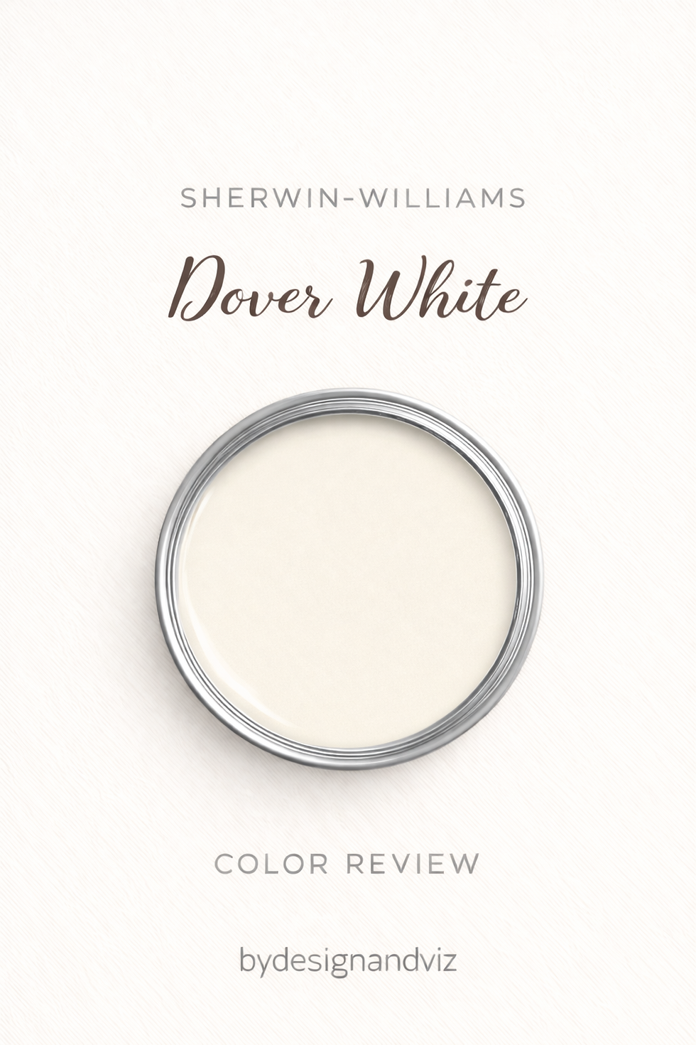
Dover White has an LRV of 83 - bright enough to lift a room with limited natural light, with an undertone that does not hide. The base is a clear yellow-beige, and unlike many SW whites that hedge toward gray or green, Dover White stays committed to warmth in nearly every light condition tested.
The undertone is the defining feature, not a side note. Place it next to a cooler greige and the yellow becomes more obvious, not less - Dover White has a reputation for amplifying warmth in cool-toned company rather than blending into it. That makes it a deliberate choice rather than a safe default.For how Dover White compares against the Benjamin Moore white it is most often confused with by name, the Dover White vs White Dove guide covers that cross-brand distinction in full.
SW Shoji White - What It Really Looks Like

Shoji White has an LRV of 74 - nine points below Dover White - and the depth is immediately visible on a wall. The base is cream, but it is moderated by gray and a faint green component, which keeps the colour from settling firmly into warm or cool. That ambiguity is precisely what makes it so widely specified across open-plan homes.
The undertone genuinely shifts with its environment. Under warm bulbs it leans more amber and grounded. Under cooler daylight LEDs it can read more taupe or faintly green. This is not a flaw - it is the mechanism that lets Shoji White move through connecting rooms without clashing at each threshold.For how Shoji White compares against another popular SW neutral with a similar LRV but a different undertone direction, the Shoji White vs Pale Oak guide covers that cross-brand comparison in full.
The Real Difference Between Dover White and Shoji White

Dover White commits. Shoji White adapts. That single distinction explains almost everything else about how these two colours perform in a room.
The nine-point LRV gap is not subtle on a wall. Dover White at 83 reads as a genuinely bright, light-reflecting cream - the kind of white that lifts a room with limited natural light. Shoji White at 74 reads as noticeably deeper and quieter, closer to a true greige-white than a bright cream. Stand a sample of each side by side and the brightness difference is immediately obvious before the undertone conversation even starts.
The undertone behaviour is where the real difference lives. Dover White's yellow-beige base is stable - it reads warm in north light, warm in south light, warm under LED bulbs. Shoji White's undertone is genuinely unstable in the way professional colour consultants describe as 'flexible' - it can read slightly pink under one bulb and slightly green under another, settling into a calm greige in between. For the closest within-brand comparison that shows how Shoji White behaves against another popular SW warm neutral, theShoji White vs Alabaster guide covers that undertone contrast in detail and is worth reading before committing to either.
Not sure which one works for your room? A colour consultation is included in all our design packages - book directly here. |
When to Choose Dover White

Choose Dover White when the brief is bright, dependable warmth. Traditional and farmhouse interiors where a cream-leaning white is the goal, not a true neutral. Rooms with limited natural light that need the lift a high LRV provides without losing warmth in the process.
Dover White is also correct in rooms with warm wood floors and warm metal hardware, where its committed undertone has material partners to agree with rather than fight against.
When to Choose Shoji White
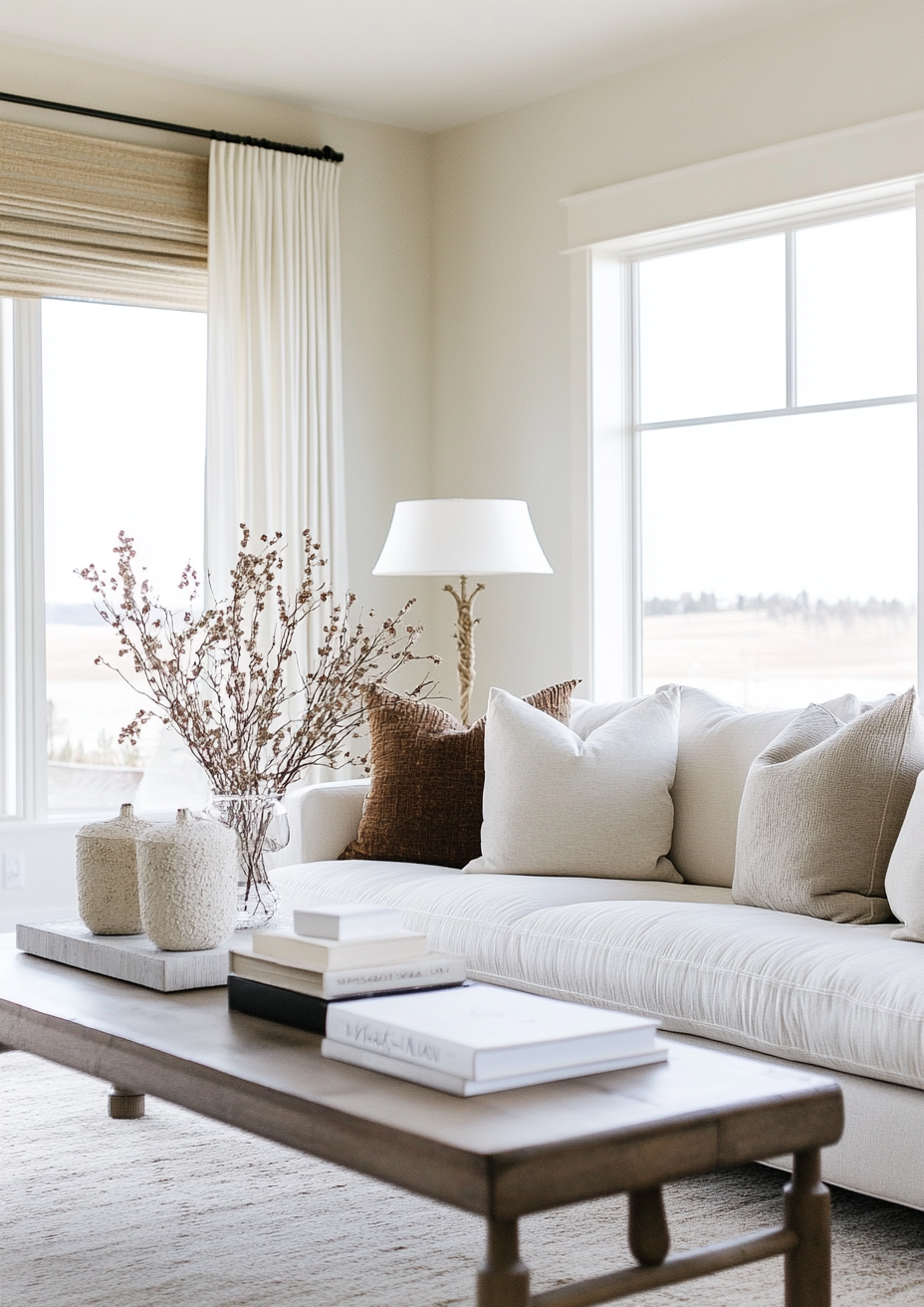
Choose Shoji White when the brief is a flexible whole-house neutral. Open-plan homes where the same colour needs to read consistently across rooms with different orientations and light sources. Modern farmhouse and organic modern interiors where a grounded, lower-chroma backdrop is the goal.
Shoji White is also correct in north-facing rooms, where its gray-taupe moderation holds together more predictably than a high-chroma cream would in the same cool, indirect light.
How the Pairings Differ

For Dover White on walls, white trim from the same warm family - Creamy or Alabaster - holds together best. Avoid Shoji White on trim against Dover White walls; the deeper greige reads as a mismatched, muddier white rather than a deliberate contrast.
For Shoji White on walls, Pure White or Snowbound on trim gives crisp, deliberate contrast. Dover White on trim against Shoji White walls tends to read warmer and more yellow than intended, fighting the gray-taupe calm that makes Shoji White work.
For flooring, Dover White is strongest with warm wood tones - oak, walnut, pine - where the cream warmth and the wood warmth reinforce each other. Shoji White is more flexible, holding its own against warm wood, cool stone, and contemporary tile alike, since its lower chroma does not compete as hard with what is underfoot.
For hardware, Dover White pairs naturally with warm metals - brass, bronze, warm gold - that echo its committed warmth. Shoji White is more forgiving, working with brushed brass, matte black, or polished nickel without the undertone shifting noticeably.
Architect's Verdict - Dover White or Shoji White?

These two Sherwin Williams whites are not really competing for the same brief. One commits to warmth. The other adapts to its surroundings.
If the brief is a bright, reliably warm cream that lifts a room and never wavers from its character regardless of bulb or orientation - Dover White is the answer.
If the brief is a quieter, more flexible neutral that can move through an open-plan home or a series of rooms with shifting light without dictating the mood of each one - Shoji White is the answer.
Sample both at large scale in your specific room - ideally a north-facing space under standard LED lighting, the most demanding test for any warm white, since it is where Dover White's commitment can tip from cozy to heavy and where Shoji White's ambiguity is most likely to surface a pink or green cast. A pass means the colour still reads intentional, not muddy or unpredictable, once the sample has sat on the wall for a full day under that light.
Frequently Asked Questions

Is Dover White brighter than Shoji White?
Yes - by nine LRV points. Dover White has an LRV of 83 and Shoji White has an LRV of 74. Dover White reads as a genuinely bright cream that lifts a room. Shoji White reads as a deeper, more muted off-white that holds more shadow and depth.
Which one is better for a north-facing room?
Shoji White generally performs more reliably in north-facing light. Its gray-taupe moderation keeps it from reading flat or overly yellow in cool indirect light. Dover White's strong, committed yellow undertone can intensify and feel heavier in a north-facing room that lacks warm direct sun to balance it.
Can Dover White and Shoji White be used together in the same home?
It works best with separation rather than adjacency. Using them in completely separate zones of an open-plan home - rather than on adjoining walls or in sightline of each other - avoids the mismatched look that putting them side by side tends to create, since the LRV and undertone gap reads as inconsistency rather than intentional layering.
Which is more versatile for whole-house colour?
Shoji White is the more flexible whole-house choice. Its lower chroma and gray-calmed undertone let it move through different rooms and light conditions without shifting dramatically. Dover White's committed warmth is better suited to spaces where a consistent, bright cream is specifically wanted throughout.
What is the LRV of Dover White vs Shoji White?
Dover White SW 6385 has an LRV of 83 and Shoji White SW 7042 has an LRV of 74. The nine-point gap places them in different brightness categories - Dover White reads as a true bright off-white, Shoji White reads as a deeper warm greige.
Does Shoji White look pink or green in some rooms?
It can, depending on the light source. Shoji White's undertone is genuinely more context-dependent than Dover White's - it can pick up a faint pink cast under some bulbs and a faint green cast under others, settling into a neutral greige in between. Always sample it in the actual room before committing.
Final Thought
Dover White and Shoji White solve different problems. One is a bright, dependable warm cream. The other is a deeper, adaptable greige-white that earns its keep in connected spaces.
Bright, committed warm cream for traditional and farmhouse interiors - Dover White. Quiet, adaptable greige-white for modern farmhouse and transitional schemes spanning multiple rooms - Shoji White. Sample both at large scale, in your specific light, before deciding.
Want a complete colour scheme built around Dover White or Shoji White? Our design packages cover full palette selection, finish recommendations, and 3D visualisations - see our packages. |
About the Author
Beril Yilmaz is a qualified architect and interior designer based in the UK. She runs BY Design And Viz, a design platform covering paint colour reviews, interior design guidance, and residential design projects. Beril has specified both Sherwin Williams Dover White and Shoji White across residential projects in the UK and internationally - Dover White in traditional and farmhouse interiors where a bright, committed warm cream is the brief, and Shoji White in modern farmhouse and transitional schemes where a quieter, adaptable greige-white is needed to hold together across multiple rooms and light conditions.


Comments