


Sherwin-Williams Dover White SW 6385 - An Architect's Honest Review

Sherwin-Williams Dover White SW 6385 is a warm white that is sold as a neutral and behaves like a cream. Its LRV of 83 puts it level with most of the whites on a typical shortlist, which is why people assume it will sit quietly in the background - but the yellow-cream undertone is strong enough to announce itself the moment the light turns warm. I have specified Dover White where a client wanted softness without a greige look, and in every case the outcome came down to how much yellow the room could carry.
The tension is easy to state. Dover White is clean enough to pass for white on a chip and warm enough to read as cream on a wall, and the gap between those two readings is where most disappointment happens. In the right light, with trim chosen to suit it, it gives a room a settled, lived-in glow that crisper whites cannot produce. Beside a cool white it simply looks like an error.
This review covers Dover White's undertone, its LRV, how it changes by orientation and under artificial light, the trim and materials that suit it, and an honest assessment of who should and should not choose it.
Dover White SW 6385 - The Key Facts
Collection | Sherwin-Williams whites and off-whites |
LRV | ~83 (very light zone - bright, but with more body than a true white) |
Undertone | Yellow-cream - warm, soft, openly creamy |
Character | Traditional, farmhouse, transitional, softly enveloping |
Best trim | Pure White SW 7005, or Dover White itself for a tonal wrap |
Best orientation | North or east-facing - cool light tempers the yellow; south and west rooms need a large sample first |
Main risk | Yellow turns buttery in strong south or west light, and looks dingy beside a cooler, brighter white such as Extra White |
Dover White Undertones - What Is Actually Going On
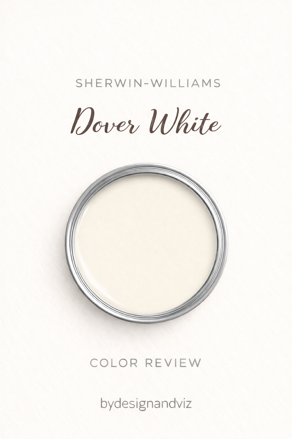
The undertone of Dover White is yellow-cream - and it is the defining feature of the colour, not a faint accent. Reviewers disagree on how strong it is: one colour consultant calls the yellow strong, another describes a creamy white with beige-yellow warmth, and some data sites file it simply as warm with neutral undertones. None of them describe it as cool, pink, or grey. On a wall it reads closer to fresh cream than to butter, provided the room is not already warm.
That yellow is what separates Dover White from the pure whites. A white with almost no undertone sits flat against a wall, while Dover White has body, which is why it suits panelling, shaker joinery, and older houses with warm timber. The price of body is that the yellow cannot be argued away: if the room already leans warm, the colour will lean further.
Where the undertone causes trouble is beside other whites. Next to a bright, cool white it looks distinctly creamy, and next to a true cream it can look almost clean. The error I see most often is a Dover White wall with trim in a cooler, brighter white chosen separately, so the pair reads as two unrelated decisions. For the closest warm sibling, Creamy SW 7012, the Dover White vs Creamy guide shows how far apart two warm whites at near-identical LRV can sit.
LRV - What 83 Means in a Real Room

At LRV ~83, Dover White sits in the very light zone - bright enough to lift a room, but with slightly more body than the brightest whites. Published figures cluster at 83, with one colour database listing 82.5. It sits about one point below Pure White and Greek Villa (both 84), one point above Alabaster (82), and roughly two points above Creamy (81).
A gap of one or two points is not something the eye can detect in a finished room. Between these colours the undertone, not the reflectance, does the separating. What does show is the distance to the true brights: Extra White sits at LRV 86 with a bluish bias, and the three-point difference is small on paper but large in effect because the undertone runs in the opposite direction.
In practical terms, Dover White will keep a smaller room feeling open without bleaching it. It reflects less than a stark white, so it holds shadow and form better on panelling and mouldings. For a direct comparison against the crisper SW white, the Dover White vs Pure White guide covers where the reflectance gap matters and where it does not.
How Dover White Behaves in Different Light

South-Facing Rooms
South-facing rooms show Dover White at its warmest and most generous. Strong warm light amplifies the yellow, and through the afternoon the colour drifts toward soft butter-cream. In a large, bright living room that is exactly the point. In a small south-facing room it can feel heavy, so I look at a large sample at four in the afternoon rather than ten in the morning before committing.
North-Facing Rooms
North-facing rooms suit Dover White better than most people expect. Cool, indirect light removes some of the yellow and leaves a clean, soft cream rather than a grey, which is a better result than a cool white would give in the same room. The wall keeps a warm tone and counters the flatness of north light rather than adding to it. The condition is that the artificial lighting is warm too, otherwise the benefit disappears after dark.
East and West-Facing Rooms
East-facing rooms give Dover White a pale, clean cream in the morning and a quieter, slightly flatter one by afternoon. For a breakfast room or a kitchen used mostly before midday, that is a pleasant arc. West-facing rooms behave like south-facing ones from mid-afternoon, with the yellow deepening toward gold in evening light. If the room is mainly used in the evening, a west-facing Dover White wall can be very comfortable, but it should be sampled in that light specifically.
Artificial Lighting
Bulb temperature changes Dover White more than it changes the cooler whites. At 2700K the cream deepens and the room reads as cosy and traditional. At 3000K it stays soft without tipping into yellow, and at 4000K and above it flattens toward a dull, slightly dirty off-white. I specify 2700K to 3000K with Dover White and avoid cool daylight bulbs entirely. If the same room is also lit by a window facing another direction, check the wall in both conditions, because the shift between them is larger than with a neutral colour.
Not sure if Dover White works for your room? A colour consultation is included in all our design packages - book directly here. |
Trim Colours and What to Pair With Dover White

Trim - Pure White or Tonal
Pure White SW 7005 is the trim colour I reach for first. It carries very little undertone, so it reads clean beside Dover White without introducing a second temperature. Extra White, at LRV 86 with a bluish bias, makes Dover White look yellower by comparison, and I only accept it where it is already on the woodwork. For a tonal, traditional result, walls, trim, and ceiling can all be Dover White in different sheens, which removes the contrast question altogether.
Floor Materials
Warm timber floors, from natural oak through to walnut, are the easiest companions for Dover White. The shared warmth means nothing in the room competes, and the wall reads as a softer extension of the wood. Grey-washed floors and blue-grey tile pull the yellow forward by contrast, and I avoid them. Warm natural stone, such as travertine, relates well for the same reason.
Metal Finishes
Brushed nickel keeps Dover White feeling fresh, while warmer metals deepen the cream. Nickel adds a clean counterpoint that stops a traditional room from tipping into heaviness. Aged brass and bronze reinforce the warmth and suit farmhouse and period interiors, but they commit the room to a fully warm palette. I avoid mixing both across one room unless the split is clearly intentional.
Accent Colours
Deep, muted colours with some grey in them work best against Dover White. Iron Ore, at LRV 6, gives joinery or a feature wall a strong anchor, and Evergreen Fog, at LRV 30, adds a softer green that reads as natural rather than decorative. Both give the cream wall something to push against. I avoid icy pastels and clean cool blues, which exaggerate the yellow rather than balancing it.
Dover White Room by Room

Bathrooms
Bathrooms are a good fit when warmth is the brief rather than a spa look. Dover White with warm timber, brushed nickel, and natural stone creates a soft, traditional result, though it will not give the cool clarity of a crisper white. If you want a marginally brighter and peachier cream at LRV 84, the Greek Villa vs Dover White guide sets out the difference between the two.
Bedrooms
Dover White in a bedroom creates a soft, enveloping atmosphere that holds up well in evening light. With 2700K bedside lighting the cream deepens in the hours the room is actually used. In a north-facing bedroom it gives warmth without the heaviness of a darker neutral. I keep bedding in natural linen or cream so the wall does not look yellow against bright white fabric.
Living Rooms
Living rooms are where Dover White is most at home, particularly traditional and transitional ones. Warm timber, upholstered furniture in natural fibres, and table lamps at 2700K all reinforce the cream. In a large south-facing room it can read a touch buttery by late afternoon, so it needs enough floor area and furniture to absorb it. Anyone cross-shopping Benjamin Moore should note that sources differ on White Dove's undertone, and the Dover White vs White Dove guide compares the two directly.
Kitchens
Dover White works well on kitchen walls and shaker cabinetry in farmhouse, traditional, and transitional kitchens. Against stone worktops and brushed nickel hardware it stays clean for a warm white. On cabinets the undertone becomes more visible next to countertops, so large door samples matter. If the yellow feels too assertive, Alabaster is the more muted alternative, and the Dover White vs Alabaster guide sets out the trade-off.
Home Offices and Studies
Dover White suits a home office where the aim is a calm, unobtrusive backdrop with some warmth. It does not distract the way a stronger colour can, and the cream softens the screen glare that a stark white tends to amplify. Paired with a dark joinery colour such as Iron Ore on shelving and a warm timber desk, the room gains structure without losing comfort.
Who Dover White Is Right For - And Who It Is Not

Dover White is right for you if:
The interior style is traditional, farmhouse, or transitional - these briefs ask for a wall colour with body and warmth. Dover White supplies that without tipping into beige, and it gives timber, panelling, and period detail a soft setting.
The room is north or east-facing, or lit mainly in the evening - cool light tempers the yellow and leaves a clean cream, while evening light deepens it pleasantly. These are the conditions where Dover White is most forgiving.
You want a white that feels warm rather than neutral - a stark or near-neutral white can look clinical in a family home. Dover White reads as a deliberate, comfortable choice, and that is its real strength over cooler whites.
You are prepared to specify warm bulbs and a compatible trim white - 2700K to 3000K lighting and a trim such as Pure White keep the colour resolved. With those two decisions made, most of the risk is removed.
Dover White is not right for you if:
The room is strongly lit from the south or west and is small - the yellow can deepen into butter-cream through the afternoon, and a small room has no way to absorb it. If you love the cream in a bright room, a more muted white such as Alabaster is safer.
The brief is crisp, modern, or gallery-like - Dover White has too much warmth to deliver precision. A cooler, brighter white will read as cleaner and more architectural in that kind of interior.
The palette is cool, with grey tile, steel, or blue-grey furnishings - the yellow will be pushed forward by contrast and the room will look unresolved. Cool materials need a white that does not compete with them.
You are not prepared to sample beside your real trim and bulbs - Dover White is one of the colours that changes most against its neighbours. A swatch in isolation will not reveal whether it looks cream or dingy beside your woodwork.
How Dover White Compares to Similar Colours

vs Creamy SW 7012 - Creamy sits at LRV 81, about two points below Dover White's 83, and both read as warm, yellow-leaning whites. The two are close enough that the choice comes down to how much depth you want against your timber and fabrics, and sources do not agree on which carries more yellow. Sample them side by side before committing, because the difference is subtle and context-dependent.
vs Alabaster SW 7008 - Alabaster is one point lower at LRV 82 and is the more muted of the two, with a softer, more neutral warmth. Dover White carries the more openly cream character and suits traditional rooms; Alabaster is easier in mixed or contemporary schemes where the yellow needs to recede.
vs Greek Villa SW 7551 - Greek Villa is slightly brighter at LRV 84 and tends to read as a peachier, creamier white. The one-point gap is invisible in a room, so the choice is about undertone: Greek Villa is often cited as more forgiving in cooler light, while Dover White gives a more distinctly yellow-cream result.
vs Pure White SW 7005 - Pure White is one point brighter at LRV 84 and carries far less undertone, which is why it works as trim beside Dover White. As a wall colour it is cleaner and more neutral, so it suits rooms where warmth should come from furnishings rather than paint.
vs White Dove OC-17 - Benjamin Moore White Dove is almost identical in reflectance at LRV 83, but sources describe its undertone differently, some as yellow and some as a muted green-grey. Many reviewers describe it as softer and less creamy than Dover White. If you are choosing between brands for a warm white, sample both on the wall rather than relying on the chip.
Frequently Asked Questions

Is Dover White warm or cool?
Dover White is warm. Its yellow-cream undertone places it firmly on the warm side of white, and no source describes it as cool. This is the quality that makes it right for traditional, cosy rooms and wrong for crisp, cool-toned ones. If you want a neutral white with little temperature, look at Pure White instead.
Does Dover White look yellow on the wall?
It can, depending on the light and what sits beside it. In north-facing or east-facing rooms it usually reads as a soft cream, while strong south or west light can push it toward butter-cream. Beside a cool bright white it will look yellower than it does alone. A large sample in the actual room is the only reliable way to judge how much yellow your conditions will bring out.
What is the best trim colour for Dover White?
Pure White SW 7005 is the trim colour I recommend most often. It carries very little undertone, so it looks crisp without introducing a second temperature. For a tonal, traditional look, Dover White itself in a different sheen also works well. Avoid Extra White, which has a bluish bias and makes Dover White look yellower by comparison.
Does Dover White work in a north-facing room?
Yes, and it is often better there than in a south-facing room. Cool indirect light tempers the yellow and leaves a soft cream rather than a grey. The room needs warm artificial lighting at 2700K to 3000K, otherwise the colour can lose its warmth after dark. Check it on a large sample at several times of day before painting.
What rooms is Dover White best for?
Living rooms, kitchens, and bedrooms in traditional or transitional homes are its strongest applications. The warmth suits timber, upholstery, and period detail, and it creates a comfortable backdrop in rooms used in the evening. It is less suited to small, strongly sunlit rooms, modern minimal interiors, and any space dominated by cool materials.
The Verdict
Sherwin-Williams Dover White is a reliable, characterful warm white when the conditions suit it. Treat it as a cream-leaning white, never as a neutral. It is a cream-leaning white that rewards warm materials, warm bulbs, and a trim colour selected to suit it.
In those conditions it creates a soft, settled atmosphere that crisper whites cannot match, and it does so without the heaviness of a beige. Its closest rivals, including Creamy, Alabaster, and Greek Villa, sit within two points of it in reflectance, so the decision is almost entirely about undertone and context rather than brightness.
Here is the sampling sequence I use. First, paint two large boards in Dover White, at least A2 each, with two coats. Second, place one on the wall that gets the most light and one on the wall that gets the least, and place your proposed trim white sample beside each. Third, look at both at 9am, 1pm, 4pm, and after dark under your actual bulbs at 2700K to 3000K. Fourth, note whether the colour reads as soft cream or as butter, and whether the trim looks crisp or cold beside it. If it holds in all four checks, it is the right colour for that room; if it fails at 4pm or beside the trim, switch to a more muted white and repeat the test.
Want a complete colour scheme built around Dover White? Our design packages cover full palette selection, finish recommendations, and 3D visualisations - see our packages. |
About the Author
Beril Yilmaz is a qualified architect and interior designer based in the UK. She runs BY Design And Viz, a design platform covering paint colour reviews, interior design guidance, and residential design projects. Beril has specified Dover White across residential projects in the UK and internationally - most often in traditional living rooms, shaker kitchens, and north-facing bedrooms, paired with warm oak floors and brushed nickel fixtures.


Comments