


Sherwin-Williams Drift of Mist Coordinating Colors: The Complete Architect's Guide

Sherwin-Williams Drift of Mist SW 9166 is one of the quietest colours in the range. An LRV of 69 carries a pale, muted greige with a low-chroma green-gray undertone that rarely announces itself. On a chip it can look like a plain pale gray. On a wall, in the right light, it settles into a soft, warm-leaning neutral that avoids both beige heaviness and cool-gray flatness.
I have specified Drift of Mist for clients who wanted barely a colour on the walls without the room going cold, and here is the honest truth: the challenge is not choosing Drift of Mist — it is choosing what goes with it. Because its undertone is so restrained, small changes in trim, floor, metal, or bulb pull it noticeably one way or the other. The right pairings keep it soft and warm. The wrong ones leave it gray. Here are the Drift of Mist coordinating colors named in my own comparisons and in independent reviews, and exactly why each one works.
Understanding Drift of Mist Before You Coordinate

Drift of Mist's LRV of 69 sits just below City Loft (70), well above Agreeable Gray (60), and thirteen points below Alabaster (82). It is light enough to keep a small or dim room from feeling heavy. In strong direct sun, though, that high reflectance can wash the undertone out and leave the wall reading close to white by midday.
The undertone is a warm gray carrying a muted green-greige cast, and the word muted is doing real work. Drift of Mist is a gray that borrows warmth. In a room with warm wood and brass it settles into a gentle, grounded warmth. In a room with cool stone, gray tile, or blue-gray accents it reads distinctly cooler. In a dim north-facing room the green can surface and the wall can turn cold.
That tells you what to coordinate it with. Clean whites give it definition. Pale or white-oak floors and warm lighting keep it soft. Deep charcoal, navy, and dusty sage give it the depth it cannot supply itself. Warm cream trims, orange-toned floors, and cool-temperature bulbs all work against it.
For the full standalone breakdown — undertone, light behaviour in every orientation, and the rooms where it earns its place — the Drift of Mist review is the place to start before you commit to a whole-house scheme.
Quick Reference Table
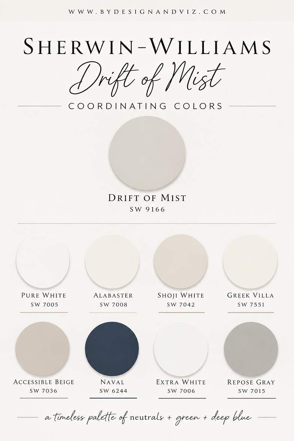
The six colors below are covered in full in the pairings section that follows. Each is named for Drift of Mist in my own comparisons or in independent reviews. Two additional colors are included here for completeness.
Color | Code | Why it works with Drift of Mist |
Pure White | SW 7005 | The trim I specify most — soft enough not to fight the undertone, crisp enough to define the wall |
Alabaster | SW 7008 | The classic tested trim — lifts the room without fighting the shifting undertone |
Shoji White | SW 7042 | A soft tone-on-tone trim, or walls with Drift of Mist built-ins for quiet depth |
Greek Villa | SW 7551 | A considered two-tone: Drift of Mist lower cabinets or walls, Greek Villa trim or uppers |
Accessible Beige | SW 7036 | A warm island against Drift of Mist walls — a tested kitchen pairing |
Naval | SW 6244 | Deep navy depth that Drift of Mist cannot supply alone |
Extra White | SW 7006 | The brighter trim when more contrast is wanted |
Repose Gray | SW 7015 | A deeper gray that shares similar undertones for a tonal, layered scheme |
Drift of Mist as a Wall Color — Best Pairings
Pure White SW 7005 with Drift of Mist Walls

Pure White is the trim I specify most often alongside Drift of Mist. It has enough softness not to fight the muted undertone, and it stays crisp enough to define the wall. It is also the colour that keeps trim from looking too stark. Use it on trim, doors, and ceilings.
This suits bathrooms, living rooms, and hallways. Keep floors pale or white oak and lighting at 2700K so the wall stays soft.
Alabaster SW 7008 with Drift of Mist Walls
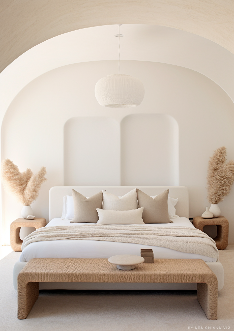
Alabaster on trim alongside Drift of Mist walls is the classic, tested pairing. At LRV 82 it lifts the room without fighting the wall's shifting undertone. Alabaster's yellow is restrained but constant: what you see in the morning is close to what you see at night, which gives the trim steadiness.
It is the softer option compared with Pure White. Keep the floors warm. Drift of Mist needs warmer floors to avoid compounding its cooler moments.
For the full comparison of Drift of Mist against Alabaster — a restrained, shifting greige set against a constant warm white — the Drift of Mist vs Alabaster guide explains how the pairings, floors, and metals differ.
Shoji White SW 7042 with Drift of Mist

Drift of Mist walls with Shoji White trim is a soft, tone-on-tone pairing. Test it, because the step is subtle. Shoji White walls with Drift of Mist built-ins adds quiet depth without a hard line.
Drift of Mist leans green-gray and Shoji White leans warmer, so the step between them is subtle. Use Extra White on trim when you want more contrast.
For the full comparison of Drift of Mist against Shoji White — a gray that borrows warmth set against a warm neutral with real presence — the Drift of Mist vs Shoji White guide covers when each belongs on the wall and when on the cabinetry.
Greek Villa SW 7551 with Drift of Mist

Drift of Mist on lower cabinetry or walls, with Greek Villa on trim or upper cabinets, is a considered two-tone scheme. Greek Villa reflects noticeably more light, so it gives the trim a clean, bright edge while Drift of Mist sits calmly below.
This suits quieter, contemporary kitchens where the cabinetry should recede rather than glow. Keep some warmth nearby, since Drift of Mist can feel underpowered beside very cool gray stone.
For the full comparison of Drift of Mist against Greek Villa — one that reads gray first and one that reads warm first — the Drift of Mist vs Greek Villa guide explains which rooms favour which.
Accessible Beige SW 7036 with Drift of Mist

Drift of Mist walls with Accessible Beige on a kitchen island is a tested pairing. Drift of Mist keeps the room open and airy while Accessible Beige gives the island weight and warmth.
The reverse needs testing. Accessible Beige walls with Drift of Mist on trim can read flat, because Drift of Mist reflects much more light than Accessible Beige and the contrast goes soft.
For the full comparison of Drift of Mist against Accessible Beige — an airy gray-greige set against a grounded warm one — the Drift of Mist vs Accessible Beige guide explains which suits strong light and which suits inconsistent light.
Naval SW 6244 with Drift of Mist
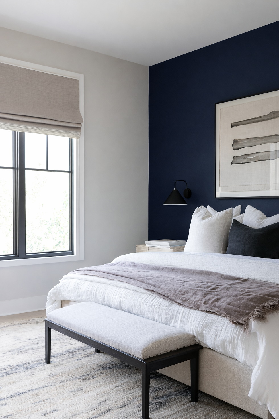
Deep navy gives Drift of Mist the depth it cannot supply alone. At LRV 69 the wall has little weight of its own, and a soft navy or deep charcoal anchors it without fighting the muted undertone.
Use it on an accent wall, a bookcase, a door, or built-ins. Matte black or brushed nickel carry the pairing through.
Drift of Mist for Trim, Floors, and Finishes

Choose clean over warm-cream for trim. Pure White is the default, Extra White the brighter option, and Alabaster the softer, tested one. A heavily warm cream trim makes the wall look grayer and flatter by comparison, so avoid it.
For floors, white oak and other pale, neutral wood are the most dependable, and pale oak, light stone, and soft gray flooring suit it too, because the low contrast does not compete. Strongly orange or honey-toned timber overpowers the wall, and gray-toned tile can tip it fully gray rather than greige.
For metals, brushed nickel and matte black sit comfortably. Warm brass works as a deliberate, repeated accent rather than one isolated fixture, and it keeps the greige side dominant. Polished chrome and very cool metals can make the wall feel colder.
Lighting decides the result. Use 2700K warm bulbs. Under cool daylight-temperature bulbs the little warmth it has recedes and the wall reads flat, slightly cool gray. For woodwork, use a satin or semi-gloss finish.
Drift of Mist vs Natural Linen — Which Soft Neutral?

This is the decision for anyone weighing a soft, light wall. Drift of Mist is the gray-leaning off-white. It looks cleaner and more mineral, close to unpolished plaster, and it recedes. Natural Linen is a warm beige with body, at LRV 66, and it does the warming for you.
The decision comes down to the room's light and finishes. If the room has generous light and mixed finishes, Drift of Mist gives a calm, flexible backdrop that never competes. If the room runs dim or leans cool and you want it to feel warmer, Natural Linen does that work.
Drift of Mist suits kitchens with cool stone and stainless appliances. It can look gray and flat beside strongly orange timber. Natural Linen is the right choice when the walls themselves need to carry the warmth.
Want a complete color scheme built around Drift of Mist? A Color Direction consultation gets you a full custom palette built around your space - book yours here. |
For the full comparison of Drift of Mist against Natural Linen — a gray-leaning off-white and a warm beige at nearly the same depth — the Drift of Mist vs Natural Linen guide covers flooring, metals, and kitchens in full.
Drift of Mist Coordinating Colors by Room

Bathroom
Bathrooms are one of the strongest applications for Drift of Mist. My standard specification is Drift of Mist walls, Pure White trim and ceiling, white oak or light stone flooring, and brushed nickel fixtures. In a south or west-facing bathroom it reads settled and restful. It also gives a calm, spa-like neutral without reading as stark white.
Bedroom
For a quiet bedroom, pair Drift of Mist with warm linen, pale oak, and a 2700K bedside lamp to hold the undertone soft into the evening. Think carefully in a north-facing main bedroom without those warming elements.
Living Room
Drift of Mist walls with warm wood floors, natural linen upholstery, and a navy or charcoal accent wall creates a calm, considered room. Give it a sunny orientation. In a room of mostly cool materials with no warm accents, it reads flat and characterless.
Kitchen
On cabinetry, Drift of Mist is a strong, currently underused choice for a soft warm-neutral scheme, beside white or light stone worktops and brushed nickel or matte black hardware. It gives a soft gray-cream finish that looks almost white against dark surfaces. Add an Accessible Beige island for warmth.
For the comparison relevant to kitchen decisions, the Drift of Mist vs Revere Pewter guide explains why Revere Pewter suits kitchens with strong light and islands, while Drift of Mist suits kitchens that need softness.
Home Office
Drift of Mist suits a study because its restrained undertone keeps the room from feeling busy. Pair it with a dark wood desk, warm brass task lighting, and a charcoal or navy bookcase.
Exterior
Drift of Mist works as a soft exterior with crisp white trim. For contrast, pair it with deep charcoal or black on shutters and the front door. Sample it on the actual elevation — in strong direct sun it can wash toward near-white.
Frequently Asked Questions
What colors go with Sherwin-Williams Drift of Mist?
Pure White, Extra White, and Alabaster for trim, Shoji White and Greek Villa as soft neighbours, Accessible Beige for warmth, and navy, charcoal, and dusty sage for depth. Avoid heavily warm cream trims and orange-toned floors.
What is the best trim color for Drift of Mist?
Pure White SW 7005. It is soft enough not to fight the muted undertone and crisp enough to define the wall. Extra White is the brighter option, and Alabaster is the classic, softer one.
Is Drift of Mist warm or cool?
It is a warm gray, but only mildly. Its muted undertone is easily overridden by cool light or cool materials. In warm light it reads gently warm; in north-facing or cool-lit rooms it can read close to a plain, slightly cool gray.
Can Drift of Mist work in a north-facing room?
With real commitment. Use 2700K lighting, warm wood on the floor or furniture, and at least one warm metal accent. Without those, the undertone has nothing to hold onto in flat north light.
Final Thought
Drift of Mist's defining trait as a coordinating color is restraint. Every winning combination in this guide gives that quiet greige a clean edge, a warm material, or a deep accent to settle against, so the wall reads soft and deliberate rather than plain gray.
Want help building a complete scheme around Drift of Mist SW 9166? See our design packages here - bydesignandviz.com/#interiordesignpackages.
Want a complete color scheme built around Drift of Mist? Our design packages cover full palette selection, finish recommendations, and 3D visualisations - see our packages. |
About the Author
Beril Yilmaz is a qualified architect and interior designer based in the UK. She runs BY Design And Viz, a design platform covering paint colour reviews, interior design guidance, and residential design projects. Beril has specified Sherwin-Williams Drift of Mist across residential projects in the UK and internationally — most often in south-facing bathrooms and studies, paired with white oak floors and Pure White trim.


Comments