


Drift of Mist vs Alabaster: The Comparison That Actually Helps You Decide

One of these is a warm white. The other is not sure it wants to be a white at all, and that uncertainty is exactly what makes Drift of Mist and Alabaster so easy to confuse on a fan deck and so different once they're rolled onto a wall. Alabaster commits to warmth in a quiet, dependable way. Drift of Mist commits to nothing - it shifts between gray, greige, and a faint green cast depending on the light hitting it, and that instability is either the whole appeal or the whole problem.
I have specified Alabaster on more projects than almost any other white, and I reach for Drift of Mist specifically when a client wants a neutral that reads soft and undecided rather than warm and settled. They are not interchangeable, and treating them as such is how a client ends up with a living room that looks muddy instead of moody.
Here is exactly how I tell them apart, and how I decide which one a room actually needs.

At a Glance
| Drift of Mist | Alabaster |
Brand | Sherwin-Williams | Sherwin-Williams |
LRV | 69 - light-mid, holds more visual weight than Alabaster despite reading pale | 82 - notably brighter than Drift of Mist and more reliably light-reflecting |
Colour category | Muted warm gray-greige - never fully commits to gray, beige, or green | Restrained warm neutral - warm enough to avoid cold, quiet enough to avoid cream |
Undertones | Soft green-gray with a passive warmth; can flash cooler purple-gray in low or indirect light | Soft, consistent yellow held well back; present but never announces itself |
Character | Quietly unresolved; reads differently from room to room and even hour to hour | Dependable and even; reads the same room to room regardless of light direction |
North-facing | Risky - the green-gray leans cooler and can look flat or slightly murky without warm light to lift it | Reliable - the restrained undertone holds its warmth without tipping cool or yellow |
South-facing | Good - the greige side comes forward and the color settles into a soft, warm neutral | Clean and crisp - warmth is present without buttery intensity |
Open-plan | Moderate - convincing in one zone, can read colder or greener in another under mixed light | Strong - reads consistently across zones with mixed light and material temperatures |
On walls | Soft, undecided neutral backdrop that shifts character across the day | Even, settled warm-white backdrop that behaves the same way from every angle |
On cabinets | Strong in farmhouse and transitional kitchens with mixed metals and warm wood | The practical, wide-application choice across warm and cool kitchen finishes |
Use together? | Yes - Drift of Mist on walls with Alabaster on trim is a clean, settled pairing | Yes - Alabaster on trim alongside Drift of Mist walls is the classic, tested pairing |
Trim for each | Alabaster SW 7008 for a crisp, stable contrast that keeps the gray from drifting further cool | Extra White SW 7006 or Pure White SW 7005 for crisper definition where needed |
Style fit | Modern farmhouse, transitional, Scandinavian-leaning neutral schemes | Traditional, transitional, coastal, organic modern - the more universally applicable of the two |
Architect's pick | When the brief wants a neutral with quiet complexity, not a flat, predictable warm white | When the room's light is uncertain and the neutral needs to behave predictably |
Sherwin-Williams Drift of Mist SW 9166 - What It Really Looks Like

Drift of Mist has an LRV of 69, which puts it in the light-mid range - noticeably deeper and more grounded than Alabaster despite looking pale on the chip. The undertone is the real story here: a soft, muted green-gray that never fully declares itself as gray, greige, or beige.
It does not hedge toward warmth the way Alabaster does. In north light or under cool bulbs, the green-gray can flash cooler and slightly murky. In south or west light, the greige side comes forward and the color settles into something genuinely soft and liveable. That range is the point - Drift of Mist is built to feel complex, not decisive.
This makes it a considered choice, not a safe default. It rewards a room with good, warm light and works hard against a room with poor light, where it can read dull rather than soft. Pair it with warm wood, brass, and layered texture, and the muted undertone reads as intentional rather than indecisive.
Sherwin-Williams Alabaster SW 7008 - What It Really Looks Like

Alabaster has an LRV of 82, which makes it noticeably brighter and more light-reflecting than Drift of Mist. The undertone is soft yellow, held well back - present enough to avoid a cold, clinical white, but never loud enough to read as cream.
There is nothing ambiguous about how it behaves. Where Drift of Mist shifts across gray, greige, and green depending on light and hour, Alabaster stays remarkably consistent. It holds its warmth in north-facing rooms without tipping obviously yellow, and it stays clean rather than buttery in strong southern light.
This dependability is exactly why it appears on so many designer shortlists. It does not need the surrounding materials to work as hard for it - it performs against cool stone, warm wood, and everything in between without conflict.
The Real Difference Between Drift of Mist and Alabaster

The simplest way to put it: Alabaster is a neutral that behaves the same way every time. Drift of Mist is a neutral that behaves differently depending on when you look at it. Alabaster's yellow undertone is restrained but constant - what you see in the morning is close to what you see at night. Drift of Mist's green-gray undertone is genuinely reactive to light direction, bulb temperature, and the materials around it.
The 13-point LRV gap matters more here than in most comparisons. Alabaster reflects noticeably more light, which is part of why it reads as dependable - there is simply more brightness for the undertone to sit inside. Drift of Mist's lower LRV gives it more visual weight, which is what makes it feel complex and layered rather than flat, but it also means the color has less room to recover in a poorly lit space.
The pairing logic follows the same pattern. Drift of Mist on walls with Alabaster on trim is a settled, well-tested combination - the brightness step keeps the room from feeling murky while letting the wall color do its quieter, more complex work. Alabaster vs Agreeable Gray guide is worth reading alongside this one if the room in question is also being weighed against a true gray - it covers exactly where Alabaster's warmth starts to read as the better neutral choice over a cooler competitor.
When to Choose Drift of Mist

Choose Drift of Mist when the brief calls for a neutral with depth and quiet complexity rather than a clean, predictable white. These are the conditions where it performs:
South or west facing rooms with strong natural light, where the greige undertone has something to work with. Transitional and modern farmhouse interiors that want a gray-adjacent neutral without going fully cool or fully beige. Rooms with warm wood tones, brass, and layered natural texture that can anchor the shifting undertone. Open-plan spaces where a single zone gets consistent light and the color can settle rather than jump between readings.
Avoid Drift of Mist in north-facing rooms with limited natural light, where the green-gray can read flat or slightly murky. Avoid it where the client wants a dependable, unchanging neutral - its whole character is that it shifts, and that reads as a flaw to anyone expecting consistency.
When to Choose Alabaster

Choose Alabaster when the room's light or material mix is uncertain and the neutral needs to hold steady. These are the situations where it outperforms Drift of Mist:
North-facing rooms where a shifting undertone is a liability rather than an asset. Open-plan spaces that move through several light conditions across the day. Kitchens and bathrooms with cool-toned stone or stainless finishes, where Drift of Mist's green cast can clash. Any room where the client has tested a more complex neutral and found it unpredictable in their specific light.
Alabaster is also the safer trim partner in almost every scheme - its higher LRV and settled undertone read clean and defined against a busier, more variable wall color like Drift of Mist.
How the Pairings Differ

For Drift of Mist on walls, Alabaster on trim is the natural pairing - it lifts the room without fighting the wall color's shifting undertone. A crisper white like Extra White can work but risks making the green-gray look muddier by contrast.
For Alabaster on walls, Extra White or Pure White on trim gives clean, dependable definition. Drift of Mist on trim against Alabaster walls is an unusual reversal that needs testing - the trim can read greener than intended against a stable warm white.
For flooring, Alabaster is the more forgiving partner - it handles warm wood, warm stone, and cool porcelain without conflict. Drift of Mist needs warmer floors to avoid compounding its cooler moments; against grey-toned tile it can tip fully gray rather than greige.
For hardware, both colors suit brass and warm metals. Alabaster also handles brushed nickel and matte black comfortably in more contemporary schemes. Drift of Mist can look slightly colder against very cool-toned metals - warm brass keeps its greige side dominant.
Architect's Verdict - Drift of Mist or Alabaster?
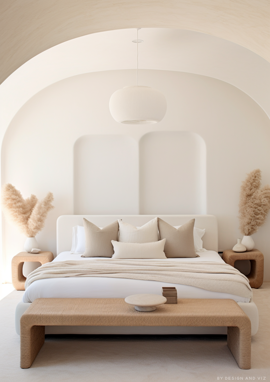
For most rooms - particularly those with uncertain light, mixed finishes, or a client who wants predictability - Alabaster is the more reliable choice. It does the job without asking the room to compensate for it.
Drift of Mist is the right choice when the brief specifically wants a neutral with more depth and character than a straightforward warm white delivers, and when the room has the light to support it. In a well-lit transitional space with warm wood and brass throughout, Drift of Mist brings a quiet complexity that Alabaster simply does not have.
Alabaster is the right choice whenever the light is working against you - north-facing rooms, spaces with mixed material temperatures, or any room where an unpredictable undertone is a risk rather than a feature.
The worst-case test here is a north-facing room with no direct sun: paint a large sample of each color on the darkest wall and check it at midday and again at dusk with the lamps on. A pass for Drift of Mist means it still reads soft and greige rather than flat or faintly green in both readings. A pass for Alabaster means it looks the same warm neutral at both times - if it does, your light is stable enough for either color; if Drift of Mist shifts noticeably, go with Alabaster.
Frequently Asked Questions

Is Drift of Mist warmer than Alabaster?
No - Alabaster carries a more consistent warm undertone. Drift of Mist is technically classified as warm, but its green-gray cast reads cooler and less settled than Alabaster's restrained yellow, particularly in rooms without strong natural light.
Can I use Drift of Mist and Alabaster in the same house?
Yes, and it's a well-tested combination. Drift of Mist on walls with Alabaster on trim is a clean, settled pairing - the brightness step on the joinery keeps the more complex wall color from feeling heavy.
Which is better for a north-facing room?
Alabaster, without much competition. Drift of Mist's green-gray undertone is most likely to read flat or murky in exactly this light condition, while Alabaster holds its warmth reliably regardless of exposure.
Does Drift of Mist look gray or greige?
Both, depending on the light. In cooler or indirect light it reads closer to gray with a faint green cast. In warm southern or western light it settles into a softer greige. This shift is the defining feature of the color, not a flaw to be corrected.
What is the LRV of Drift of Mist vs Alabaster?
Drift of Mist has an LRV of approximately 69 and Alabaster has an LRV of approximately 82. That 13-point gap is significant - Alabaster reflects meaningfully more light, which is a large part of why it reads brighter and more dependable in a wider range of rooms.
Final Thought
Drift of Mist and Alabaster solve different problems. One is a neutral built for rooms that can support a little unpredictability. The other is a neutral built to remove unpredictability altogether.
If your room has strong, consistent light and warm materials, Drift of Mist rewards you with genuine depth and character. If your light is mixed or uncertain, Alabaster is the safer, more dependable result. Buy sample pots of both, paint large patches on your darkest and brightest walls, and check them at midday and again with the lamps on. The answer will be clear within a day.
Want a complete colour scheme built around Drift of Mist or Alabaster? Our design packages cover full palette selection, finish recommendations, and 3D visualisations - see our packages. |
About the Author
Beril Yilmaz is a qualified architect and interior designer based in the UK. She runs BY Design And Viz, a design platform covering paint colour reviews, interior design guidance, and residential design projects. Beril has specified both Drift of Mist and Alabaster across residential projects in the UK and internationally - Drift of Mist in well-lit transitional and farmhouse spaces where a layered, shifting neutral adds depth, Alabaster in north-facing or mixed-light rooms where a dependable warm white was the safer call, often pairing the two directly as wall and trim.


Comments