


Sherwin-Williams Kestrel White Coordinating Colors: The Complete Architect's Guide

Sherwin-Williams Kestrel White SW 7516 is one of the most under-specified warm neutrals in the range. It sits quietly between two more famous names, Shoji White and Alabaster, and clients rarely ask for it by name. An LRV of 68 carries a warm beige-greige base with a soft ivory cast. It is warmer and deeper than Alabaster, softer and less assertive than Accessible Beige.
I specify Kestrel White where a room needs a warm backdrop that does not draw attention to itself, and here is the honest truth: the challenge is not choosing Kestrel White — it is choosing what goes with it. It depends on warm light and warm materials, so the wrong trim, floor, or bulb flattens it into a dull gray. The right pairings keep it soft and settled. Here are the Kestrel White coordinating colors named in my own review and in independent sources, and exactly why each one works.

Understanding Kestrel White Before You Coordinate
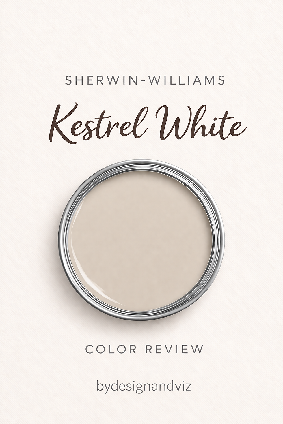
Kestrel White's LRV of 68 puts it in the light-medium zone. It sits six points below Shoji White (74), fourteen below Alabaster (82), and ten above Accessible Beige (58). That gap is the difference between a colour that reads as a genuine warm neutral and one that reads as a soft white. It is bright enough to open a room, with enough body to read as an actual colour.
The undertone is a warm beige-greige with a soft ivory cast, gentle rather than assertive. The beige gives it warmth. The whisper of gray keeps it from drifting yellow or creamy. It is a colour that depends on warm light. In north-facing rooms or under cool LEDs the beige base has little to draw on and can flatten toward a dull, slightly muddy gray.
That tells you what to coordinate it with. Soft warm whites give it definition. Warm wood, brass, and bronze keep it settled. Deep earth tones and muted greens give it the depth its light LRV cannot supply. Cool blues, icy grays, and cool metals fight it.

For the complete standalone picture — undertone, light behaviour in every orientation, and the rooms where it earns its place — the Kestrel White review is the place to start before you commit to a whole-room scheme.
Quick Reference Table
The six colors below are covered in full in the pairings section that follows. Each is named for Kestrel White in my own review and comparisons or in independent sources. Two additional colors are included here for completeness.
Color | Code | Why it works with Kestrel White |
Alabaster | SW 7008 | The trim I specify most often — a clean, related contrast beside the wall |
Pure White | SW 7005 | A crisp trim that defines the wall without introducing a colour clash |
Natural Linen | SW 9109 | A near-neighbour: Kestrel White works as a soft-step trim against Natural Linen walls |
Accessible Beige | SW 7036 | A deeper, warmer companion — ten points below Kestrel White |
Urbane Bronze | SW 7048 | Deep warm bronze for a feature wall or joinery — adds the depth it lacks |
Sea Salt | SW 6204 | A soft, muted green for a calm, nature-inspired palette |
Extra White | SW 7006 | The crisper trim alternative — sharper contrast than Alabaster |
Iron Ore | SW 7069 | A deep charcoal for striking contrast on doors and accents |
Kestrel White as a Wall Color — Best Pairings
Alabaster SW 7008 with Kestrel White Walls

Alabaster is the trim I specify most often alongside Kestrel White. Its higher LRV and closely related warm undertone create a clean, related contrast rather than a jarring one. At 82 against 68, the fourteen-point step is visible and soft.
Use it on trim, ceilings, and cabinetry. In a bathroom, my standard specification is Kestrel White walls, Alabaster trim and ceiling, warm stone or wood-look tile, and brushed brass or warm bronze fixtures.
Pure White SW 7005 with Kestrel White Walls

Pure White is the crisp option. It gives definition against Kestrel White's earthy warmth without introducing a colour clash, which is why my comparison posts name it for crisp trim.
Choose it when the brief wants a sharper line than Alabaster gives. Keep floors and hardware warm so the cooler trim does not pull the wall toward gray.
Natural Linen SW 9109 with Kestrel White

Kestrel White and Natural Linen sit only two LRV points apart, at 68 and 66, so the difference is entirely undertone. Kestrel White leans toward a soft, greige-tinted quiet. Natural Linen commits to a warm, linen-toned beige. Kestrel White can serve as a soft-step trim against Natural Linen walls.
Because the step is so slight, test the pairing. Extra White is the alternative where more contrast is wanted. This suits organic modern rooms with natural materials.
For the full comparison of Kestrel White against Natural Linen — two warm Sherwin-Williams neutrals that look like variations on one idea — the Kestrel White vs Natural Linen guide explains why the undertone gap matters more than the LRV difference and which one holds up better in a north-facing room.
Accessible Beige SW 7036 with Kestrel White

Accessible Beige is the deeper, warmer companion. At LRV 58 it commits harder to warmth and depth, while Kestrel White stays the lighter, quieter option. Used in adjoining rooms, the two give a whole-house scheme a soft anchor and a deeper anchor without leaving the warm family.
Accessible Beige suits a den or dining room that wants more visible warmth and weight. Keep wood tones and metals warm so the two read as one palette.
Urbane Bronze SW 7048 with Kestrel White

Urbane Bronze gives Kestrel White the depth its light LRV cannot provide on its own. A deep bronze on a feature wall or in joinery shares the warmth, so the contrast feels cohesive. A Kestrel White study with warm wood built-ins, a brass desk lamp, and one Urbane Bronze wall reads considered rather than default.
Use it on a single surface. Brass or bronze hardware carries the pairing through.
Sea Salt SW 6204 with Kestrel White

A muted green sits comfortably beside Kestrel White without creating an undertone conflict. Sea Salt, or Rainwashed, brings a calm, nature-inspired note, and a muted sage on a feature wall or in joinery works the same way.
Use it in a bedroom, bathroom, or study. Natural wood and linen sit comfortably between the two.
Kestrel White for Trim, Floors, and Finishes

Stay in the soft, warm white family for trim. Alabaster is the default, Pure White and Extra White the crisper options. Avoid very cool, stark whites, because the temperature mismatch against Kestrel White's warm base reads as an unresolved contrast.
For floors, warm and mid-toned wood is most natural: white oak, natural oak, and light walnut, and warm stone or terracotta tile also relate well. Cool gray-toned or gray-washed floors create a mild undertone conflict that needs a warm rug or furniture to bridge.
For metals, brushed brass and warm bronze are the most flattering. Brushed nickel and chrome work, particularly in bathrooms and kitchens, but the contrast is more noticeable and reads best in strong natural light. Avoid strong cool blues or icy grays as a primary accent.
Lighting decides the result. In a north-facing room, use 2700-3000K bulbs throughout, at least one warm wood surface, and a warm metal accent. Under 4000K bulbs the beige base loses warmth and reads flatter and grayer. For woodwork, use a satin or semi-gloss finish.
Kestrel White vs Shoji White — Which Warm Off-White?

This is the comparison that comes up most. Kestrel White is LRV 68 and Shoji White is 74, a six-point gap. Both sit in the soft greige-white zone. Kestrel White leans earthier and more settled. Shoji White leans fresher and more open, with a subtle gray-green that makes it a chameleon.
The decision comes down to character and light. If the interior is organic modern or deliberately earthy, with warm wood, stone, and linen, and you want more visible colour on the wall, choose Kestrel White. If you want more reflected light, more versatility, or the safer option in a room with limited light, choose Shoji White.
When in doubt, Shoji White is the safer choice. Do not put the two on adjacent or open-plan surfaces. The undertone difference is subtle but visible enough to read as an unintentional clash.
Want a complete color scheme built around Kestrel White? A Color Direction consultation gets you a full custom palette built around your space - book yours here. |
For the full comparison of Kestrel White against Shoji White — two of Sherwin-Williams' closest warm off-whites — the Kestrel White vs Shoji White guide covers undertone, light behaviour, and each room in detail.
Kestrel White Coordinating Colors by Room

Living Room
A south or west-facing living room with warm wood floors, linen upholstery, and brass accents lets Kestrel White read as an easy, settled backdrop. It works in traditional, transitional, and warm-contemporary spaces. In a room of cool materials, such as polished concrete, chrome, and cool stone, it reads out of step.
Bedroom
In a south or west-facing bedroom with warm wood, linen bedding, and 2700K bedside lighting, Kestrel White reads soft and restful through the evening. In a north-facing bedroom, the same warm-lighting minimum applies, or the colour reads flatter at night.
Kitchen
On kitchen walls, Kestrel White is a strong, easy choice beside white or warm wood cabinetry, cream or warm-veined countertops, and brushed brass hardware. On cabinets it is more specific and needs warm stone and warm wood to anchor it. Shoji White is the more reliable cabinet choice across kitchen styles.
Bathroom
Kestrel White works in bathrooms with reasonable natural light, against white oak vanities and warm-toned tile. In a windowless or north-facing bathroom, move to a lighter, higher-LRV colour instead, since Kestrel White needs natural warmth to perform.
Home Office
A dependable study colour that keeps the room calm without competing with shelving or artwork. Add warm wood built-ins, a brass desk lamp, and an Urbane Bronze accent wall.
Exterior
Kestrel White works as siding, trim, or shutters, with a warm, earthy, slightly muted quality that suits organic modern and natural-material exteriors. It is more situational than Shoji White, which has the stronger exterior track record. Sample it on the actual elevation.
Frequently Asked Questions

What colors go with Sherwin-Williams Kestrel White?
Alabaster, Pure White, and Extra White for trim; Accessible Beige and Natural Linen as warm neighbours; Urbane Bronze and Iron Ore for depth; and Sea Salt or a muted sage for a soft green. Avoid cool blues, icy grays, and stark cool white trim.
What is the LRV of Kestrel White?
68, consistently, across independent colour data. That is six points below Shoji White, fourteen below Alabaster, and ten above Accessible Beige.
What is the best trim color for Kestrel White?
Alabaster SW 7008 for a soft, related contrast. Pure White SW 7005 or Extra White SW 7006 for crisper definition. Avoid very cool, stark whites.
Can Kestrel White work in a north-facing room?
With care. Use 2700-3000K bulbs, a warm wood surface, and a warm metal accent. Without them it can read flat, gray, and heavy, so sample it first.
Final Thought
Kestrel White's defining trait as a coordinating color is that it is a supporting colour. Every winning combination in this guide gives its warm beige-greige a soft white edge, warm wood and brass, and a deep earth tone when it needs weight, rather than a cool material that flattens it.
Want help building a complete scheme around Kestrel White SW 7516? See our design packages here - bydesignandviz.com/#interiordesignpackages.
Want a complete color scheme built around Kestrel White? Our design packages cover full palette selection, finish recommendations, and 3D visualisations - see our packages. |
About the Author
Beril Yilmaz is a qualified architect and interior designer based in the UK. She runs BY Design And Viz, a design platform covering paint colour reviews, interior design guidance, and residential design projects. Beril has specified Sherwin-Williams Kestrel White across residential projects in the UK and internationally — most often in south and west-facing living rooms and studies, paired with warm wood floors, Alabaster trim, and brushed brass fixtures.


Comments