


Kestrel White vs Natural Linen: The Comparison That Actually Helps You Decide

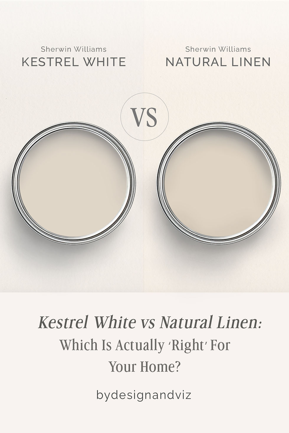
Kestrel White and Natural Linen sit only two LRV points apart, and on a paint card they can look like variations on the same idea. In a real room they read as two different neutrals entirely - one leans toward a soft, greige-tinted quiet, the other commits to a warm, linen-toned beige that never hedges. The gap between them is entirely in the undertone, not the depth.
I have specified both across residential projects, and I do not treat them as interchangeable. Kestrel White is the color I reach for when a room needs warmth without weight. Natural Linen is the color I reach for when the brief calls for something closer to raw fabric or aged plaster - warm, organic, and unmistakably beige.
This guide covers exactly how the two behave, where each one wins, and how to tell - before you commit a full room to either - which one your space actually needs.
At a Glance
| Kestrel White | Natural Linen |
Brand | Sherwin-Williams | Sherwin-Williams |
LRV | 68 - light, reflects well, restrained warmth | 66 - light-medium, slightly deeper than Kestrel White |
Colour category | Warm greige-white - quiet, muted, never announces itself | Committed warm beige - organic, linen-like, unmistakably a color |
Undertones | Soft warm beige with a greige cast - low chroma, no strong yellow push | Warm beige-yellow with an orange base - present and consistent, not restrained |
Character | Understated and versatile; reads as a considered neutral rather than a specific color choice | Rich and grounded; reads as an intentional, natural-fabric warmth rather than a background neutral |
North-facing | Reliable - the greige cast keeps it from tipping obviously warm or cold | Workable but not ideal - the warm base holds up better than a true cream, but still needs some natural light to avoid looking flat |
South-facing | Clean and soft - warms slightly but never turns buttery or gold | Excellent - the beige-yellow undertone glows and reads as genuinely organic |
Open-plan | Strong - the muted undertone reads consistently across zones with mixed materials | Moderate - reads warmer in some zones than others depending on adjacent material tone |
On walls | Soft, quiet warm-neutral backdrop that stays composed rather than announcing warmth | Full warm-beige backdrop with real depth - unmistakably a color choice, not a quiet neutral |
On cabinets | Reliable across mixed finishes - warm wood, cool stone, brushed metal all sit comfortably beside it | Best with warm wood and natural stone; can look heavy against cool white counters or stainless |
Use together? | Kestrel White on walls with Natural Linen as an accent or adjacent room works well - the reverse needs testing first | Natural Linen on walls with Kestrel White on trim is a workable pairing - the extra brightness on the joinery keeps the scheme from feeling flat |
Trim for each | Extra White SW 7006 or Pure White SW 7005 for crisp definition | Kestrel White SW 7516 for a soft step up, or Extra White SW 7006 for more contrast |
Style fit | Transitional, modern farmhouse, Scandinavian-adjacent - the more restrained of the two | Organic modern, warm traditional, rooms built around natural materials - the more committed of the two |
Architect's pick | When the brief wants warmth present but not the focus of the room | When the brief specifically wants an organic, linen-toned warmth and the room's materials can support it |
Sherwin-Williams Kestrel White SW 7516 - What It Really Looks Like

Kestrel White has an LRV of approximately 68, which puts it firmly in the light warm-neutral category. The undertone is a soft beige with a greige cast - present, but never insistent. It does not announce itself the way a true cream does.
It reads as considered rather than committed - a neutral that supports a room's materials instead of competing with them. It does not hedge into gray, and it does not tip into yellow. It simply sits quietly warm.In practice this restraint is what makes it useful. Kestrel White vs Shoji White guide is the place to start if you are also weighing it against Shoji White's more gray-green complexity - a genuinely different kind of restraint.
The tradeoff is character. Kestrel White will not give a room the organic, linen-like warmth that a true beige delivers. There is nothing ambiguous about what it is not - it is not a cream, and it is not a statement neutral. It is a background color that happens to be warm.
Sherwin-Williams Natural Linen SW 9109 - What It Really Looks Like

Natural Linen has an LRV of approximately 66, close to Kestrel White on paper but with a completely different personality on the wall. The undertone is warm beige-yellow with an orange base - present and consistent rather than restrained. This is the color of undyed fabric and raw plaster, and it reads that way immediately.
It commits to being a color, not just a neutral backdrop. There is nothing quiet about it - in good light it glows with real warmth, and in flat light it still reads distinctly beige rather than gray-adjacent.It does not fade into the background. Natural Linen vs Alabaster guide covers how it behaves against a true off-white, which is the clearest way to see just how much depth Natural Linen actually carries.
The tradeoff is flexibility. Natural Linen needs warm materials around it - warm wood, warm stone, natural textiles - to look intentional rather than dated. It needs warmth around it to perform. Against cool stone or stark white trim it can look heavy rather than organic.
The Real Difference Between Kestrel White and Natural Linen

The simplest way to put it: Kestrel White is a neutral that happens to be warm. Natural Linen is a beige that happens to be light. The two-point LRV gap barely registers - the real distinction is how committed each color is to its own warmth.
Kestrel White holds its undertone back. Natural Linen lets it show. Side by side in the same light, Kestrel White will read as the quieter, more neutral option, while Natural Linen reads clearly as a warm beige with real presence. Your room's existing materials should decide which one wins.
The practical difference shows up fastest on trim and adjacent surfaces. Kestrel White pairs comfortably with almost anything, while Natural Linen needs warm company to avoid looking heavy - a distinction worth checking against a broader beige comparison before committing. For how Natural Linen compares against a true beige benchmark, the Natural Linen vs Accessible Beige guide lays out exactly where the depth and undertone diverge, and which rooms each one is built for.
Not sure which one works for your room? A colour consultation is included in all our design packages - book directly here. |
When to Choose Kestrel White

Choose Kestrel White when the brief wants warmth present but restrained - a room that needs to feel soft rather than beige. It suits transitional interiors, mixed-material kitchens, and open-plan spaces where the color has to read consistently across different zones and different light.
in rooms with a lot going on already - patterned textiles, warm wood, layered materials - where a more assertive beige would compete rather than support. Choose it when you want the room to feel finished, not colored.
When to Choose Natural Linen

Choose Natural Linen when the brief specifically calls for organic, linen-toned warmth and the room's materials are already warm. It belongs in rooms built around natural wood, aged brass, and woven textures - where beige is the decision, not an accident.
where the beige can flatten rather than glow. Choose it when the room already has warmth to match.
How the Pairings Differ

For Kestrel White on walls, Extra White or Pure White on trim gives clean, quiet definition without disrupting the neutral's restraint. It is a low-risk pairing that works in almost any room.
For Natural Linen on walls, Kestrel White on trim softens the transition without losing the beige's warmth - a genuinely useful pairing when you want depth on the walls but don't want the trim competing for attention.
Both colors work with warm wood tones, but Natural Linen needs it more urgently. Cool grey stone or tile alongside Natural Linen creates a clash that is hard to resolve. Kestrel White is far more forgiving and handles cool or warm flooring equally well.
Both suit aged brass and warm metals. Kestrel White also works comfortably with brushed nickel and matte black in more contemporary schemes. Natural Linen is less comfortable with cool metals - the warm beige base fights a cool finish in a way Kestrel White's restraint does not.
Architect's Verdict - Kestrel White or Natural Linen?

For most homes - particularly those with mixed materials, open-plan layouts, or any uncertainty about light - Kestrel White is the more reliable choice. Its restraint means it rarely creates a problem.
Kestrel White is the safer bet in nearly every room. It is warm enough to avoid feeling cold, quiet enough to avoid clashing, and consistent enough to use across an entire open-plan space without the color shifting from zone to zone.
Natural Linen is the right call when the brief specifically wants organic, beige warmth - and when the room's materials, light, and finishes are already pulling in that direction. In a south-facing space with warm wood and natural texture throughout, Natural Linen has a depth and character Kestrel White cannot match.
The test I always use, particularly given how close these two sit on paper: paint a large sample of each on the wall that gets the least natural light in the room - typically the north-facing wall - and check it again at dusk under artificial light. If Natural Linen still reads warm and organic rather than flat or muddy in that worst-case light, it passes and the room can support it. If it goes dull, move to Kestrel White. Your room will tell you which one it needs.
Frequently Asked Questions

Is Kestrel White warmer than Natural Linen?
No - Natural Linen is the warmer, more committed color. Kestrel White holds its undertone back and reads as a quiet, restrained neutral, while Natural Linen leans fully into a beige-yellow warmth that is visible in almost any light.
Can I use Kestrel White and Natural Linen in the same house?
Yes, though they work better in adjacent rooms than blended in one space. Kestrel White on walls with Natural Linen used as an accent, or the two in connecting rooms with a consistent trim color, keeps the transition from feeling jarring.
Which is better for a north-facing room?
Kestrel White handles a north-facing room more reliably. Its restrained undertone avoids looking flat in cooler light. Natural Linen can still work, but it needs some warm artificial light in the evening to avoid reading dull.
Which is better for kitchen cabinets?
Kestrel White is the more practical choice across most kitchens. It sits comfortably beside cool stone, stainless, and warm wood alike. Natural Linen looks best in kitchens with warm wood and natural stone specifically, and can look heavy against cooler finishes.
What is the LRV of Kestrel White vs Natural Linen?
Kestrel White has an LRV of approximately 68 and Natural Linen approximately 66. The two-point gap is minimal in practice - the real difference between them is undertone commitment, not brightness.
Final Thought
Kestrel White and Natural Linen are both genuinely useful warm neutrals, and the choice between them is not about which is objectively better. It is about how much warmth your room's materials and light can actually support.
If your space has mixed materials or uncertain light, Kestrel White is the more forgiving, more consistent choice. If your materials are already warm and the brief wants genuine beige character, Natural Linen delivers a depth Kestrel White does not attempt. Paint large samples of both on your least-lit wall, check them in morning and evening light, and let the room decide.
Want a complete colour scheme built around Kestrel White or Natural Linen? Our design packages cover full palette selection, finish recommendations, and 3D visualisations - see our packages. |
About the Author
Beril Yilmaz is a qualified architect and interior designer based in the UK. She runs BY Design And Viz, a design platform covering paint colour reviews, interior design guidance, and residential design projects. Beril has specified both Kestrel White and Natural Linen across residential projects in the UK and internationally - Kestrel White in transitional, mixed-material kitchens and open-plan spaces where consistency across zones matters most, Natural Linen in warm, natural-material interiors where an organic, linen-toned beige is the specific brief.




Comments