


Pointing vs Wimborne White: The Comparison That Actually Helps You Decide

Pointing and Wimborne White are separated by less than two points of LRV, and on a colour card they can look nearly interchangeable. Put them on adjoining walls, though, and the split becomes obvious — one carries a faint warmth toward pink, the other toward yellow. That difference in base pigment, not brightness, decides which colour a room actually needs.
I have specified both across UK residential projects, and the choice is never about which one is "whiter." It is about which undertone the room's materials can carry. Pointing needs warm, traditional materials around it to earn its softness. Wimborne White works across a wider range of settings because its warmth is quieter.
Here is exactly how I tell them apart, and how I decide which one a room actually needs.

At a Glance
| Pointing | Wimborne White |
Brand | Farrow & Ball | Farrow & Ball |
LRV | ~88 - among the palest in F&B's range, reflects almost as much light as a true white | ~90 - marginally brighter still, one of the brightest whites Farrow & Ball makes |
Colour category | Red-based neutral - quietly warm rather than creamy | Yellow-based neutral - Farrow & Ball's most popular all-rounder white |
Undertones | Soft red/pink cast beneath the white; warms without yellowing | Gentle yellow cast; warms without pinking |
Character | Restrained and traditional; reads as a backdrop that quiets strong colour around it | Bright and adaptable; reads as a confident, versatile white that holds its own |
North-facing | Reliable in principle, but the red base can flatten toward grey without warm materials nearby | Reliable - the yellow undertone holds a soft ivory cast rather than turning flat or cold |
South-facing | Excellent - the pink warmth softens the light without glowing yellow | Excellent - the yellow warmth activates into a gentle, buttery glow |
Open-plan | Moderate - best where materials stay warm and traditional throughout the space | Strong - reads consistently across mixed zones and material temperatures |
On walls | Soft, mortar-toned backdrop built to sit behind strong traditional colour | Bright, clean warm-white backdrop that works with almost anything |
On cabinets | Best in traditional kitchens with aged brass and warm wood | The more practical choice across contemporary and traditional kitchens alike |
Use together? | Yes - Pointing on walls with Wimborne White on trim is Farrow & Ball's own recommended pairing | Yes - Wimborne White on walls with Pointing on trim works well in warmer schemes |
Trim for each | Wimborne White No. 239 for a clean brightness step, or All White No. 2005 for more contrast | All White No. 2005 for crisp definition, or Pointing No. 2003 for extra warmth |
Style fit | Traditional, period property, farmhouse, warm classic interiors | Traditional, transitional, contemporary - the more versatile of the two |
Architect's pick | When the brief calls for a quiet, mortar-warm backdrop behind strong traditional colour | When the room needs a reliably bright, warm white that works regardless of style |
Farrow & Ball Pointing No. 2003 - What It Really Looks Like
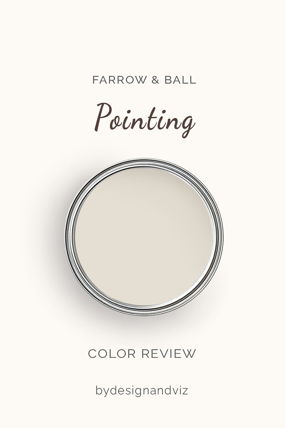
Pointing has an LRV of approximately 88, which puts it firmly at the palest end of Farrow & Ball's neutral range. The name comes from the colour of lime mortar used in traditional brickwork, and that origin shows: this is a white with a faint, chalky warmth rather than a bright, reflective one.
The undertone leans red, not yellow. Farrow & Ball's own colour team describes Pointing as the red-based sibling of Wimborne White, and that distinction is the whole story. In flat daylight it reads as a soft, warm off-white; in direct sun the pink base can just about surface, though it never tips toward true blush.
Pointing was built as a deliberate companion to the Farrow & Ball Wimborne White review - Farrow & Ball's own pairing guidance names the two as a matched set, and reading both side by side is the fastest way to see exactly where the red base pulls away from Wimborne White's yellow one.
It does not compete for attention. That restraint is the point - Pointing is designed to sit quietly behind stronger, more traditional colour elsewhere in the room.
Farrow & Ball Wimborne White No. 239 - What It Really Looks Like

Wimborne White has an LRV of approximately 90, making it one of the brightest whites in the Farrow & Ball range. It sits only a fraction above Pointing on paper, but the undertone tells the real story - this is a yellow-based white, softer than a stark white but cleaner than a cream.
It does not lean cream, and it does not lean grey. Farrow & Ball describes it as an empathetic white with a touch of yellow - enough warmth to avoid feeling clinical, not enough to read as buttery. That balance is why designers reach for it across such a wide range of interiors.
Wimborne White is most often tested against a cooler, brighter alternative in the All White vs Wimborne White guide, which is worth a look for anyone who finds Wimborne White's warmth still slightly too soft for a north-facing room.
In lower light it drifts toward a soft ivory rather than grey, which is why it holds up in rooms that see limited sun. It rarely looks like a mistake.
The Real Difference Between Pointing and Wimborne White

The simplest way to explain it: Pointing is a warm white built to recede. Wimborne White is a warm white built to lead.
Pointing has more pink in its undertone and Wimborne White has more yellow - and once you know to look for it, the difference is easy to see side by side. The 1.5-point LRV gap tells you almost nothing. Both colours reflect a similarly high amount of light; the undertone is what actually separates them.
Pointing on walls with Wimborne White on trim is Farrow & Ball's own recommended pairing - the slight lift in brightness on the joinery keeps the red-based wall colour from feeling heavy. The reverse, Wimborne White walls with Pointing trim, works too in warmer schemes, though it needs testing first. For the closest comparison of Wimborne White's own versatility against another very light Farrow & Ball neutral, the Strong White vs Wimborne White guide covers how a cooler, whiter option stacks up against Wimborne White's warmth.
When to Choose Pointing

Choose Pointing when the room needs a quiet, mortar-warm backdrop for strong traditional colour. Period properties, farmhouse conversions, and rooms built around deep, saturated accent colours are where Pointing performs. It's the softener, not the star.
South and west-facing rooms with warm wood floors and aged brass hardware let the pink undertone settle in without becoming the focus. Avoid Pointing in north-facing rooms with cool-toned stone or steel - the warmth can flatten into a slightly muddy grey without direct light or warm materials to lift it.
Avoid it too in bright, contemporary spaces built around crisp white joinery - a truer white will read as more intentional there than Pointing's softer, mortar-toned warmth.
When to Choose Wimborne White

Choose Wimborne White when you want a reliably bright, warm white that works regardless of style. Open-plan spaces, mixed-material kitchens, and rooms where the light changes significantly through the day are exactly where its versatility earns its reputation.
It handles north-facing rooms better than most Farrow & Ball whites, holding a soft ivory cast rather than reading as flat or cold. It is the safer choice when you are testing a white for the first time in a room whose light conditions you don't fully trust yet.
Avoid it only where the brief specifically calls for the deeper, quieter warmth of Pointing - a Wimborne White wall next to heavily traditional, aged materials can occasionally read a shade too bright and clean for the room's character.
How the Pairings Differ
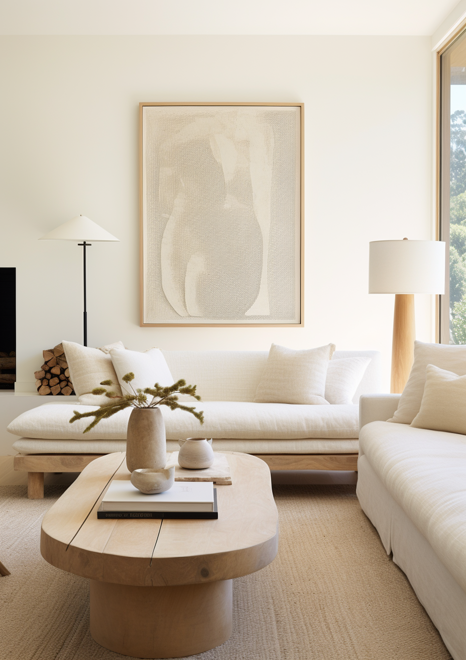
For Pointing on walls, Wimborne White is the natural trim choice - Farrow & Ball's own complementary pairing, and the brightness step keeps the red-based wall colour from feeling heavy. All White works too, for more contrast.
For Wimborne White on walls, All White or Pointing on trim both work well. All White gives the crispest definition; Pointing on trim brings a touch more warmth without fighting the wall colour, since both share the same Farrow & Ball whites family.
Both colours suit warm wood tones. Pointing needs warmth nearby more urgently - cool grey stone or pale engineered oak can leave its pink undertone looking slightly murky. Wimborne White is more forgiving and reads cleanly against warm stone, limestone, and most porcelain tile.
Both colours suit aged brass. Wimborne White also sits comfortably with brushed nickel and matte black in more contemporary schemes. Pointing is happier with warmer metals - cool hardware can pull attention toward the pink base in a way Wimborne White's yellow warmth handles more gracefully.
Architect's Verdict - Pointing or Wimborne White?

For most homes - especially those with mixed material temperatures or any uncertainty about light - Wimborne White is the more reliable choice. Its warmth is real but delivered with enough restraint to work across a wide range of conditions without creating problems.
Pointing is the right choice when the brief specifically calls for a quiet, traditional backdrop - in a period property with warm wood and strong accent colour throughout, Pointing is more considered than Wimborne White. The red-based warmth reads as intentional rather than incidental.
Wimborne White is the safer bet when the room's materials or light conditions are mixed or uncertain - it is the more forgiving, more broadly useful white of the two, and in most rooms it is simply the better result.
The test I always use: buy sample pots of both, paint two patches side by side on a north-facing wall - the toughest light either colour will face - then check them again at dusk under warm lamplight. If Pointing still reads warm and settled rather than muddy in that cold morning light, it passes and the room can carry it. If it looks flat or slightly grey, Wimborne White is the safer result. Your room will tell you which one it needs.
Frequently Asked Questions

Is Pointing warmer than Wimborne White?
Not warmer exactly - differently warm. Pointing carries a soft red/pink undertone while Wimborne White carries a yellow one. Side by side in good light, Pointing reads slightly more muted and mortar-toned; Wimborne White reads slightly brighter and cleaner.
Can I use Pointing and Wimborne White in the same house?
Yes, and it's Farrow & Ball's own recommended pairing. Pointing on walls with Wimborne White on trim is a classic combination - the brightness step on the joinery keeps the red-based wall colour from feeling heavy, while both stay within the same warm-white family.
Which is better for kitchen cabinets?
Wimborne White is the more practical choice for most kitchens. Its yellow-based warmth works across a wider range of countertop and hardware finishes. Pointing looks best in traditional kitchens with warm wood and aged brass, but can read slightly flat against cool stone or steel.
Does Pointing look pink on the walls?
Only very subtly, and only in certain light. In warm natural light the red undertone stays soft and mortar-like rather than obviously pink. In cooler, north-facing light without warm materials nearby, the undertone is more likely to flatten than to pink up.
Which is better for a north-facing room?
Wimborne White handles north-facing rooms more reliably. Its yellow undertone holds a soft ivory cast in cool light, where Pointing's red base can occasionally flatten toward grey without warm materials or artificial light to lift it.
What is the LRV of Pointing vs Wimborne White?
Pointing has an LRV of approximately 88 and Wimborne White has an LRV of approximately 90. The gap is minimal - both colours reflect a similarly high amount of light. The real difference is in the undertone, not the reflectance.
Final Thought
Pointing and Wimborne White are both excellent Farrow & Ball off-whites. The choice between them isn't about which is objectively better - it's about which undertone your room's materials and light can support.
If your room is traditional, warm-materialled, and built around strong accent colour, Pointing will reward you with quiet, considered warmth. If you have any uncertainty about light or material mix, Wimborne White is the more forgiving, more broadly reliable choice. Buy sample pots of both, paint patches on your coolest wall, and check them again in evening light. The answer will be clear within a day.
Want a complete colour scheme built around Pointing or Wimborne White? Our design packages cover full palette selection, finish recommendations, and 3D visualisations - see our packages. |
About the Author
Beril Yilmaz is a qualified architect and interior designer based in the UK. She runs BY Design And Viz, a design platform covering paint colour reviews, interior design guidance, and residential design projects. Beril has specified both Pointing and Wimborne White across residential projects in the UK and internationally - Pointing in period properties and traditional schemes built around strong accent colour, Wimborne White in open-plan and mixed-material spaces where light and material temperature vary across the day, often specifying both together with Wimborne White on trim alongside Pointing walls.


Comments