


Repose Gray vs Cloud White: The Comparison That Actually Helps You Decide

Repose Gray and Cloud White do not really compete for the same wall. One is a warm, cool-leaning greige with real depth; the other is a soft, high-reflectance warm white that barely qualifies as a colour at all. Put them side by side and the twenty-seven point LRV gap tells you everything before the undertones even enter the conversation.
I have specified both across dozens of residential projects, and the pairing that actually works is rarely "pick one." It is usually "where does each one belong." Repose Gray carries a room. Cloud White quietly supports it.
This guide covers what each colour actually does on a wall, where the twenty-seven point brightness gap matters more than any undertone discussion, and how architects use them together rather than as rivals.
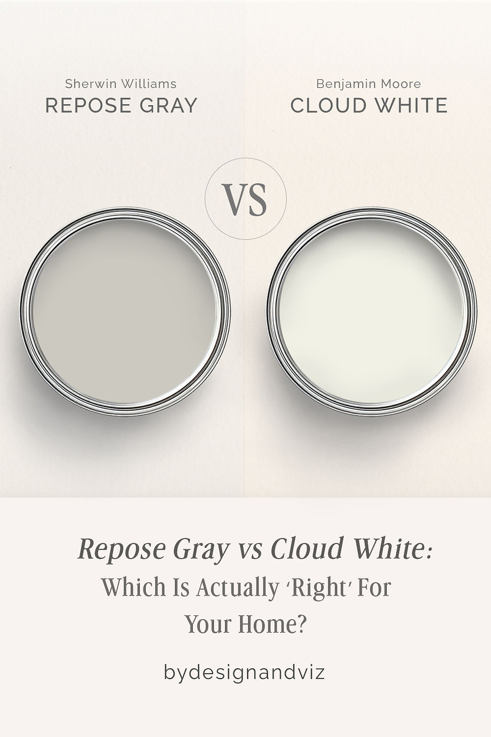
At a Glance
| Repose Gray | Cloud White |
Brand | Sherwin-Williams | Benjamin Moore |
LRV | 58 - a true mid-tone, absorbs and reflects in roughly equal measure | 85 - among the brightest whites in the range, reflects the vast majority of light |
Colour category | Warm-leaning greige with a cool undercurrent - shifts noticeably with light | Soft warm white - barely registers as a colour on its own |
Undertones | Balanced violet-gray undertone that reads warm in daylight and cooler under artificial light | Faint warm undertone, close to neutral - present only in comparison to a stark white |
Character | A committed wall colour with genuine depth - not a backdrop, a presence | A quiet, high-reflectance white built to disappear into trim, ceilings, and millwork |
North-facing | Reliable - the violet undertone prevents the flat, dull look many mid-tone grays get in cool light | Reliable - the warm undertone keeps it from reading cold or clinical |
South-facing | Excellent - warms slightly without tipping into beige | Clean and bright - stays soft rather than glaring |
Open-plan | Strong on its own walls, but needs a distinct trim colour to read cleanly against Cloud White ceilings | Excellent - a near-white this bright reads consistently across zones and light conditions |
On walls | Full mid-tone coverage - the wall reads as an intentional colour choice, not a neutral backdrop | Works as a standalone wall colour only in already bright rooms - otherwise it disappears |
On cabinets | Works in kitchens wanting a soft, moody lower cabinet without going fully dark | One of the most dependable whites for cabinetry across almost any countertop or hardware finish |
Use together? | Yes - Repose Gray on walls with Cloud White on trim and ceiling is a classic high-contrast pairing | Yes - Cloud White on trim and ceiling against Repose Gray walls is the standard high-contrast combination |
Trim for each | Cloud White OC-130 for crisp definition, or Extra White SW 7006 for maximum contrast | Not typically trimmed against - it is usually the trim colour itself |
Style fit | Transitional, modern farmhouse, coastal - anywhere a mid-tone neutral needs to do real work | Transitional, coastal, modern farmhouse - the connective white that ties a scheme together |
Architect's pick | When the room needs a wall colour with genuine presence, not just a neutral backdrop | When the brief calls for trim, ceilings, or millwork that recedes rather than competes |
Sherwin-Williams Repose Gray SW 7015 - What It Really Looks Like

Repose Gray has an LRV of 58, which puts it firmly in the mid-tone category - roughly half the light hitting the wall is reflected, half absorbed. That balance is what gives it weight. It does not read as a pale neutral trying to pass as gray. It commits to being a real colour.
The undertone is a balanced violet-gray that shifts with the light. In daylight it can lean faintly warm; under cooler artificial light it settles into a cleaner, more neutral gray. For a closer look at how that undertone shift plays out against a warmer, cream-leaning neutral at a similar depth - where the comparison is genuinely undertone-driven rather than a brightness gap - the Repose Gray vs Pale Oak guide covers that tighter decision in detail.
It is not a color that fades into the background. In a living room or bedroom it becomes the dominant material decision, and everything else - furniture, art, textiles - gets chosen around it rather than the other way round.
Benjamin Moore Cloud White OC-130 - What It Really Looks Like


Cloud White has an LRV of 85, among the highest in the Benjamin Moore range - it reflects the vast majority of light that hits it. On its own, in a well-lit room, it barely registers as a colour at all. There is nothing ambiguous about what it is built to do.
The undertone is faintly warm, close enough to neutral that it only becomes visible in direct comparison to a stark, cool white. That restraint is the entire point - it is engineered to disappear into trim and ceilings rather than announce itself.For how that same restrained warmth performs against a more assertive, higher-contrast white on trim - a genuinely close comparison rather than a brightness mismatch - the Cloud White vs White Dove guide walks through which one holds definition better against a mid-tone wall.
Used as a standalone wall colour, it needs strong natural light to avoid looking flat. In its intended role - trim, ceilings, millwork - it performs reliably in almost any condition.
The Real Difference Between Repose Gray and Cloud White

The twenty-seven point LRV gap is the entire story here. Repose Gray and Cloud White are not two shades of the same idea competing for the same wall - they are a wall colour and a trim colour, and treating them as head-to-head rivals misses what each one is actually built to do.
Repose Gray sits at an LRV of roughly 58, which means it absorbs and reflects light in close to equal measure - it reads as a genuine mid-tone with weight and presence. Cloud White sits at 85, high enough that it functions almost like a structural white rather than a colour choice. That gap is what makes them complementary rather than comparable.
The undertone comparison matters far less here than it would between two close neutrals. What matters is contrast and function: Repose Gray anchors a room, Cloud White defines its edges. For the comparison of Repose Gray against a warmer, cream-adjacent neutral closer to its own LRV - where undertone really is the deciding factor - the Repose Gray vs Swiss Coffee guide covers a much tighter, undertone-driven decision.
Not sure which one works for your room? A colour consultation is included in all our design packages - book directly here. |
When to Choose Repose Gray

Choose Repose Gray when the room needs a wall colour with actual presence, not another safe neutral. It works in living rooms and bedrooms wanting depth, in transitional schemes built around contrast, and anywhere the brief calls for a mid-tone that reads as a deliberate design choice rather than a default.
Avoid it in small, low-light rooms where a mid-tone gray can feel heavy rather than considered, and avoid it where the brief calls for maximum brightness - that job belongs to something with a much higher LRV.
When to Choose Cloud White

Choose Cloud White when the room needs trim, ceilings, or millwork that recedes rather than competes with the wall colour. It is the standard partner for a mid-tone or saturated wall colour, and it works across nearly every hardware and flooring finish without conflict.
Avoid using it as a standalone wall colour in a dim or north-facing room - without strong light behind it, an LRV this high can read flat rather than crisp.
How the Pairings Differ
Repose Gray on walls with Cloud White on trim and ceiling is the classic high-contrast pairing for this combination - the mid-tone wall gets clean definition from the bright trim without the harshness of a stark white. This is the pairing most architects reach for by default.
Cloud White rarely goes on the same wall as Repose Gray - its role in this pairing is almost always trim, ceiling, or millwork. Used on walls alone, it needs a bright, well-lit room or it reads flat and forgettable.
Repose Gray works with both warm and cool wood tones, which is part of what makes it so dependable as a wall colour - it does not force a flooring decision the way a stronger undertone would. Cloud White is equally forgiving underfoot, pairing cleanly with light oak, walnut, and most stone finishes.
Repose Gray suits both warm brass and cool brushed nickel without conflict - the balanced undertone does not fight either metal. Cloud White is the same: genuinely neutral enough to sit behind gold, nickel, or matte black hardware without pulling attention.
Architect's Verdict - Repose Gray or Cloud White?

For most rooms, this is not really a choice between two colours - it is a decision about which job needs doing.
If the room needs a wall colour with actual presence - something with enough depth to anchor furniture, art, and materials around it - Repose Gray is the answer. It carries weight that a near-white simply cannot.
If the room needs trim, ceilings, or millwork that recedes rather than competes, Cloud White is the right call. It is built to disappear, and in that role nothing does it more reliably.
The test I always use for this pairing: paint a Repose Gray sample on the darkest wall of the room and a Cloud White sample on the trim beside it, then check both at dusk under artificial light - the worst-case condition for a mid-tone losing its undertone to shadow. If Repose Gray still reads warm rather than flat gray, and Cloud White still reads clean rather than dingy against it, the pairing passes. If either one collapses under that light, adjust before you commit to the full room.
Frequently Asked Questions

Is Repose Gray warm or cool?
It is genuinely balanced. Repose Gray carries a violet-gray undertone that reads warmer in daylight and cooler under artificial light, which is exactly why it performs consistently across different rooms and orientations.
Can Repose Gray and Cloud White be used in the same room?
Yes, and it is one of the most reliable pairings in either brand's range. Repose Gray on walls with Cloud White on trim and ceiling creates clean, confident contrast without harshness.
Is Cloud White too bright to use on its own?
Only in poorly lit rooms. With an LRV of 85, Cloud White needs good natural or artificial light to avoid looking flat and characterless as a standalone wall colour - it performs best as a supporting colour rather than the star.
Which is better for a small room?
Cloud White, if the goal is to maximise light and openness. Repose Gray will make a small room feel more grounded and intentional, but it will also make it feel smaller. The choice depends on whether the brief wants the room to expand or to feel enclosed and considered.
Does Repose Gray look purple?
It can, in the wrong light. The violet undertone is subtle in most conditions but can become more visible under cool LED lighting or in rooms with little natural light. Testing with a large sample under your actual lighting conditions is essential.
What is the LRV difference between Repose Gray and Cloud White?
Repose Gray has an LRV of approximately 58, and Cloud White has an LRV of approximately 85 - a gap of twenty-seven points. That is a substantial difference, and it is the reason these two function as complementary wall-and-trim partners rather than as competing options for the same surface.
Final Thought
Repose Gray and Cloud White are not really competing for the same job. One is built to anchor a room, the other to define its edges cleanly. The question worth asking is not which colour is better, but which role your room actually needs filled.
If your room needs depth and presence, Repose Gray delivers it. If it needs light, definition, and a colour that recedes, Cloud White is the more reliable choice. Used together, they do more than either can do alone.
Want a complete colour scheme built around Repose Gray or Cloud White? Our design packages cover full palette selection, finish recommendations, and 3D visualisations - see our packages. |
About the Author
Beril Yilmaz is a qualified architect and interior designer based in the UK. She runs BY Design And Viz, a design platform covering paint colour reviews, interior design guidance, and residential design projects. Beril has specified both Repose Gray and Cloud White across residential projects in the UK and internationally - Repose Gray on walls in transitional and modern farmhouse living spaces, Cloud White on trim and ceilings in the same schemes, often using the two together as a wall-and-trim pairing.




Comments