


Repose Gray vs Swiss Coffee: The Comparison That Actually Helps You Decide

Updated: 3 hours ago
These two rarely get compared for the same wall, and that is the point worth understanding first. Sherwin-Williams Repose Gray and Benjamin Moore Swiss Coffee sit almost 25 LRV points apart - one is a mid-depth warm gray built to anchor a room, the other is a bright, barely-there cream built to recede into the background. Anyone weighing them against each other usually is not choosing between rivals. They are deciding whether a room needs a colour with presence or a colour that disappears.
I have specified both, often in the same house, and rarely on the same wall. Here is how I decide which job each one is actually being asked to do.
This guide covers the undertone behaviour, the light performance, and the pairing logic that makes Repose Gray and Swiss Coffee work together far more often than they compete.

At a Glance
| Repose Gray | Swiss Coffee |
Brand | Sherwin-Williams | Benjamin Moore |
LRV | 58 - mid-depth, absorbs and reflects in roughly equal measure | 83.7 - very bright, reflects the vast majority of light that hits it |
Colour category | Warm greige - a true gray with just enough warmth to avoid reading cold or clinical | Warm off-white - reads closer to white than cream, with just enough undertone to avoid stark |
Undertones | Balanced violet-gray with a whisper of warmth - shifts cooler in shade, warmer under artificial light | Soft, restrained yellow-beige - present on close inspection but nearly invisible from a normal viewing distance |
Character | Grounded and architectural; reads as a considered neutral rather than a soft backdrop | Quiet and receding; built to disappear into trim, ceilings, and walls that need to stay out of the way |
North-facing | Can turn cool and flat without warm materials or layered lighting to counter it | Reliable - the high LRV keeps rooms bright even without direct sun; undertone stays neutral rather than yellowing |
South-facing | Excellent - the warmth in the undertone activates without tipping into lavender or blue | Clean and bright - strong light can wash the undertone out almost entirely, reading close to pure white |
Open-plan | Strong as an anchor tone - works best paired with a lighter partner rather than carrying every wall alone | Excellent - the near-white brightness reads consistently across zones with very different light conditions |
On walls | Full-depth neutral backdrop with genuine presence - defines a room rather than fading into it | Soft, bright backdrop that recedes rather than announces itself - a canvas colour, not a statement |
On cabinets | Reads sophisticated on lower cabinets and islands; too much depth for a full run of upper cabinetry | Reliable across nearly every kitchen style; brightens spaces with limited natural light without looking sterile |
Use together? | Yes - Repose Gray on walls or lower cabinetry with Swiss Coffee on trim and uppers is a considered contrast pairing | Yes - Swiss Coffee on trim and upper cabinetry alongside Repose Gray on walls or lower cabinetry is the classic pairing |
Trim for each | Swiss Coffee OC-45 for a soft, warm contrast, or Extra White SW 7006 for a crisper break | Works as its own trim colour against most warm neutrals; pairs cleanly with crisper whites like Chantilly Lace for extra contrast |
Style fit | Transitional, modern farmhouse, contemporary neutral schemes | Transitional, coastal, traditional, and any scheme that needs a dependable, low-risk white |
Architect's pick | When the room needs depth and definition - an accent wall, a moody kitchen island, a grounded open-plan anchor | When the room needs brightness and breathing room - ceilings, trim, small rooms, or any space already carrying colour elsewhere |
Sherwin-Williams Repose Gray SW 7015 - What It Really Looks Like

Repose Gray has an LRV of 58, which puts it firmly in the mid-depth category - noticeably darker than the near-white creams and off-whites it sometimes gets grouped with. In flat, overcast light it reads as a cool, slightly violet gray. In warm afternoon sun the undertone softens and the colour reads more neutral, closer to a true greige.
This is not a colour that fades into the background. It has weight, and it is meant to. On a full wall it reads as a deliberate design decision rather than a safe default - which is exactly why it performs so well as an accent or anchor tone rather than a whole-house neutral.
For the comparison of Repose Gray against SW Alabaster - a near-white on the opposite end of the LRV scale that pairs with it constantly as a trim partner - the Repose Gray vs Alabaster guide breaks down exactly how that pairing is built and where the depth contrast works best.
Benjamin Moore Swiss Coffee OC-45 - What It Really Looks Like

Swiss Coffee has an LRV of 83.7, placing it firmly among the brightest off-whites in general circulation. The undertone is warm but genuinely restrained - close up there is a soft beige-yellow quality, but from across a room it reads close to a clean white. There is nothing dramatic about it, and that is precisely its function. Trying to build a full palette around Swiss Coffee rather than just choosing between it and Repose Gray? The Swiss Coffee coordinating colors guide covers the best wall, trim, and accent pairings room by room.
It does not compete for attention. It is a background colour by design, which makes it one of the most dependable trim and ceiling whites in the Benjamin Moore range - and a natural full-wall choice for anyone who wants brightness without the undertone risk that comes with warmer, more assertive creams.
For how Swiss Coffee compares to SW Alabaster - the closest Sherwin-Williams equivalent in both brightness and restraint - the Swiss Coffee vs Alabaster guide covers the small but real undertone gap between the two brands' benchmark warm whites.
The Real Difference Between Repose Gray and Swiss Coffee

The simplest way to explain it: Repose Gray is built to be noticed. Swiss Coffee is built to disappear. A 25-point LRV gap is not a close call - it is the difference between a colour that anchors a room and a colour that gets out of the way so something else can.
This is not a case where undertone nuance decides the winner, the way it might between two warm whites sitting a single LRV point apart. Here the reflectance gap does the deciding. Repose Gray absorbs light and reads with weight; Swiss Coffee reflects light and reads with air. Put them on adjacent walls and the contrast is immediate, not subtle.
The two are best understood as partners, not competitors. Repose Gray on walls or lower cabinetry with Swiss Coffee on trim, ceilings, and uppers is a genuinely classic pairing - the depth contrast does real work without ever fighting for the same job. For the closest live comparison of how that light-versus-depth relationship plays out against a near-white benchmark, the Shoji White vs Swiss Coffee guide is worth reading alongside this one - it covers Swiss Coffee's undertone behaviour against another restrained warm white in more depth.
Not sure which one works for your room? A colour consultation is included in all our design packages - book directly here. |
When to Choose Repose Gray

Choose Repose Gray when the room needs a colour with genuine presence rather than a quiet backdrop. That means accent walls, kitchen islands, powder rooms, and any space where the brief calls for depth and definition rather than brightness.
It suits transitional and modern farmhouse interiors where a grounded, architectural neutral is the goal. It does not suit rooms that are already short on natural light - stacking a mid-depth gray onto a dim north-facing room compounds the problem rather than solving it.
When to Choose Swiss Coffee

Choose Swiss Coffee when the room needs brightness and the goal is a colour that recedes rather than commands. That means ceilings, trim, small or dark rooms, and any space where another material or colour is already doing the visual work.
It is the safer, more forgiving option for anyone uncertain about undertone risk. It is not the right choice when the brief specifically calls for depth or drama - at LRV 83.7 it simply cannot deliver that on its own.
How the Pairings Differ
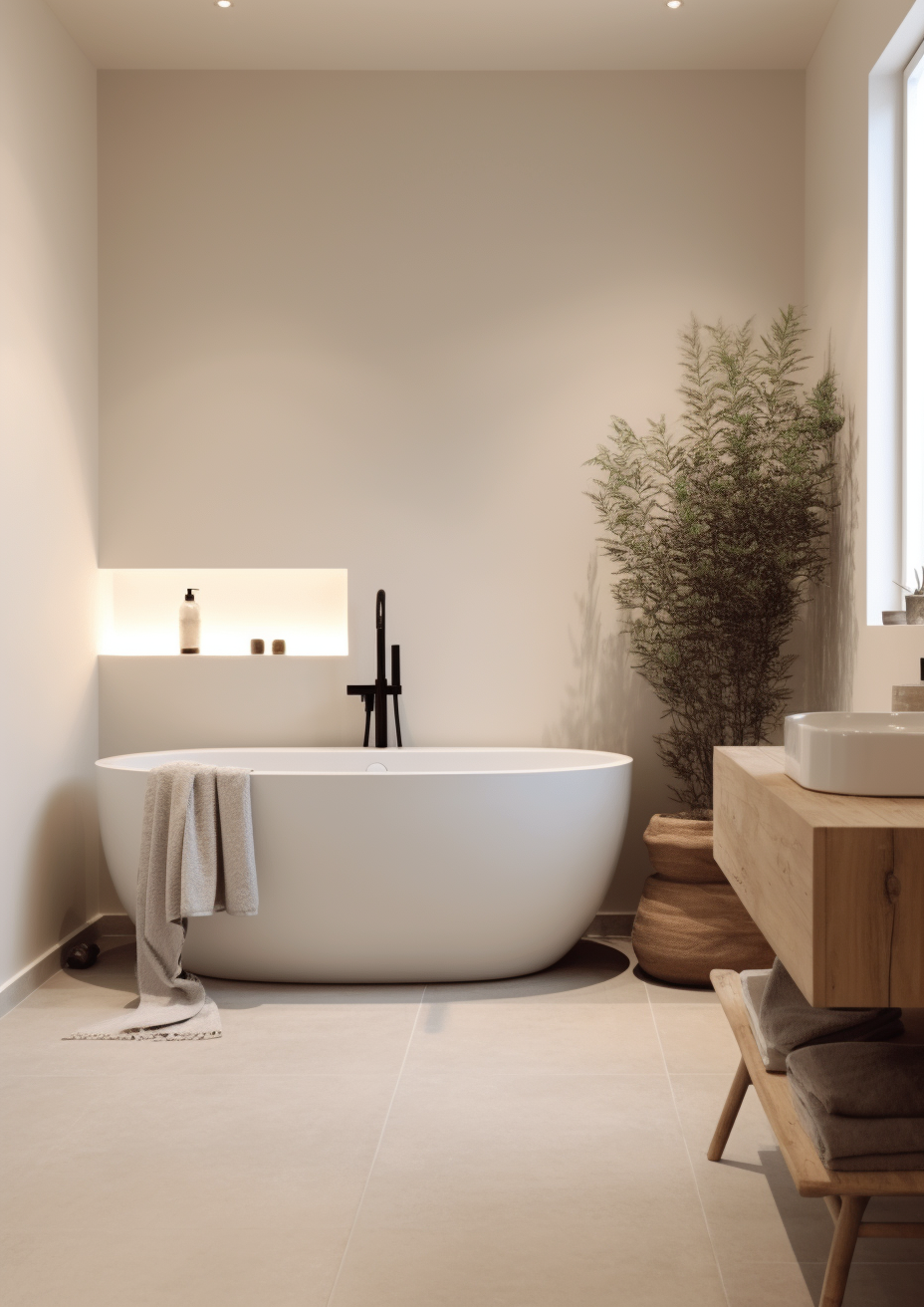
For Repose Gray on walls, Swiss Coffee on trim creates a soft, warm contrast that keeps the depth from feeling heavy. Extra White or Pure White work as a crisper alternative where more separation is wanted between wall and trim.
For Swiss Coffee on walls, it rarely needs a dramatic trim partner - a slightly brighter white like Chantilly Lace keeps the look clean, or Repose Gray on doors and built-ins adds grounding without overwhelming the room.
Repose Gray performs best with warm-toned wood floors - the warmth in the undertone needs something to key off, and cool grey flooring alongside an already-gray wall can flatten the room. Swiss Coffee is more forgiving and works across warm and cool floor tones alike.
Both colours suit warm metals well - aged brass, warm gold, and bronze read naturally against each. Swiss Coffee also handles brushed nickel and matte black comfortably; Repose Gray can look slightly cool against very bright chrome unless the room already carries warmth elsewhere.
Architect's Verdict - Repose Gray or Swiss Coffee?

This is not really a choice between two competing colours - it is a choice about what job a given wall needs to do.
Choose Repose Gray when the brief calls for depth - an accent wall, a grounded kitchen island, a powder room that wants character. It rewards rooms with good light and warm materials to play off, and it struggles in already-dim north-facing spaces.
Choose Swiss Coffee when the brief calls for brightness and restraint - trim, ceilings, small rooms, or full-wall coverage in a space that needs to stay light and quiet. It is the more forgiving, lower-risk choice in almost every lighting condition.
The test I always use for this pairing: paint a Repose Gray sample on the darkest wall of a north-facing room and a Swiss Coffee sample beside it. If the Repose Gray still reads warm and grounded rather than flat and cool in that worst-case light, it can carry the room on its own. If it turns muddy or lavender-tinted, keep it to an accent and let Swiss Coffee do the heavy lifting on the main walls.
Frequently Asked Questions

Is Repose Gray warmer than Swiss Coffee?
No - the two aren't really comparable on warmth in a useful way. Swiss Coffee carries a soft warm undertone across a very bright, near-white base, while Repose Gray is a mid-depth gray with only a slight warm cast. Swiss Coffee reads brighter and, in most light, gentler; Repose Gray reads deeper and more architectural.
Can I use Repose Gray and Swiss Coffee in the same house?
Yes - and it is one of the most reliable pairings available. Repose Gray on walls or lower cabinetry with Swiss Coffee on trim, ceilings, and uppers gives a room genuine depth without losing brightness. They work well precisely because they are not trying to do the same job.
Which is better for a small room?
Swiss Coffee, in almost every case. Its LRV of 83.7 reflects far more light, which keeps small or low-light rooms feeling open rather than closed in. Repose Gray's depth can make a small room feel smaller unless the space already has strong natural light.
Does Repose Gray look purple or blue?
It can, in cool or overcast light. Repose Gray's undertone shifts toward violet-gray in flat daylight, which is the most common complaint about the colour. Warm artificial lighting and warm-toned materials nearby counteract this; always test with a large sample patch before committing.
Which is better for kitchen cabinets?
It depends on the kitchen. Swiss Coffee is the safer, more universally workable choice for a full run of cabinetry. Repose Gray works beautifully on an island or lower cabinets for contrast, but a full kitchen in Repose Gray needs strong natural light and warm counter or floor tones to avoid feeling heavy.
What is the LRV difference between Repose Gray and Swiss Coffee?
Repose Gray has an LRV of approximately 58, and Swiss Coffee has an LRV of approximately 83.7. That 25-point gap is large - large enough that the two colours are rarely genuine rivals for the same wall. The gap is the whole story here, not a footnote to it.
Final Thought
Repose Gray and Swiss Coffee are not really competing for the same job, and that is what makes them useful together rather than difficult to choose between. The decision is not which one is better - it is which job the wall in front of you actually needs done.
If the room needs depth, character, and a colour that holds its own, Repose Gray delivers it - provided the light and materials around it can support the weight. If the room needs brightness, restraint, and a colour that gets out of the way, Swiss Coffee is the more dependable choice in nearly every lighting condition. Sample both, paint them on adjacent boards, and look at the pairing - not just the individual colours - before deciding.
Want a complete colour scheme built around Repose Gray or Swiss Coffee? Our design packages cover full palette selection, finish recommendations, and 3D visualisations - see our packages. |
About the Author
Beril Yilmaz is a qualified architect and interior designer based in the UK. She runs BY Design And Viz, a design platform covering paint colour reviews, interior design guidance, and residential design projects. Beril has specified both Repose Gray and Swiss Coffee across residential projects in the UK and internationally - Repose Gray on accent walls, islands, and grounded transitional schemes with strong natural light, Swiss Coffee on trim, ceilings, and full-wall applications where brightness was the priority, often specifying both together in the same scheme with Repose Gray anchoring and Swiss Coffee on the trim.




Comments