


Sanctuary vs Edgecomb Gray: The Comparison That Actually Helps You Decide

Sanctuary and Edgecomb Gray get pulled onto the same shortlist because both are warm, both are marketed as neutrals that go with almost anything, and both show up constantly in quietly luxurious interiors. The similarity ends at the LRV chart. Sanctuary sits at LRV 76, close enough to white that it barely registers as a colour choice at all. Edgecomb Gray sits at LRV 63, a genuine mid-tone greige with real depth on the wall. A thirteen-point gap is not a rounding error. It is the difference between a hushed backdrop and a colour with presence.
I have specified both, and the decision usually comes down to how much colour a room can actually carry. Sanctuary disappears into a space and lets everything else do the talking. Edgecomb Gray does not disappear. It contributes.
This guide covers the undertone each one carries, which rooms and light conditions suit each, and how to decide between a near-white hush and a proper warm greige.

At a Glance
| Sanctuary | Edgecomb Gray |
Brand | Sherwin-Williams | Benjamin Moore |
LRV | 76 - close to white, barely reads as a colour | 63 - a genuine mid-tone greige with real depth |
Colour category | Near-white warm neutral - the palest step before true white | Mid-tone warm greige - BM's benchmark transitional neutral |
Undertones | Muted orange-red, very restrained - present but easy to miss | Warm orange-tan, more assertive - reads clearly as greige, not white |
Character | Hushed and quiet; recedes rather than announces itself | Grounded and substantial; holds its own against furniture and floors |
North-facing | Risky - at LRV 76 it can flatten and read cool without warm light to lift it | Reliable - the deeper base tone keeps its warmth even in dim light |
South-facing | Glows softly, stays subtle even in strong direct light | Warms up further and can lean tan in strong direct sun |
Open-plan | Strong - its near-white quality reads consistently regardless of the material mix | Strong - its mid-depth warmth bridges wood, stone and metal tones easily |
On walls | A barely-there warm backdrop that keeps rooms feeling expansive and quiet | A confident warm greige backdrop with visible colour and weight |
On cabinets | Best for spa-style bathrooms and softly minimal kitchens | The classic choice for kitchen cabinetry across a wide range of styles |
Use together? | Yes - Sanctuary on walls with Edgecomb Gray on cabinetry or an island reads as a considered tonal layer | Yes - Edgecomb Gray on walls with Sanctuary on ceiling or trim lifts a room without going stark white |
Trim for each | Extra White SW 7006 or Pure White SW 7005 for a crisp, quiet lift | White Dove OC-17 or Swiss Coffee OC-45 for clean, bright definition |
Style fit | Wellness-led, quiet luxury, modern minimal interiors | Transitional, traditional, modern farmhouse |
Architect's pick | When the brief calls for a hushed, barely-there backdrop that still reads warm rather than stark | When the room needs a true greige with visible depth and definition |
Sherwin-Williams Sanctuary SW 9583 - What It Really Looks Like

Sanctuary has an LRV of 76, which puts it in the near-white category - the palest step before you cross into true white. The undertone is a muted orange-red, warm but so restrained it barely registers as colour in most light. On the wall it reads as a soft, hushed neutral rather than a committed beige or greige.
It does not compete for attention. In a collection built around calm, quiet spaces, Sanctuary is the colour that recedes and lets furniture, art and materials carry the room. There is nothing bold about it.
For how Sanctuary compares to a true workhorse greige - the colour it gets shortlisted against most often when a brief calls for something with a bit more presence - the Sanctuary vs Accessible Beige guide covers where the near-white hush of Sanctuary gives way to a colour that actually holds its own on the wall.
Benjamin Moore Edgecomb Gray HC-173 - What It Really Looks Like

Edgecomb Gray has an LRV of 63, a genuine mid-tone that puts real depth on the wall rather than a whisper of one. The undertone is warm orange-tan, clearly present rather than restrained - this is a greige that reads as a greige, not as an off-white doing double duty.
It is the workhorse of Benjamin Moore's neutral range for a reason. It holds its warmth in low light, it does not wash out next to wood floors, and it gives a room definition without tipping into brown or grey. It does not fade into the background the way Sanctuary does.
For how Edgecomb Gray compares to the lighter, more delicate neutral it is most often tested against - the Edgecomb Gray vs Pale Oak guide explains the LRV gap between them and which one holds up better in a room with mixed material tones.
The Real Difference Between Sanctuary and Edgecomb Gray

The simplest way to put it: Sanctuary is a neutral you barely notice. Edgecomb Gray is a neutral you can see. A thirteen-point LRV gap is not subtle at this end of the scale. It is the difference between a wall that disappears and a wall that has genuine presence.
Sanctuary's LRV of 76 puts it a step away from true white, while Edgecomb Gray's 63 sits comfortably in mid-tone greige territory. In practice this means Sanctuary needs very little to look considered - it works as a quiet backdrop almost anywhere. Edgecomb Gray needs the room to be able to carry actual colour; it will read as a decision, not a default.
Sanctuary paired with Edgecomb Gray works as a considered layered scheme rather than a simple wall-and-trim pairing. Sanctuary on the main walls with Edgecomb Gray on cabinetry, an island, or a built-in gives the room two warm neutrals at different depths without competing. For the reverse relationship, and a look at how Edgecomb Gray sits against Sherwin-Williams' own deeper greiges, the Agreeable Gray vs Edgecomb Gray guide covers how two near-identical cross-brand greiges actually diverge at scale.
When to Choose Sanctuary

Choose Sanctuary when the brief calls for a hushed, barely-there backdrop that still reads warm rather than stark white.
Rooms with good natural light where a near-white warmth is enough - primary bedrooms, bathrooms built around a calm, wellness-style feel, and open, minimal living spaces where the walls should not compete with anything else in the room. It works well where the goal is calm, not character.
Avoid Sanctuary in north-facing rooms with limited light - at LRV 76 it can flatten and lose its warmth almost entirely, reading closer to a cool, flat white than the soft neutral it is meant to be. Avoid it too where you actually want the wall colour to register as a decision. It is too quiet for that.
When to Choose Edgecomb Gray
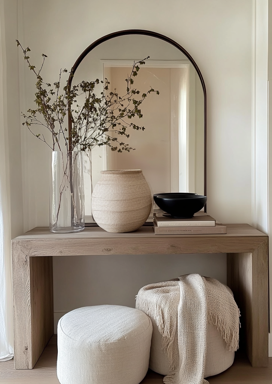
Choose Edgecomb Gray when the room needs a true warm greige with visible depth, not a near-white gesture at one.
Transitional and traditional interiors, kitchens with wood tones and warm stone, and any space where the wall colour is meant to hold its own against furniture and floors rather than disappear behind them. It is the safer bet in low light, where its deeper base tone keeps the warmth intact.
It is also the more forgiving choice for anyone testing a greige for the first time. The undertone is clear enough to read as intentional, but restrained enough not to clash with most existing materials.
How the Pairings Differ

For Sanctuary on walls, Extra White SW 7006 or Pure White SW 7005 on trim gives a crisp, quiet lift without introducing any contrast strong enough to disrupt the hush. Avoid a heavily warm trim colour, which will pull Sanctuary's already-restrained undertone forward more than the room needs.
For Edgecomb Gray on walls, White Dove OC-17 or Swiss Coffee OC-45 on trim are the classic choices - both bright enough to create definition without fighting the greige. Edgecomb Gray on both walls and trim, tonal throughout, is also a well-tested option in transitional schemes.
Both colours work with warm wood tones, though Edgecomb Gray is the more forgiving of the two - its deeper base handles a wider range of floor tones, including some cooler stone, without conflict. Sanctuary looks best against light, warm floors; a dark or cool floor can make its near-white walls feel unresolved.
Both suit brushed brass and warm nickel. Edgecomb Gray also carries matte black and aged bronze comfortably in more traditional schemes. Sanctuary, being so pale, works best with softer, lighter-toned metals - a heavy black fixture can look like it is floating against a wall with this little colour behind it.
Architect's Verdict - Sanctuary or Edgecomb Gray?

For most rooms, Edgecomb Gray is the more dependable choice. It has enough colour to read as intentional, enough depth to hold up in low light, and enough restraint to sit comfortably next to almost any material. It does the job a warm neutral is supposed to do.
Sanctuary earns its place when the brief is specifically for quiet - a bedroom, a bathroom, or a minimal space built around calm rather than character. In good natural light it is genuinely beautiful. In the wrong light it can disappear entirely, which is either exactly what you want or a real risk depending on the room.
Edgecomb Gray is the right call when the room needs to hold a warm neutral without hedging. It works across more light conditions and more material combinations than Sanctuary does, which is why it remains one of Benjamin Moore's most consistently specified colours.
The test I use for this pair: paint a large sample of each on the room's worst wall - typically the north-facing one in late afternoon. If Sanctuary still reads as a soft, warm neutral rather than going flat and cool, it passes. If it goes flat, move to Edgecomb Gray and run the same test; its deeper base should hold its warmth even there. Whichever one keeps its colour in the room's hardest light is the one to specify.
Frequently Asked Questions

Is Sanctuary warmer than Edgecomb Gray?
No - Edgecomb Gray carries the more visible warmth. Sanctuary's undertone is real but so muted at LRV 76 that it barely registers in most light. Edgecomb Gray's warm orange-tan undertone is clearly present at LRV 63, which is why it reads as a genuine greige rather than a near-white.
Can I use Sanctuary and Edgecomb Gray in the same house?
Yes. They sit far enough apart on the LRV scale that pairing them creates a considered, layered look rather than a clash - Sanctuary on the main walls with Edgecomb Gray on cabinetry, an island, or a feature wall gives a room two warm neutrals at different depths.
Which is better for a kitchen?
Edgecomb Gray is the more practical choice for kitchen cabinetry. Its deeper base gives cabinets visible colour and definition against countertops and floors. Sanctuary works better as a wall colour behind Edgecomb Gray cabinetry than as the cabinet colour itself, where its near-white quality can look washed out.
Does Sanctuary look flat in low light?
It can. At LRV 76, Sanctuary needs a reasonable amount of natural light to hold its warmth. In north-facing or low-light rooms it can lose its undertone almost entirely and read as a flat, slightly cool white rather than the soft warm neutral it is meant to be.
What is the LRV difference between Sanctuary and Edgecomb Gray?
Sanctuary has an LRV of approximately 76 and Edgecomb Gray approximately 63 - a thirteen-point gap. That is a significant difference for two neutrals often shortlisted together. It is the difference between a near-white hush and a genuine mid-tone greige.
Final Thought
Sanctuary and Edgecomb Gray are not really competing for the same job. One is built to disappear, the other is built to hold its own. The choice is less about which is the better neutral and more about how much colour your room can carry.
If the room has good light and the brief is calm, quiet, near-white warmth, Sanctuary delivers exactly that. If you want a warm neutral with genuine presence that performs consistently across light and materials, Edgecomb Gray is the safer, more versatile choice. Buy sample pots of both, paint large patches on your worst wall, and check them in morning and evening light before deciding - the gap between them is wide enough that you will see it immediately.
Want a complete colour scheme built around Sanctuary or Edgecomb Gray? Our design packages cover full palette selection, finish recommendations, and 3D visualisations - see our packages. |
About the Author
Beril Yilmaz is a qualified architect and interior designer based in the UK. She runs BY Design And Viz, a design platform covering paint colour reviews, interior design guidance, and residential design projects. Beril has specified both Sanctuary and Edgecomb Gray across residential projects in the UK and internationally - Sanctuary in wellness-led bedrooms and bathrooms where the brief called for a near-white hush, Edgecomb Gray in transitional kitchens and living spaces where the wall needed genuine warmth and depth, often layering the two together with Sanctuary on the walls and Edgecomb Gray on cabinetry or a feature piece.


Comments