Sherwin Williams Cabinet Paint: The 8 Best Colors Recommended by a Designer
- Beril Yilmaz

- Feb 22
- 7 min read
Let’s be honest: staring at a wall of paint swatches at the hardware store is enough to give anyone a mid-life crisis. Over the last decade of my design career, I’ve stood in more than a hundred kitchens, clutching my coffee and trying to explain that "no, that white isn't the same as that white."
As an interior designer, I’ve spent my career navigating the delicate balance between a client’s dream and the reality of their kitchen’s lighting. I’ve stood in hundreds of homes, clutching a coffee in one hand and a fan deck in the other, explaining why a 'pure' white can suddenly look like a hospital ward once it hits forty cabinet doors.
Choosing the right Sherwin Williams cabinet paint isn’t just about picking a color you like; it’s a high-stakes game of undertones, light-reflective values (LRV), and architectural flow. I’ve lived through the 'paint-mergencies' and the midnight reveals, and I’ve learned that the right shade doesn't just change a room—it changes how you feel when you walk into it every morning. The magic of a great kitchen often lies in how your cabinets interact with the surrounding walls and trim. Since the subtle shift in Sherwin Williams white paint colors can completely change the mood of a space, I always look at the bigger picture before committing to a final cabinet shade.
To save you the headache, I’ve narrowed down the absolute best colors that I personally recommend to my clients time and time again.
Why I Almost Always Choose Sherwin Williams for Cabinets
I’m not a paid spokesperson, but after years of trial and error, I’ve found that the Sherwin Williams cabinet paint line (specifically their Emerald Urethane Trim Enamel) is the "Old Reliable" of the industry. It levels beautifully, meaning those annoying brush marks disappear as it dries, leaving you with a factory-like finish that can survive a toddler with a crayon.
But before we dive into the colors, a pro tip from the trenches: Always, always sample your paint. Your kitchen's lighting, your countertop’s flecks of gold, and even the trees outside your window will change how these colors look.
1. Sherwin Williams Shoji White (SW 7042)

If you want that "Quiet Luxury" look that’s taking over the 2026 design trends, Shoji White is your best friend. It’s a warm, creamy off-white that feels incredibly expensive.
The Vibe: It’s not stark; it’s soft. In a bright kitchen, it looks like a clean white. In a darker space, those beige undertones come out to play.
Designer Note: I used this in a client's beach house last year, and it perfectly bridged the gap between their sandy floors and white marble counters.
2. Sherwin Williams Alabaster (SW 7008)

There’s a reason this is a cult favorite. Alabaster is the "Goldilocks" of whites—not too cool, not too yellow. It’s just right.
The Vibe: Welcoming and balanced. It has an LRV of 82, meaning it reflects plenty of light without feeling like a hospital hallway.
Designer Note: If you’re worried about your kitchen feeling too "cold," Alabaster is the safety net you need.
3. Sherwin Williams Greek Villa (SW 7510)

If you find Extra White too clinical but still want a bright kitchen, Greek Villa is my professional recommendation. It is a stunning, soft white that feels sun-drenched and sophisticated.
The Vibe: It’s a rich, "bready" white. It has a tiny bit of yellow and green in the undertone, which sounds scary but actually makes it look incredibly high-end and organic under natural light.
Designer Note: In my projects, I love pairing Greek Villa cabinets with warm wood open shelving. It’s the secret to that "California Cool" aesthetic that homeowners are obsessed with right now.
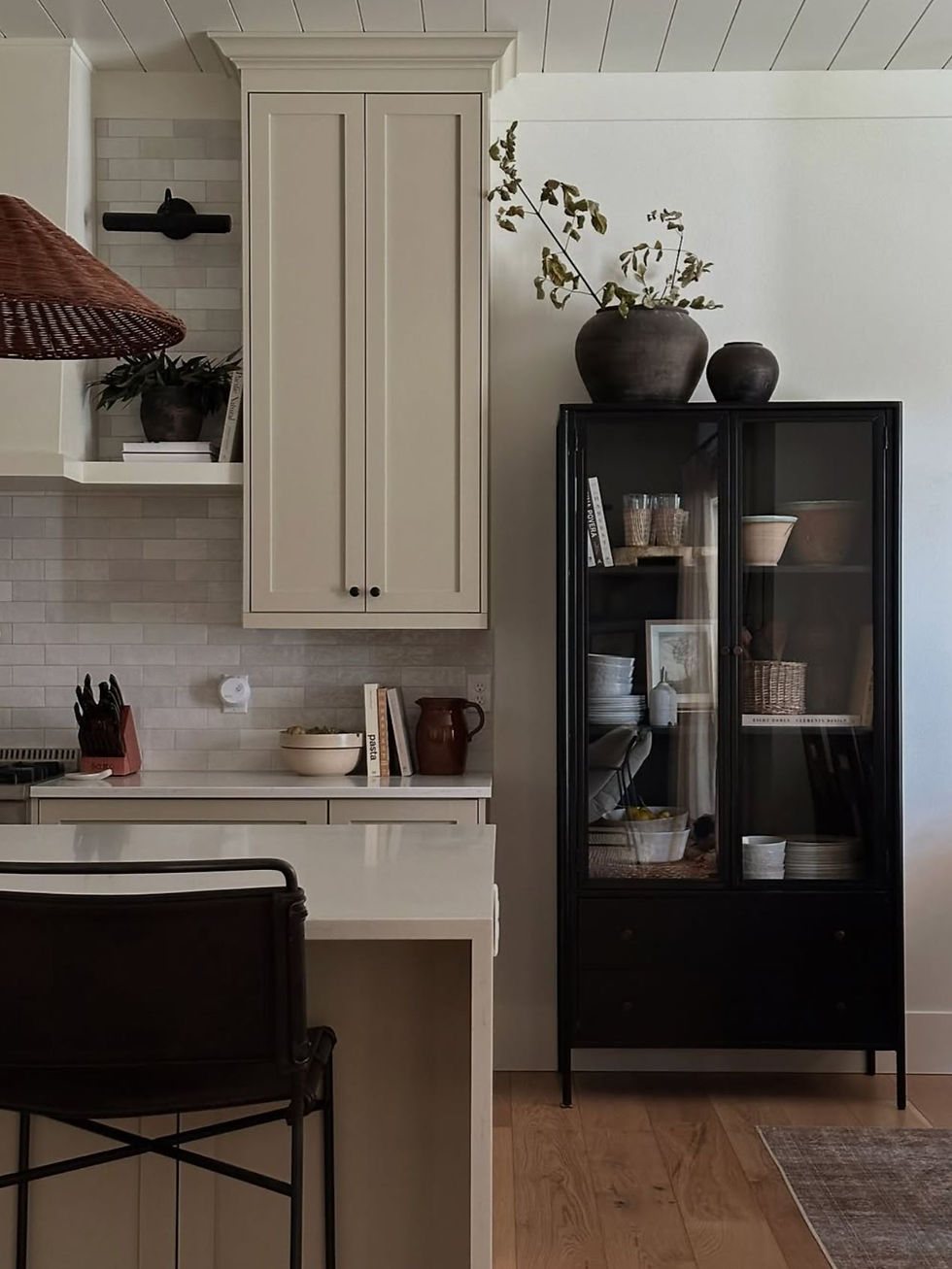
4. Sherwin Williams Accessible Beige (SW 7036)

I’m calling it now: beige is the new white for 2026 cabinets. Accessible Beige (or "Greige") is leading the charge.
The Vibe: Grounded and earthy. It makes a kitchen feel like a cozy sanctuary rather than just a place to cook.
Designer Note: I recently convinced a skeptic to use this on their lower cabinets with white uppers. The result? A stunning, layered look that they now brag about to everyone.
5. Sherwin Williams Anew Gray (SW 7030)

For clients who want to move away from all-white kitchens but aren't ready for dark colors, Anew Gray is the ultimate compromise. It’s the perfect "stone" color.
The Vibe: This is a true "warm gray." It’s sophisticated, grounding, and looks phenomenal in kitchens with stainless steel appliances.
Designer Note: I often use Anew Gray for kitchen islands to create a subtle contrast against white perimeter cabinets. It has enough depth to hide the inevitable scuff marks from barstools, which is a huge plus for families.
6. Sherwin Williams Pure White (SW 7005)

If you can't decide, pick Pure White. It’s the most versatile white in the Sherwin Williams catalog.
The Vibe: Soft but bright. It doesn't lean too hard into any one undertone.
Designer Note: This is my "holy grail" for trim and cabinets. It works with almost any backsplash or countertop material you throw at it.
7. Sherwin Williams Shiitake (SW 9173)

If you’re looking for a color that screams "high-end designer kitchen," Shiitake is my go-to recommendation. It’s a stunning, mid-tone neutral that sits perfectly between beige and gray, often referred to as a warm taupe.
The Vibe: It’s incredibly sophisticated and organic. Unlike a flat beige, Shiitake has a depth that makes cabinets look like custom-crafted furniture.
Designer Note: I love using Shiitake in kitchens with natural stone backsplashes and warm limestone floors. It’s the ultimate "earthy luxury" shade. Pro tip: pair it with unlacquered brass hardware, and you’ll have a kitchen that looks like it belongs on the cover of Architectural Digest.
8. Sherwin Williams Naturel (SW 7542)
If you find beige too yellow and gray too cold, let me introduce you to Naturel. As an interior designer, I often turn to this shade when a client wants their kitchen to feel like a warm embrace without losing that clean, modern edge.
The Vibe: It is a sophisticated, mid-tone tan that feels incredibly organic. It has a unique ability to ground a room while still keeping it airy and light.
Designer Note: I’m currently obsessed with using Naturel on full-height pantry cabinets. It creates a stunning, monolithic look that feels much softer and more "lived-in" than a standard white or dark charcoal. It pairs beautifully with terracotta tiles and matte bronze hardware for a Mediterranean-meets-Modern vibe.
Pro Tips for the Perfect Cabinet Finish
What sheen should I use?
For Sherwin Williams cabinet paint, I almost always suggest a Satin or Semi-Gloss finish.
Satin: Hides imperfections better and looks more modern.
Semi-Gloss: Is a breeze to wipe down after a spaghetti sauce explosion.
How many coats do I really need?
I know the label says "one coat coverage," but please, don't listen to it. For cabinets, you want two thin coats of primer and two thin coats of paint. It’s the secret to a finish that doesn't chip the first time you hit it with a vacuum cleaner.
Conclusion: Don't Let the Paint Swatches Win
At the end of the day, picking the right Sherwin Williams cabinet paint is about more than just matching a Pinterest board. It’s about how you want to feel in your home. Whether you go with the crisp, clean look of Extra White or the moody, sophisticated vibes of Iron Ore, remember that paint is one of the few things in a remodel that you can actually change if you hate it later (though, let's try to get it right the first time so you don't have to!).
My biggest piece of advice? Trust your gut, but test your samples. I’ve seen homeowners talk themselves out of a color they loved because a neighbor didn't like it—don't be that person! This is your sanctuary. Grab those brushes, pick a color that makes your heart skip a beat, and let's get that dream kitchen started.
FAQs: Everything You’re Secretly Wondering About Cabinet Paint
1. What is the most durable Sherwin Williams paint for cabinets?
Hands down, I always recommend the Emerald Urethane Trim Enamel. It acts like an oil-based paint in terms of toughness but cleans up with water like a latex paint. It’s the "holy grail" for high-traffic kitchens where cabinets get bumped and spilled on constantly.
2. Do I really need to sand my cabinets before painting?
I know you don't want to hear this, but: Yes. You don't need to sand them down to the raw wood, but you do need to "scuff sand" them to give the paint something to grab onto. If you skip this, I can almost guarantee your beautiful new color will start peeling within a year.
3. Is white or beige better for small kitchens?
Both work wonders! High Reflective White will make the room feel the most "open," but Accessible Beige adds a level of depth and warmth that prevents a small kitchen from feeling like a cold, white box. If you have low natural light, lean toward the warmer whites like Alabaster.
4. Can I paint my cabinets without taking the doors off?
You can, but you'll probably regret it. For a professional, "designer-approved" look, take the doors off, remove the hardware, and lay them flat. It prevents drips and ensures you get into all those pesky nooks and crannies.
5. What sheen should I choose for a modern look?
For 2026 trends, we are seeing a massive shift toward Satin finishes. It has just enough glow to look high-end without the "plastic" look that sometimes comes with high-gloss. Plus, it’s much more forgiving of minor imperfections.
Start Your Dream Home Transformation
Our online design packages were created to make the entire process smoother, clearer, and far more enjoyable — no stress, no second-guessing. Whether you’re refreshing one room or reimagining your whole home, we guide you every step of the way with layouts, visuals, and a fully personalised design plan.
See our interior and exterior design packages to get started.
Author Bio
Beril Yilmaz is the founder of BY Design And Viz, an online interior and exterior design studio specialising in clear layouts, thoughtful architectural details, and design decisions that support how people actually live. With a background in architecture and a practical design approach, her work focuses on creating homes that feel considered, functional, and intentionally designed.


Comments