


Sherwin-Williams Snowbound SW 7004 - An Architect's Honest Review

Sherwin-Williams Snowbound SW 7004 is one of the most requested whites I get asked about - and one of the most inconsistently described. Search for it and you will find it called a crisp white in one review and a warm off-white in the next, which tells you something important before you have even opened a sample pot: this is a colour that changes character with its surroundings more than most. On the right wall, with the right light, it is one of the most quietly versatile whites Sherwin-Williams makes. On the wrong wall it can look flat and slightly grubby.
Snowbound sits at an LRV of 82-83, placing it firmly in the bright, high-reflectance zone without tipping into the starkest whites in the SW range. Its base is a soft grey, but that grey carries an underlying warmth that shows up differently depending on the room - sometimes reading close to a warm greige, sometimes reading cooler and more neutral. I have specified Snowbound in trim, cabinetry, and full-wall applications, and the single lesson that carries across every project is that it must be sampled in the actual room before committing.
This review breaks down Snowbound's undertone in detail, unpacks what its LRV number means once the colour is on a real wall, tracks how it shifts across different orientations, sets out sensible pairing choices, and closes with a candid verdict on the rooms where it earns its popularity and the rooms where it does not.
Snowbound SW 7004 - The Key Facts
Collection | Sherwin-Williams White & Pastel Collection |
LRV | 82-83 (high-reflectance white zone - bright, but not a stark, ultra-crisp white) |
Undertone | Soft grey base with an underlying warmth - can drift toward taupe in low light, cooler grey in flat light |
Character | Versatile soft white - contemporary, transitional, farmhouse-adjacent |
Best trim | Extra White SW 7006 or Pure White SW 7005 for a crisp contrast line |
Best orientation | South or east-facing with strong, consistent natural light |
Main risk | In north-facing rooms or spaces with weak natural light, the grey base can read flat, dingy, or muddy rather than soft |
Snowbound Undertones - What Is Actually Going On

Snowbound is a soft grey white with a warmth underneath it, not a clean neutral grey. That combination is precisely what makes it hard to pin down. In good, even daylight it reads as a calm, balanced off-white - not obviously grey, not obviously cream. Push the light conditions in either direction and the undertone shifts: in cooler, flatter light the grey becomes more prominent and the colour can look slightly clinical or dull; in warmer, dimmer light the underlying warmth surfaces and it can lean toward taupe.
This is a materially different undertone profile from Sherwin-Williams Alabaster, the brand's other hugely popular white, which carries a more consistent yellow-beige warmth balanced by grey. Where Alabaster reads warm and creamy fairly reliably across light conditions, Snowbound is the more chameleon-like of the two. For a detailed breakdown of how Alabaster's warmth compares against a genuinely warm greige, the Alabaster vs Agreeable Gray guide is useful context for understanding where Snowbound sits between the two.
LRV - What 82-83 Means in a Real Room
At LRV 82-83, Snowbound sits in the same bright band as most of Sherwin-Williams' best-selling whites - close to Alabaster (82) and just under Pure White (84). That level of reflectance is enough to stop a space from feeling boxed in or heavy, and a well-lit room will hold its brightness from morning through evening.
What an LRV in the low-to-mid 80s does not guarantee is consistency of appearance. Two whites with near-identical LRVs can look completely different on the wall once undertone and light direction are factored in - Snowbound's underlying warmth means it behaves differently from a flatter, more neutral white at the same reflectance value. For the fine detail on how two SW whites at a similar LRV can diverge, the Alabaster vs Pure White comparison sets out exactly that distinction.
How Snowbound Behaves in Different Light

South-Facing Rooms
South-facing rooms are where Snowbound performs most reliably, and where I specify it with the most confidence. The strong, warm natural light keeps the underlying warmth balanced rather than dominant, and the result is a soft, clean white that avoids both the clinical edge of a cooler white and the risk of looking dingy. I have used Snowbound on walls and trim in south-facing kitchens and it consistently reads as fresh and bright through the whole day.
North-Facing Rooms
North-facing rooms are where Snowbound needs the most scrutiny before committing, and where I have seen it disappoint clients who expected a straightforward white. The cool, indirect light of a north aspect has nothing to counteract the grey base, and in a room with limited natural light overall, Snowbound can start to look flat, dull, or slightly dingy rather than soft. If the room is genuinely low on daylight, I steer clients toward a higher-LRV, more neutral white instead.
East and West-Facing Rooms
East-facing rooms see Snowbound at its warmest in the morning, when direct light activates the underlying warmth, and cooler and more restrained in the afternoon as the light shifts indirect. West-facing rooms show the reverse pattern - a more neutral, even quality through the day building to a warmer, softer glow in late afternoon and evening light, which is often the most flattering moment for this colour.
Artificial Lighting
Artificial lighting has a real effect on how Snowbound presents, more so than with a truly neutral white. Under warm 2700K bulbs, the underlying warmth in the undertone is reinforced and the colour can lean closer to a soft, warm off-white. Under cooler 3500K-4000K bulbs, the grey base takes over and it reads crisper and more neutral. Neither is wrong, but the two produce a noticeably different room, so the lighting temperature should be decided alongside the paint colour, not after.
Not sure if Snowbound works for your room? A colour consultation is included in all our design packages - book directly here. |
Trim Colours and What to Pair With Snowbound

Trim
A crisper white on trim reads best against Snowbound's soft, slightly warm base. Extra White SW 7006 or Pure White SW 7005 both give a clean contrast line without introducing a competing undertone. I avoid pairing Snowbound with warmer cream trims - the two warm whites sitting side by side tend to blur into each other rather than creating a defined edge.
Floor Materials
Mid-tone and warm-toned wood floors are the most forgiving pairing for Snowbound, since they supply the warmth that keeps the undertone from tipping cool and flat. Very pale, cool-toned floors - bleached or grey-washed oak - can push Snowbound toward its cooler, greyer reading, which works in a deliberately minimal scheme but is worth knowing in advance rather than discovering on the wall.
Metal Finishes
Both warm and cool metals sit comfortably with Snowbound, which is part of its appeal as a genuinely versatile white. Brushed nickel and chrome keep the scheme feeling clean and neutral; brass or matte black introduces enough contrast to give the room a stronger identity without fighting the wall colour.
Accent Colours
Deep, saturated accents - navy, forest green, charcoal - all read well against Snowbound because the wall colour stays quiet enough to let the accent carry the room. Very pale or cream-toned accents are harder to place, since they can start to compete with Snowbound's own underlying warmth rather than sit clearly apart from it.
Snowbound Room by Room

Bathrooms
Bathrooms with reasonable natural light are a strong application for Snowbound. My standard specification is Snowbound walls, Pure White trim and ceiling, warm-toned or mid-tone stone or tile, and brushed nickel fixtures. In a south or east-facing bathroom this reads as clean and calm through the day.
Bedrooms
Snowbound works well in bedrooms that get consistent daylight, giving a soft, restful backdrop that is not clinical. In a north-facing bedroom with limited natural light I would test it carefully first, since the flat quality that can appear in low light is more noticeable in a room used mostly in the evening.
Living Rooms
Living rooms are where Snowbound's versatility is most useful - it works as a genuine neutral backdrop for both warm, traditional furnishings and cooler, more contemporary pieces. Give it mid-tone wood floors, a mix of warm and cool accents, and reliable daylight from a south or west aspect, and Snowbound holds its own without pulling the scheme in either direction.
Kitchens
On kitchen cabinetry and walls, Snowbound reads as a clean, slightly soft white that pairs well with both warm brass and cool stainless hardware. I specify it most often in kitchens with strong natural light, where its brightness and versatility are assets rather than a risk.
Home Offices and Studies
Snowbound suits home offices and studies that receive good daylight, offering a calm, unobtrusive backdrop that is neither cold nor precious. Paired with warm wood furniture and a darker accent wall or shelving unit, it creates a considered, workable space without becoming the focal point of the room.
Who Snowbound Is Right For - And Who It Is Not
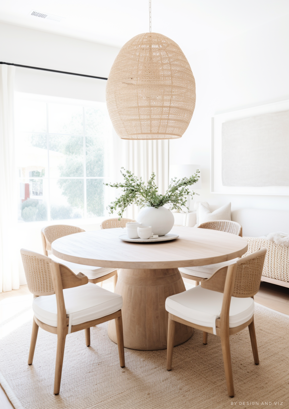
Snowbound is right for you if:
The room gets strong, consistent natural light - ideally south or east-facing - this is the condition under which Snowbound's soft warmth and brightness are best balanced, and where the risk of a flat or dingy read is lowest.
You want a genuinely versatile white that can sit alongside both warm and cool materials - Snowbound's shifting undertone, which is a liability in poor light, becomes an asset in a mixed-material scheme.
The brief calls for a soft, approachable white rather than a stark, clinical one - Snowbound's underlying warmth keeps it from reading cold in the way a purely neutral or blue-based white can.
You are prepared to sample it directly in the room, at different times of day, before committing - this colour changes more with light than most, so a chip in a showroom will not tell you enough.
Snowbound is not right for you if:
The room is north-facing with genuinely limited natural light - without strong daylight to balance it, Snowbound is one of the whites most likely to read flat, dull, or dingy rather than soft.
You need a colour that looks identical in every room regardless of light and lighting temperature - Snowbound's undertone shift is real and noticeable, and if consistency across spaces is the priority, a flatter, more neutral white will serve you better.
The brief is for a crisp, stark, high-contrast white - Snowbound's softness works against that goal; Extra White or Pure White will deliver a cleaner, more consistent bright white.
You are choosing based on the paint chip or an online swatch alone - Snowbound is one of the colours most frequently misjudged this way, and the gap between chip and wall can be significant.
How Snowbound Compares to Similar Colours

vs Alabaster SW 7008 - Alabaster carries a more consistent yellow-beige warmth balanced by grey, at a near-identical LRV of 82. Where Snowbound's undertone shifts noticeably with light direction, Alabaster holds its warm character more reliably across conditions, which makes it the safer choice for rooms with inconsistent daylight and Snowbound the more interesting one for rooms that get strong, even light.
vs Pure White SW 7005 - Pure White sits slightly higher in reflectance at LRV 84 and carries only a faint warm undertone against a more neutral base, giving it a crisper, cleaner read than Snowbound's grey-with-warmth combination. Pure White is the better pick for trim and for briefs wanting a consistently bright, low-drama white; Snowbound suits a wall colour with more personality and a softer overall feel.
vs Agreeable Gray SW 7029 - Agreeable Gray is a considerably deeper colour at LRV 60, with a warm greige character rather than a near-white. It is not really an alternative to Snowbound so much as a next step for anyone who tried Snowbound and wanted more visible colour and warmth in the room, particularly in spaces with strong natural light that can support a mid-tone neutral.
vs White Dove OC-17 (Benjamin Moore) - White Dove is a warmer, creamier white with a yellow-grey undertone split and an LRV in the low-to-mid 80s, broadly comparable to Snowbound's range. White Dove reads more consistently warm across light conditions, while Snowbound's grey base makes it the cooler and more changeable of the two - useful to know for anyone comparing options across brands rather than staying within Sherwin-Williams.
Frequently Asked Questions
Is Snowbound warm or cool?
Snowbound is best described as a soft grey white with an underlying warmth, rather than firmly warm or firmly cool. Which quality dominates depends heavily on the room's light: strong, warm natural light draws out the warmth, while flat or cool light lets the grey base take over. This is the single most important thing to understand before specifying it.
Does Snowbound look grey or beige on the wall?
In most well-lit rooms it reads as a soft, balanced off-white rather than distinctly grey or distinctly beige. In north-facing or low-light rooms it tends to look greyer and flatter; in warm, direct light it can lean toward a gentle taupe. Sampling in the actual room, at different times of day, is the only reliable way to know which way it will settle.
What is the best trim colour for Snowbound?
Extra White SW 7006 or Pure White SW 7005 both give a clean, crisp contrast against Snowbound's softer base. Avoid pairing it with another warm cream white on trim, since the two tend to blend together rather than create a defined line between wall and woodwork.
Can Snowbound work in a north-facing room?
It can, but only with strong daylight elsewhere in the room and warm supporting materials - otherwise I would recommend against it. Without enough natural light to balance the grey base, Snowbound is one of the whites most likely to read flat or dingy rather than soft. If the room's daylight is genuinely limited, a different white with a more stable, neutral undertone is the safer specification.
How does Snowbound compare to Alabaster?
Alabaster holds a warmer, more consistent character across different light conditions, while Snowbound shifts more noticeably between cooler and warmer depending on the room. Both sit at a near-identical LRV in the low 80s, so picking between them is really a question of how much undertone movement you are willing to live with, rather than a question of overall brightness.
The Verdict
Sherwin-Williams Snowbound is a genuinely useful white, but it is not a set-and-forget neutral. Its appeal lies in its versatility - a soft grey base with an underlying warmth that can sit comfortably in both warm and cool schemes - but that same quality means it is more sensitive to light and orientation than many of its Sherwin-Williams stablemates.
In a room with strong, consistent natural light it is one of the most quietly flattering whites in the range. In a north-facing room with limited daylight, it is one of the more likely to disappoint. For a closer look at how Snowbound's cross-brand competitor performs by comparison, the White Dove vs Agreeable Gray guide and the Pure White vs White Dove guide are both useful next stops for placing Snowbound within the wider white and off-white landscape.
Before committing, paint a large sample - at least a two-foot square, ideally a full wall section - on every wall that will carry the colour. View it at three points: mid-morning, midday, and again after dark under your actual artificial lighting. If it still reads as a soft, balanced white in all three conditions, it is the right colour for the room. If it turns flat or dingy at any one of those checkpoints, treat that as the room telling you to look elsewhere.
Want a complete colour scheme built around Snowbound? Our design packages cover full palette selection, finish recommendations, and 3D visualisations - see our packages. |
About the Author
Beril Yilmaz is a qualified architect and interior designer based in the UK. She runs BY Design And Viz, a design platform covering paint colour reviews, interior design guidance, and residential design projects. Beril has specified Snowbound across residential projects in the UK and internationally - most often in south and east-facing kitchens and bathrooms, paired with mid-tone wood floors and a mix of warm and cool metal finishes.


Comments