


Snowbound vs Swiss Coffee: The Comparison That Actually Helps You Decide

Snowbound and Swiss Coffee both sit close to LRV 83, both get marketed as easy, adaptable near-whites, and both show up constantly on shortlists for cabinets, trim, and whole-house colour schemes. On paper the two numbers are almost identical. On a wall, they read as opposite temperatures - one cool and quiet, the other soft and warm.
I have specified both across very different briefs - Snowbound where a kitchen needed to sit alongside steel and quartz without warming up, Swiss Coffee where a traditional scheme needed softness without tipping into cream. The two rarely solve the same problem.
This guide covers exactly how each one behaves in real light, which materials they support and which they fight, and which one your room actually needs.

At a Glance
| Snowbound | Swiss Coffee |
Brand | Sherwin-Williams | Benjamin Moore |
LRV | 83 - very light, reflects strongly, but the undertone reads before the brightness does | 83 - nearly identical to Snowbound on paper, but the undertone behaves nothing alike |
Colour category | Cool-neutral off-white - reads crisp and quiet rather than creamy | Warm off-white - soft and creamy rather than crisp |
Undertones | Faint gray-blue, barely-there - recedes instead of announcing itself | Gentle yellow-based warmth, present but never aggressive |
Character | Clean and contemporary; needs cool or neutral materials around it to look intentional rather than flat | Soft and classic; performs as a workhorse warm neutral across trim, ceilings, and whole rooms |
North-facing | Reliable - the cool undertone doesn't fight flat, grey daylight | Holds its warmth without tipping yellow - one of the more forgiving warm whites in flat light |
South-facing | Can read slightly cold and lifeless in strong direct sun without warm materials to balance it | Excellent - the warmth reads soft and inviting rather than sterile |
Open-plan | Strong - stays a consistent cool-neutral across zones with mixed light | Strong - the warmth reads consistently across zones without clashing |
On walls | Crisp, quiet backdrop that stays neutral rather than warming up through the day | Soft warm backdrop that never goes stark and never goes cold |
On cabinets | Excellent against steel appliances, quartz, and black hardware | Best with warm wood tones, brass hardware, and traditional finishes |
Use together? | Snowbound on cabinets with Swiss Coffee on trim needs testing - the temperature gap is real and visible | Swiss Coffee on trim alongside Snowbound walls is workable but needs testing; the reverse pairing is safer |
Trim for each | Pure White SW 7005 or Extra White SW 7006 for a clean, same-temperature match | Chantilly Lace or Simply White for crisper definition |
Style fit | Modern farmhouse, contemporary, coastal | Traditional, transitional, classic |
Architect's pick | When the brief is specifically crisp and cool and the room's materials are already cool-toned | When warmth is needed without a full commitment to cream, and the room's materials are mixed |
Sherwin-Williams Snowbound SW 7004 - What It Really Looks Like

Snowbound has an LRV of 83, which puts it firmly in the cool-neutral white category. The undertone is a faint gray-blue - understated, but present enough that the colour never drifts warm, even under artificial light. There is nothing creamy about it.
The brightness means it reflects light efficiently, but the undertone is what does the real work. Against warm wood or brass, Snowbound can look slightly flat. Against steel, quartz, and matte black, it looks considered and current.
Snowbound does not warm up, whatever the room asks of it. That consistency is exactly why it has become a standard choice for exteriors and cabinetry - it behaves the same way in every light, which is not something every near-white can claim.
Benjamin Moore Swiss Coffee OC-45 - What It Really Looks Like

Swiss Coffee has an LRV of approximately 83 - almost identical to Snowbound - but the undertone tells a completely different story. Where Snowbound recedes, Swiss Coffee gently announces itself. The yellow undertone is soft, not buttery, and it never reads as an accident.
In daylight it looks clean without feeling cold. In lamplight the warmth deepens slightly, which is part of why it has been a trim and ceiling standard for decades. It sits comfortably next to warm wood, brass, and traditional millwork without ever looking heavy.
For the comparison of Swiss Coffee against Alabaster - a Sherwin-Williams warm white it's shortlisted against constantly for whole-house schemes - the Swiss Coffee vs Alabaster guide covers how two warm near-whites with different undertone intensities actually compare on the wall.
The Real Difference Between Snowbound and Swiss Coffee

The simplest way to put it: Snowbound is a near-white that stays quiet. Swiss Coffee is a near-white that stays warm. Side by side, the gap is obvious within seconds - Snowbound reads cooler and flatter, Swiss Coffee reads softer and more inviting.
Both sit around LRV 83, so brightness is not the differentiator here. The undertone does all the work: Snowbound's gray-blue keeps it composed under any light, while Swiss Coffee's yellow warmth means it responds to light rather than resisting it.
The clearest evidence of the gap shows up on trim. Snowbound paired with a warm trim colour looks like two different projects competing for attention, while Swiss Coffee paired with a cool trim white can look chalky rather than crisp. For the comparison of Swiss Coffee against a genuinely cool white, the Swiss Coffee vs Simply White guide breaks down exactly how far Swiss Coffee's warmth can be pushed before it starts to compete with a truly cool trim colour.
When to Choose Snowbound

Choose Snowbound when the brief calls for crisp, cool, and confidently modern - these are the conditions where it's the right answer:
Kitchens with steel appliances, quartz counters, or cool stone that need a white that won't fight them. Contemporary and coastal interiors where warmth would read as inconsistent. Exteriors and trim meant to read sharp against black or charcoal detailing. Bathrooms with cool marble or porcelain tile, where a warm white would create an undertone clash.
Avoid Snowbound where the materials are warm - wood floors, brass hardware, warm stone - unless the goal is deliberate contrast. It does not warm up to meet them. And avoid it in rooms starved of daylight, where the cool undertone can tip toward flat and lifeless without help from artificial warmth.
When to Choose Swiss Coffee

Choose Swiss Coffee when you want warmth without committing fully to cream - these are the situations where it outperforms Snowbound:
Traditional and transitional interiors with warm wood floors and brass or aged gold hardware. Whole-house schemes where trim, ceilings, and walls all need to feel cohesive rather than competing. Rooms where a stark white has already been tried and felt too cold or clinical.
Avoid Swiss Coffee in kitchens dominated by steel and cool stone, where the warmth can start to look slightly mismatched. It does not fight for attention, but it does need materials willing to meet it halfway.
How the Pairings Differ
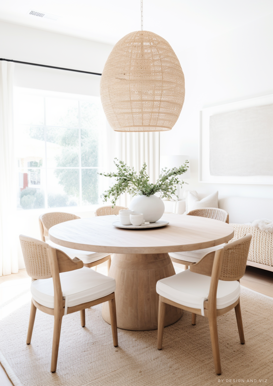
For Snowbound on walls, Pure White or Extra White on trim keeps the whole space in the same cool register - anything warmer creates a visible temperature clash at every corner and door frame.
For Swiss Coffee on walls, Chantilly Lace or Simply White on trim gives clean, crisp definition without fighting the wall colour's warmth.
Snowbound is the safer choice over cool stone, polished concrete, and pale engineered oak with ashy tones. Swiss Coffee wants warmer floors - honey oak, walnut, or warm-toned tile - to avoid looking slightly washed out against anything too cool.
Snowbound suits brushed nickel, chrome, and matte black - the cool undertone holds up against cool metals. Swiss Coffee is more at home with brass, aged gold, and warm bronze, where the metal reinforces rather than fights the undertone.
Architect's Verdict - Snowbound or Swiss Coffee?

For rooms with cool or mixed-temperature materials - steel appliances, quartz counters, black hardware - Snowbound is the more reliable choice. It holds its composure regardless of the light.
Snowbound is the right call when the brief is specifically crisp, cool, and modern - a kitchen with steel and quartz, an exterior meant to read sharp against black trim, a bathroom with cool marble. It does not try to be anything other than quiet.
Swiss Coffee is the right call when the room wants warmth without committing to cream - traditional trim, a whole-house scheme with warm wood throughout, a space where Snowbound would feel unfinished. It has earned its reputation as a workhorse for a reason.
The test I always use for a comparison this close on paper: buy sample pots of both, paint two patches on the same wall, and check them in your worst light - a north-facing room at midday under artificial light is where the difference collapses fastest if it's going to. If one patch still looks composed and the other looks flat or yellowed, that's your answer within a day.
Frequently Asked Questions

Is Snowbound warmer than Swiss Coffee?
No - Snowbound is the cooler of the two. It carries a faint gray-blue undertone, while Swiss Coffee leans warm with a soft yellow undertone. Side by side, Swiss Coffee reads noticeably creamier.
Can I use Snowbound and Swiss Coffee in the same house?
Yes, but it needs deliberate zoning. The two work better in separate areas - Snowbound in cooler, more contemporary spaces and Swiss Coffee in warmer, more traditional ones - rather than side by side in the same room, where the temperature contrast can look unresolved.
Which is better for kitchen cabinets?
Snowbound is the more popular choice for cabinets with steel appliances and quartz counters. Swiss Coffee works better in kitchens with warm wood, brass hardware, and traditional detailing. The surrounding materials should decide this one, not personal preference alone.
Does Snowbound look gray or blue on the walls?
In flat or artificial light, it can lean slightly gray-blue. The undertone is subtle rather than obvious, but it is enough to keep the colour reading cool rather than neutral in every light condition. Always test a large sample patch before committing.
Which is better for a north-facing room?
Both handle north light reasonably well, but for different reasons. Snowbound stays composed because it isn't trying to warm up in the first place. Swiss Coffee holds its warmth without tipping yellow, which is where many warm whites struggle in flat light.
What is the LRV of Snowbound vs Swiss Coffee?
Both sit at approximately LRV 83 - functionally identical in brightness. The real difference has nothing to do with reflectance and everything to do with undertone, which is why testing swatches side by side matters more than comparing the numbers.
Final Thought
Snowbound and Swiss Coffee solve different problems, not the same problem twice. Neither is a universal default - the choice depends entirely on what the rest of the room is already doing.
If your materials are cool and your brief is crisp, Snowbound will hold its composure in every light you throw at it. If your materials are warm and your brief wants softness without a full commitment to cream, Swiss Coffee is the more forgiving and more established choice. Buy sample pots of both, paint patches on the same wall, and check them morning, midday, and evening. The temperature difference will be obvious well before the 24-hour mark.
Want a complete colour scheme built around Snowbound or Swiss Coffee? Our design packages cover full palette selection, finish recommendations, and 3D visualisations - see our packages. |
About the Author
Beril Yilmaz is a qualified architect and interior designer based in the UK. She runs BY Design And Viz, a design platform covering paint colour reviews, interior design guidance, and residential design projects. Beril has specified both Snowbound and Swiss Coffee across residential projects in the UK and internationally - Snowbound in contemporary kitchens with steel and quartz, Swiss Coffee in traditional schemes with warm wood and brass, most often keeping the two in separate zones of the same project rather than side by side.




Comments