


Snowbound vs White Dove: The Comparison That Actually Helps You Decide

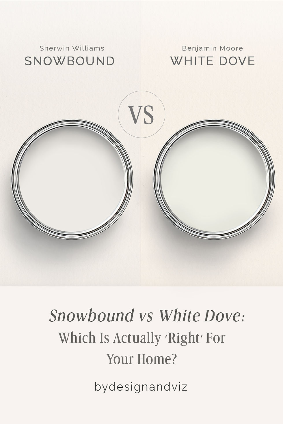
Snowbound and White Dove get pulled onto the same shortlist by anyone hunting for the perfect whole-house white, and the reason is obvious the moment you check the LRV: both sit at 83, both read as soft rather than stark, and both get marketed as safe, do-anything neutrals. Where they part ways is temperature. Snowbound pulls cool and gray. White Dove pulls warm and cream. On a fan deck the difference is easy to miss. On a wall, it decides whether a room reads contemporary or classic.
I have specified both extensively, and the choice always comes down to what else is in the room — the floor tone, the hardware finish, the direction and quality of the natural light. Snowbound behaves like a gray in white's clothing. White Dove behaves like a cream that has learned restraint. Assuming either one is "just white" is the fastest way to end up with walls that fight your cabinetry.
This guide covers exactly how each one behaves — the light conditions that flatter them, the finishes they pair with, and which one actually earns its reputation as the safer whole-house choice.
At a Glance
| Snowbound | White Dove |
Brand | Sherwin-Williams | Benjamin Moore |
LRV | 83 - cool-neutral, stays quiet even as light shifts through the day | 83 - identical to Snowbound on paper, but reads warmer at every stage |
Colour category | Restrained cool-neutral white - built to disappear, not perform | Committed warm white - creamy enough to read as intentional, not accidental |
Undertones | Soft gray with a faint violet cast; can deepen in dim or north light | Soft yellow-cream held in check by a touch of green; warms further in strong daylight |
Character | Contemporary and unshowy; holds its cool, gallery-quiet temperament in almost any room | Classic and inviting; carries real warmth without tipping fully into cream |
North-facing | Reliable - stays composed, though it can read faintly violet-pewter without warm light | Strong - warmth holds even without direct sun, rarely looks cold or dingy |
South-facing | Clean and neutral - resists turning yellow even in strong direct sun | Excellent - the creamy undertone deepens and glows without looking artificial |
Open-plan | Strong - reads consistently cool-neutral across zones and mixed fixtures | Strong - warmth reads consistently across mixed materials and changing light |
On walls | Crisp, contemporary backdrop that stays quietly neutral from every angle | Soft, enveloping warm-white backdrop that never looks stark |
On cabinets | The safer pick against cool stone, stainless steel, and matte black hardware | Best with warm wood, brass, and traditional or transitional schemes |
Use together? | Rare - the gray-violet and cream-green undertones don't reinforce each other | Rare - same caveat as Snowbound; each performs better within its own undertone family |
Trim for each | Extra White SW 7006 for cooler crispness, or Pure White SW 7005 for a softer cool contrast | Chantilly Lace OC-65 for brighter contrast, or White Dove itself on both walls and trim |
Style fit | Contemporary, modern farmhouse, Scandinavian, transitional-cool | Traditional, transitional, classic coastal - the warmer overall range |
Architect's pick | When the brief calls for a quiet, cool-neutral backdrop that won't compete with fixtures | When the brief calls for warmth that still reads as a true white, not an off-white |
Sherwin-Williams Snowbound SW 7004 - What It Really Looks Like

Snowbound has an LRV of 83, which puts it firmly in the pale, light-reflecting end of the white spectrum - but the undertone is what actually defines it, not the brightness. Where many popular whites lean warm, Snowbound leans cool: a soft gray base with a faint violet cast that keeps it from ever reading cream. There is nothing ambiguous about it.
In flat or north light, the gray can deepen slightly, giving Snowbound a faintly moody, almost pewter-toned quality rather than a true white. In strong, warm afternoon light it softens a touch, but it never swings all the way into cream the way a true warm white would. It stays composed in almost every condition - which is exactly why it has become a go-to for contemporary and transitional schemes that want a white with no hint of buttery warmth.
The trade-off is versatility with warm materials. Snowbound sits comfortably against cool stone, matte black hardware, and light oak floors. Against heavily warm wood tones or a brass-heavy traditional scheme, it can look slightly clinical by comparison - not wrong, just noticeably cooler than the room around it.
Benjamin Moore White Dove OC-17 - What It Really Looks Like

White Dove has an LRV of 83 - identical to Snowbound on paper - but the undertone could not behave more differently. This is a warm white built on a soft cream base, with a whisper of green holding the yellow in check. It does not hedge. In good light it reads as genuinely warm, never sharp or synthetic.
In south-facing rooms and afternoon sun, White Dove deepens into a rich, buttery warmth. In north-facing rooms or overcast light, the green undertone pulls it back toward neutral rather than letting it go cold - which is the real reason it has become the benchmark warm white for so many designers. It rarely looks stark, and it rarely looks yellowed either.
White Dove's reputation rests as much on what it pairs with as on the colour itself, and the full breakdown of its best coordinating trims and undertone matches is worth reading before committing a whole scheme to it - the White Dove coordinating colors guide lays out the pairings that keep its warmth working with you rather than against you.
The Real Difference Between Snowbound and White Dove

The simplest way to separate them: Snowbound is a white that thinks like a gray. White Dove is a white that thinks like a cream. Both sit at an LRV of 83, both are marketed as safe whole-house neutrals, but the undertone families could not be further apart.
The identical LRV is exactly why this comparison trips people up. Reflectance tells you how much light a colour bounces back - it says nothing about temperature. Snowbound's gray-violet base and White Dove's cream-green base will never read the same on a wall, no matter how close the numbers sit on a fan deck. The undertone decides the room, not the LRV.
Trim behaves differently for each, too. Snowbound pairs cleanly with cooler, brighter trims like Extra White or Pure White, keeping the whole scheme in the same cool family. White Dove is often used on both walls and trim for a seamless warm-white envelope, or stepped up with Chantilly Lace for crisper contrast. For the comparison of White Dove against its closest same-brand rival - a warmer, more traditional cream from the same coordinating family - the Dover White vs White Dove guide covers which one holds its warmth better across mixed light.
When to Choose Snowbound
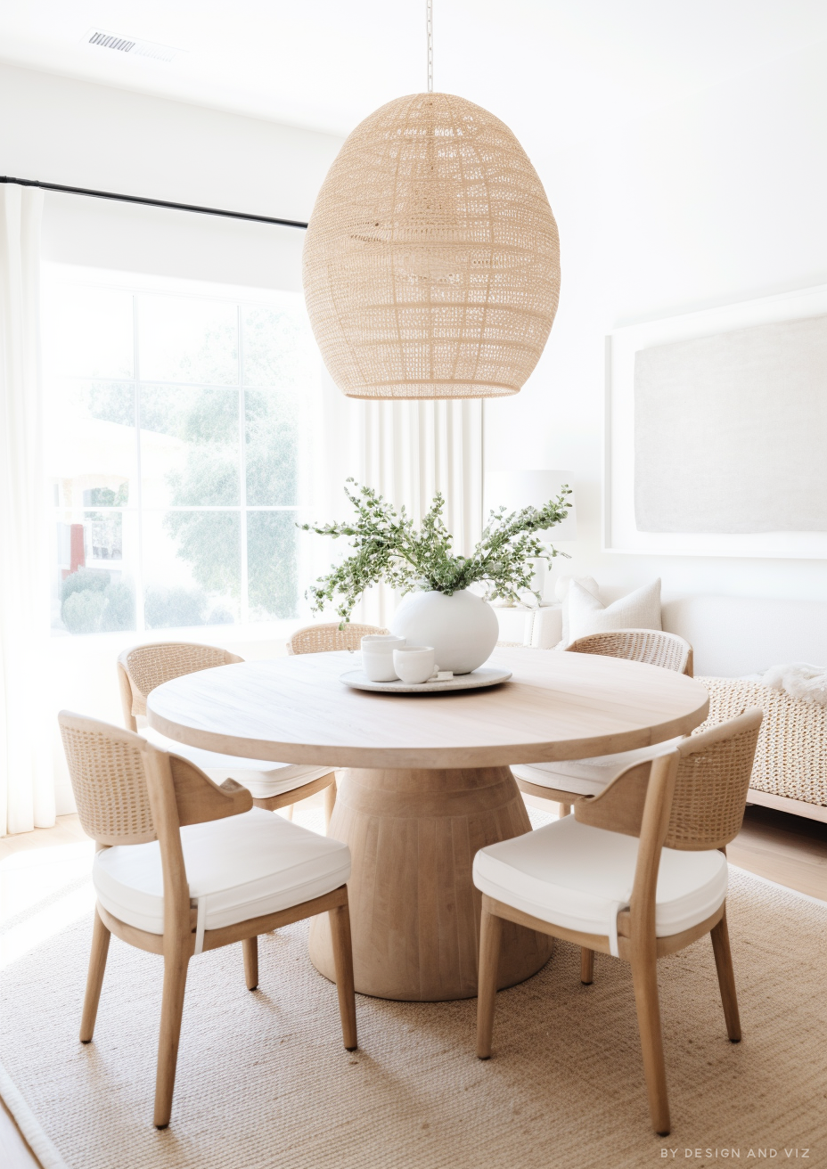
Choose Snowbound when the brief is cool, contemporary, and needs the white to disappear into the background rather than announce itself. These are the conditions where it performs best: modern and transitional interiors with cool stone, stainless steel, or matte black fixtures. North or east-facing rooms where a warm white would tip cold-adjacent materials out of balance. Kitchens and bathrooms where the palette is already cool and any hint of cream would clash.
Avoid Snowbound in rooms heavy with warm wood, brass, and traditional detailing - against that much warmth, its gray base can look slightly flat or out of place. It is not the right choice when the brief specifically calls for cosy or cream.
When to Choose White Dove

Choose White Dove when the brief calls for real warmth that still reads as a genuine white, not an off-white. These are the situations where it wins: traditional and transitional interiors with warm wood floors and brass hardware. Whole-house schemes where consistency matters more than drama. Any room where a cooler white has already been tested and felt clinical or unwelcoming.
Avoid White Dove in strongly contemporary schemes built entirely around cool stone and black metal - its cream undertone will read as slightly dated against that much coolness. It is the wrong choice when the brief is specifically for a crisp, gallery-white finish.
How the Pairings Differ

Snowbound on walls pairs best with Extra White SW 7006 or Pure White SW 7005 on trim - both keep the scheme in the same cool-neutral family without introducing competing warmth. Avoid pairing Snowbound with a warm cream trim; the contrast reads as mismatched rather than intentional.
White Dove on walls works beautifully with Chantilly Lace OC-65 on trim for a soft step up in brightness, or with White Dove repeated on trim for a fully enveloping warm-white scheme. Avoid stark, blue-based whites on trim - they will make White Dove's warmth look dingy by comparison.
For flooring, Snowbound is the more forgiving of the two against cool materials - pale oak, light stone, and porcelain tile all sit comfortably alongside it. White Dove wants at least some warmth nearby: warm oak, natural wood tones, or warm-toned stone keep its cream undertone from feeling unsupported.
Snowbound suits matte black, brushed nickel, and cooler chrome finishes - hardware that reinforces its contemporary, cool-neutral character. White Dove leans toward brass, aged gold, and warm nickel, finishes that echo its cream undertone rather than fighting it.
Architect's Verdict - Snowbound or White Dove?

For most whole-house applications - particularly homes with a mix of cool fixtures, stone, and modern finishes - Snowbound is the more contemporary and dependable choice. Its gray base stays quiet and composed across almost any light condition, which is exactly what a busy, multi-room palette needs.
Choose Snowbound when the brief is cool, contemporary, and low-drama - modern kitchens, transitional living spaces, and any room where you want the white to recede rather than announce itself.
Choose White Dove when the brief calls for warmth that still reads as a genuine white - traditional and transitional interiors, warm-wood kitchens, and any room where a cooler white would feel at odds with the materials already in place.
The test I always use for this pair: paint large sample boards of each, then check them side by side in your worst light - north-facing, overcast, late afternoon. If Snowbound still reads clean and neutral rather than faintly violet or grubby, it passes. If White Dove still reads warm and inviting rather than washed out or dingy, it passes. Whichever one holds its character in that worst-case light is the one your room needs.
Frequently Asked Questions

Is Snowbound warmer or cooler than White Dove?
Snowbound is the cooler of the two — its gray-violet undertone keeps it firmly in the cool-neutral white family, while White Dove's cream-green undertone puts it just as firmly in the warm white family. Side by side in the same room, the difference is unmistakable.
Can Snowbound and White Dove be used together in the same house?
It's possible, but it needs care — the two undertone families don't reinforce each other, so pairing them room to room, rather than zone to zone with a clear boundary, can make one look slightly off. Most designers pick one whole-house white rather than mixing the two.
Which is better for a north-facing room?
White Dove generally holds up better in north light because its warm undertone resists turning cold. Snowbound can lean faintly violet or pewter-toned in flat northern light — some homeowners love that for a moody, contemporary look, and others find it too cool.
Which is better for kitchen cabinets?
It depends on the room's other finishes — Snowbound is the safer pick against cool stone, stainless steel, and matte black hardware, while White Dove is the stronger choice with warm wood, brass, and traditional detailing.
What is the LRV of Snowbound vs White Dove?
Both sit at an LRV of approximately 83, making them nearly identical in brightness. The real difference is entirely in the undertone, not the reflectance — which is why relying on LRV alone to choose between them is a mistake.
Does Snowbound look gray on the walls?
In flat or north light, yes, slightly — the violet-gray undertone becomes more noticeable when there's little warm light to counter it. In brighter, warmer light Snowbound softens and reads closer to a true, quiet white.
Final Thought
Snowbound and White Dove are both excellent whites, but they are not interchangeable. The choice between them is not about quality — it is about temperature, and about what the rest of the room is already doing.
If your fixtures are cool and your brief is contemporary, Snowbound will give you a clean, quiet backdrop that never competes. If your materials lean warm and the brief calls for a white that still feels inviting, White Dove is the more forgiving, more classic choice. Buy sample pots of both, paint large boards side by side, and view them in your worst light before you decide. The undertone will tell you everything the LRV can't.
Want a complete colour scheme built around Snowbound or White Dove? Our design packages cover full palette selection, finish recommendations, and 3D visualisations - see our packages. |
About the Author
Beril Yilmaz is a qualified architect and interior designer based in the UK. She runs BY Design And Viz, a design platform covering paint colour reviews, interior design guidance, and residential design projects. Beril has specified both Snowbound and White Dove across residential projects in the UK and internationally — Snowbound in contemporary and transitional homes with cool stone and matte black finishes, White Dove in traditional and warm-wood schemes where a genuine warm white was the brief, occasionally specifying White Dove on both walls and trim for a seamless envelope.


Comments