


Swiss Coffee vs Edgecomb Gray: The Comparison That Actually Helps You Decide

Updated: Sep 15
These two rarely get compared on their own terms, and that is the point worth making first. Swiss Coffee sits at an LRV in the low 80s and Edgecomb Gray sits nearly twenty points below it in the low 60s - a gap wide enough that this is not really a contest between two similar neutrals. It is a decision about what job the wall needs to do.
I have specified both across residential projects, and I have never once treated them as interchangeable options for the same brief. Swiss Coffee behaves like a soft, warm-adjacent white; Edgecomb Gray behaves like a true greige backdrop with real depth. Once you understand that the LRV gap is the whole story, the rest of the decision gets much easier.
Here is exactly how I tell them apart, and which conditions point to each one.

At a Glance
| Swiss Coffee | Edgecomb Gray |
Brand | Benjamin Moore | Benjamin Moore |
LRV | 82 - high, reads as a soft off-white rather than a true neutral | 63 - medium-light, holds real depth and presence on the wall |
Colour category | Warm off-white - reads as a brighter, cleaner backdrop rather than a committed neutral | Balanced warm greige - reads as an anchoring neutral, not a white |
Undertones | Warm yellow with a faint green cast - subtle, but present enough to shift in cool light | Beige-taupe base with a faint green-gray thread beneath it - genuinely balanced, rarely tips hard in either direction |
Character | Bright and adaptable; functions closer to a trim-adjacent white than a wall-anchoring neutral | Grounded and versatile; does the quiet, structural work a backdrop colour needs to do |
North-facing | Manageable - the green cast can surface in flat light but rarely reads as a problem | Reliable - the balanced undertone keeps it from reading cold, even in flat light |
South-facing | Excellent - warms further without tipping heavy, stays light throughout the day | Warms further and reveals its beige side without turning yellow |
Open-plan | Strong - high LRV keeps it consistent across zones with mixed light | Strong - depth reads consistently across zones without going heavy |
On walls | Bright, soft-white backdrop that opens a room up rather than grounding it | Grounding, warm-neutral backdrop with genuine presence - the colour a room is built around, not just brightened by |
On cabinets | Reliable warm white for most kitchens, including cooler stone and stainless finishes | Excellent in kitchens wanting warmth with weight; less suited to cabinetry chasing maximum brightness |
Use together? | Yes - Swiss Coffee on trim against Edgecomb Gray walls is a considered, well-tested pairing | Yes - Edgecomb Gray on walls with Swiss Coffee on trim is the classic, well-tested pairing |
Trim for each | White Dove OC-17 or Chantilly Lace OC-65 for a crisper step up | Chantilly Lace OC-65 for crisp contrast, or White Dove OC-17 for a softer step up |
Style fit | Transitional, coastal, light traditional - anywhere brightness is the priority | Traditional, transitional, organic modern - genuinely style-agnostic |
Architect's pick | When the room needs light and a soft neutral base, not a grounding, anchoring colour | When the room needs an anchoring neutral with real depth, not a brightening backdrop |
Benjamin Moore Swiss Coffee OC-45 - What It Really Looks Like

Swiss Coffee has an LRV of 82, which puts it firmly in the soft-white category rather than the greige family. The name suggests cream, but in practice it reads closer to a warm, gentle white than a committed cream.
The undertone is yellow with a faint green thread running underneath it. It does not announce itself the way a true cream does. In flat, north-facing light the green can surface briefly, but it settles quickly once warmer light or warm materials are introduced.
Because the LRV sits so high, Swiss Coffee reflects a large amount of light and keeps rooms feeling open. It is not a colour that grounds a space - it brightens one. That is precisely why it competes more naturally with other whites than with a mid-depth greige like Edgecomb Gray.
For the closest true rival in the same LRV band - a Sherwin-Williams warm white with nearly identical brightness but a different undertone story - the Swiss Coffee vs Alabaster guide covers which one holds its warmth better across brands and light conditions.
Benjamin Moore Edgecomb Gray HC-173 - What It Really Looks Like

Edgecomb Gray has an LRV of 63, nearly twenty points below Swiss Coffee, which is why the two rarely compete for the same wall. It sits firmly in the greige family - warm enough to avoid reading cold, grey enough to avoid reading beige.
The undertone is a beige-taupe base with a faint green-gray thread beneath it. It rarely commits hard in either direction. That restraint is exactly what makes it read as calm rather than indecisive.
Because the LRV sits in the medium range, Edgecomb Gray has genuine weight on a wall. It does not brighten a room the way Swiss Coffee does - it grounds one. In rooms with plenty of natural light already, that grounding quality is often exactly what is missing.
For how Edgecomb Gray performs against a true grey neutral rather than a warm white - a comparison that tests its balance from the other direction - the Agreeable Gray vs Edgecomb Gray guide covers which one wins when a room needs a cooler anchor.
The Real Difference Between Swiss Coffee and Edgecomb Gray

The simplest way to explain it: Swiss Coffee brightens a room. Edgecomb Gray anchors one. They are not really competing for the same job.
The nineteen-point LRV gap is the whole story here. Swiss Coffee, at 82, behaves like a soft off-white - it reflects light and keeps things airy. Edgecomb Gray, at 63, has genuine depth and presence on the wall. When two colours are this far apart in LRV, the choice is rarely about undertone nuance. It is about whether the room needs brightness or weight.
This is also why the classic pairing between them works so well: Edgecomb Gray on walls with Swiss Coffee on trim creates real definition, because the two colours are doing genuinely different jobs rather than competing shades of the same idea. For the reverse pairing - Swiss Coffee walls with a deeper accent - the wider Swiss Coffee cluster is worth reviewing, including the Chantilly Lace vs Swiss Coffee guide, which covers how Swiss Coffee holds up against a true crisp white rather than a greige.
Not sure which one works for your room? A colour consultation is included in all our design packages - book directly here. |
When to Choose Swiss Coffee
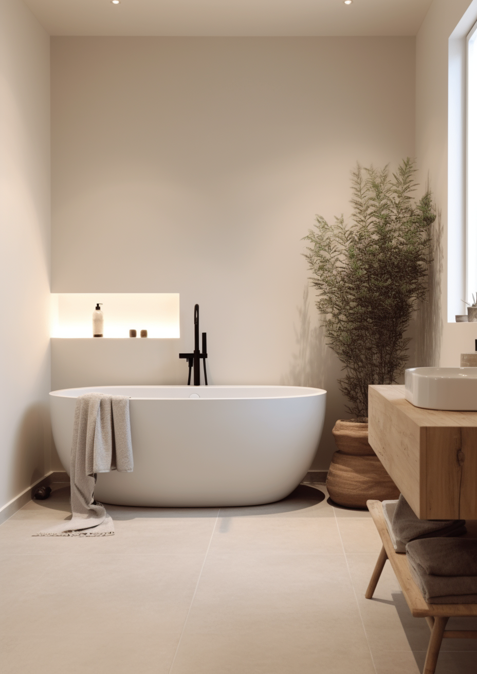
Choose Swiss Coffee when the room needs brightness and a soft, warm-adjacent white rather than a grounding neutral. These are the conditions where it is the right answer.
Open-plan spaces where light needs to carry evenly across zones. Kitchens with cool stone or stainless finishes that would fight a deeper greige. Trim and cabinetry where a true white would look stark but a full cream would look dated. Any room where the brief is airy rather than anchored.
Avoid Swiss Coffee where you actually want depth and presence on the wall - a high-LRV white cannot do the grounding work a greige like Edgecomb Gray does, no matter how warm its undertone reads.
When to Choose Edgecomb Gray
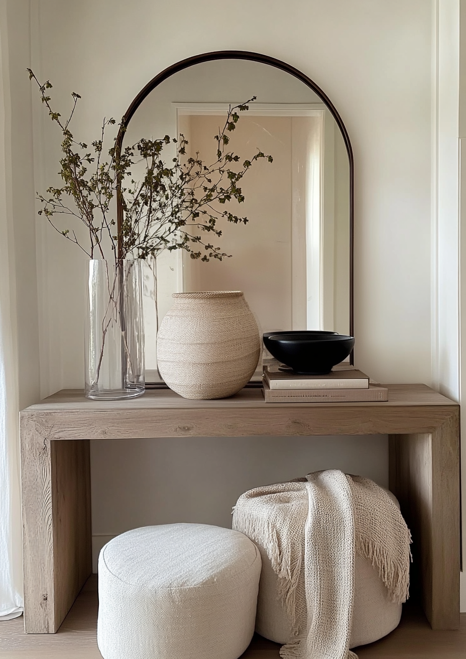
Choose Edgecomb Gray when the room needs an anchoring neutral with genuine depth, not another bright white. These are the situations where it outperforms Swiss Coffee.
Living rooms and dining rooms where the brief calls for warmth with weight rather than airiness. Rooms with abundant natural light that can absorb a deeper neutral without feeling dim. Whole-house schemes that need one reliable greige to run trim, cabinetry, and adjacent whites against. Any space where Swiss Coffee has been tested and read as too pale or too insubstantial for the room's proportions.
Avoid it in small, low-light rooms where the medium LRV can start to feel heavy rather than grounding - that is Swiss Coffee's territory instead. For how Swiss Coffee compares to Snowbound - two near-white colours both sitting around LRV 83 that read completely differently on the wall - the Snowbound vs Swiss Coffee guide explains why the undertone, not the LRV, decides which one a room needs.
How the Pairings Differ

For Swiss Coffee on walls, White Dove or Chantilly Lace on trim gives a clean, quiet step up in brightness without competing undertones. Avoid pairing it with a deep, cool grey trim - the contrast reads harsh rather than considered.
For Edgecomb Gray on walls, Swiss Coffee or Chantilly Lace on trim is the more natural route. Swiss Coffee softens the transition; Chantilly Lace sharpens it. Either works depending on how much contrast the room wants.
Both colours suit warm wood tones, though Edgecomb Gray is the more forgiving of the two against cooler stone and tile - its greige base absorbs cool materials better than Swiss Coffee's brighter, more yellow-leaning undertone.
Both pair well with warm brass and bronze. Edgecomb Gray also handles matte black and aged pewter with ease, given its balanced undertone. Swiss Coffee is more comfortable with warmer metals - cool nickel can make its faint green cast more noticeable.
Architect's Verdict - Swiss Coffee or Edgecomb Gray?

For most rooms, the decision is less about preference and more about what the space is missing.
If the room already has depth - dark floors, heavy furnishings, low ceilings - Swiss Coffee is the better call. It opens things up without erasing warmth, and its high LRV does real work in spaces that need light more than they need grounding.
If the room is already bright and a little characterless, Edgecomb Gray is the more considered choice. It gives the space something to hold onto - genuine depth without tipping into a colour that reads heavy or dated.
The test I always use here, given how far apart these two sit on the LRV scale: paint a large sample of each on the wall that gets the least natural light in the room, typically the north wall, and check it in overcast midday light - the hardest condition for both. If Swiss Coffee still reads clean and bright rather than washed out, it passes. If Edgecomb Gray still reads warm and grounded rather than flat or muddy, it passes. Whichever one survives that test on your worst wall is the one your room actually needs.
Frequently Asked Questions

Is Swiss Coffee lighter than Edgecomb Gray?
Yes, significantly. Swiss Coffee has an LRV of approximately 82, while Edgecomb Gray sits at approximately 63 - a gap of nearly twenty points. Swiss Coffee reads as a soft off-white, while Edgecomb Gray reads as a true, medium-depth greige.
Can I use Swiss Coffee and Edgecomb Gray in the same house?
Yes, and it is a well-tested combination. Edgecomb Gray on walls with Swiss Coffee on trim creates clean definition because the two colours are doing different jobs rather than competing shades of the same idea. They share enough warmth in their undertones to feel coordinated without clashing.
Which is better for a small, dark room?
Swiss Coffee, in most cases. Its higher LRV reflects more available light, which helps a small or dark room feel less enclosed. Edgecomb Gray's greater depth can make a genuinely low-light room feel heavier rather than cosier.
Which is better for kitchen cabinets?
It depends on the countertops. Swiss Coffee is the safer choice against cool stone and stainless appliances. Edgecomb Gray works beautifully in kitchens with warm wood and stone, but can read slightly heavy against very cool, minimal finishes. Always test in your own kitchen's light before committing.
Does Edgecomb Gray look green?
Occasionally, in specific light. Edgecomb Gray carries a faint green-gray thread beneath its beige-taupe base. It rarely reads as obviously green, but the undertone can surface briefly in cool, flat light or against strongly green furnishings. Sampling in your actual room resolves this quickly.
What is the LRV of Swiss Coffee vs Edgecomb Gray?
Swiss Coffee has an LRV of approximately 82 and Edgecomb Gray has an LRV of approximately 63. This is a substantial gap by paint standards, and it is the main reason the two colours serve different purposes rather than competing for the same wall.
Final Thought
Swiss Coffee and Edgecomb Gray are not really rivals. They sit far enough apart on the LRV scale that the choice comes down to what the room is missing, not which undertone you prefer.
If your room needs light and a soft, adaptable backdrop, Swiss Coffee is the more reliable choice. If your room needs depth and a neutral with genuine presence, Edgecomb Gray is the one to reach for. Paint large samples of both on your darkest wall, check them in flat midday light, and the answer will be obvious within a day.
Want a complete colour scheme built around Swiss Coffee or Edgecomb Gray? Our design packages cover full palette selection, finish recommendations, and 3D visualisations - see our packages. |
About the Author
Beril Yilmaz is a qualified architect and interior designer based in the UK. She runs BY Design And Viz, a design platform covering paint colour reviews, interior design guidance, and residential design projects. Beril has specified both Swiss Coffee and Edgecomb Gray across residential projects in the UK and internationally - Swiss Coffee in bright, open-plan spaces and on trim needing a soft lift, Edgecomb Gray in living and dining rooms needing genuine warmth and depth, often specifying both together with Edgecomb Gray on walls and Swiss Coffee on trim.


Comments