


Pale Oak vs Creamy: The Comparison That Actually Helps You Decide

These two rarely get shortlisted against each other, and once you put them side by side it's obvious why they're not really competing for the same job. Pale Oak sits at an LRV of 69, a soft greige with a whisper of warmth, while Creamy sits at an LRV of 81, a committed warm cream with an unmistakable yellow undertone. One is quiet and shifts with the room around it. The other announces itself the moment it hits the wall.
I have specified both, often in the same house but never in the same room for the same reason. Pale Oak does the work of a flexible, mood-setting neutral. Creamy does the work of a warm, characterful backdrop. Confusing the two briefs is the most common mistake I see homeowners make when they pick from a swatch alone.
This guide covers exactly how each one behaves in real light, where each one belongs, and why the twelve-point LRV gap between them matters far less than the undertone difference underneath it.

At a Glance
| Pale Oak | Creamy |
Brand | Benjamin Moore | Sherwin-Williams |
LRV | 69 - mid-range, softens rather than brightens | 81 - bright, reflects well, brings warmth forward |
Colour category | Warm greige - reads gray in some light, faintly beige in others, never fully commits to either | Committed warm cream - reads as intentionally buttery, not an accidentally warm neutral |
Undertones | Subtle warm gray-beige - present but never assertive, the kind of undertone you notice only in comparison | Strong yellow, verging on buttery in direct light - the undertone announces itself immediately |
Character | Adaptive and quiet; changes character with light and adjacent materials rather than asserting its own | Rich and traditional; commits hard to warmth and needs warm materials around it to perform |
North-facing | Reliable - the muted undertone keeps it from turning flat or cold even without direct sun | Risky - can read yellow without warm light or warm materials to balance it |
South-facing | Good - stays soft and controlled rather than blowing out or reading beige | Excellent - the yellow undertone activates and reads as intentional, glowing cream |
Open-plan | Strong - its shape-shifting quality is exactly what open-plan spaces with mixed light need | Weak - reads inconsistently across zones with different light and material temperatures |
On walls | A quiet, mid-tone backdrop that recedes rather than announces - built for rooms that need calm, not character | A full-commitment warm cream backdrop - unmistakably warm from every angle, never recedes the way a greige does |
On cabinets | Excellent on kitchen cabinetry, especially with warm wood and mixed metals | Best in warm, traditional kitchens with wood tones; can look yellowed against cool stone |
Use together? | Yes - Pale Oak on walls with Creamy reserved for an adjacent warm-toned room works; using both in the same room competes | Yes, in adjoining rooms rather than the same one - Pale Oak's restraint and Creamy's commitment read as two different design decisions side by side |
Trim for each | Chantilly Lace OC-65 or White Dove OC-17 for a soft, non-clinical contrast | Extra White SW 7006 for crisp contrast, or Alabaster SW 7008 for a softer step up |
Style fit | Transitional, modern farmhouse, quiet luxury - the industry's default safe greige | Traditional, farmhouse, cottage, warm classic interiors |
Architect's pick | When the brief is a flexible neutral that needs to hold its own across changing light and mixed materials | When the brief is specifically warm and creamy and the room's materials can support it |
Benjamin Moore Pale Oak OC-20 - What It Really Looks Like

Pale Oak has an LRV of 69, which puts it in mid-tone greige territory - bright enough to feel fresh, deep enough to have real presence on a wall. The undertone is warm but restrained: gray dominates, with only a faint beige lean showing through in warm afternoon light.Pale Oak vs Sea Pearl guide covers how that restraint plays out against a cooler, more silvery greige, which is the comparison that actually reveals what Pale Oak's undertone is doing.
It does not perform the same way in every room. In cool northern light it settles into a soft gray. In warm southern light it picks up a faint beige cast. This is not inconsistency - it is the whole point of the colour. Designers reach for Pale Oak precisely because it adapts instead of fighting the room's existing light and materials.
Pale Oak pairs comfortably with warm wood, cool stone, brass, and matte black without clashing with any of them. It is a bridge colour. It does not have the strong personality that would make it the wrong choice in a mixed-material room, and that neutrality is its defining trait.
Sherwin-Williams Creamy SW 7012 - What It Really Looks Like
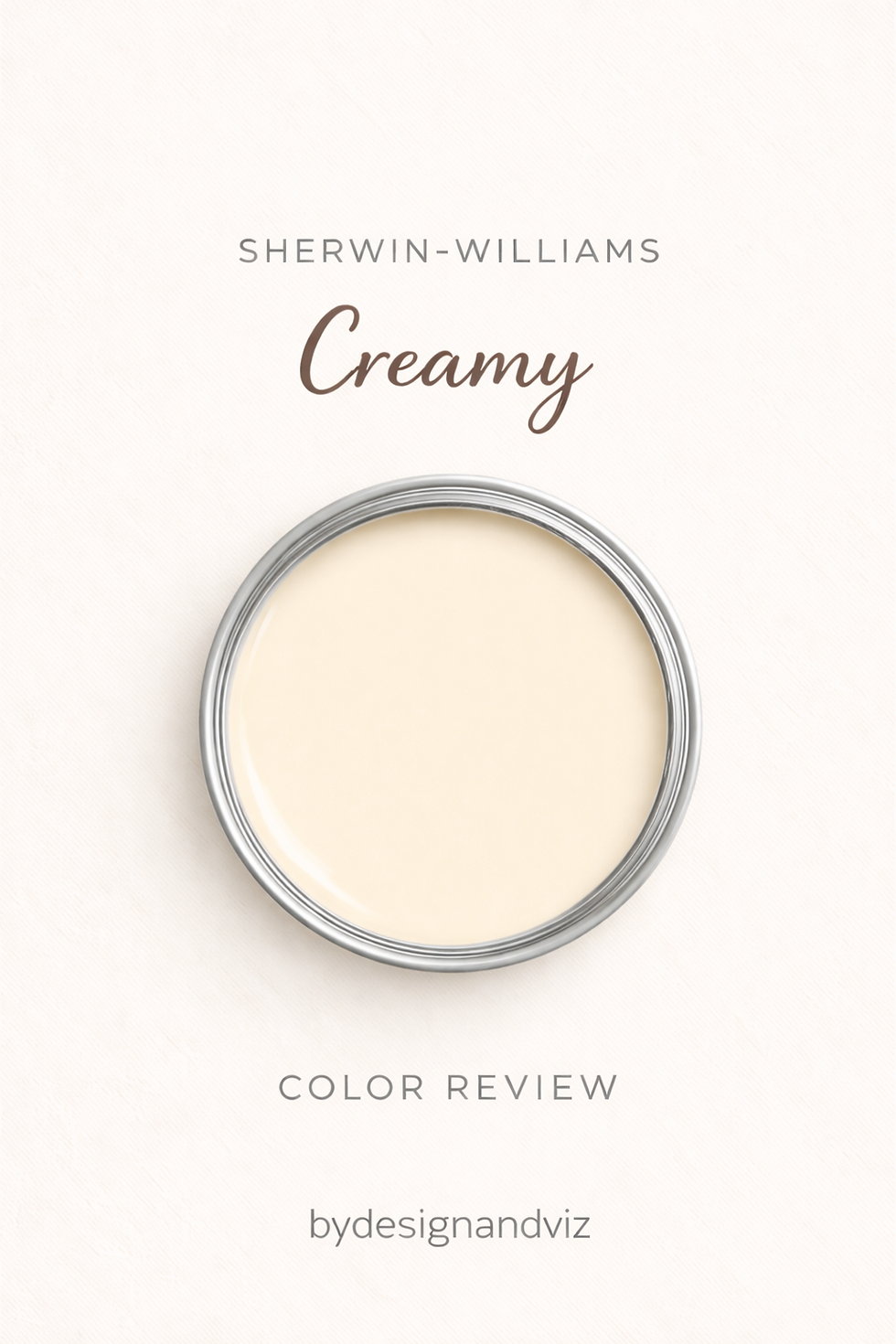
Creamy has an LRV of 81 and a noticeably warm yellow undertone that never hides. The name is accurate - in warm natural light this colour reads as a soft, buttery cream that sits clearly in the warm white family. There is nothing ambiguous about it.Creamy vs Swiss Coffee guide is the better read if you want to see exactly how far that yellow undertone pushes when set against a cooler, more restrained warm white.
In strong southern light Creamy can lean quite yellow, which is either exactly what you want or a real problem depending on the brief. It does not hedge. It commits hard to warmth, and it needs warm materials around it - warm wood, warm trim, warm stone - to look considered rather than accidental.
Against cool or neutral materials it can look yellowed and out of place. That is not a flaw so much as a condition of use: Creamy performs when the brief is unambiguously warm, and struggles the moment the room asks it to be flexible.
The Real Difference Between Pale Oak and Creamy
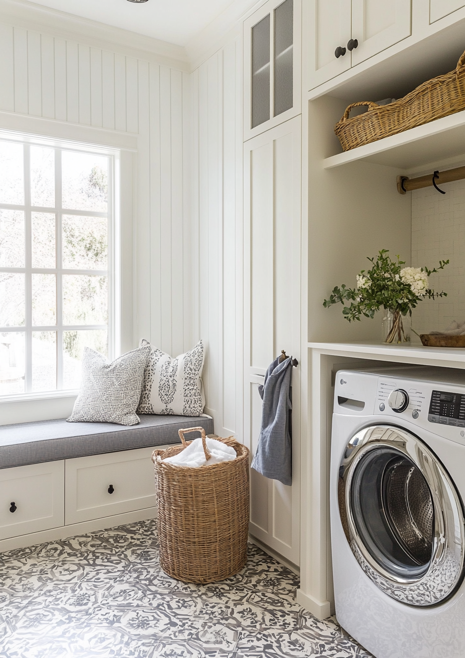
The simplest way to put it: Pale Oak is a neutral built to disappear into a room. Creamy is a neutral built to be noticed. They are not really rivals - they are tools for two different jobs, and the twelve-point LRV gap between them (69 versus 81) is a much smaller part of the story than the undertone difference.
Pale Oak's gray-beige undertone is restrained by design - it shifts quietly with the light and never fully declares itself. Creamy's yellow undertone does the opposite: it declares itself in every light condition, strongly in the sun, more mutedly in shade, but always present. Put the two together in a room with mixed materials and Pale Oak will settle in while Creamy will pull focus.
The two work best as a wall-and-trim style relationship stretched across a house rather than a single room - Pale Oak carrying the flexible, everyday spaces and Creamy reserved for the one room built specifically around warmth, like a farmhouse kitchen or a period-property bedroom. For the reverse pairing question, whether Creamy can sit comfortably against a true warm white rather than a greige, Dover White vs Creamy guide covers the one-point LRV gap and the adjacent-surface rule that decides it.
Not sure which one works for your room? A colour consultation is included in all our design packages - book directly here. |
When to Choose Pale Oak

Choose Pale Oak when the room has mixed materials, mixed light, or an undecided brief and needs a neutral that will not fight any of it.
Open-plan kitchens and living spaces where the wall colour has to read consistently under morning light, afternoon light, and lamplight. Transitional interiors that mix warm wood tones with cooler stone or metal finishes. Whole-house neutrals where one colour needs to work across several rooms with different orientations.
Avoid Pale Oak where the brief specifically calls for warmth and character - it will read as too quiet, even flat, next to a room built around cream or terracotta tones.
When to Choose Creamy

Choose Creamy when warmth and creaminess are specifically what the brief calls for, and the room's light and materials can support it.
South or west-facing rooms with good natural light where the yellow undertone has something to activate it. Traditional, farmhouse, and cottage interiors where a warm, aged quality is part of the design intent. Rooms with warm wood floors and warm natural materials throughout, where everything else is already pulling in the same direction.
Avoid Creamy in north-facing rooms, in contemporary interiors built around cool-toned materials, and in any open-plan space where the colour will be judged under several different light conditions across the day.
How the Pairings Differ

For Pale Oak on walls, Chantilly Lace or White Dove on trim gives a soft, non-clinical contrast that keeps the greige reading calm rather than cold. Avoid a stark, blue-white trim - it will push Pale Oak's undertone toward gray and strip out its warmth entirely.
For Creamy on walls, Alabaster on trim is the classic pairing - a step up in brightness that keeps both colours in the same warm family. Extra White works for more contrast in a traditional scheme that can handle it.
Pale Oak is forgiving on flooring - it works with warm wood, cool stone, and most engineered floors without a fight. Creamy needs warm floors more urgently; cool grey stone alongside Creamy walls creates an undertone conflict that is difficult to resolve.
Both colours suit brass and matte black. Pale Oak also handles brushed nickel and chrome comfortably in a way Creamy does not - Creamy's strong yellow undertone tends to fight cool metals rather than complement them.
Architect's Verdict - Pale Oak or Creamy?

For most homes, and particularly for any room where the light changes across the day or the materials are mixed, Pale Oak is the safer and more useful choice. Its restraint is not a limitation - it is exactly what lets it hold a whole-house palette together without clashing anywhere.
Pale Oak earns its place as a go-to neutral because it never forces a room to argue with it. Choose it for open-plan spaces, whole-house schemes, and any room where you are not certain yet what the final material palette will be.
Creamy earns its place when the brief is specific: a warm, traditional room with warm materials and good natural light. In that context it outperforms Pale Oak comfortably - it has a richness and presence that a greige simply cannot deliver.
The test I always use, and the one that matters most here given how differently these two behave under compromised light: paint a large sample of each in the room's worst light - typically the north wall in late afternoon - and check it again after dark under lamplight. If Pale Oak still reads calm and settled in both conditions, it passes. If Creamy holds its warmth without tipping into flat yellow under the lamp, it passes too. If either one looks wrong in the worst light, it will look wrong on the wall.
Frequently Asked Questions

Is Pale Oak warmer than Creamy?
No - Creamy is significantly warmer. Creamy's yellow undertone is strong and immediate, while Pale Oak's warmth is a faint gray-beige lean that only shows up in direct comparison. Side by side, Creamy reads as the clearly warmer, creamier colour every time.
Can I use Pale Oak and Creamy in the same house?
Yes, but not usually in the same room. Pale Oak works best as the flexible, everyday neutral running through open-plan and transitional spaces, while Creamy is better reserved for a single room - a farmhouse kitchen or period bedroom - where warmth is the specific intent.
Which is better for a north-facing room?
Pale Oak, without much competition. Its restrained undertone holds its composure in cool light, while Creamy's yellow undertone is the one most likely to look wrong - either flat or unintentionally yellow - when direct sun isn't there to activate it.
Which is better for an open-plan space?
Pale Oak. Its adaptive quality is built for exactly this problem - a colour that has to read consistently across zones with different light and different material temperatures throughout the day. Creamy is far more sensitive to those shifts.
What is the LRV of Pale Oak vs Creamy?
Pale Oak has an LRV of approximately 69, and Creamy has an LRV of approximately 82... closer to 81 in most references. The twelve-point gap means Creamy reflects noticeably more light, but the bigger practical difference is the undertone, not the brightness.
Final Thought
Pale Oak and Creamy are not really competing for the same wall. The choice between them comes down to what the room is asking for: a neutral that adapts, or a neutral that commits.
If your room has mixed materials or changing light, Pale Oak will hold its composure and let everything else do the talking. If your room is built around warmth - warm wood, warm stone, good direct sun - Creamy will reward you with real richness and character that Pale Oak cannot match. Buy sample pots of both, paint large patches in your room's worst light, and check them again after dark. The answer will be clear within a day.
Want a complete colour scheme built around Pale Oak or Creamy? Our design packages cover full palette selection, finish recommendations, and 3D visualisations - see our packages. |
About the Author
Beril Yilmaz is a qualified architect and interior designer based in the UK. She runs BY Design And Viz, a design platform covering paint colour reviews, interior design guidance, and residential design projects. Beril has specified both Pale Oak and Creamy across residential projects in the UK and internationally - Pale Oak as a flexible whole-house neutral in open-plan and transitional homes, Creamy in traditional farmhouse kitchens and period bedrooms with warm wood and stone, rarely in the same room but often in the same project.




Comments