


Calm vs Swiss Coffee: The Comparison That Actually Helps You Decide

Calm and Swiss Coffee sit on the same Benjamin Moore shortlist, both filed as soft, livable neutrals with LRVs in the high seventies to low eighties. That similarity ends the moment they go on a wall. Calm is a quiet warm gray carrying a violet undertone; Swiss Coffee is a creamy off-white built on yellow and green. One reads cool-adjacent even in warm light. The other never stops reading warm.
I have specified both across UK and international projects, and I do not treat them as substitutes for each other. Calm earns its place in rooms that need quiet, almost architectural restraint - it is not trying to be cream. Swiss Coffee earns its place in rooms that need warmth and softness without committing to a strong cream. Confusing the two produces a wall colour that fights the room it was meant to calm.
Here is exactly how I read them apart, and which conditions tell you which one a room actually needs.

At a Glance
| Calm | Swiss Coffee |
Brand | Benjamin Moore | Benjamin Moore |
LRV | 78 - light, but the violet undertone reads before the brightness does | 82 - four points brighter than Calm, and considerably warmer in character |
Colour category | Restrained warm gray - reads considered, not creamy | Committed warm off-white - reads soft and creamy, never grey |
Undertones | Soft violet-grey; can flash pink-purple in strong afternoon light | Yellow-green, warm but never announces itself as cream the way a true cream would |
Character | Quiet and architectural; behaves like a true grey more than a warm neutral | Warm and inviting; reads as a classic soft white rather than a statement colour |
North-facing | Reliable - the cooler cast holds up without warm light to lean on | Strong - the extra pigment keeps it from looking washed out or stark |
South-facing | Risky - strong afternoon sun pulls the pink-purple undertone forward | Excellent - the warmth activates without tipping yellow |
Open-plan | Moderate - consistent on its own, but its cool-leaning cast can feel disconnected next to warmer materials | Strong - reads consistently warm across zones and light conditions |
On walls | Soft, composed backdrop that leans closer to grey than warm neutral | Warm, enveloping backdrop that stays soft rather than stark |
On cabinets | Best in transitional kitchens with cool stone or stainless, where a true warm grey is wanted | Best in classic kitchens with warm wood and natural stone, where cream-adjacent warmth is wanted |
Use together? | Workable - Calm on walls with Swiss Coffee on trim, tested together first | Swiss Coffee on trim with Calm on walls is the safer order; the reverse needs testing |
Trim for each | Chantilly Lace or Simply White for a clean, neutral lift | Simply White or Super White for crisp contrast |
Style fit | Transitional, modern, minimalist - the more restrained of the two | Traditional, classic, farmhouse - the warmer, more versatile of the two |
Architect's pick | When the brief calls for a quiet, grey-leaning neutral rather than warmth | When warmth and softness are the brief, without going as far as a true cream |
Benjamin Moore Calm OC-22 - What It Really Looks Like
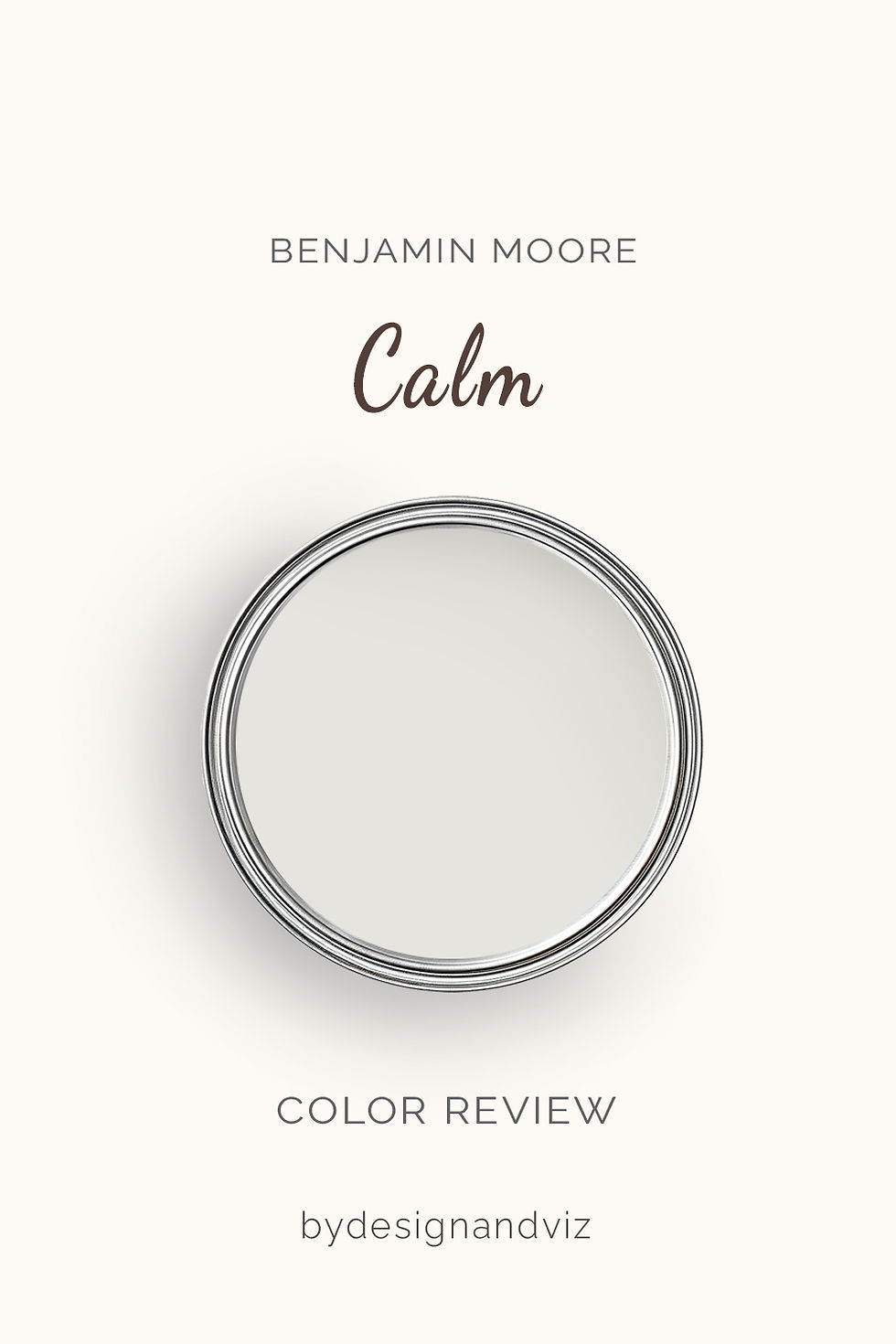
Calm has an LRV of 78, which places it as a light warm grey rather than a true neutral or an off-white cream. The name undersells how present the undertone is - in flat or north light it reads as a soft, quiet grey, but in strong sun a distinct violet-pink cast can surface. There is nothing cream about it. It is grey first, warm second.
The critical thing about Calm is that it does not commit to a single temperature. It shifts between grey and violet depending on exposure, artificial light, and the colour temperature of anything reflective nearby. In a hallway with little natural light it can look like a true architectural grey. Move the same colour into a south-facing living room in the afternoon and the violet undertone becomes obvious enough to notice from across the room.
For the full breakdown of how Calm performs across every exposure and room type - the Benjamin Moore Calm review guide walks through the undertone shift in more depth than a single comparison post can cover.
Benjamin Moore Swiss Coffee OC-45 - What It Really Looks Like

Swiss Coffee has an LRV of 82, four points brighter than Calm and considerably warmer in character despite the closeness on paper. The undertone is yellow-green rather than grey, and it reads as a genuine soft white rather than a stone-cool neutral. It does not hedge toward grey the way Calm does. It is warm, and it stays warm.
In north-facing rooms Swiss Coffee holds its warmth better than most whites in its LRV range - the pigment load is high enough that it does not wash out under flat light. In direct sun it can pick up a faint green cast against very warm wood, which is worth testing before committing on cabinetry.
For how Swiss Coffee compares to a considerably brighter, cooler-leaning white - the Swiss Coffee vs Simply White guide covers the ten-point LRV gap and which rooms actually need that extra brightness.
The Real Difference Between Calm and Swiss Coffee

The simplest way to separate them: Calm is a warm grey with a violet undertone. Swiss Coffee is a warm white with a yellow-green undertone. Side by side, Calm reads distinctly cooler and Swiss Coffee reads distinctly creamier, despite sitting only four LRV points apart.
That four-point gap means almost nothing on its own. The undertone is doing all the work here, not the reflectance value. Calm holds its grey cast in most light; Swiss Coffee holds its warmth in most light. Put them on adjoining walls and the difference is obvious within seconds, not minutes.
Calm on walls with Swiss Coffee on trim is a workable, tested pairing - the extra warmth on the trim keeps Calm from reading too cold on its own, while the grey wall colour keeps the scheme from tipping fully into cream. Balboa Mist vs Calm guide covers how Calm behaves against another cool-leaning Benjamin Moore neutral, which is useful context before pairing it with a warmer trim like Swiss Coffee.
Not sure which one is right for your room? A Color Direction consultation gets you a full custom palette built around your space - book yours here. |
When to Choose Calm

Choose Calm when the room calls for a quiet, grey-leaning neutral that will not read as cream. These are the conditions where it performs best: transitional and modern interiors where a true warm grey is the goal, rooms with cool stone or stainless steel that would clash with a creamier white, and spaces where the brief is calm and architectural rather than cosy and traditional.
Avoid Calm in south or west-facing rooms with strong direct sun, where the violet undertone can surface more than intended. Avoid it also in rooms with predominantly warm wood and warm brass, where the cool cast can feel slightly at odds with everything else.
When to Choose Swiss Coffee

Choose Swiss Coffee when warmth and softness are the priority, without going as far as a full cream. These are the situations where it outperforms Calm: classic and traditional kitchens with warm wood and natural stone, north-facing rooms that need help holding warmth, and open-plan spaces where the colour needs to read consistently warm across different zones and light conditions.
Swiss Coffee is also the safer choice for whole-house exteriors, where its warm, high-pigment off-white holds up well across a wide range of light conditions without looking stark or washed out.
How the Pairings Differ

For Calm on walls, Chantilly Lace or Simply White on trim keeps the scheme quiet and lets the grey read as intentional rather than washed out. Avoid a strongly creamy trim, which will fight the violet undertone rather than complement it.
For Swiss Coffee on walls, Simply White or Super White on trim gives clean definition without competing with the warmth underneath. Swiss Coffee on both walls and trim also works well as a seamless, all-over soft white scheme.
Both colours work with warm wood, but for different reasons. Calm is more forgiving of cool stone and pale oak because its own undertone already leans cooler; warm wood keeps it from reading flat. Swiss Coffee wants warm wood or warm stone to avoid a mismatch between a warm wall and a cool floor.
Calm suits brushed nickel and matte black - cool metals that complement its violet-grey cast rather than fight it. Swiss Coffee is better with aged brass or warm brushed gold, which reinforces the yellow-green undertone instead of working against it.
Architect's Verdict - Calm or Swiss Coffee?
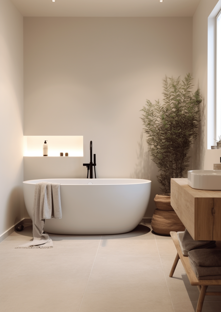
For most homes, the deciding factor is not the LRV gap - it is whether the room can carry a cool-leaning neutral or needs real warmth.
Choose Calm when the room needs a considered, grey-leaning neutral that will not tip into cream. It excels in transitional or modern interiors, in rooms with cool stone or stainless steel, and anywhere a true warm grey - not an off-white - is the brief.
Choose Swiss Coffee when warmth and softness are the priority and a true cream feels like too much. It is the more forgiving choice for classic kitchens, warm wood floors, and rooms that need brightness without losing cosiness.
The test I always use for this pairing: paint two large sample boards and place them on the same wall in a south-facing room in the afternoon - the worst-case light for Calm's violet undertone. If Calm still reads as a composed grey and not pink, it will hold in every other room in the house. If it flashes violet-pink, move to Swiss Coffee instead and save Calm for a north-facing or low-light space.
Frequently Asked Questions

Is Calm warmer than Swiss Coffee?
No - Swiss Coffee is the warmer of the two. Calm carries a violet-grey undertone that reads cooler in most light, while Swiss Coffee's yellow-green undertone keeps it consistently warm. Side by side, Swiss Coffee is unmistakably the creamier, cosier colour.
Can I use Calm and Swiss Coffee in the same house?
Yes, though the pairing needs testing before committing. Calm on walls with Swiss Coffee on trim is the more reliable order - the trim's warmth keeps Calm from reading too cold. Putting Calm on trim against Swiss Coffee walls is less tested and can look slightly mismatched if the undertones aren't checked together first.
Which is better for a north-facing room?
Both hold up reasonably well, but for different reasons. Calm's cooler undertone does not need warm light to look intentional, so it reads as composed grey rather than washed out. Swiss Coffee's higher pigment load keeps it from looking flat or chalky in the same conditions. Neither looks obviously wrong; the choice comes down to whether the room wants grey or cream.
Which is better for kitchen cabinets?
It depends on the surrounding materials. Swiss Coffee is the safer, more classic choice for kitchens with warm wood and natural stone. Calm works better in transitional kitchens with cool stone or stainless steel, where a true grey rather than a cream-adjacent white is wanted.
Does Calm look purple on the walls?
In strong afternoon sun, yes - and that is part of its character, not a flaw. The violet undertone is subtle in flat or north light and becomes more noticeable in direct, warm sunlight. Always test with a large sample patch through a full day before committing, particularly in south or west-facing rooms.
What is the LRV of Calm vs Swiss Coffee?
Calm has an LRV of approximately 78, and Swiss Coffee has an LRV of approximately 82. The four-point gap is minor on paper. The real difference between the two colours is the undertone, not the reflectance value.
Final Thought
Calm and Swiss Coffee solve different problems. The choice between them is not about which one is better - it is about whether your room wants a quiet grey or a genuine warm white.
If your room needs restraint and a cooler-leaning neutral, Calm will read as considered and quietly architectural. If your room needs warmth without going as far as full cream, Swiss Coffee is the more forgiving, more reliable choice. Buy sample pots of both, paint large patches on the same wall, and check them in morning light, afternoon sun, and evening lamplight before deciding. The answer will be clear within a day.
Want a complete colour scheme built around Calm or Swiss Coffee? Our design packages cover full palette selection, finish recommendations, and 3D visualisations - see our packages. |
About the Author
Beril Yilmaz is a qualified architect and interior designer based in the UK. She runs BY Design And Viz, a design platform covering paint colour reviews, interior design guidance, and residential design projects. Beril has specified both Calm and Swiss Coffee across residential projects in the UK and internationally - Calm in transitional and modern interiors with cool stone and stainless steel, Swiss Coffee in classic kitchens and living rooms with warm wood and natural stone, occasionally pairing the two together with Swiss Coffee on trim against Calm walls.


Comments