Dover White vs Accessible Beige: The Comparison That Actually Helps You Decide
- Beril Yilmaz

- 16 hours ago
- 11 min read
Dover White and Accessible Beige are both Sherwin Williams warm neutrals and both appear on shortlists for rooms where committed warmth is the brief. Both are clearly warm. Both read as deliberate colour decisions rather than neutral backdrops. On a mood board they sit comfortably in the same warm palette. On a wall in a real room, the 24-point LRV gap between them is clearly and immediately visible - and the colour category difference between them is just as significant as that brightness gap suggests.
Dover White SW 6385 reads as a warm white. At LRV 82 it is a bright, creamy, directly warm off-white - the yellow-cream undertone commits fully to warmth and creates a luminous, traditional quality that makes it one of SW's most popular warm whites for farmhouse and transitional schemes. Accessible Beige SW 7036 reads as a colour. At LRV 58 it is a warm beige-greige with genuine depth and settled presence - a committed neutral that reads as a deliberate colour choice on four walls rather than a warm backdrop. Both are warm, both belong to the same SW warm family, and both reward south-facing rooms with warm materials. But they serve entirely different purposes.
This guide covers exactly how Dover White and Accessible Beige differ in undertone, LRV, light behaviour, and room application - with a clear verdict on which one to choose and when, and an honest answer on whether they work together.

At a Glance
| Dover White SW 6385 | Accessible Beige SW 7036 |
Brand | Sherwin Williams | Sherwin Williams |
LRV | 82 - bright warm white, reads as a cream-quality white | 58 - medium warm beige-greige, reads as a settled neutral colour |
Colour category | Warm white - reads as a creamy, directly warm white | Warm beige-greige - reads as a committed peacekeeping neutral |
Undertones | Direct warm yellow-cream - committed, clearly warm, traditional | Warm beige-tan with greige anchor - direct, clearly beige-forward |
Character | Creamy, inviting, luminous warm white with traditional character | Warm, grounded, settled beige-greige with peacekeeping presence |
North-facing | Risky - yellow undertone can read flat or sharp without warm light | Good - warm beige holds; can read slightly flat in very cool light |
South-facing | Beautiful - yellow-cream glows with genuine warmth | Excellent - beige warmth glows, most beautiful in strong light |
Open-plan | Good - consistent in warm-lit zones; yellow risk in north-facing zones | Good - performs best with consistent warm light throughout |
On walls | Warm cream backdrop - reads as a bright warm white | Settled warm beige-greige - reads as a deliberate colour decision |
On cabinets | Beautiful traditional cream cabinet colour | Warm beige - traditional and transitional kitchens |
Use together? | Yes - Dover White on trim alongside Accessible Beige walls is a strong all-SW warm pairing | Accessible Beige walls with Dover White trim creates a warm, committed, tonal result |
Trim for each | Pure White SW 7005 most reliable; Alabaster SW 7008 for warmer result | Alabaster SW 7008 most natural; Dover White SW 6385 for fully committed warm scheme |
Style fit | Traditional, transitional, farmhouse, warm coastal | Traditional, transitional, farmhouse, warm contemporary |
Architect's pick | When creamy warm white with traditional brightness is the brief | When warm settled beige-greige with depth and presence is the brief |
SW Dover White SW 6385 - What It Really Looks Like
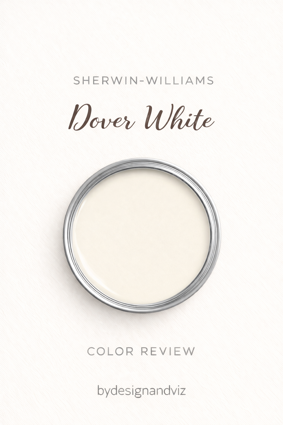
Dover White has an LRV of 82 and a direct warm yellow-cream undertone. It commits to warmth without reservation - the cream quality is present and deliberate, giving rooms a traditional, inviting brightness that reads as luminous and warm simultaneously. In south-facing rooms with good natural light Dover White is genuinely beautiful - the yellow-cream activates and the room feels like it is glowing from within. That warm luminosity is what clients are responding to when they choose it, and in the right conditions it fully delivers.
The directness is also the risk. I had a client in a north-facing open-plan kitchen where Dover White had been selected based on a chip sample - on the wall in cool indirect light the yellow undertone read as flat and slightly sharp rather than warm and inviting, and we ended up repainting with Alabaster. If the room is north-facing or the light is unpredictable, sample Dover White at large scale before committing. For how Dover White compares to the SW warm white it is most directly shortlisted against within the brand, the Dover White vs Alabaster guide covers that within-SW distinction in detail.
SW Accessible Beige SW 7036 - What It Really Looks Like

Accessible Beige has an LRV of 58 and a warm beige-tan undertone with a greige anchor. There is no grey-green complexity, no complex layering - the beige direction is clear, direct, and committed. It reads as what I call the peacekeeper in my practice: warm and grounded enough to read as a deliberate colour decision, but balanced and restrained enough to sit alongside almost any fixed material without creating an undertone fight. In fifteen years of residential work I have never had a client come back with an undertone complaint about Accessible Beige - it simply works.
In south-facing light it is at its most beautiful - the beige quality glows with genuine warmth and rooms feel genuinely inviting rather than just neutrally pleasant. In north-facing conditions the warmth holds reasonably well, though in very cool indirect light it can read slightly flat. The critical advantage over Dover White: Accessible Beige is significantly more predictable and stable across varied light conditions. For how it compares to the other SW warm neutral it is most often confused with, the Accessible Beige vs Agreeable Gray guide covers that distinction in detail.
The Real Difference Between Dover White and Accessible Beige

Dover White is a warm white. Accessible Beige is a warm beige-greige. They are different categories of colour that serve fundamentally different purposes - and the 24-point LRV gap between them creates entirely different experiences in a room.
Dover White rooms feel bright, creamy, and luminously warm - the high LRV at 82 keeps the room open and light-filled while the yellow-cream undertone delivers genuine warmth. The room reads as white but warm rather than simply white. Accessible Beige rooms feel warm, grounded, and specifically beige - the depth at LRV 58 creates an enveloping quality where the wall colour is part of the character of the room rather than a bright backdrop to it.
The trim question is the most practically useful aspect of this comparison. Unlike many warm white vs neutral pairings where the trim relationship only works in one direction, Dover White and Accessible Beige share enough of the same yellow-warm family direction that they can work together on adjacent surfaces - specifically Dover White on trim alongside Accessible Beige walls. Both colours commit to direct warm yellow-cream and warm beige-tan respectively, which means the transition from wall to trim stays within the same warmth family. The result is a fully committed warm scheme with a tonal, inviting character. Alabaster SW 7008 on trim gives a slightly more restrained and widely recommended result - but Dover White on trim is the choice when the brief calls for maximum warmth throughout. On a recent traditional kitchen project with warm oak cabinets, aged brass hardware, and a south-facing aspect I used Accessible Beige on the walls and Dover White on the trim and cornice - the client described the result as "the warmest, most welcoming room I have ever had." That is the combination at its best.
Not sure which one works for your room? A colour consultation is included in all our design packages - book directly here. |
When to Choose Dover White

Choose Dover White when the brief is bright, creamy, luminously warm white in a room with south or west-facing light. Traditional, farmhouse, and warm transitional interiors where cream warmth is specifically part of the design intent. Rooms with warm wood floors, warm stone, and aged brass hardware. Trim alongside Accessible Beige walls in fully committed warm schemes. Any brief where Accessible Beige's depth at LRV 58 would feel too dark, too committed, or too obviously coloured for the walls.
Dover White as a trim white alongside Accessible Beige walls is one of its strongest roles within the SW system. The shared warm family direction means the two colours relate naturally on adjacent surfaces without the undertone conflicts that different-temperature combinations create. If the scheme calls for maximum warmth throughout - walls, trim, and cabinets all pulling in the same yellow-warm direction - Dover White on trim alongside Accessible Beige walls delivers exactly that.
When to Choose Accessible Beige

Choose Accessible Beige when the brief is warm, settled beige-greige with real depth and peacekeeping presence. Traditional, transitional, and warm contemporary interiors where the walls need to contribute warmth and character rather than simply provide a bright backdrop. Rooms with warm wood floors, warm stone, and brass hardware where the beige-tan quality ties naturally into the palette. Any room where Dover White's brightness at LRV 82 would feel too light, too obviously white, or too open for the warmth the brief requires.
Accessible Beige is also the more reliable specification for rooms with varied or challenging light conditions. I have used it in rooms ranging from east-facing bedrooms to open-plan kitchen-diners with mixed north and south aspects - the direct warm undertone holds its character more consistently across those conditions than Dover White's more light-sensitive yellow-cream can manage. When in doubt about the light, Accessible Beige is the safer choice between the two.
How the Pairings Differ

For Accessible Beige on walls, Alabaster SW 7008 on trim is the most universally natural and widely recommended choice - the warm cream-greige relates to Accessible Beige's warmth and creates a cohesive, inviting result. Dover White SW 6385 on trim works in fully committed warm schemes where the brief calls for maximum yellow-warm character throughout. Pure White SW 7005 gives a crisper, more contemporary result. Avoid cool whites on trim - they fight the beige direction and make the walls read as yellowed by comparison.
For Dover White on walls, Pure White SW 7005 on trim is the most reliable within-system choice - near-neutral quality provides clean definition without fighting the yellow undertone. Alabaster SW 7008 gives a warmer, more tonal result. Accessible Beige on trim alongside Dover White walls does not work - the depth and settled greige quality reads as a wall colour applied to the trim rather than a considered trim choice, and makes the bright off-white walls read as thin by contrast.
For flooring, both colours are most natural above warm wood floors - the shared yellow-warm family creates an instinctively cohesive relationship with warm oak, honey wood, and traditional hardwood. Dover White handles a slightly broader range because the higher LRV creates less colour temperature tension with cooler materials. Accessible Beige is strongest when every material in the room is pulling in the same warm direction - it is less comfortable alongside very cool grey stone or contemporary tile where the beige quality can read as slightly yellowed by contrast.
For hardware, both suit aged brass, warm bronze, and matte gold - the shared warm family makes these metals the natural companion for both colours. Both are less comfortable with cool contemporary hardware. Accessible Beige can handle brushed nickel in transitional schemes where the greige anchor provides some colour temperature balance. Dover White's yellow-cream is least comfortable alongside polished chrome or cool steel in rooms with cool natural light.
Architect's Verdict - Dover White or Accessible Beige?

Both colours are warm. Both belong to the same SW warm family. Both suit south-facing rooms with warm materials. The choice between them is about which role the colour needs to play in the room - bright warm white backdrop, or settled warm beige presence.
If the brief is bright, creamy, luminously warm white - a backdrop that reads as white while delivering genuine cream warmth - Dover White is the answer, in a south or west-facing room with warm materials. Use Alabaster SW or Pure White SW on trim unless the brief specifically calls for maximum committed warmth throughout, in which case Dover White on trim alongside Accessible Beige on walls is the more daring and more rewarding combination.
If the brief is warm, settled beige-greige with depth, peacekeeping character, and reliable performance across varied light conditions - Accessible Beige is the answer, with Alabaster SW on trim as the default and Dover White on trim as the maximum-warmth alternative for the right scheme. The test is simple: do you want the walls to read as white or as a colour? White - Dover White. Colour - Accessible Beige.
Frequently Asked Questions

Is Dover White lighter than Accessible Beige?
Yes - by 24 LRV points. Dover White has an LRV of 82 and Accessible Beige has an LRV of 58. Dover White reads as a bright warm cream white. Accessible Beige reads as a medium warm beige-greige with settled depth and presence. The gap is clearly visible on a wall and the two colours sit in entirely different categories.
Can Dover White work as trim with Accessible Beige on walls?
Yes - in the right scheme. Both colours share a direct warm yellow-family direction, which means Dover White on trim alongside Accessible Beige walls stays within the same warmth family without the undertone conflicts that cross-temperature trim combinations create. Alabaster SW 7008 is the more widely recommended and more restrained trim choice - but Dover White on trim is correct when the brief calls for maximum committed warmth throughout. Always sample in the specific room before committing.
Which is better for north-facing rooms?
Accessible Beige handles north-facing rooms more reliably than Dover White. The warm beige-tan holds its warmth in cool indirect light without the yellow-risk that Dover White's cream undertone introduces in the same conditions. Dover White in north-facing conditions with no warm artificial lighting can read as flat or slightly sharp rather than creamy and warm. For any north-facing room within the SW range, Alabaster SW 7008 is more reliable than either.
Do Dover White and Accessible Beige go together?
Yes - specifically as Dover White on trim alongside Accessible Beige on walls. The shared warm yellow-family direction means they work harmoniously on adjacent surfaces in a way that many warm white and warm neutral combinations do not. They should not appear on walls in the same room - the 24-point LRV gap reads as a mismatch between rooms rather than a considered depth relationship. But wall-and-trim is a natural and effective combination for fully committed warm traditional schemes.
What is the LRV of Dover White vs Accessible Beige?
Dover White SW 6385 has an LRV of 82 and Accessible Beige SW 7036 has an LRV of 58. The 24-point gap places them in clearly different brightness categories. Dover White reads as a bright warm cream white. Accessible Beige reads as a medium warm beige-greige with real settled depth.
Final Thought
Dover White and Accessible Beige are both outstanding SW warm neutrals for the right brief - and unlike many white-vs-neutral pairings, they can also work together on adjacent trim and wall surfaces when the brief calls for a fully committed warm traditional scheme.
Bright, creamy, luminously warm white backdrop in a south-facing room - Dover White on walls with Alabaster SW or Pure White SW on trim. Warm, settled, peacekeeping beige-greige with depth and reliable performance - Accessible Beige on walls with Alabaster SW on trim, or Dover White on trim in the most warmly committed version of the scheme. Sample both at large scale in your specific room. The 24-point LRV gap will be immediately obvious and the answer will be clear within 24 hours.
Want a complete colour scheme built around Dover White or Accessible Beige? Our design packages cover full palette selection, finish recommendations, and 3D visualisations - see our packages. |
About the Author
Beril Yilmaz is a qualified architect and interior designer based in the UK. She runs BY Design And Viz, a design platform covering paint colour reviews, interior design guidance, and residential design projects. Beril has specified both Sherwin Williams Dover White and Accessible Beige across residential projects in the UK and internationally - often in the same scheme, with Accessible Beige on walls and Dover White on trim in traditional and farmhouse interiors where a fully committed warm, creamy character is specifically the brief.


Comments