Dover White vs Creamy: The Comparison That Actually Helps You Decide
- Beril Yilmaz

- 5 hours ago
- 10 min read
Dover White and Creamy are two of Sherwin Williams' most searched warm white comparisons - both bright, both clearly warm, and both appearing on shortlists when the brief is a committed warm white with genuine character. On a paint card they look like extremely close relatives. The 1-point LRV gap between them is one of the smallest in any white VS comparison. On a wall in a real room the difference is visible and meaningful - not in depth, but in the quality and character of the warmth each colour delivers.
Dover White SW 6385 reads as a warm, traditional yellow-cream white. At LRV 82 it is creamy, rich, and directly warm - the yellow-cream undertone commits to warmth clearly but with a quality that reads as classic and considered. Creamy SW 7012 reads as a buttery, more obviously yellow warm white. At LRV 81 it commits even more fully to its warmth direction - the yellow quality is more present, more buttery, and more demanding of the right conditions to perform at its best. Both announce their warmth. Creamy announces it louder.
This guide covers exactly how Dover White and Creamy differ in undertone character, light sensitivity, versatility, and room application - with a clear verdict on which one to choose and when, and a direct answer on the most important practical question: should they ever appear on adjacent surfaces?

At a Glance
| Dover White SW 6385 | Creamy SW 7012 |
Brand | Sherwin Williams | Sherwin Williams |
LRV | 82 - bright warm white, reads as traditional cream-quality white | 81 - bright warm white, reads as buttery committed cream |
Colour category | Warm white - direct yellow-cream, traditional and classic | Warm white - buttery yellow, more committed and more demanding |
Undertones | Direct warm yellow-cream - clean, traditional, committed warmth | Warm yellow-butter - more obviously yellow, more committed than Dover White |
Character | Warm, creamy, traditionally inviting - rich but classic | Warm, buttery, specifically yellow-cream - deeper warmth commitment |
North-facing | Risky - yellow reads flat or sharp without warm light | More risky - yellower undertone demands warm light even more |
South-facing | Beautiful - yellow-cream glows with genuine warmth | Beautiful - buttery warmth at its most beautiful in strong warm light |
Open-plan | Good in consistently warm zones; avoid if north zones present | Best with consistent warm south or west-facing light throughout |
On walls | Rich warm cream backdrop - traditional and committed | More obviously buttery cream backdrop - demands warm materials throughout |
On cabinets | Classic warm cream - traditional and transitional kitchens | Beautiful buttery cream - traditional and farmhouse kitchens |
Use together? | Never on adjacent surfaces - 1-point near-match reads as a mistake | In separate rooms only with clear visual boundaries between them |
Trim for each | Pure White SW 7005 or Alabaster SW 7008 for warmer result | Pure White SW 7005; avoid other warm whites on trim |
Style fit | Traditional, transitional, farmhouse, warm coastal | Traditional, farmhouse, warm traditional - the most committed brief only |
Architect's pick | When warm traditional cream with classic character is the brief | When specifically buttery yellow-cream warmth is the brief and conditions are right |
SW Dover White SW 6385 - What It Really Looks Like
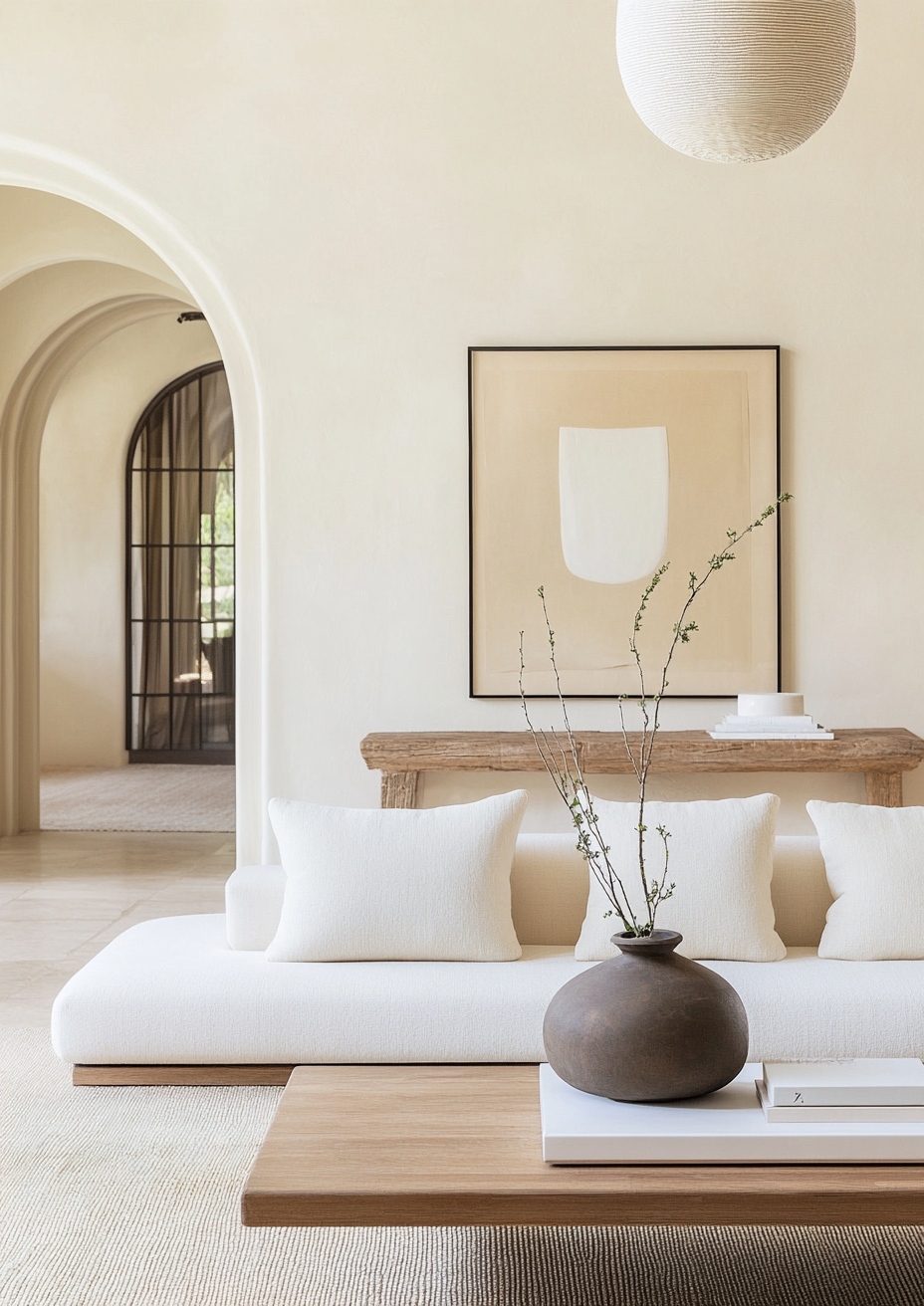
Dover White has an LRV of 82 and a direct warm yellow-cream undertone. The warmth is present and deliberate - the yellow-cream quality reads as classic and traditional rather than obviously buttery, and in the right conditions the colour creates a genuinely beautiful warm white result. In south-facing rooms with warm natural light it glows with a rich, traditional cream character that suits farmhouse, transitional, and warm-palette contemporary schemes particularly well.
The yellow quality is real and needs to be respected at the specification stage. I have seen Dover White look stunning in south-facing traditional kitchens with warm oak cabinets and aged brass hardware - the warmth of the walls, the warmth of the materials, and the warmth of the south-facing light all pull in the same direction and the result is genuinely inviting. In the same project's north-facing utility room painted with the same colour at the same time, it read as flat and slightly sharp under cool indirect light. The room, not just the chip, determines whether Dover White is the right choice. For the full comparison of Dover White against the SW off-white it is most often directly shortlisted against, the Dover White vs Alabaster guide covers every condition.
SW Creamy SW 7012 - What It Really Looks Like

Creamy has an LRV of 81 and a warm yellow undertone that is more obviously buttery than Dover White's yellow-cream. Where Dover White's warmth reads as classic cream, Creamy's warmth reads as butter - richer, more committed, and more obviously yellow in the undertone. There is no grey or greige component moderating the direction. Creamy commits fully to warmth and does not hedge.
In south-facing rooms with warm materials and warm light, Creamy is one of the most beautiful warm white results available - the buttery warmth glows and the room feels genuinely cozy and traditional. I have specified it in farmhouse kitchens with warm stone countertops, unlacquered brass hardware, and warm oak floors where the client brief was explicitly "the warmest possible white" and it delivered exactly that. The risk is equally direct: without warm light and warm materials around it, the yellow reads as flat or obviously yellow rather than warm and inviting. It is the most condition-dependent of all the SW warm whites. For how Creamy compares to Alabaster - the more broadly versatile SW warm white at a similar depth - the Creamy vs Alabaster guide covers the full picture.
The Real Difference Between Dover White and Creamy

Dover White is warm. Creamy is warmer. The 1-point LRV gap tells you almost nothing. The quality and commitment of the yellow undertone is what the comparison is actually about.
Dover White's yellow-cream reads as classic and traditional - the warmth is clearly present but the cream quality is restrained enough that the colour reads as a considered, traditional warm white rather than an obviously yellow one. Creamy's yellow reads as butter - the warmth is the defining feature of the colour and it makes no apology for it. In warm south-facing light the difference between them is subtle but visible side by side: Dover White reads as warm and cream, Creamy reads as warm and buttery. In cool north-facing light the difference becomes more pronounced - Dover White holds its warm-cream character better than Creamy's more committed yellow can manage in the same conditions.
The most important practical note from this comparison: Dover White and Creamy must never appear on adjacent surfaces. The 1-point LRV near-match with similar but not identical undertone characters reads as a mistake rather than a considered tonal relationship - like two whites that were meant to match but do not quite. This is not a hypothetical risk. On a recent project where a client had chosen Dover White for walls and Creamy for kitchen cabinets in the same open-plan space, the combination read as a warm-white coordination failure from the moment the second colour went on. We repainted the cabinets. In separate rooms with clear visual boundaries they can coexist comfortably - but adjacent surfaces are to be avoided with these two colours more strictly than almost any other same-brand near-match.
Not sure which one works for your room? A colour consultation is included in all our design packages - book directly here. |
When to Choose Dover White

Choose Dover White when the brief is warm, traditional, cream-quality white in a room with reliable warm light. South and west-facing rooms with good natural light. Traditional, farmhouse, and warm transitional interiors where classic cream warmth is the brief. Rooms with warm wood floors, warm stone, and aged brass hardware where the yellow-cream quality relates naturally to the material palette. Any brief where Creamy's more buttery commitment would feel too obviously yellow or too demanding of warm materials to support it.
Dover White is the more forgiving of the two - its yellow-cream is classic and traditional where Creamy's is buttery and demanding. For rooms where the light is reliable and the materials are warm but not quite as committed as Creamy requires, Dover White is the correct warm white between the two.
When to Choose Creamy
Choose Creamy only when specifically buttery yellow-cream warmth is the brief and the conditions fully support it. South-facing rooms with strong natural light throughout the day. Farmhouse and traditional interiors where the material palette is entirely warm - warm wood, warm stone, brass, linen. Any brief where Dover White would feel not quite warm enough and the client has specifically asked for the warmest possible white within the SW range.
Creamy is not a safe alternative to Dover White - it is a more committed version for rooms that can carry that commitment. If there is any doubt about the light conditions, any cool materials in the palette, or any mixed orientations in an open-plan space - choose Dover White. Creamy rewards certainty. If the conditions are right it is beautiful. If they are not, the yellow reads as obviously yellow rather than warmly cream.
How the Pairings Differ

For Dover White on walls, Pure White SW 7005 on trim is the most reliable choice - near-neutral quality provides clean definition without fighting the yellow undertone. Alabaster SW 7008 gives a warmer, more tonal result. Creamy on trim alongside Dover White walls is one of the combinations to avoid - the 1-point near-match with slightly different buttery character reads as a warm-white coordination mistake rather than a considered pairing.
For Creamy on walls, Pure White SW 7005 on trim is the most reliable choice for the same reason. Alabaster SW 7008 on trim works in the most committed warm schemes but needs careful sampling - the similar warmth direction at different depths can read as near-matched rather than intentionally tonal in some light conditions. Dover White on trim alongside Creamy walls creates the same near-match problem from the other direction. Keep trim clearly lighter and more neutral than Creamy walls.
For flooring, both colours are most naturally at home above warm wood floors. Dover White handles a slightly broader range because the yellow-cream quality is more restrained - it sits more comfortably alongside warm stone and transitional floor materials than Creamy's more obviously buttery warmth can. Creamy is most at home in rooms where every floor material is warm and organic - honey wood, warm oak, traditional wide-plank hardwood. Cool grey stone or contemporary tile alongside Creamy makes the yellow read as obviously off by contrast.
For hardware, both are strongest with warm metals. Aged brass, unlacquered brass, warm bronze, and antique brass all complement the yellow-warm direction of both colours. Dover White handles brushed nickel in transitional schemes more gracefully than Creamy - the slightly more restrained yellow quality creates less tension with cool hardware finishes. Creamy is at its best surrounded exclusively by warm metals.
Architect's Verdict - Dover White or Creamy?

Both colours are warm. Both suit traditional and farmhouse briefs. Both need warm light and warm materials to perform at their best. The choice between them comes down to how committed the warmth needs to be.
If the brief is warm traditional cream - classic, inviting, broadly reliable in south-facing and transitional conditions - Dover White is the answer. It delivers genuine warmth without the demanding conditions that Creamy requires.
If the brief is specifically buttery, obviously warm, farmhouse yellow-cream - and the room is south-facing with entirely warm materials and consistently warm light - Creamy is the answer. It delivers a warmth and a butter quality that Dover White's more restrained character does not quite reach.
The absolute rule from this comparison: never put Dover White and Creamy on adjacent surfaces in the same space. The 1-point LRV near-match and the similar-but-not-identical undertone characters produce the most uncomfortable result in residential paint specification - two warm whites that look like they were meant to be the same colour but are not. In separate rooms, both can be excellent. On adjacent surfaces, neither can perform.
Frequently Asked Questions

Is Dover White the same as Creamy?
No - despite being 1 LRV point apart, they have a meaningful character difference. Dover White's yellow-cream undertone reads as classic and traditional. Creamy's yellow undertone reads as more obviously buttery and committed. Dover White is the more broadly usable of the two across varied conditions. Creamy is the more demanding colour that delivers its best result only when conditions fully support it.
Which is warmer - Dover White or Creamy?
Creamy reads as warmer in most conditions. The more obviously buttery yellow undertone commits more fully to warmth than Dover White's yellow-cream. In side-by-side samples in warm light, Creamy reads as noticeably more yellow and more buttery. In cool light the gap becomes even more visible - Creamy's yellow quality reads as more obviously yellow without warm light to give it context.
Can Dover White and Creamy be used together?
Never on adjacent surfaces. The 1-point near-match LRV with similar but not identical undertone characters reads as a warm-white coordination mistake in a real room. In separate rooms with clear visual boundaries they can coexist in the same home. On walls and trim or cabinetry in the same space - avoid.
Which is better for north-facing rooms?
Neither is well-suited to north-facing rooms - both have direct yellow undertones that need warm light to perform. Dover White handles north-facing conditions marginally more reliably because the yellow-cream is slightly more restrained than Creamy's buttery yellow. For north-facing rooms within the SW warm white range, Alabaster SW 7008 is the more reliable specification than either Dover White or Creamy.
What is the LRV of Dover White vs Creamy?
Dover White SW 6385 has an LRV of 82 and Creamy SW 7012 has an LRV of 81. The 1-point gap makes them virtually identical in brightness - one of the smallest LRV gaps in any warm white VS comparison. The meaningful difference is entirely in undertone character: Dover White's restrained traditional yellow-cream versus Creamy's more committed buttery yellow warmth.
Final Thought
Dover White and Creamy are 1 LRV point apart but create rooms with a perceptible character difference when sampled side by side. The choice between them is not about brightness - it is about how much yellow the brief can carry and how certain the conditions are.
Classic, traditional cream warmth in a south-facing room with warm materials - Dover White with Pure White SW on trim. Specifically buttery, farmhouse yellow-cream in a south-facing room with entirely warm materials and warm light - Creamy with Pure White SW on trim. Never on adjacent surfaces regardless of which one you choose. Sample both at large scale in the specific room under natural and artificial lighting. The 1-point LRV gap will look invisible. The undertone character difference will be visible.
Want a complete colour scheme built around Dover White or Creamy? Our design packages cover full palette selection, finish recommendations, and 3D visualisations - see our packages. |
About the Author
Beril Yilmaz is a qualified architect and interior designer based in the UK. She runs BY Design And Viz, a design platform covering paint colour reviews, interior design guidance, and residential design projects. Beril has specified both Sherwin Williams Dover White and Creamy across residential projects in the UK and internationally - Dover White most often in traditional and transitional schemes where classic cream warmth is the brief, Creamy in farmhouse and warm-traditional projects where the client has specifically requested the most committed buttery warmth available in the SW range and the conditions fully support it.


Comments