Nude Color: What It Is, Its Undertones, and How to Use It in Interiors
- Beril Yilmaz

- Mar 9
- 10 min read
Nude color is one of those terms that seems self-explanatory until you try to define it precisely. Ask ten designers what nude is and you will get ten slightly different answers — some will describe a warm, peachy beige; others a cool, greige-tinged off-white; others a soft, skin-toned cream. The reason for this variation is that nude is not a single fixed color — it is a family of neutrals united by a shared quality: a soft, warm, skin-toned character that sits between white, beige, and the faintest suggestion of pink or peach.
In interior design, nude color has become one of the most useful and widely used neutrals precisely because of this flexibility. It reads as warm without being obviously yellow, sophisticated without being cold, and neutral without being flat. This guide covers exactly what nude color is, its undertone variations, how it behaves in different light conditions, and how to use it in real rooms.
What Is Nude Color?

Nude color in interiors is a soft, warm neutral that sits in the space between off-white, pale beige, and the faintest blush or peach. The name comes from its association with skin tones — specifically the warm, muted tone of skin seen in natural light, which varies between a warm peachy beige and a soft pinkish cream depending on the light and the specific undertone of the color.
In paint terms, nude colors typically have an LRV between 65 and 82 — lighter than a true beige but warmer than most off-whites. What distinguishes nude from simply being a light beige is the presence of a warm, slightly peachy or pinkish undertone that gives the color its characteristic softness. A nude without that warmth reads as greige or taupe rather than nude.
The closest color relatives to nude in the neutral family are ecru, cream, and very pale blush. The full breakdown of how ecru compares to other warm neutrals is in the what color is ecru guide.
Nude Color Undertones
The undertone is the most important thing to understand about any specific nude color — it determines which materials and colors work alongside it and how it behaves in different light conditions. Nude colors fall into three broad undertone categories:
Warm Peachy Nude

Warm peachy nudes have a soft orange-pink undertone that reads as skin-toned and inviting — this is the nude color most people picture when they think of the term. In warm natural light it reads beautifully warm and organic. In cool north-facing light the peachy quality becomes slightly more visible and the color can read as slightly pink, which is worth testing before committing. Warm peachy nudes suit rooms with warm wood floors, warm brass accents, and warm artificial lighting.
Warm Cream Nude

Warm cream nudes sit closer to off-white with a soft, barely-there warmth that gives them a lighter, airier quality than peachy nudes. They share the nude family's warmth but with a higher LRV and less obvious pink or peach. In most light conditions they read as a sophisticated, clean warm white-beige that is neither obviously cream nor obviously nude. This is the most versatile nude undertone — it works across the widest range of materials and light conditions.
Greige Nude

Greige nudes have a cooler, more complex undertone — a blend of the warm nude quality with a subtle gray component that gives them a more sophisticated, contemporary character. They sit at the boundary between nude and greige and have less of the obvious warmth of peachy or cream nudes. They work well in rooms with mixed warm and cool materials and suit contemporary interiors where a warmer white-gray is needed. These are sometimes described as blush-greige rather than nude.
Nude Color vs Similar Colors
Nude Color vs Ecru

Nude and ecru are the closest color relatives in the neutral family — both are warm, skin-toned neutrals with soft undertones. The key difference is that ecru leans more yellow-beige while nude leans more pink-peach. Ecru has its origin in natural unbleached fabric — its warmth is the yellow warmth of raw linen. Nude's warmth is the pink-peach warmth of skin tone. In practice the two colors look very similar in most light conditions, which is why Google consistently sends nude color searches to ecru content. The full breakdown of ecru is in the ecru vs cream guide.
Nude Color vs Cream

Cream is warmer and more obviously yellow than nude — it commits more fully to the yellow-white direction, while nude sits in a more complex, peachy-beige territory. Cream reads as a warm white; nude reads as a warm skin tone. In strong natural light cream can appear quite yellow, while nude maintains its more neutral, skin-toned quality across a wider range of light conditions.
Nude Color vs Beige

Beige is deeper and more obviously toned than nude — it reads as a clear, warm neutral rather than a barely-there skin tone. Nude is lighter and has more of the soft, delicate quality that makes it feel sophisticated rather than simply warm. The full breakdown of how these neutrals compare is covered in the ecru vs beige guide, which covers the same undertone territory.
Nude Color vs Taupe
Taupe is cooler and more complex than nude — it has gray in its undertone that gives it a more urban, sophisticated quality. Nude is warmer and more obviously skin-toned. In a room where you want warmth and softness, nude is the right choice; in a room where you want a more neutral, considered warm-gray, taupe is the better direction. The full comparison is in the ecru vs taupe guide.
Want help choosing the right nude or neutral for your space? Book a color consultation here — bydesignandviz.com/book-online |
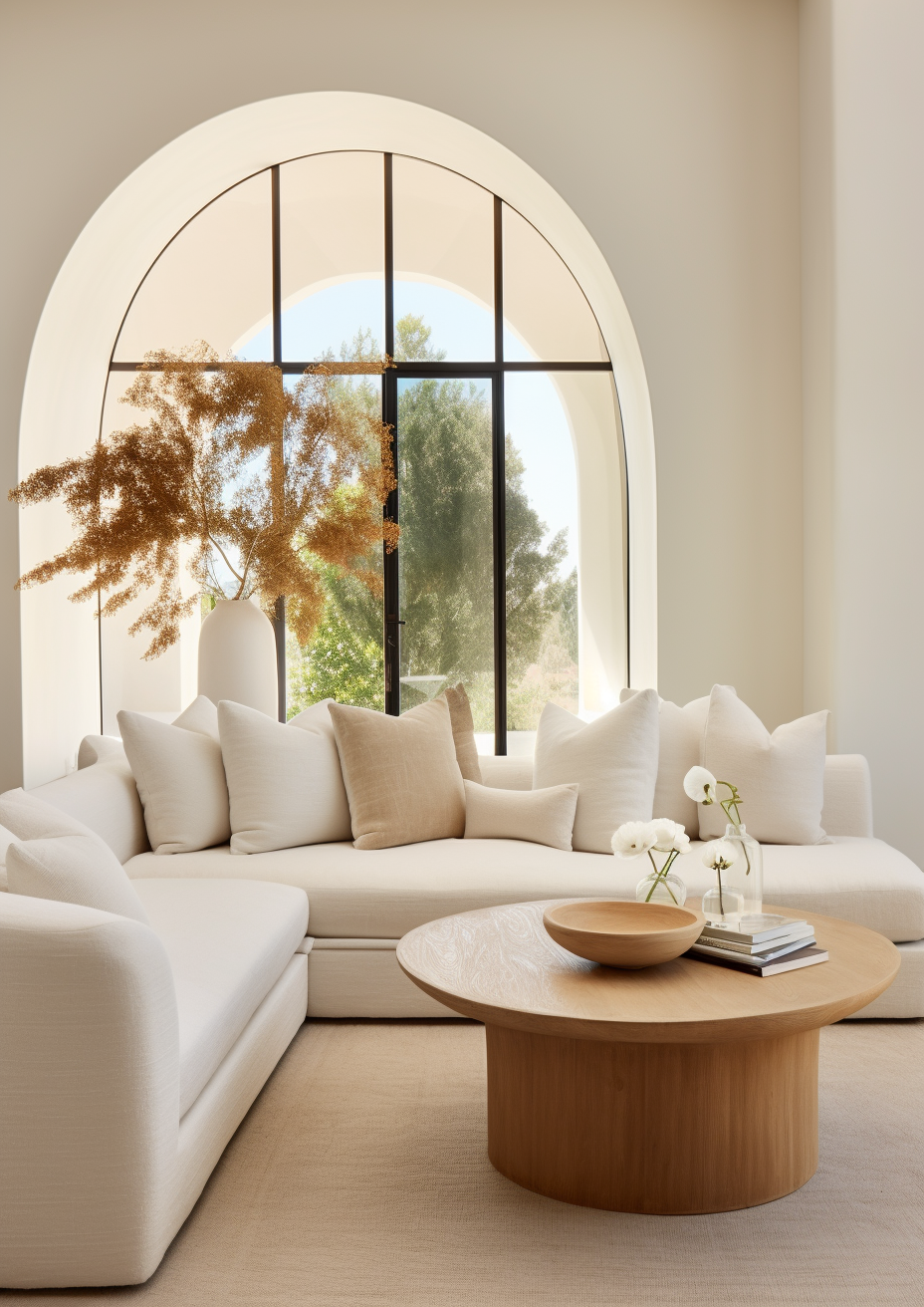
Nude Color in Interior Design
Nude color in interior design works because it provides warmth without the obvious character of a stronger neutral — it is a backdrop color that makes everything placed in front of it look considered and deliberate. The right nude wall color does not compete with furniture, art, or textiles — it lets them perform.
Nude Color on Walls

Nude walls create one of the most universally flattering room backgrounds available — warm enough to prevent the cold quality of white or near-white, light enough to keep rooms feeling open, and neutral enough to work alongside almost any furniture color or material. The key is choosing a nude that shares the warmth direction of the room's other elements — a peachy nude alongside cool-toned furniture reads as slightly pink; a cream nude alongside very warm materials reads as very yellow.
Test the nude on a large sample board (at least A3 size) and view it at different times of day and under both natural and artificial light before committing — nude colors shift more noticeably between light conditions than most neutrals because the warmth is subtle enough to be amplified or suppressed by different light temperatures.
Nude Color in Fabrics and Upholstery

Nude is one of the most popular fabric colors in contemporary residential design precisely because it photographs beautifully and wears well visually over time — a nude linen sofa or a nude boucle armchair reads as quietly sophisticated without the visual weight of a darker upholstery color. Nude velvet in particular has become a defining material choice in organic modern and contemporary interiors — the combination of the soft color and the light-catching quality of velvet creates a texture-forward neutral that reads as genuinely considered.
Nude Color in Kitchens

Nude kitchen cabinets are a sophisticated alternative to white or cream — they have more warmth than white without the obvious character of a colored cabinet. Nude cabinetry works best alongside warm stone countertops — warm marble, travertine, or cream quartz all complement the peachy-beige quality of nude cabinets naturally. Warm brass hardware is the most consistent metalwork choice alongside nude cabinetry — it shares the warm, skin-toned quality of the cabinet color and creates a cohesive, considered scheme.
Nude Color in Bedrooms

Nude is one of the most restful bedroom colors available — its warmth creates an enveloping, cocooning quality without the heaviness of a deeper neutral. A nude bedroom with warm linen bedding, warm wood furniture, and warm brass or aged bronze accents is one of the most quietly luxurious combinations in residential bedroom design. The key is keeping every element in the room warm-toned — a nude bedroom with cool-toned materials reads as slightly pink rather than warmly neutral.
Nude Color in Bathrooms
Nude in a bathroom — on tiles, on walls, or on vanity cabinetry — creates a warm, spa-like quality that white bathrooms cannot match. Nude tile in a shower or on a floor reads as sophisticated and organic rather than clinical. Pair with warm stone, warm wood, and brushed brass for a bathroom scheme that feels genuinely considered. Avoid cool-toned grout alongside nude tile — the contrast between the cool grout and the warm tile makes the undertone of the nude more visible and can read as slightly pink.
Colors That Work With Nude
White and Off-White

Crisp white trim alongside nude walls creates clean definition while maintaining the warmth of the scheme — Pure White SW 7005 or White Dove OC-17 both work well. Avoid very cool whites alongside nude — they make the peachy or warm undertone of the nude more visible by contrast.
Warm Wood

Warm wood is the most natural companion for nude color in any application — the shared warm undertone of nude and warm wood creates an instinctively cohesive relationship that requires no additional styling effort. Light oak, white oak, and warm walnut all work well alongside nude walls, nude upholstery, and nude cabinetry.
Warm Brass and Bronze
Warm brass and aged bronze hardware, lighting, and accessories complement nude color by sharing its warm, skin-toned quality — the gold warmth of brass relates directly to the peachy warmth of nude. This is why the nude-and-brass combination appears so consistently in contemporary residential design: the two materials are in the same warmth family and reinforce each other.
Soft Terracotta

A soft terracotta accent — in cushions, ceramics, or a single textile — brings warmth and energy to a nude scheme without introducing a competing color. The earthy orange-red of terracotta and the warm peachy quality of nude share the same undertone family, which is why they read as naturally related rather than contrasting.
Muted Sage Green
Muted sage green alongside nude creates one of the most popular contemporary neutral combinations — the earthy, organic quality of both colors creates a grounded, considered scheme that reads as natural and deliberate. Sage green cushions, plants, or a single accent piece in a nude room introduces color without disrupting the warmth of the scheme.
Deep Chocolate Brown
Deep chocolate brown — in a coffee table, a console, or upholstery — grounds a nude scheme by providing depth and visual weight alongside the lightness of the nude. The warm undertone of both colors creates cohesion; the LRV difference creates contrast. This is one of the most reliable ways to prevent a nude room from feeling flat or underdressed.
Nude Paint Colors to Consider
These are the paint colors that most consistently deliver true nude results across different rooms and light conditions:
• Accessible Beige SW 7036 (Sherwin Williams) — warm greige-nude that works across most light conditions
• Pale Oak OC-20 (Benjamin Moore) — warm nude-greige with a slightly more complex undertone
• Shoji White SW 7042 (Sherwin Williams) — lighter nude with a soft greige quality
• Natural Linen SW 9109 (Sherwin Williams) — warm, slightly peachy nude that reads as a soft organic neutral
• White Dove OC-17 (Benjamin Moore) — at the lighter end of nude, a warm off-white with nude qualities
• Pale Blush (various brands) — the pinkest end of the nude family, for rooms where a warmer, more obviously skin-toned read is the brief
For the full breakdown of how to build a complete color palette around these warm neutral tones, the ecru color palette guide covers the same neutral family in detail.
How Nude Color Behaves in Different Light

Nude color is more light-sensitive than most neutrals because its warmth is subtle enough to be significantly affected by different light temperatures. Understanding this before choosing a specific nude is essential.
North-Facing Rooms
In cool north-facing light, nude colors with a peachy or pink undertone can shift noticeably towards pink — what reads as a warm, skin-toned neutral in balanced light reads as a pale blush in cool blue-toned light. For north-facing rooms, choose a nude with a cream or greige undertone rather than a peachy one — it will hold its warmth without tipping into pink.
South-Facing Rooms
South-facing rooms are the most flattering environment for nude color — warm natural light amplifies the peachy, skin-toned quality of the color and makes it read at its most sophisticated. In strong direct southern light, nude reads as a warm, clean, beautiful neutral that suits both traditional and contemporary interiors.
Artificial Lighting
Warm artificial lighting at 2700K-3000K deepens nude color and makes its warmth more present — this is usually a positive effect, creating a cozy, enveloping quality in the evening. Cool daylight bulbs above 4000K can strip the warmth from nude colors and make them read as flat or slightly pink rather than warmly neutral. Warm bulbs are essential in rooms where nude is the primary color.
Frequently Asked Questions
What color is nude exactly?
Nude is a soft, warm, skin-toned neutral that sits between off-white, pale beige, and the faintest suggestion of pink or peach. It is lighter than a true beige and warmer than most off-whites, with a barely-there warmth that gives it a sophisticated, delicate quality. In interior design it is most often described as a warm, peachy off-white or a very pale warm beige.
Is nude the same as beige?
No — nude is lighter and more peachy-pink than beige. Beige is a deeper, more obviously warm neutral; nude is lighter and has a more delicate, skin-toned character. Beige reads as clearly warm; nude reads as barely warm, with its warmth present but subtle.
Is nude a warm or cool color?
Nude is a warm color — its defining characteristic is a soft, peachy or cream warmth that gives it its skin-toned quality. The warmth is subtle rather than obvious, which is what distinguishes nude from more overtly warm neutrals like beige or cream.
What colors go well with nude?
Warm white trim, warm wood, warm brass, soft terracotta, muted sage green, and deep chocolate brown all work naturally alongside nude color. The key is keeping every element in the room warm-toned — nude reads best when surrounded by warmth rather than mixed with cool materials or cool-toned colors.
Is nude color good for walls?
Yes — nude is one of the most universally flattering wall colors available. Its warmth prevents the cold quality of white or near-white walls, its lightness keeps rooms feeling open, and its neutrality means it works alongside almost any furniture style and color. Always test a large sample in the specific room and light conditions before committing.
Final Thought
Nude color succeeds in interiors for the same reason it succeeds in fashion — its warmth is present but not assertive, and its skin-toned character makes everything around it look considered and deliberate. It is not a trend color. It is a permanent part of the neutral palette that cycles in and out of fashion while always remaining a valid and beautiful choice for rooms where warmth, sophistication, and restraint are the brief.
The key to using it well is understanding which undertone works in your specific room and testing it in real light before committing. Get that right and nude delivers a room quality that more assertive colors cannot match.
Want help choosing the right nude for your home? See our design packages here — bydesignandviz.com/#interiordesignpackages |
About the Author
Beril Yilmaz is a qualified architect and interior designer based in the UK. She runs BY Design And Viz, a design platform covering paint color reviews, interior design guidance, and residential design projects. Beril specifies nude and warm neutral color schemes for residential projects across the UK.


Comments