


Snowbound vs Alabaster: The Comparison That Actually Helps You Decide

Updated: Aug 10
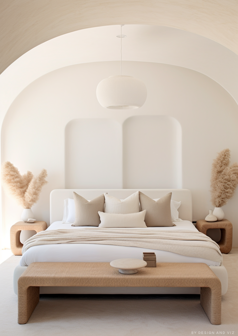
Snowbound and Alabaster sit almost on top of each other on the Sherwin-Williams fan deck. One point of LRV separates them, and both are marketed as flexible, whole-house neutrals. What the fan deck does not tell you is that they pull in opposite directions the moment they hit a wall. Snowbound leans quietly cool, Alabaster leans quietly warm - and that single fact decides almost everything else about where each one belongs.
I have used both across residential projects, and I do not treat this as a coin flip. Alabaster is the safer warm neutral for most rooms; Snowbound is the sharper, more deliberate choice for spaces that need to feel calm rather than cosy. The two are not interchangeable, even though the paint chips look nearly identical in the store.
This guide covers the undertone behaviour, how each performs under different light, and which one your room actually needs.

At a Glance
| Snowbound | Alabaster |
Brand | Sherwin-Williams | Sherwin-Williams |
LRV | 83 - bright, sits at the cool-neutral end of the white range | 82 - nearly identical to Snowbound on paper, opposite in behaviour |
Colour category | Soft cool-neutral white - reads composed rather than warm or creamy | Restrained warm neutral - warm enough to avoid reading cold, quiet enough to avoid reading cream |
Undertones | Grey base with a faint violet-pink whisper - shifts toward mauve in flat light, never toward yellow | Soft yellow held well back - present without announcing itself |
Character | Quiet and deliberate; holds its neutrality under mixed light rather than tipping warm or cold | Versatile and quietly warm; bridges cool and warm materials without conflict |
North-facing | Cautious - the grey base can read flat and slightly mauve without warm materials to offset it | Reliable - the restrained undertone holds its warmth without tipping into obvious yellow |
South-facing | Clean and composed - stays balanced rather than warming up the way a true warm white would | Clean and warm - the yellow undertone activates gently rather than intensifying |
Open-plan | Strong - the restrained undertone reads consistently across zones with mixed finishes | Strong - reads consistently across zones with mixed light and material temperatures |
On walls | Soft, composed cool-neutral backdrop that stays calm rather than cosy, even in changing light | Soft warm-neutral backdrop that stays composed under changing light throughout the day |
On cabinets | Excellent against cool stone, brushed nickel, and black hardware; less at home with heavy warm wood | The practical choice across most kitchens, including cool stone and stainless finishes |
Use together? | Yes - Snowbound on walls with Alabaster on trim gives a deliberate warm/cool step; the reverse reads muddier | Yes - Alabaster on trim alongside Snowbound walls is the classic pairing; the reverse needs testing first |
Trim for each | Extra White SW 7006 for crisp contrast, or Pure White SW 7005 for a softer step | Extra White SW 7006 or Pure White SW 7005 for crisp definition |
Style fit | Contemporary, Scandinavian, coastal, minimalist - anywhere the brief calls for restraint over warmth | Traditional, transitional, organic modern - the more broadly warm-compatible of the two |
Architect's pick | When the brief needs a bright, composed neutral that will not read yellow or creamy under any light | When warmth is needed but the room's materials or light conditions are mixed or uncertain |
Sherwin-Williams Snowbound SW 7004 - What It Really Looks Like

Snowbound has an LRV of 83, which puts it among the brighter whites in the Sherwin-Williams range. The undertone is grey first, with a faint violet-pink note that surfaces mainly under warm artificial light. It does not read as a warm white and it does not read as a true cool white either - it sits in a deliberately restrained middle ground. For the full standalone review of Snowbound - its undertones, LRV, and exactly when it works - the Sherwin-Williams Snowbound review covers everything in detail.
It does not hedge toward cream. That is the point of it. In flat, overcast light the grey base can drift toward a soft mauve, which reads sophisticated in a considered scheme and slightly flat in an under-furnished one. Snowbound rewards rooms with texture and warm materials nearby to give it something to react against.For how Snowbound holds up against a genuinely cool white rather than a warm one, the Alabaster vs Cloud White guide is useful groundwork - it maps where the cool end of this range starts to feel cold rather than composed, a line Snowbound sits just on the warm side of.
Sherwin-Williams Alabaster SW 7008 - What It Really Looks Like

Alabaster has an LRV of 82, close enough to Snowbound that the two are indistinguishable on a paint card. The undertone is what separates them. Alabaster carries a soft, restrained yellow - warm enough to prevent it looking cold, quiet enough that it never reads as a cream.
It bridges warm and cool more naturally than a true warm white does. Its restraint is what makes it the more forgiving of the two in mixed-material rooms - it does not clash with cooler-toned stone or metal the way a fully committed cream would.Against a genuinely cool-leaning white in the same LRV band, the difference becomes obvious fast; the Alabaster vs Pure White guide lays out exactly where Alabaster's warmth starts and a true cool white's neutrality takes over.
The Real Difference Between Snowbound and Alabaster

The simplest way to put it: Snowbound is a white that leans cool without ever going cold. Alabaster is a white that leans warm without ever going cream. They are separated by only a single point of LRV, which tells you almost nothing about how they will actually behave.
LRV is a near-wash here - 83 against 82 - so the entire decision rests on undertone, not brightness. Side by side in the same light, Snowbound will read composed and slightly grey; Alabaster will read soft and slightly gold. That is the whole comparison in one sentence.
The pairing potential is where this becomes genuinely useful rather than academic. Snowbound walls with Alabaster trim creates a deliberate warm-cool step that reads considered rather than accidental - the kind of contrast that photographs well precisely because it is intentional. For the fuller case on why that combination works better than most warm-and-cool pairings in this LRV band, Swiss Coffee vs Alabaster guide walks through how Alabaster performs as the warming half of a two-tone scheme against a range of cooler neutrals.
Not sure which one works for your room? A colour consultation is included in all our design packages - book directly here. |
When to Choose Snowbound

Choose Snowbound when the room needs to feel calm, bright, and unmistakably neutral rather than warm. It performs best in contemporary interiors with a mix of black, brass, and cool stone, where a warm white would compete with the metals rather than support them. It is a strong choice for open-plan spaces with large expanses of glass, where a warmer white can start to look yellow against daylight.
Avoid Snowbound in north-facing rooms with little else to warm them up. Without warm wood, brass, or textiles nearby, the grey base can read flat rather than composed. It is also not the right choice for traditional or farmhouse interiors that are explicitly asking for warmth - that brief belongs to a cream or a warm neutral, not to Snowbound.
When to Choose Alabaster

Choose Alabaster when you want warmth without committing to a full cream, and the room's conditions are not guaranteed to be ideal. It is the safer pick for north-facing rooms, for kitchens with a mix of warm and cool finishes, and for anyone who has tested a cooler white and found it flat.
Alabaster is also the stronger trim colour in most schemes. Its restrained warmth reads as clean and defined against a wide range of wall colours, including Snowbound, without competing for attention.
How the Pairings Differ

For Snowbound on walls, Extra White or Pure White on trim gives a crisp, composed finish. Alabaster on trim is the more considered option where the brief wants a deliberate warm-cool contrast rather than a uniform cool scheme.
For Alabaster on walls, Extra White or Pure White on trim gives clean definition without competing warmth. Snowbound on trim alongside Alabaster walls is the reverse pairing and needs testing - the cool trim can read slightly stark against warm walls if the room's light is already dim.
Both colours suit pale oak and light stone flooring, but Snowbound is the more forgiving of the two with cool grey or polished concrete floors, where Alabaster's warmth can start to look slightly at odds with a fully cool material palette.
For hardware, Snowbound suits brushed nickel, matte black, and chrome without any undertone conflict. Alabaster leans toward aged brass and warm gold, though it will tolerate cooler metals better than a fully committed cream would.
Architect's Verdict - Snowbound or Alabaster?

For most homes - particularly north-facing rooms, traditional interiors, or anywhere the brief explicitly wants warmth - Alabaster is the more forgiving choice. Its restraint means it rarely looks wrong.
Snowbound is the right call when the brief is specifically composed and cool - contemporary kitchens with black and brass hardware, bright open-plan spaces with a lot of glass, bathrooms with cool stone and chrome fittings. It rewards a room that already has warmth built into its materials, because the paint itself will not supply it.
Alabaster is the right call whenever warmth is part of the brief but the room's light or materials are not fully predictable. It is close to unkillable across a wide range of conditions, which is precisely why it appears in so many schemes.
The test I always use for this specific pairing: paint a large sample of each on the wall that gets the least natural light in the house - typically a north-facing hallway or bathroom. Look at both in the morning and again under evening lamplight. If Snowbound still reads clean and composed rather than flat or mauve, it has passed. If it looks grey or muddy in that worst-case room, Alabaster is the safer choice throughout the rest of the house.
Frequently Asked Questions
Is Snowbound cooler than Alabaster?
Yes - Snowbound has a grey base with a faint violet-pink undertone, which reads as composed and slightly cool. Alabaster carries a restrained yellow undertone and reads as warm by comparison. Despite being only one LRV point apart, the two behave in opposite temperature directions.
Can I use Snowbound and Alabaster in the same house?
Yes, and the pairing is a deliberate one. Snowbound on walls with Alabaster on trim creates an intentional warm-cool contrast that reads considered rather than mismatched. The reverse combination - Alabaster walls with Snowbound trim - needs testing, as the cool trim can look stark against warm walls in low light.
Which is better for a north-facing room?
Alabaster is the more reliable choice for north-facing rooms. Its restrained warmth prevents the flat, slightly grey read that Snowbound can take on without warm materials or artificial light to balance it. If you are set on Snowbound in a north-facing space, test it with warm lamps and warm-toned furnishings nearby.
Which is better for kitchen cabinets?
It depends on the hardware and countertop finish. Snowbound is the stronger choice against cool stone, stainless steel, and black or nickel hardware. Alabaster works across a broader range of finishes, including warm wood and brass, and is the more forgiving option if the kitchen mixes warm and cool materials.
What is the LRV of Snowbound vs Alabaster?
Snowbound has an LRV of approximately 83 and Alabaster approximately 82. The one-point gap is not meaningful in practice - both reflect a similar amount of light. The real difference is entirely in the undertone, not the brightness.
Final Thought
Snowbound and Alabaster are both excellent, dependable whites. The choice between them is not about which reflects more light - they are functionally identical on that front. It is about which temperature your room's materials and light are already leaning toward.
If your room is bright, contemporary, and built around cool or neutral materials, Snowbound will hold its composure. If your room mixes warm and cool finishes, or faces north, Alabaster is the more dependable result. Your room's worst light will tell you which one it needs.
Want a complete colour scheme built around Snowbound or Alabaster? Our design packages cover full palette selection, finish recommendations, and 3D visualisations - see our packages. |
About the Author
Beril Yilmaz is a qualified architect and interior designer based in the UK. She runs BY Design And Viz, a design platform covering paint colour reviews, interior design guidance, and residential design projects. Beril has specified both Snowbound and Alabaster across residential projects in the UK and internationally - Snowbound in contemporary kitchens and bathrooms built around cool stone and black or nickel hardware, Alabaster in mixed-material and open-plan spaces where light and finishes vary through the day, often specifying Alabaster on trim alongside Snowbound walls in the same scheme.




Comments